

Santa’s Star(fish)
People are endlessly creative. I struggle to pass by handmade Santa Claus pieces when I am thrifting or garage sale hunting. The problem is there are entirely too many out there, made in remarkable mediums, including ceramic, wood, gourds, cornhusk, lightbulbs, cloth, wax, and, apparently, starfish. There are also an obscene amount of cheaply made ones, mostly from China, at which I turn up my nose. When I bring home a handmade Santa, I tuck it into one of the storage bins in our basement, rarely recalling what I’ve gathered until it’s time to bring up the holiday bins. When unpacking, it becomes a bit ridiculous as all the “new” Santa’s emerge.
I have been purging the holiday decorations – getting rid of things hubby and I have no attachment to, selling vintage pieces and donating others to a thrift store. Some things I’ve passed on to the kids, especially those things that have meaning for them. But sadly none of this seems to apply to Santa. If he was handmade, I become sentimentally attached. I often wonder why people get rid of these art projects, as someone somewhere put a good deal of effort into making them. And the handiwork is often amazing.
This year the collection grew significantly. I had stopped at a garage sale this past summer at a small home in our town. The owner had moved into a care facility and the sale was run by neighbors which was very sweet. On a table in the driveway was a fraternity of handmade Santa’s. Dear lord I was overwhelmed. They were not priced, so I tried to pick a favorite one or two, figuring they may be expensive. I then learned they were a $1.00 apiece. Ok, game over. I picked up 12, though I did sell one on eBay for $32 (apparently Johanna Parker papier-mâché Santa’s from the 1980s are collectible).

Johanna Parker
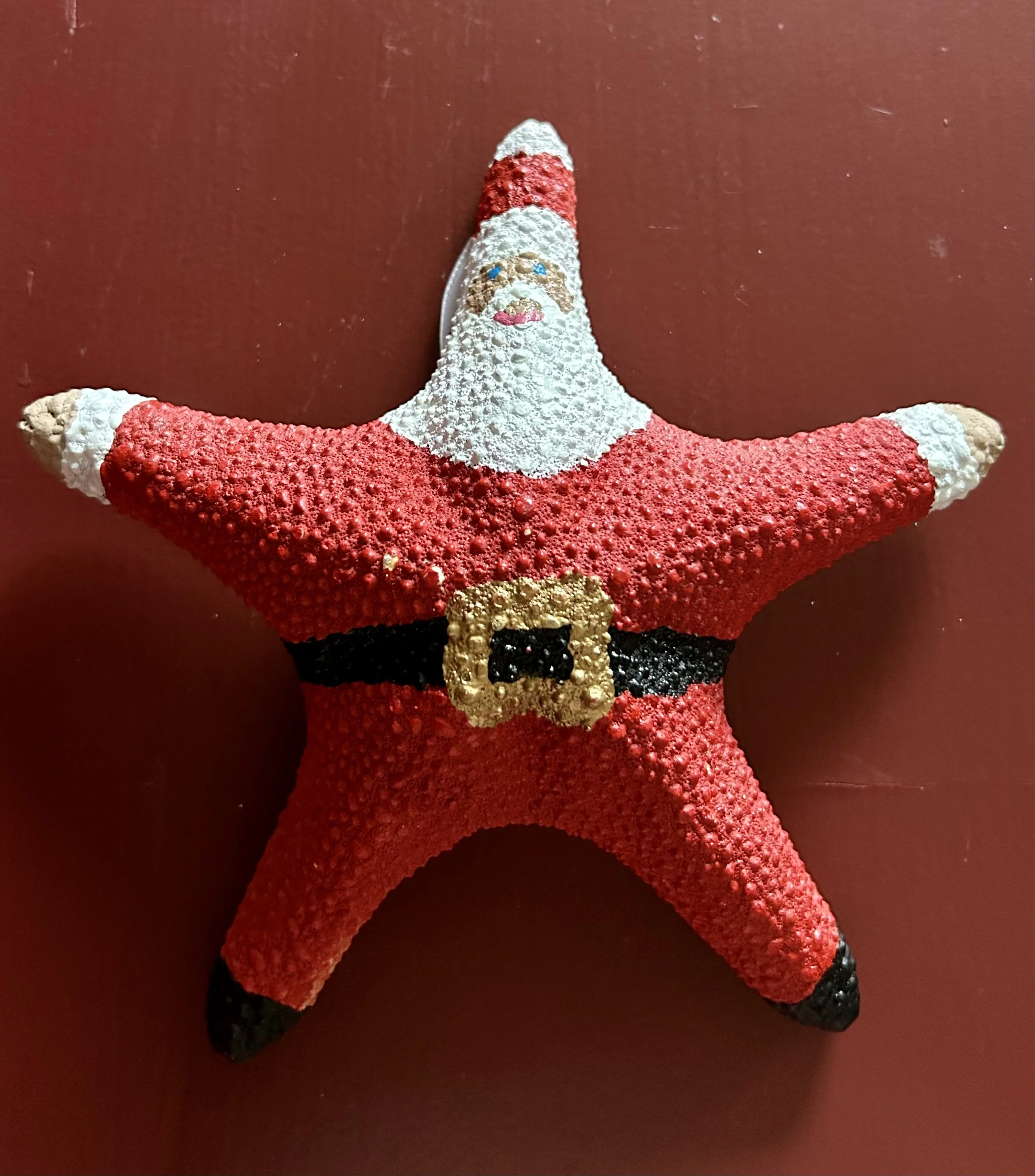
I was recently poking about the local thrift shop and found a beautiful ceramic one, passing on two sewn ones from the 1980s –they were a tad too “country living” for my taste. Another one - made out of a starfish – was also at the thrift shop, but I struggled a bit deciding whether to buy it. It feels slightly peculiar, and I still have not decided if it is a creative use of the poor starfish, or sacrilegious to the animal. It reminds me of the antique ivory dresser set I have.
The set was from my grandmother, Katharine Strong Humphrey Osborne (1905-1987), though it is unclear how she got them. I am guessing they were her mother’s, Margaret LeBoutille Strong (1874-1906), who died after Katharine’s birth. I get a queasy stomach when I hold them, but realize the poor elephant died over 100 years ago for these things to be made, and to not treasure them is also disrespectful of the elephant’s death. In my great grandmother’s day, there was no concern for the animal involved, and, as the set was saved by my grandmother and my parents, it clearly was considered a valuable item. My mother displayed the set on a dresser in my eldest sisters’ bedroom, and eventually she gave them to me. I have them stored in a cloth bag and remain unsure what to do with them. (Suggestions are welcome).
But, the starfish! Good grief. It is hard to fathom how that was considered a “canvas” to make a Santa. But who am I to judge? I love all the carved wood, cloth-stuffed, ceramic made Santa’s, and adding a starfish Santa seemed a good idea at the time. It does still make me cringe, but art is not always about loving something. Sometimes it is about making you think.

R. Carson 1993

P. L. Walk 2008


H. Taasch 1993


U.S. Pat. D290-381


Eldreth 2002


R. Carson 1992

Gilligan, Northern Lights Candles


House of Hatton 1994
Catawampus Framing

There are projects that make their way into my life through no fault of my own. This vintage needlepoint rug is a case in point. A friend picked it up at our usual thrifting haunt. She decided it wasn’t something she could sell and, charmingly, gave it to me. I say “charmingly” because she is charming, but also because it’s a “free horse-$100 saddle” scenario (a term that makes me laugh, having purchased a teenage girl a saddle with a tax charge higher than $100). More “chaaaarming” than “charming” because unfinished projects quite literally bother me. My appreciation for vintage handiwork meant I couldn’t see it thrown away, but had no idea how to finish it. Nor what I would do with it when done. Very few people would tackle this beast and live to tell the tale. Time to do some research.
JER happily needlepointed the top in 1978, but then was at a standstill. If you saw the canvas, you would understand. Suffice it to say the back looked like a shag rug, and the whole thing was a parallelogram not a rectangle. It needed to be blocked. When a person stitches a piece, they will work in one direction. Over an entire piece, the tension of their stitches adds up to cause the weft of the underlying canvas to twist a certain way, skewing the overall piece. Ok, crafter-inspired physics lesson over, but this rug needed to be mounted to a stretcher, soaked, and let to dry, which would square it back up. (I could explain why this works, but will refrain. See this link if curious: https://thornalexanderstyle.com/needlepoint101). I’ve often regretted not having my mother’s handmade blocking form, which she used during my childhood to block her projects, though in this case it wouldn’t do me much good. This particular “canvas” happens to be 3 feet x 5 feet, making the “wood stretcher” thing a challenge.
Having a barn (or two) full of random things, I asked hubby if he could make up a frame out of old wood. He grumbled, but eventual scrounged up and cut some boards, hauling them to the basement to assemble (too cold out in the barn in December). I used my sewing machine to secure the edges of the rug with a zigzag stitch, then stapled it to the new frame. Doused it with water, and left it dry.
The rug, it should be mentioned, needed a serious haircut. The back strands were not finished off properly, and it was rather shaggy. Once mounted on the frame, I trimmed the strings as best I could. To clarify, the back of a needlework project shouldn’t have knots and long loose yarn waving about. To begin stitching, the tail thread is caught under the first few stitches. When ending, the thread is buried into a few inches of prior stitches. Thus no knots. JER hadn’t read that page of the directions and simple knotted the ends, leaving random inches of left-over yarn.
After a few days I puzzled over why the rug’s selvage was not running square along the wood frame. Frustrated, I pulled out all the damn staples and tried again. Mind you these were electric staple gun staples, pried out with an old screwdriver and pliers. Starting over, the piece kept going askew. In total frustration, I rummaged around for a T-square (yup, we had my dad’s old one) and checked the frame. One DAMN corner was not square. Hubby and I scratched our heads, tried various things, disassembled the wood, and puzzled some more. Until one of us thought to measure the length of the boards (no names used to protect the innocent). And yes, hubby had cut one side 2” shorter. Dear god in heaven. I was trying to square up a parallelogram canvas on a catawampus trapezoid frame.
Once the third round of mounting, watering and drying was done I applied a glue to the back. In researching I learned a fancy (read: expensive) industrial glue was recommended to finish off the back. I wasn’t keen on dropping $50, so ended up using mod podge craft glue which worked as a (cheap) substitute. Once dry, the rug was taken off the stretcher, and the glued chunks were trimmed (I likely should have watered down the glue but oops). I now needed a backing on the rug. Another “free horse-$100 saddle” scenario: the recommended fancy rug backing was also in the $50 range, but I’m too cheap. Off to the sewing store, where I found a nylon fabric in literally the same shade of 1970s green for a total of $10. Trimmed the rug, zigzagged the raw edges (again), sewed and flipped, much like inverting a pillowcase. I needed to press the now-sewn edges to finish the rug off, but ironing the darn thing was a challenge. I was unsure of the fiber of the 1970s yarn, and was leery of ironing the green backing fabric (nylon + hot iron = nothing pretty). Eventually, using a pressing cloth and large binder clips as “pins”, I was able to sew a finished edge. This keeps the back in the correct place, adds durability to the edge and helps keep the canvas from fraying.
Not 100% sure all those “shag rug” ends might not cause trouble, but that is a future me problem. For now my only modestly catawampus rug graces the floor of our dressing room. I appreciate my friend’s found treasures, and give hubby accolades for helping me with all these ridiculous “projects”. Even if sometimes I end up with a bit of a charming snafu.

Comfort Zone Trunk
This trunk was a project I completed recently. My sister has the charming yellow painted trunk my mother Barbara F. Humphrey (1928-2021) did back in the 1950s, and I decided since I could not “have” my mother’s, I would create my own in her memory. The one done by my mother was a “domed” trunk, a classic 19th century steamer trunk. I wanted one that had a flat top as that is more useful in a guest room. My trunk was a Marketplace find, but was painted a vivid orange.
This trunk is one of countless old “steamer trunks” left over from the turn of the 19th century – and the history of these trunks is intriguing. Ok, maybe to me and no one else but I’m writing so you’re stuck with my intrigues. Believe it or not, travel in the late 1800s and early 1900s by train or ship also had restrictions on luggage sizes. Small sized trunks were stashed under seats on trains, while larger ones were sent to the ship’s hull or carted away by porter to the storage train cars. The domed top trunks, known as camelback or barrel top, were inspired by the fancy trunks used by the curvaceous Opera performer Jenny Lind (1820-1887). Prior to her, trunks were a utilitarian item, usually rectangular, and referred to as a stagecoach trunk. There is a myth that the domed top trunks were used by wealthier travelers, because…”upper-class passengers did not like…their baggage being stacked with the lower-class passenger luggage. The manufactures started making dome topped trunks so that the baggage handlers would not stack other bags on top of theirs. Which makes sense, until you look at old photos of porter and luggage handlers loading these on ships. In the photos…most of these were stacked up on their end” meaning the trunks were sideways in the storage areas. (https://mainesteamertrunkcompany.com)
Since I loved the interior, with its curved tray and robin’s egg blue paint, I purchased the orange beast and began work. I sanded the darn thing outside in the summer, with orange dust covering my clothes and hair, though I wore a face mask. I then began painting, using a lovely antique dresser as inspiration. The dresser, with matching mirror, is in our guest room (also my sewing room), and was an estate sale find from 25 years ago. The sale was in Racine, WI, in an empty mall storefront. The contents were from the Johnson family (of Johnson Wax fame) as they emptied numerous “storage” units. I arrived to snag the lovely hand painted dresser and mirror, and ended up going back two more times, gathering other treasures, as well as yardage of amazing fabrics I shipped to my mother for her sewing projects. (The lamp on the dresser is the only piece I have from my mother-in-law Lotte Jarrett (1927-1988)).
I am not much of an artist so painting the trunk took me a few weeks to finish to my satisfaction. This involved wiping off and redoing various attempts. Adding different colors and accents slowly. The gold used for the metal hardware was too darn shiny, so highlighted it in burgundy color. I think I managed to create a nice compliment to the dresser, and the trunk is now used to store bags – all those darn store bags you don’t want to throw away; Ziplocks from myriad sewing projects (quilters LOVE Ziplock bags); large tote bags for schlepping quilts, gifts, etc. My intention was to have a spot in the guest room for people to sit as well as plop down their luggage, and as an added bonus I now have corralled all those bags in one spot.
I love finding uses for vintage things, even when there are modern, cheaper options available. The charm of the older pieces shows through in the workmanship, and the uniqueness. Why surround yourself with boring when you can try something fun? My mother quite literally never decorated with yellow that I recall, and yet she enjoyed painting an old trunk in yellow with folk art charm back in the 1950s. Sometimes a small project lets you try things outside your comfort zone. And that is always a good idea.
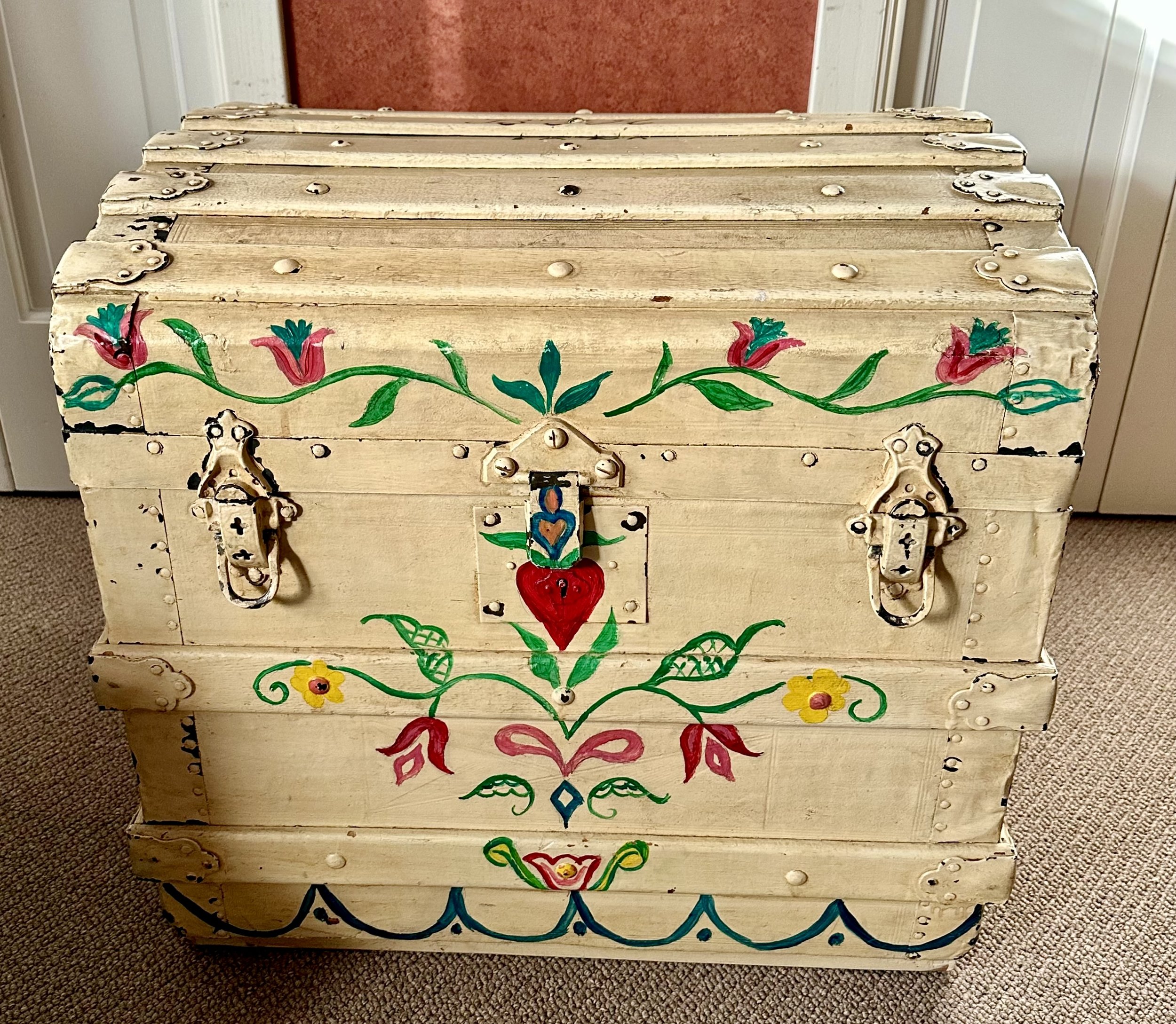
Barbara F. Humphrey’s trunk dated 1958

A Moment Of Truth
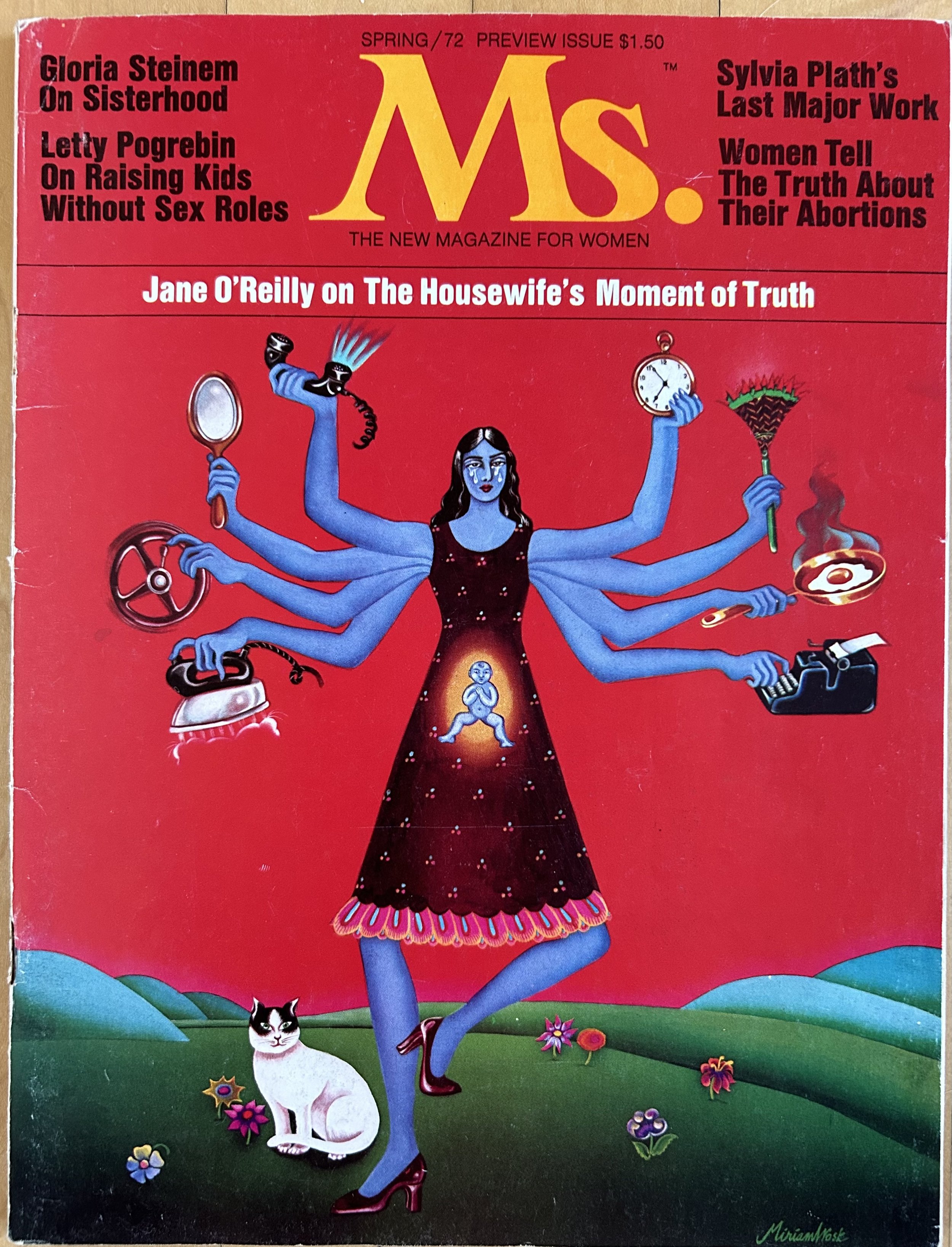
When I volunteer at the thrift store, I often come across things that intrigue me. Not always officially “art”, and in this case I would say more an “artifact”. There was no way I was passing up this magazine when I spotted it. I did not know, however, just how much an artifact the piece is - as far as I was concerned, any Ms. Magazine from the 1970s would be interesting. The magazine was poorly mounted in a frame, with the insides slipping off the binding, and thus a bit catawampus. I asked the manager to put a price on it for me, and was a tad worried she would recognize what it was, pricing it high, or holding onto it for more research. She did neither, and I purchased it for $15.
According to Merriam-Webster online dictionary, an artifact is:
a. a usually simple object (such as a tool or ornament) showing human workmanship or modification as distinguished from a natural object.
b. something characteristic of or resulting from a particular human institution, period, trend, or individual
c. something...associated with an earlier time especially when regarded as no longer appropriate, relevant, or important
This magazine actually hits all three definitions. It is a simple object: a published magazine, filled with writings and ads. It definitely qualifies as resulting from a particular human period – the 1970s United States, with the feminist push for equality and rights. But that last definition made me pause. Is the “housewife’s moment of truth” no longer relevant or important in our society? Has much changed over the past 50 years for women and their rights? In researching this piece I came across a quote which also made me pause: “While on a personal level feminism is everywhere, like fluoride, on a political level the movement is more like nitrogen: ubiquitous and inert.” (Manifesta: Young Women, Feminism, and the Future, Jennifer Baumgardner and Amy Richards). American women today seem to accept they have rights and yet do not realize just how fragile those rights are historically. And don’t get me started on fluoride – but an apt analogy as it too may soon go the way of the dodo. Gloria Steinem and her magazine paved the way for women to ask questions and make demands, but the backlash was severe, and continues to be so.
Steinem was working at the New York Times Magazine office in the early 1970s and was asked by her editor to either “go to a hotel room with him in the afternoon, or…mail his letters on the way out.” She adds, in an interview with the Smithsonian “I mailed his letters, but thanks to changed consciousness, I realized it wasn’t right. I didn’t have to put up with it. I could speak up about it.” Basically, she quit (https://www.smithsonianmag.com/explore-the-founding-of-ms-magazine). I worked at Chemical Bank in NYC 15 years later and, sadly, experienced similar comments. I actually filed a complaint at the time, and the bank executives had a conniption fit, making the trainee class I was part of learn about sexual harassment. That, however, did not mean sexism in the corporate world simply went away if my experience in the banking world through the 1990s is any example.
Back in the 1970s, the news industry would not print any “real” stories about women. “The male editors of the major women’s magazines—called the “seven sisters,” like the colleges—would not accept pitches that did anything other than advise readers to be better, happier, more productive housewives and mothers” (https://yalereview.org/article/closer-look-ms-magazine). After quitting, Steinem began work in her apartment with female journalists and politically active feminists to create a women’s magazine. It was an uncomfortable gathering, and eventually the more “militant” feminists parted ways as they did not like to cater to the advertising world (run by men). “There was no budget to advertise the preview issue, and much of the press attention that it elicited was negative…The magazine’s own editors planned for slow sales: when a stand-alone edition of the preview issue appeared in January, it was labeled “Spring 1972” so that it could stay on newsstands for months. As it turned out, there was no need for such hedging. The issue sold out in eight days.” (https://yalereview.org/article/closer-look-ms-magazine).
My thrift store find is one of those issues, preserved most likely by a woman for 52 years. Hubby joked that the woman must have only had sons, who, while clearing out their mother’s stuff, couldn’t imagine why she kept a Ms. Magazine from the 1970s in a frame. It amuses me that the magazine I found is actually valuable, so nah nah na nah nah boys. Your mother was a wise woman.

This particular one is in remarkably good condition, complete with all those “blow in” inserts. Honestly, that impresses me the most as I promptly tore all those things out when I read a magazine. Particularly back in the 1990s when perfume companies used the blow ins to promote fragrances, making the magazines rather pungent. I only just found out those things have a name, and a rather odd one at that. The term derives from the fact that the machines, used for stapling the magazines, blew in the cards…thus they were referred to as “blow ins”.
The magazine’s cover art is by Canadian artist, Miriam Wosk (1947-2010), patterned on the image on Krishna, the Indian god with many arms. Krishna, the Hindu god of love, compassion and protection, is often depicted as blue. Wosk’s version has a blue woman juggling the demands of work, marriage, and motherhood. The idea being “having it all” was a serious juggling act, and not at all easy. It was only in the next year that the U.S. government allowed the designation “Ms.” to be legally used by a woman. Prior to then women had to use “Miss” or “Mrs.”, as though a woman’s marriage status was all that could define her, compared to a man who is always “Mr.”. Okay etymology fans, did you know “Mrs.” was originally short hand for “mistress”? Grant you, back in the 1500s, it was an honorific title, specifically for upper class women, not the slightly risqué idea of a woman having an affair with a married man we tend to interpret it as. Over time, “Mrs.” was associated with women who had husbands, and thus were married women. The idea of a woman’s marital status being irrelevant to the way she is addressed only came about after Ms. Magazine created the honorific “Ms.”
When I was first married, my mother mailed me a letter, addressed to Mrs. “Hubby” Jarrett – as though Erica now didn’t exist. I made it very clear to her I was NOT Mrs. Hubby Jarrett, I was Erica H. Jarrett, or Ms. Jarrett if need be. That was in 1987 mind you. Society – and my mother – still expected a woman to become her husband’s property – if not in actuality, at least in spirit. My mother’s traditional salutation did puzzle me a bit. She demanded – and was paid - a salary from my father back in the 1960s for her work raising 7 children. She proudly had her own financial accounts all my life, and she was given the house they purchased in 1970 as she pointed out to my dad she did all the work to create our homes. From that point on, she owned the real estate my parents lived in, held in trust in her name only. And she made these demands from my father for equality before the 1974 creation of The Equal Credit Opportunity Act. That Act allowed a woman the right to open a bank or credit account, without a man signing for her. Yet here she was calling me “Mrs.” in 1987.
Interestingly, the 1980s saw a “backlash” against this feminism, and particularly against women’s ambitions. The “New Right” was growing, and targeted feminist issues – reproductive freedom, affordable childcare – in an effort to bring back “family values”; read: women stay home and have babies. Ms. Magazine had its own backlash. When Congresswoman Shirley Chisholm, the first Black candidate for president, was on the May 1973 cover, almost all newsstands across the country declined to stock the magazine. When Alice Walker appeared on the cover in June 1982, newsstands in the South refused to display the magazine. “Steinem had imagined that a feminist readership with diverse interests and purchasing power would change advertising for the better. Instead, the pressure to please advertisers—publishing’s most concrete proxies for the powers that be—changed the magazine’s content for the worse.” (https://yalereview.org/article)
50 years later it seems we are still struggling to define what it means to be “feminist”. I have ideas that revolve around our patriarchal social structure, and all the ramifications of the Right’s political agenda. But it does me no good to harp on it; I only get more depressed and worried. So the best approach for me is to find joy in artifacts, recognizing the strength of the women who worked tirelessly before us to try to achieve something in the face of obstacles. No one said it was going to be easy to demand equality. History has a sad way of proving that point. And Krishna pointedly reminds us that compassion, protection and love take work.

Daffodil The Dragon

This pottery piece actually chokes me up a bit. Silly, I know, but I see myself in the lumpy sweet dragon peering into a reflecting mirror, and realize that even at age 60, life is full of introspection. And trying to change for the better. Some introspection is healthy, some toxic, and avoiding the toxic takes work. The pottery piece also stores memories, new but treasured all the same.
This past Thanksgiving did not include my sons and their families. It was hard to not have them here, though in both cases, it was clearly the right choice. So my local daughter made sure to spend time with us, and I was grateful for her kindness. She arrived Wednesday morning to learn to bake pie, a ludicrous situation as both her brothers have whipped up pies for years. Including one son using a farm-share pumpkin to make a fresh pumpkin pie during college! Her, not so much. I had no idea making pie dough was a textural issue, but I have learned it is, and realize it is a texture I actually enjoy. Her, not so much. When baking was done, daughter wanted to stop at an estate sale in a town nearby.
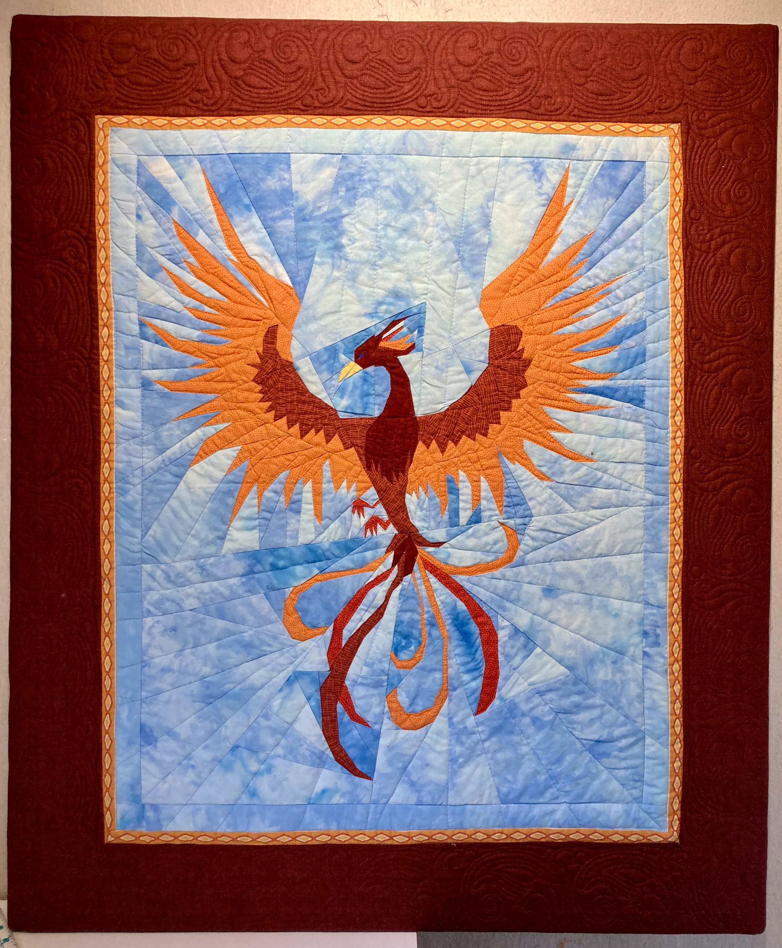
The day before Thanksgiving was an odd day for an estate sale, and we were amused by the event, chatting about things and people we spotted. I found this handmade pottery piece and immediately thought of a daughter in law. I have virtually no idea why I associate dragons with her, but suspect it is the close jump from dragon to phoenix. The phoenix image I do understand as their dog’s name is Fawkes, the phoenix from Harry Potter. I made my son and his bride an engagement quilt depicting a phoenix, done in her favorite colors. The original paper piecing pattern was 12” and I wanted it much larger. Thankfully Juli Weber at Little Fort Media in Waukegan (https://www.facebook.com/LittleFortMedia/) is a whiz at figuring these things out, and the resulting quilt is close to 3 feet tall. Phoenix are mythical birds, known for their loyalty, intelligence, and bravery. They regenerate themselves by bursting into flames and rising from the ashes. A powerful metaphor for life and marriage, certainly, and quite appropriate for their wonderful Malinois rescue pup.
My estate sale dragon is signed “Tyler”, though unclear if that is a first or last name. Guessing it is from the 1970s due to the coloring, but that is only a hunch. It is a handmade pottery plate with a hole cut out of the middle to insert the mirror. The charming dragon sits by the side, much like Narcissus looking at his reflection in the water. The dragon is made of a different textured clay from the plate, formed in lumps and built much like those drippled sand castles I made as a child in the 1970s. The dragon’s face is remarkably sweet, and I sense a female dragon. The glazing on the plate makes it seem she sits on a grassy bank by some water.

The Greek myth of Narcissus is not a charming tale, and lent its name to the psychologically unhealthy Narcissist Personality Disorder. Sadly I have a great deal of family experience with that disorder. A handsome youth, Narcissus never found love, leaving many broken-hearted women and men in his wake. Eventually, he spotted his reflection in a pool of water, and fell in love with himself. “Naturally, this one-way relationship went nowhere, and Narcissus, unable to draw himself away from the pool, pined away in despair until he finally died of thirst and starvation. Immortality…was assured, though, when his corpse…turned into the flowers which, thereafter, bore his name.” (https://www.worldhistory.org/Narcissus/). The Romans adopted the myth, and it was very popular in their art, including 50 wall paintings at Pompeii alone. Interestingly the narcissi plants are poisonous, and the name is roughly translated from ancient Greek to mean “numbness”. A daffodil plant is part of the Narcissi genus and its charming appearance in spring offers us all a route out of the numbness of winter. So my feeling about my introspective Daffodil Dragon is that she is looking inward in search of a path forward, focusing on the beauty of life to help.
Unfortunately for daughter in law, when the dragon came home, she wandered into our dressing room, jumping up to land on the brown walls and settled into place. She is charming, and makes me pause when I see her. These last few weeks have been tough for me, and I feel both sadness and disconnection. While I do connect with many people, that does not seem to stop my brain from diving deep into the pond of woe. I am working, with hubby’s input, to recognize my thoughts are not always my friend. Being mindful takes a ridiculous amount of energy, and it is always easier to slip back into woe is me. I see the little Daffodil Dragon in the morning and evening. And I remember my children, the loves and lives they have and the luck I have to live such a complex and rewarding life. I promise Daffodil will eventually find her way to Colorado to take up residence with the phoenix. For now she is helping me smile.

Paris Is Always A Good Idea
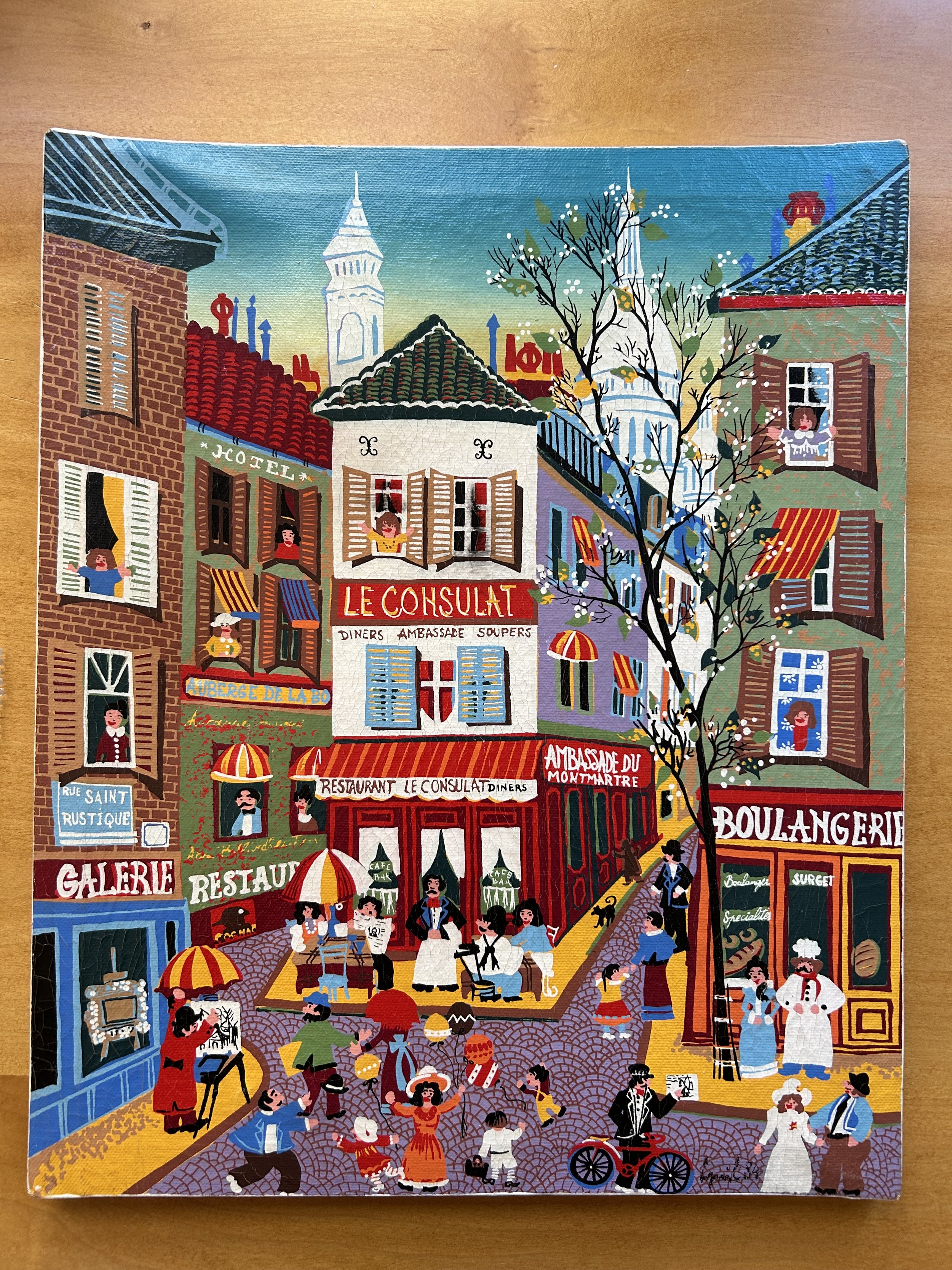
Another anniversary rolled around recently, and, as is somewhat typical for me, I thrifted a fun item to gift hubby for number 37. I picked up this oil painting at my local thrift shop, unframed and with some “dings” in the canvas, making it a bit warped. The scene, with its cobblestone roads and French storefronts, definitely screamed “Paris” to me. Paid $8 and presented it to hubby as we have enjoyed trips to France, both for our 30th and our 35th.
He loved the vibe and colors of the piece, and wanted to display it. Easier said than done as my addiction to thrifted art means our walls are a tad cramped. He pointed out the colors worked well in our family room, with the 1970s Calder vibe. I love how he is getting into the swing of design, commenting on the juxtaposition of art and now the understanding of color and related images. Question became what to remove. We decided a poster, picked up from eBay years ago, could move on in the world. The 1950s circus poster worked well with the “circus theme” family room, but we did not have much attachment to it, other than the money spent on the framing. I have listed the thing on eBay, but, sadly, shipping it will be very expensive given the glass and long size, making it hard to sell. Anyone interested?!

My Paris painting, now hung in place of the circus poster, had two areas where something had pushed on the canvas, creating unsightly dimples on the surface. I researched how to deal with “dings” on an oil painting and found a remarkably simple solution. When an artist prepares a canvas for painting, a ‘gesso’ layer is painted on the raw surface first to seal the canvas. “Gesso” is Italian for “chalk”, and was traditionally made of animal glue, chalk and white pigment. Its use, according to Wikipedia, “provides a strong foundation for the paint to adhere to, prevents the paint from soaking into the surface, and can also be used to achieve a desired texture or surface finish.” However, artists do not apply gesso to the back of the canvas, and thus the repair is quite simple: using a squirt bottle, I sprayed and dabbed water on the back of the painting, and miraculously the dings shrunk and disappeared!
The artwork I found is dated 1984, though the signature was a mystery. In my attempt to read the darn thing, I realized the signature is flanked by a dapper man with a bicycle on the left and a woman dressed in white on the right. Hubby has a passion for bike riding so it seems appropriate as an anniversary gift, though I promise I did not wear a ridiculous hat for my wedding! Not unheard of in the “big hair” days of 1987, but my head was unadorned, other than a headband wrapped in small roses.

In researching the art, I eventually found remarkably similar pieces, all prints of street scenes in Paris. The artist is identified as “Claudine” in those works, and the signature is similar enough I suspect mine is a “Claudine” work as well, though done in oils on canvas. Sadly, the echo chamber of the internet happily identifies “Claudine (Romanian, born 1938)” but other than that, I can find no information about the actual artist. My painting includes an artist working in the lower left corner. He is wearing a red coat and black bowler hat, with an umbrella shielding his easel as he works. I suspect that is an autobiographical reference for the artist, thus a man.

I began puzzling over the signs on the buildings, so looked online for images of the Montmartre area of Paris. Voila! Believe it or not, the painting is a work depicting an actual place. Our next visit to Paris will now include an outing to Montmartre to find this intersection, Rue Saint Rustique. My internet rabbit hole has now introduced us to the oldest street in Paris. I will leave you with a link explaining the history of the street (https://www.solosophie.com/rue-saint-rustique/) and start planning my next trip to Paris, maybe for our 40th anniversary.

Serendipity

The wonderful thing about art is how it impacts you, both inspiring memories and creating them. This art pottery is a perfect example: the serendipity of friendships and the memories that flit off from there. The piece immediately made me think of my mother, Barbara F. Humphrey (1928-2021), as she loved Scandinavian design, and taught me a great deal about appreciating artistry in many forms.
Mom loved beautifully-made items, and would joke she inherited this from her mother. She said my grandmother, Frieda H. Fallon (1898-1961) had “champagne taste with a beer pocketbook”. Mom also had expensive taste, but she was a Depression child, and while she loved - and could afford – beautiful things, she couldn’t get away from her thrifty ways. Mom did all the decorating of our homes, painting and hanging wallpaper with my father. She scoured thrift stores and resale spots for treasures (sound familiar?!), and learned how to refinish old furniture, some of which I still have. One little dresser she picked up in Pittsburgh, telling my hubby she would refinish it for him. After she was done, she decided to keep it, and hubby was salty about that for years, often joking it was “his”. When we moved Mom in 2011, hubby finally got “his” dresser and he uses it as his nightstand.
My parents traveled a great deal, and Mom would bring empty suitcases with her on trips to countries famous for their yarns (England, New Zealand, Scandinavia). Mom also adored fabrics, and I took many trips with her to wonderful fabric sources during my childhood. Even though she had the means to purchase fancy outfits, she would sew or knit them herself, and I honestly do not think I wore a store purchased dress until my sister’s wedding in 1980. She even knit my first communion dress and sewed my high school graduation outfit, using a Ralph Lauren prairie outfit pattern from the early 1980s (I still have that one though god knows it wouldn’t fit a flea). The fabrics from Marimekko, a Finnish textile company, were a favorite of hers, and she picked them up for years for sewing projects. I will have to look for photos of Mom in her 1970s Marimekko dresses as I can picture them in my mind.
Mom also loved the streamlined look of Scandinavian design. We had Dansk kitchenware and various teak furniture, including our kitchen chairs. A Nanna Ditzel teak highchair. An original Eames chair with its black leather and rosewood frame. My father used that chair for most of my childhood, giving it to a sister when my parents moved to Florida in the 1990s.
When Mom moved into an assisted living property back in 2011, she still had the Ditzel high chair she purchased for my brother, her youngest child. She insisted I take it. Sadly, I had no use for it as my children were grown, and I knew better than to think my children would allow grandchildren to sit in it – not particularly “safe” by modern standards. I sold the thing, though I cannot say I wasn’t tempted to keep it. Mom loved these designs, and as I have thrifted, I have been drawn to similar pieces. I found a set of 6 teak chairs not long ago, and sold them for a significant profit. Danish by Poul Volther for Rojle Frem from the 1960s. The woman buying them was likely an antique dealer, selling them in turn for even more money. I would have kept them, but the chairs were a good 2” shorter than modern table chairs, making them a tad impractical.

I also have found a number of lovely pieces of pottery (see blogs ericas-heirloom-treasures/letting-go and ericas-heirloom-treasures/the-warmth-of-clay) and, through those treasures, reconnected with a dear climbing friend who I will call Elsa. Elsa is originally from Sweden, and we met climbing at a local facility around 25 years ago. While we have drifted apart as time and lives have changed, it has been a remarkably lovely process to reconnect. Elsa reads my blogs, and was gob smacked I found a highly collectible Lisa Larson sculpture for $16. She had a small piece made by Lisa Larson and was excited to see the one I found. Soon thereafter I found a piece by another Swedish artist Johan Krukmakare, a name that actually means “potter” in Swedish. I had written that I thought it was simply a designation, but she said it is an actual surname in Sweden, and Johan was a potter named Potter!
I shared an estate sale listing with Elsa back in October, as the sale had a remarkable piece I coveted. The weekend of the sale I was with my brand-new granddaughter, and wondered if Elsa would attend the sale. Elsa wasn’t able to attend either, as she had family in town, and her reply was an emoji “ 💸 “ as these pieces are highly collectible, selling for well over $1000. We both sighed over the charm and moved on, enjoying our connections with family young and old.

The piece we coveted was made by a Danish artist, Bjorn Wiinblad (1918-2006), in the 1970s or 1980s. These works are known as his Eva Series, and there a numerous versions in different colorways. Wiinblad was born into a political family, and from a young age was interested in art. His father, not keen on art as a career, had him study typesetting, though he never actually became a typesetter. He rose in the art world during the post-WWII era in Denmark, when there was “a minimalist approach, prioritizing simplicity and functionality. This led to the birth of a new design aesthetic characterized by clean lines and minimalist forms, marking a distinct departure from the heavy, ornate furniture that preceded it” (https://www.relaxhouse.com.au/blog/history-of-danish-furniture-how-it-all-began/). He was exceedingly successful, becoming both famous and wealthy in his lifetime. His pieces are in many museums and are highly collectible.
Needless to say, Wiinblad’s works are far from minimalist in style. In fact, he intended his works to counterbalance all that streamlined esthetic, and loved to incorporate natural elements, bright colors and whimsy. He was a prolific creator, working in ceramics, theater sets and costumes, puzzles, tiles, textiles as well as drawn works. As the Nordica Museum stated for their retrospective show of his work in 2018: “with a career beginning in 1945 amidst the enduringly popular “Danish modern” design movement, Wiinblad injected fantasy and an almost cartoonish flair that created a perfect accent to all the clean-lined furniture and modernist spaces of the time” (https://nordicmuseum.org/exhibitions/the-whimsical-world-of-bjrn-wiinblad).
Imagine my surprise this week when I received a text from another good friend, who I will call Ariel. Ariel was in southern Illinois visiting family and sent me a photo with a comment saying “if I was going to buy you a Christmas present from Denmark”.

I was a tad confused, but after some back and forth, it turns out the piece she sent a photo of was at a local antique store. It had been donated to a charity, and they in turn asked the antique store to sell it. Ariel knew how much I love art, but the pink color and charming female figure immediately made her think of me. While the list price wasn’t awful, given their value, I threw out a lower bid and they accepted! She now sits watching me in my dining room as I type, filled with a silk flower crown I created from thrifted flowers. Elsa, who happens to be in Sweden visiting family, sent a photo of the one her family owns, and we both smiled at the creative genius of these pieces which brighten our days. I will treasure Eva both for her charm and for the serendipity of her connection with friends.

Pink, White and Blue

Repairing commemorative quilts is a bit of an anxiety producing experience. Two women in my local quilt guild made quilts with a Veterans group in Lake County’s 19th Judicial Circuit. These quilts were composed of quilt squares signed by vets from many services, some of whom have since passed away. The quilts hung in the county office building for years, but about a year ago, there was a leak in the building, allowing water to saturate one of the quilts. As you can see from the “before” photo, the red fabric bled all over the top, making quite a mess. My friends asked if it was possible to restore it.
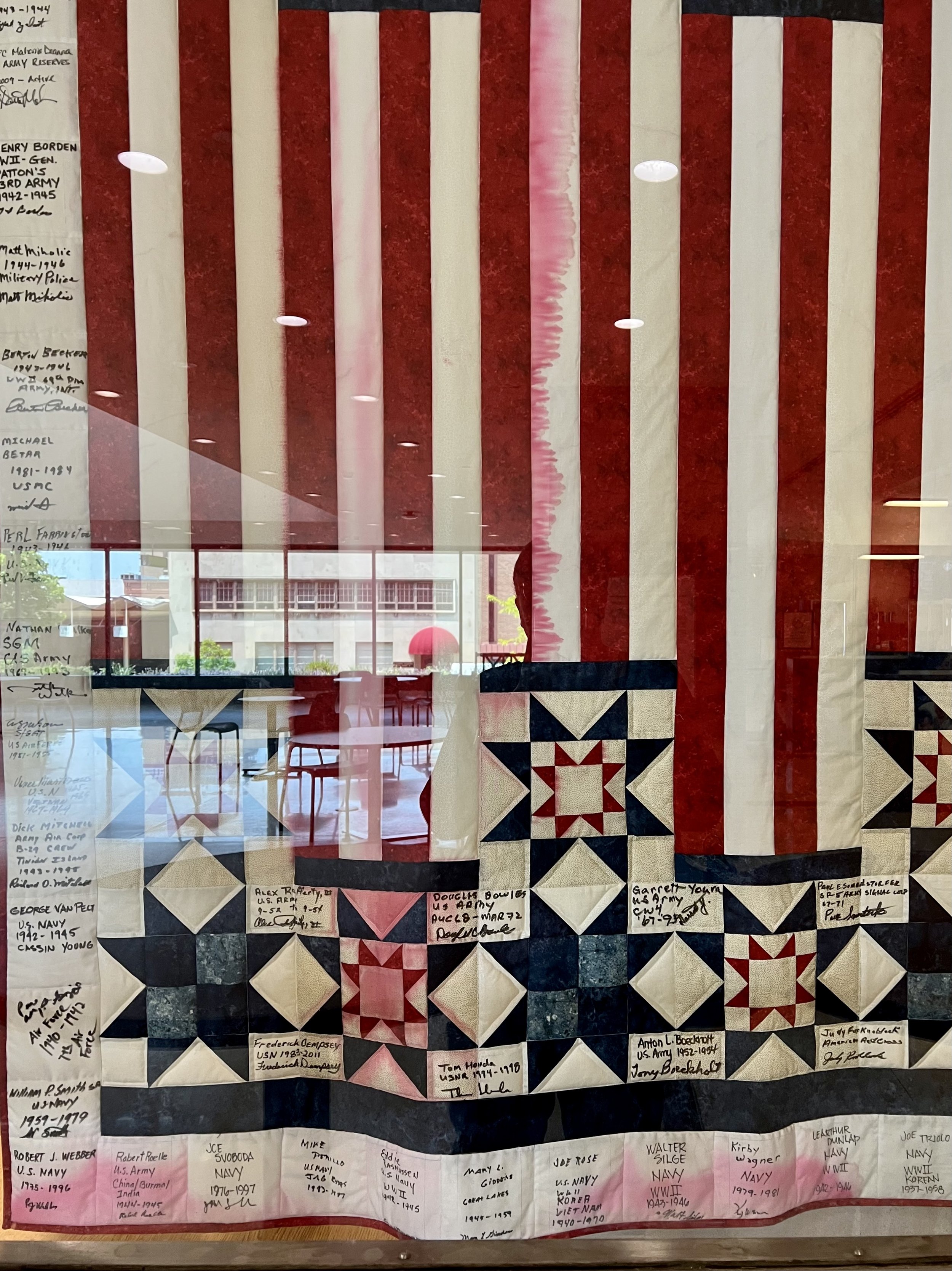
The story of the quilts’ creation is a powerful example of people coming together to assist those in need, especially our veterans. The women I know worked for the probation department of the Lake County courts. Under the direction of the late Judge Phillips, a veteran himself, the department created a special Veterans Court to assist veterans struggling through entanglements with the courts. The department offered the vets a process to clear their records, as well as “graduate” from the legal system. The court was considered a “problem solving” court, specifically aimed at aiding these vets as they struggled to right their paths. The process was so successful, many other counties began a similar program.
In addition, a Veterans History project was started in Lake County, to take down these individuals’ personal stories, and share them with the National Veterans History Project in D.C. (https://www.loc.gov/programs/veterans-history-project/about-this-program/). If the individual participated in the Veterans Court Special Process, upon graduation they would sign a quilt square and record their personal stories. My friends made 3 quilts in total through this work, with this being one of the three.
The women also connected with the Quilts of Valor project providing the graduates with a quilt of their own in thanks for their military service (https://www.qovf.org/). If you have an opportunity to participate in a QOV ceremony, I would highly recommend doing so. Honoring the vets with a quilt is a tangible example of the good of our society, the desire to show respect for those that fight for our country, and to acknowledge those vets’ sacrifices.
Back in 2019 I was able to honor a friend of my daughter’s with a quilt for Quilts of Valor. I had made the complicated quilt top as a gift for my mother years before when she moved into a care facility with a twin bed. Mom suffered a long bout of dementia, and apparently that affected her sense of color as she said she didn’t like the quilt since it was “brown”. I put the top away, not sure what to do with it, and only slightly verklempt that my mother rejected it. When my quilt guild sponsored a Quilt of Valor ceremony in 2019, I completed the top to gift to a deserving young woman. These quilts, as well as the 3 made for the Lake County vets, are important examples of the value of quilts, and the power that creating such a simple thing can have on the recipients.
So understand my trepidation at taking on the “fixing” of the Lake County Vet quilt! I discussed options with other quilters, many of whom have dealt with bleeding fabrics on finished quilts. While most dark colors can bleed, red is notorious for doing so, though I have dealt with purples and browns also bleeding. Any fabric used for constructing a quilt needs to be pre-washed using “color catchers” in the laundry. Some fabrics need to be washed multiple times, until the “catcher” no longer comes out full of color. But even that is not a guarantee the fabric wont bleed on the quilt, as this sad Veterans quilt proves.
After a bit of research, crossing of fingers for good luck, and the hope all would work out, I plunged right in. The quilt was washed in a machine, and, after the first wash, the darn thing turned an alarming shade of pink. Back in for a few more washes, though the pink remained and I became somewhat concerned it would forever be a Pink,White and Blue quilt. While I am a fan of pink, it did not strike me as the look the veterans would appreciate.
Realizing the machine was not helping my cause, I turned to chemicals and handwashing. I discovered a product, Restoration by Kofot, well loved by costume designers for removing stains from theater production costumes. Figured it was worth a shot, and ordered the product. After an overnight soak in the bath, the quilt was miraculously back to Red, White and Blue! Not a clue how it worked but I was not one to question success. After an ironing to spruce it up, the quilt was returned to my friends to be re-hung in the county building. Thankfully chemistry, and friendships restored the heartfelt work to be inspiration to other veterans as they work through the courts of Lake County.

Reality TV

This artwork feels like a commentary on society with the introduction of television. I sense the group of 5 couples are staring at a television screen, where we, as the art viewer, are actually the show they are watching. The adults are void of emotion and have little engagement among themselves. Only one man, his back to the television screen, is engaging with a child. Obviously, as art allows, I am interpreting the work, and have no clue what the artist’s original intention may have been. The piece is signed “La cobra” and is an etching print done on heavy paper, likely in the 1960s. In many cultures, the cobra snake symbolizes danger, cunning and transformation. So possibly I am not far off.
The modern television was a long-term invention, starting in 1872 when an English telegraph operator Joseph May discovered how to transform light into an electrical signal. By 1927, Philo Farnsworth “made a successful electronic television transmission and filed a patent for his system” (https://www.britannica.com/biography/Philo-Farnsworth). He was 22. Then followed a remarkable jockeying of corporations trying to undo his patents and eventually he suffered a nervous breakdown and died bankrupt. After World War II, the television became the primary source of information and entertainment in American homes, replacing the radio. By 1955 half of all homes had a television set, often a piece of furniture, encased in a wood display box, weighing between 50 to 200 pounds due to the cathode ray technology. Reception was aided with “rabbit ear” antennae, often wrapped in tinfoil. As a child I recall dashing up to the set to fiddle with the antennae when reception was wonky. Sometimes this required standing in a certain spot, or holding the darn things in a specific direction. Hubby and I had a large antennae in our first house in Libertyville in the 1990s, so really not that long ago antennae still worked to receive transmissions.
When I was growing up in the 1960s, my parents were concerned about the dangers of television, and we were restricted to only a few hours of watching a week (I believe 2 hours though I cannot recall how this was enforced). While my family had some televisions, they were tucked away. One hidden in a cabinet in the den, and one in our basement rec room, with its linoleum floors, spider infused cellar walls, and storage areas. I recall the rec room specifically as I would sneak down to the basement late at night when my parents were asleep and binge watch all sorts of old shows (so much for two hours).
Oddly, we had a “Pong” game console –likely a gift for one of my older brothers. I recall sitting on the floor in front of the television, playing the remarkably boring game with my brothers. This was a process of placing a clingy film “board” onto the television screen, and using a console, attached by wires, to make the ball bounce back and forth across a net. I am sensing the beginning of my boredom with both video games and tennis style games. Likely it was a gift in 1975 as that was when Atari launched a “home” version of their hit arcade game, marketed through the Sears stores.

Our country enacted a Fairness Doctrine, enforced by the FCC, in 1949. “Lawmakers became concerned that the monopoly audience control of the three main networks, NBC, ABC and CBS, could misuse their broadcast licenses to set a biased public agenda. The Fairness Doctrine mandated broadcast networks devote time to contrasting views on issues of public importance. Congress backed the policy in 1954 and by the 1970s the FCC called the doctrine the ‘single most important requirement of operation in the public interest’” (https://www.reaganlibrary.gov/archives/topic-guide/fairness-doctrine).
The Reagan administration worked to dismantle the Doctrine, and, in 1986, Judges Robert Bork and Antonin Scalia of the US Court of Appeals ruled the doctrine was not enforceable by the FCC. It was repealed by the Republican congress in 1987, and that same year Rush Limbaugh was signed to a nationwide syndication contract for ABC Radio.
So here we are in a country soon to be run by a Reality Television star. Picking cabinet members from a broadcasting company that lost a massive legal case against it for peddling lies to its audience (Dominion’s $787million settlement). I acknowledge there are likely other viewpoints, but our incoming administration seems to be focusing on entertainment and ego, not earned respect and capability. It seems the reality of television has migrated to politics. To sit and stare at our screens, to be entertained and not have to think, to allow others to provide you with facts, seems to be the way of the political leaning of a vast amount of our country. Besides the danger to our political structure, the underlying danger is the lack of independent thought. Without education, without open minded curiosity, without a reliance on what is fact or truth, our society is careening in a direction that worries me. I do hope I am wrong, but damn it, I seem to be participating in a Reality TV show I cannot turn off.

A Dangerous Box of Thoughts

This last week has been a challenging time for me. I was trying to be a bit of a Pollyanna, but things did not go as I hoped, and I am now feeling more like Pandora. It is all well and good to say there will be winners and losers in an election, but sadly, the real loser here is our country’s ability to be united. The upcoming administration will not be kind to many people, and the long-term ramifications may be dangerous to our sense of community as well as the global order. The incoming group of folks have agendas that support egos and financial interests, not the interests of our society as a whole. It makes me sad to realize this is the direction the majority of Americans desire. It also makes me want to crawl into a shell, pull in my head and wallow in sadness. Careening thoughts can be dangerous to mental health, and I am struggling to contain them in my life.
This artwork speaks to my current chaos. I suspect some will find it “creepy”, but anxiety can be creepy, taking over a person’s health and well-being with an insidious creep. The artist (name unclear) titled the piece “Privacy”, with the box a metaphor for their brain storm. The work is a pen drawing, and spells out the artist’s worry: “In this box are all the secrets and hopes of my life. Don’t look inside. Don’t peek. Mine mine mine.”
I do sense the artist was a man, though it is unclear why he felt his privacy was threatened, and unclear why he included the two birds. I am not as concerned about my privacy, but I do relate to the box metaphor. I remember as a child thinking of my brain as a file cabinet. I literally visualized a file box, and when I could not recall something, I would mull where I might have “filed” it. This explains my obsessive need to organize – a way of managing the chaos of life so I can function smoothly. I do think it is partly due to my dyslexia, as my siblings all were effortlessly intelligent and skilled at mastering things I could no more do than I could fly to the moon (foreign languages, musical instruments, standardized tests). I compensated by organizing my life, and when emotions became overwhelming, I would clean. Still do actually. So in case you are wondering, my house is currently undergoing a rather draconic purge.
When I was in college, my younger brother was residing at a school in Minnesota for various issues. Our family traveled to MN for a family meeting, with my journey rather involved as I was living in London at the time. The meeting was to support our brother, and discuss our family issues. I do not think it was a very successful project, sadly, as the issues in our family were too entrenched and all of us were rather “unevolved” at that time (1984). What I do remember is telling the therapist I felt each of us were trapped in a box, defined by our siblings as a certain way, and forced emotionally back into that box when we returned home. The therapist loved that visual, and actually used a long paper, drawing boxes on it where we each wrote our ideas about siblings. What I wouldn’t give to see that now! I do not have any recollection of what was written, but the visual of a person being hemmed in by other’s opinions of them resonates with my feelings today.
Pollyanna was a fictional character in a book written by Eleanor Porter in 1913. The girl, an orphan, has a positive attitude and sunny disposition. Moving in with her aunt challenges her as the woman is strict and dour. Pollyanna works to remain positive, and bring cheer to those around her. This book actually created the idea of the Pollyanna Principle, the idea of positive bias in people. Sadly, this can morph into the “Pollyanna syndrome” where folks are excessively positive and thus blind to the negative or real, seeing the past as much rosier than it actually was. Our current access to polarizing sources of information on the internet seems to only exacerbate this idea these days– we have become “tribes” that somehow are incapable of speaking to each other with any sense of understanding. The “boxes” of our political system have gotten out of hand, and the sweeping generalizations that result are dangerous, both to ourselves and our nation.
I look at my Privacy artwork and see the pink hair flying all around, and wonder what is to come. The pink hair, to me, seems charged with electricity, a sense of escaping tendrils that are reaching out from the safety of the box of thoughts. Is the hair holding the box together, or trying to escape? Unclear. But the birds also bring up thoughts that imply flight. Flights of fancy? Or harbingers of a future that currently feels unsafe?
And then of course we cannot forget Pandora, another patriarchal architype of female danger. If it isn’t Eve eating an apple, it’s Pandora unleashing pestilence on society. The box itself was a symbol of human desire for knowledge and curiosity, both of which can impact us for good or for evil. Opening the box, Pandora let loose violence, greed and disease which feels horribly apropos these days. However, she slammed the lid shut before Hope could escape. The evils are always with us, and it is up to all of us to contain them with hope, to overcome the nature of human beings to avarice and power. Religion was used for centuries to do so. Our current society relies on elections, and we are about to see how well that structure holds up. Hope is looking very flimsy at the moment.
Last night I came across a quote by Toni Morrison which offered me some peace. She was feeling despair after an election (in 2004 when the Supreme Court handed an election to G.W. Bush). A friend asked how she was and she replied: “Not well. Not only am I depressed, I can’t seem to work, to write; it’s as though I am paralyzed, unable to write anything…” The friend chided her, saying “No! No, no, no! This is precisely the time when artists go to work – not when everything is fine, but in times of dread. That’s our job!” Morrison continues her thoughts:
“I felt foolish…especially when I recalled the artists who had done their work in gulags, prison cells, hospital beds; who did their work while hounded, exiled, reviled, pilloried. And those who were executed…This is precisely the time when artist go to work. There is no time for despair, no place for self-pity, no need for silence, no room for fear. We speak, we write, we do language. That is how civilizations heal. I know the world is bruised and bleeding, and though it is important not to ignore its pain, it is also critical to refuse to succumb to its malevolence. Like failure, chaos contains information that can lead to knowledge – even wisdom. Like art. https://www.themarginalian.org/2016/11/15/toni-morrison-art-despair/
And so I circle back to art. My words are nowhere near as powerful as Toni Morrison’s, yet I recognize the idea that art and language are tools to move forward. I will try. At least after I tame my hair.

Lucky Day

Yesterday was a remarkable day for luck, and I am optimistic this trend will continue through tomorrow. Especially as I always feel luck comes in threes, both good and bad runs. Today I found two treasures, the second being so astonishing that I still cannot believe it happened. Which leaves me feeling at peace, since my third remarkably wonderful thing has to top a thrifted LOUIS VUITTON purse, so it is bound to be ceiling shattering.
Yesterday should have started with yoga. I have been dreadfully remiss of late, and my aches and pains are acting up, so I do need to get back into class. However, my “bins” buddy asked if I could go with her this week, and Monday was the only day I could make work. By missing my yoga class. Bins trumped stretching, clearly. I enjoy the outings to this place. The people are interesting – both with what they are looking for, as well as their backgrounds and ages. I know a number by name and more by face. We chat and kvetch while digging through the huge bins. I pulled this remarkable crochet piece out of a pile, and realized it was vintage, well made, and in excellent condition. Based on weight, it likely cost me $3.
The crochet stitch used is well beyond my capabilities, and seems to use two yarns simultaneously, making one side brown and the other green. I have no clue how it was done, and, as a novice crocheter, i am awed by the design. I suspect it was built, much like a grandmother’s flower garden quilt, with hexagon blocks, then somehow put together to seem all one piece. The colors are so 1970s I actually smiled when I saw it. The yarn is not the modern synthetic you would find at big box stores these days, but not 100% wool either. I brought it home, threw it in the wash, and draped it over our family room sofa.
To be honest, I was happy to have something to replace a hand-woven blanket – with angora yarn which makes my skin crawl – that hubby adores. That blue blanket wouldn’t be so bad if someone hadn’t shrunk the darn thing by putting it through the laundry. It is now so dense it is only steps from being felted. For those unaware, wool felt is traditionally made by knitting or weaving a piece and then washing it multiple times to shrink it down. The mittens my mother made for my young boys were felted after years of use, which actually helps them keep little fingers warm. However, a handloomed full size blanket is NOT supposed to be felted! I’ve wanted to pitch the darn thing for a while, but every time I sneak something else in, it is only minutes before hubby notes “his” blue blanket is missing, and I have to put it back. This time, however, he was awed by the new treasure, and he only wanted to make sure I was “keeping” the blue one. I have learned, after 37 years of marriage, that I have to get permission to pitch anything he is fond of. So yes, I told him, it was in the guest room, though heaven only knows what we will do with it. Once he forgets about it, it may wander off, but to be determined (especially as hubby reads these blogs).
In turns out, my luck yesterday was only beginning to roll. The Bins sometimes “replenishes” the carts, having shoppers “line up behind a yellow line” until all the new carts are in place. It is an amusing experience for people watching, as 50 or so people of all ages line up shoulder to shoulder to “wait” for the ok to begin digging. Yesterday, the shoes and purses (well, really most any type of bag thing) were replenished which was a bit unusual. The employees took a remarkably long time bringing out the new bins, allowing me time to rest my shoulder, which often aches from all the hauling of piles. When the bins were finally ready, and we were allowed to shop, I found a charming Louis Vuitton clutch with PINK LINING! (The purse is on a remarkable piece of embroidered silk sari fabric also picked up yesterday at the Bins.)

The darn thing is real – it is part of the “Neverfull” line, and this particular style was introduced as a detachable pouch in 2013 for the larger bags. While this style is no longer available, it seems none of the Neverful products are readily available. According to Sothebys, if you are inclined to purchase an item from the Neverfull line, you have to put your name on a waitlist, and will likely take 2 to 3 months to fulfill. Once you are notified the item is available, you have 24 hours to pick it up at a store. If you are not able to, the bag will go to the next person on the waiting list and you have to start over. Talk about competitive shopping! (https://www.sothebys.com/en/articles/buying-a-classic-louis-vuitton-neverfull-just-got-a-lot-harder).
I have been fondling the bag in awe for hours now. Hubby said I have to sell it – his rationale is that I can only have one uber fancy French designer item sitting in my closet at a time. Cracks me up, and not a chance am I selling this or my Hermes silk scarf (see blog post ericas-heirloom-treasures/pretty-in-pink-hermes). Research shows this small bag sell between $313 to $495 secondhand online. Mine has a missing zipper pull, so likely not on the high end. That said, I am not selling it. I just cannot believe that in less than six months, I have managed to score both a Hermes silk scarf and a Vuitton purse for less than ONE DOLLAR each. I kid you not.
Besides, the Zen of happy luck I am floating in has me feeling hopeful tomorrow will bring more luck: that our country, our future and our lives will move in the right direction. So have faith, keep digging, and uncover some treasure to brighten your day. Tomorrow will be a good day.

Ghoulies and Ghosties

This perfect Halloween piece was picked up at a thrift shop awhile back for a few dollars, framed in a simple frame. It amuses me and I display it during October. This year I decided to do a bit of research. There are a number of these lithographs around, and they are described as “an early [Cornish/English/Scottish] Litany”, done with water colors by Nancy Wilds in the 1960s. I noted the three different locations simply because the descriptions on the web vary tremendously as to where the “original” litany was from.
First things first: the artist, Nancy Wilds, is from Aikens, South Carolina, and is still alive at age 98. When she was a teen, she attended a service at a friend’s church, Trinity Cathedral in Little Rock, Arkansas. She fell in love with the stained-glass artwork, and continued to attend the Episcopal Church in town instead of the family’s Presbyterian one. She wanted to become a glass artist, and her parents agreed, though not until she got a traditional education. She studied at The University of Chicago, then went on to study at the Ringling School in Sarasota and a stained-glass school in Memphis. After marrying her twin brother’s Yale college friend, she moved to the remarkable family estate in Aikens, SC called Rose Hill. In 1967, with the support of the family and 5 other local artists, she created an Arts Center in the unused stables on the property. That nonprofit is still running, Aiken Center for the Arts (https://aikencenterforthearts.org/).
Her stained-glass work is remarkable, and often depicts the history of religion around the world. She says “I’m trying to convey the yearning for religion that is in all of us, and it comes out in different ways”. In describing one series of 6 windows, called Gods in Glass, she says “they’re not just for decoration…They tie together. It’s like reading a book.” (https://www.youtube.com/watch?v=Ouw5DeVFxq8). Her lithograph piece was an early work, done around the time the Art Center was started.
Now, the mystery about the “early” Litany. “Litanies are sets of prayers arranged in the form of a list of petitions, usually sung or chanted [during a church service] by cantors, to which others provide responses” (https://darklanecreative.com/ghoulies-ghosties-and-long-leggety-beasties-2/). It seems the “early litany” aspect of this particular prayer is essentially a marketing gimmick.
Research done by Susan Hack-Lane, debunks the idea that the work was from the 14th or 15th century. The first written version of the litany showed up in 1905, in a story written by Hugo Warrand, calling the poem “a quaint old Litany” (http://www.yorktownmuseum.org/PostCardImages/A-New-Look-at-the-Old-Cornish-Litany.pdf). In addition, Hack-Lane discovered that a small Cornish town, Polperro, began a tourism industry in 1923, describing their best-selling item, a series of postcards, as depicting a “Cornish Litany”. The artist of these “Cornish Litany” postcards, 21-year-old Arthur Wragg, received free room and board at the publisher’s home in exchange for his artwork. So, as Hack-Lane notes, “while the Cornish Litany may well be a quaint old litany handed down through generations of superstitious participants or a later day creation, it was found in print in 1905…enriched by creative minds and their artful pens, and given full fanfare by the Cornish tourism bureau’s 1920’s campaign to entice visitors with their clever little ditties”.
And so it seems history does repeat itself, as my fun version done in the 1960s by Nancy Wilds, was also a best-selling item, used to support a newly created arts center. The saying, quaint though it is, is a good reminder to be wary of everything you read on the World Wide Web – there are certainly ghoulies and ghosties and long-legged beasties out there.
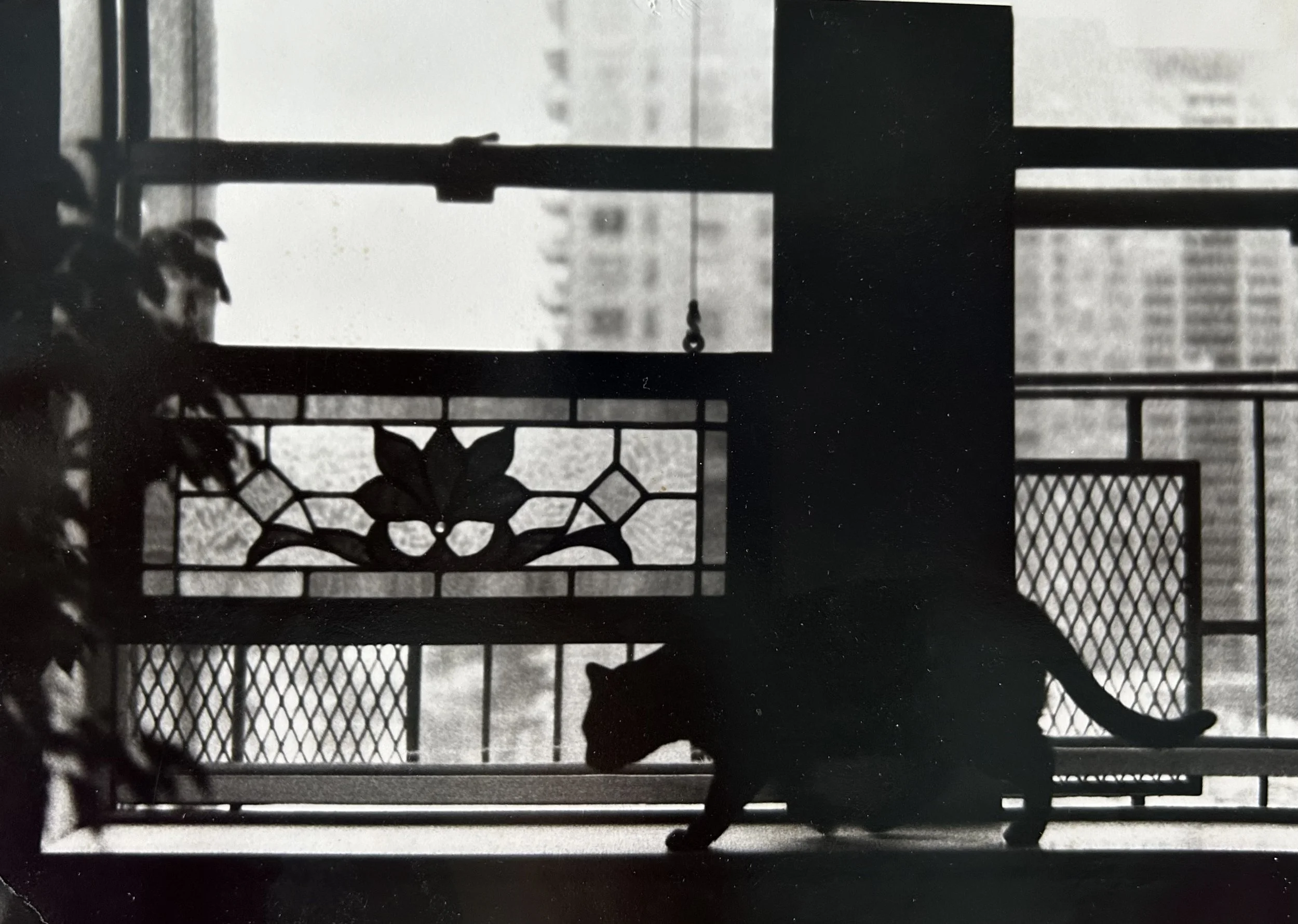
Cat Lady

The recent political chatter about ‘cat ladies’ brought to mind this photograph I took in 1980. My eldest sister lived on West 71st Street in New York City, and I often visited her while I was in high school. Using a manual camera, I photographed her cat, Tolbert, in front of the apartment’s windows. The name Tolbert inspired these musings.
Cats started in human history being revered, both by ancient Egyptians as well as religious orders throughout the Middle Ages. Their hunting of vermin, and thus protecting stores of food, was much appreciated. Unlike dogs, they were not completely domesticated, often remaining aloof, but helpful. Somewhere along the way, the cat became associated with evil women, and having a cat, especially a black one, was a sign the accused woman was a witch. (I discuss this a bit in a prior blog: ericas-heirloom-treasures/weird-women). The first documented trial of a woman accused of witchcraft was in 1566 in England. Elizabeth Francis owned a cat called “Sathan”, an old English version of “Satan”. While that may be a poor choice for a cat’s name, I can relate. My children had a cat we called “Evil Puddy” - he was a semi-feral feline with very little lovey-dovey instincts. We called him Puddy for the most part, except when he would capture animals and deposit them in the house as presents, sometimes live and sometimes in pieces. While Elizabeth survived her trial in 1566, her sister, Agnes Waterhouse who inherited Sathan later, did not.
My sister’s cat, Tolbert, had a vaguely familiar name, and I asked another sister recently why. Back in the 1960s, my parents hosted foreign students living in NYC to come for weekend visits to our home in Chappaqua. I imagine this was through some organization, but I have no idea about the logistics. They hosted a number of students, though I only recall a young Japanese man, Chit Chon, who came a few times, bearing gifts for the children. What an experience that must have been for a young man to land in a suburban American home with 6 or 7 children running about! Around that time, my mother named our Siamese kitten Chit Chon, which is somewhat cringe-worthy now that I think of it.
I still have a few child-sized kimonos and obi sashes Chit Chon gave my parents. There were 4 originally, three floral ones for my older sisters and 1 gray elephant kimono for a brother. The obis are works of art. The silk was hand dyed using “shibori” handwork. The technique involves wrapping the fabric around a nail (called Arashi), tying it in place, then dying the silk. The compressed area resists the dye, and creates unique patterns. When unwrapped, a wonderful textural pattern will remain. I wore the pink obi as a scarf over the years, and the raised texture has faded. Absolutely you cannot wash these as the entire textural design will disappear! https://www.wanderingsilk.org/shibori-history-meaning. This photo shows the two sashes I still have (I also have two kimonos). The yellow obi was not used over the past 60 years, and thus you can see the fabulous textural handwork more clearly.

According to my sister, another student who visited our family was Victoria Tolbert, though likely when I was an infant. Victoria made an impression on my older sister, who was 7 or 8, as she recalls Victoria was a stunning and regal young woman. A number of years ago my sister looked to see what became of Victoria. It was a sad story. Victoria was from Liberia, and educated in the United States. She was studying at Pace Business College in 1962-3 which was when she visited our home. She married Adolph Yancy, also educated in the United States, who was the senior economist for the Bank of Monrovia. The couple had two children, but Victoria died in 1971 at the age 30 after emergency surgery. (No details but I cannot help but suspect it was a pregnancy gone wrong given her age). Her father, William Tolbert, was President of the Republic of Liberia for 19 years, and was assassinated in a bloody coup in 1980, as was his son. His living daughters were imprisoned without their children, and his widow – who watched his murder – was locked in a bare jail cell for a month, then allowed to flee Liberia for the United States. Thus began a brutal 15-year military dictatorship lead by Sam Doe.
It certainly gave me pause to think about the sweet house cat, Tolbert, and the political history of the family who inspired his name.


Connecting Threads

I intend to write about a different quilt today, a charming 1930s butterfly one, as I have an epilogue to share. Since it is already featured in a prior blog, I needed a different image for this post (ericas-heirloom-treasures/feedsack-friendships). Deciding that dragonflies are not a far cry from butterflies, I landed on this quilt. Other than “fly”, it turns out they are not vaguely related. Dragonflies are in the order of Odonata, do not undergo metamorphosis, and their wings are transparent. Butterflies are in the order of Lepidopter, metamorphize, and have colorful wings. Forgive my stretch. Back to my quilt.
The quilt was an experiment I tried during the Covid lockdown. I was inspired by a quilt I saw at a WI quilt show, created this way with a guitar image. I loved the idea, but not the guitar theme. My children always associated my mother, Barbara F. Humphrey (1928-2021) their ‘Mimi’, with dragonflies, though I cannot recall why that started. This became a gift theme for many years, with a few ‘handmade’ treasures, including this charming pillow handmade by one of my sons. Being remarkably unsentimental, my mother asked me at one point to please stop the dragonfly gifts. Fortunately, I snagged my son’s handiwork before it was discarded.
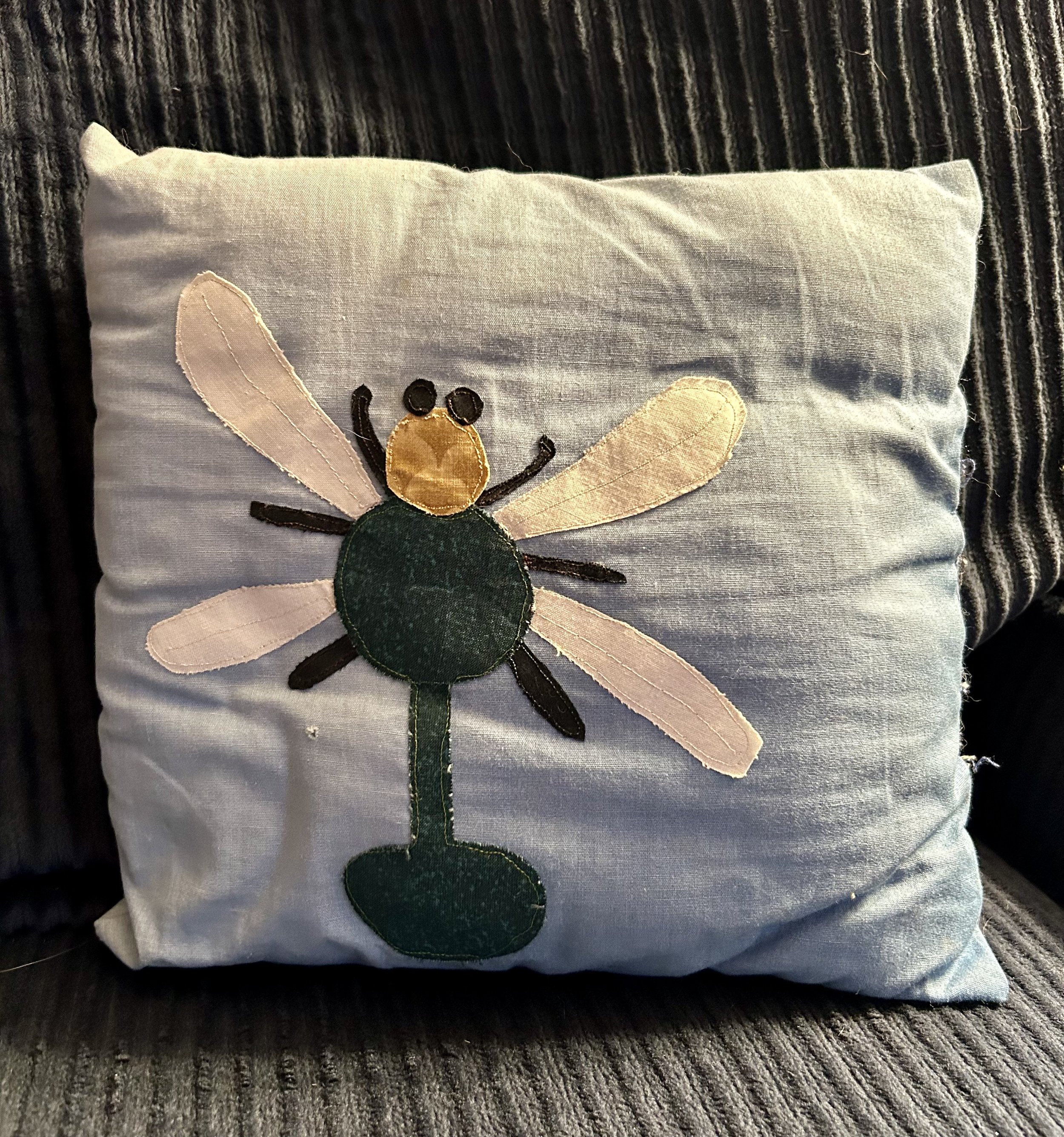
Choosing the dragonfly theme, as my mother had just died, I had no directions, and worked through a myriad of snafus. The strips are all ½”, and the two swaths of fabric – one lights and one brights – turned out to not be sufficient. Cutting all the strips, aligning all the rows, and appliquéing the dragonfly sections is not a process I’d likely undertake again. There is a reverse image quilt top made of the leftovers, which someday I should quilt and finish off. But, as this one has sat on a shelf for four years, I haven’t been motivated. In the meantime, I’ve move on to other projects. Like writing a blog for the heck of it. The art I find, the tidbits of info I uncover, and the connections to wonderful people has been a priceless reward.

Moving from dragonfly to butterfly, this quilt was purchased by my daughter’s friend at an estate sale and I cleaned and repaired it for her. Now, however, there is an epilogue to write. When I posted a blog this week about lamp treasures (ericas-heirloom-treasures/my-love-affair-with-calder), I forwarded the link to Trent, from whom I’d purchased them. He wrote a charming note on the blog, appreciating my post, which I shared with my daughter. She mentioned she hoped Trent would see my prior blog written about this butterfly quilt as it had been his grandmother’s. Wait. What?! Yes, she said, her friend had purchased the quilt from his June estate sale. When the friend was paying, Trent told a relative that his grandmother’s quilt was going to a new home. I had no idea the quilt’s history was known! Being a rather avid historical artifact junky, this was too good to pass up. I sent Trent another text, apologizing for pestering him, and forwarded the “Feedsack Friendship” blog link about his grandmother’s quilt.
The vast majority of quilts – especially vintage ones – are unsigned and their history is lost. These treasures were made by real women, with the purpose of keeping their family warm. Using whatever means they had to create something charming to do so. Knowing who did the work keeps that history alive, and I am rabid about trying to tie artwork, quilts, etc to the original maker (thus most of my blog posts). I have even tracked down people whose parents had created the art work I found and returned it to them (ericas-heirloom-treasures/american-dream).
Trent’s reply about the quilt blog was charming:
“Wow! This choked me up a bit. Thank you so much for taking care of it and seeing the beauty of what my Grandmother created. All the butterflies were material from castoff clothing from my Mother’s family. They used everything they could because they had nothing. The new binding or border trim looks so beautiful! This is a testimony that you should pass things along to those who understand and love them. I would have never been able to give it its second life and breathe new life into it. I always felt guilty moving these things along but now I feel like I have done the right thing.”
When I realized I could document the quilt with the maker’s information, I asked for his Grandmother’s name so I could create a label for the quilt. Trent replied with a photograph of his maternal grandparents, as well as a note.

“That would be amazing. Her name was Ora Alder. My Grandfather, when he was younger, was a coal miner and died early in life due to black lung from the coal mines and my Grandmother worked at Delco, a factory in Kokomo, Indiana. My Grandfather never learned how to read because during the depression he was made to go to work to support his parents and could not go to school. They died with almost a half a million dollars in the bank. They worked hard and saved and lived simply in the face of a lot of adversity. They were good people. Hoosiers.
I was unable to track down any birth or death dates for Ora and her husband Frank, though a recent death of one of their daughter’s told me Ora’s maiden name was Messer. I also learned the couple had four children, born in the 1930s during the Great Depression. Likely Frank and Ora would have been born around 1910, setting up house during the depression. Thus, Ora was making quilts out of scraps to keep her children warm. These quilts were well used, as quilts should be. Her daughter saved this one, passing it on to her son.
While Trent appreciated the quilt, there does come a time when all of us have to part with “stuff” – either due to excessive accumulation (uh hum, lamps…) or the sale of larger homes and downsizing. Some people just need to part with “stuff” for emotional reasons. Or philosophical ideas. What I love is the idea of the stories these treasures have, the joy of finding connections, both through research and through new friendships, and the ability to let handmade creations speak for history.

My Love Affair With Calder

Someday I will need to do a “Parade of Lamps” as I seem to have developed a serious fetish of late. I blame some of this on a fabulous designer who has been downsizing in a town nearby, holding tent sales over this year. Trent has incredible – and expensive – taste and confessed to me he adores lamps and shoes. There is a table set up with “project lamps” at his sales – things he’s picked up but not gotten around to rewiring and using. These are all $20 and it is a bit like being a kid in a candy store. I have purchased other lamps at prior sales, and wrote a blog about one (see ericas-heirloom-treasures/wiring-not-included). This last weekend I purchased two lamps – neither of which I actually need mind you – because they were fabulous. And the one I truly coveted, but did not buy at first, was over $400.
While one of the lamps is also ceramic and amazing, this ceramic lamp is the one I want to discuss. It has not been rewired, nor does it have a shade at present. When I mentioned to Trent I coveted another expensive “Mondrian” style lamp he was selling, he told me that the white ceramic one is also a “Mondrian”, though done in pastel colors. He picked up both while living in Amsterdam back in the 1980s, and he understood they were “authorized” by Mondrian. How could I not bring this beauty home with me?! And pine for the pricier one.
Peit Mondrian was born in 1872 in the Netherlands. He studied art from a young age, and while his early works are impressionist in nature, his later works are the source of his fame. He wrote extensively about art theory, and created a number of art movements, including De Stijl (Style) and Neoplasticism. The purpose of De Stijl was to create visual harmony that could restore order and balance to everyday life after WWI, and was for all types items not just artwork. It is likely the lamp was a result of this movement, though as yet I do not have any verifiable evidence.
However, it was Neoplasticism that informed his work with primary colors and lines. The movement, started by him in 1917, was a philosophy where naturalistic representation in art was renunciatd in favor of stripped-down art composed of lines, rectangular planes and primary colors. ( https://www.moma.org/collection/terms/neo-plasticism) These are the works we all instantly recognize. Mondrian moved to New York City in 1942 and died in 1944.
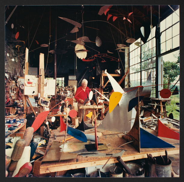
One reason I have always loved Mondrian is his connection to Alexander Calder. Calder visited Mondrian in Amsterdam in 1930. Mondrian was a very “type A” artist, with a small section of his tidy apartment set up with an easel where he produced his work. Calder is the exact opposite – his studio was a cavernous space filled to the brim with bits and bobs. Calder noted after his visit that Mondrian’s studio “was a very exciting room…there were experimental stunts with coloured rectangles of cardboard tacked on…I suggested to Mondrian that perhaps it would be fun to make these rectangles oscillate. And he, with a very serious countenance, said ‘No, it is not necessary, my painting is already very fast…’ This one visit gave me a shock that started things”. And thus Calder began work inventing the mobile as he wanted to see all those blocks of color move!
So back to my estate sale visit. As I could not afford the pricier lamp, I was carrying the white ceramic one when my daughter arrived. I told her that the piece was a Mondrian (style) lamp and she looked at me blankly, stating she didn’t know who that was. I explained to her she did – he was one of the artists taught in the elementary art program I had created called Famous Artists. Still not ringing any bells on her part. As we walked through the sale, we came across the lamp I coveted and she perked up and said – oh I know that artist! Yup, I said, it’s Mondrian.
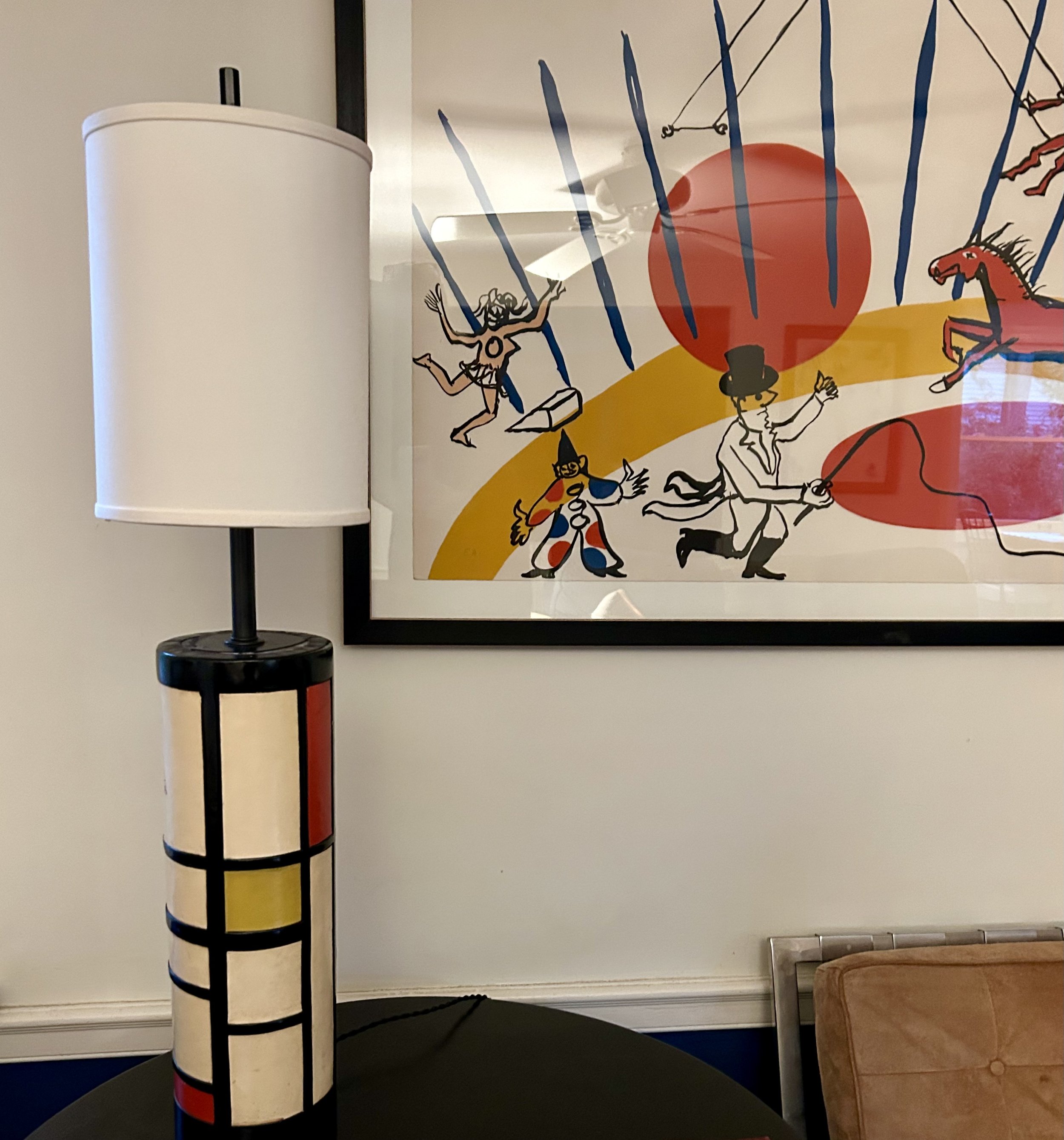
Needless to say, I went back on Saturday to see if the lamp might be reduced in price. Trent kindly offered it to me for a reasonable price and I happily carted it home. It needs a better shade so I will need to head to a remarkable lamp shade store near here( https://www.thelampshader.com/) where I suspect I will spend a ridiculous amount on a silk shade. As hubby reads these posts, I likely won’t be able to sneak that one in, but he will forgive me as he enjoys my finds. The Mondrian lamp now sits quite appropriately next to my Calder lithograph and it is astonishing how well they complement each other. As they should.

Polkadots Amid The Dross
This artwork suits my mood today. It is a rainy Fall day, overcast and cold. We had been in a false Summer season but last night the winds changed and now Fall is here. My head is pounding – unclear if that is due to some wine last night (possible) or the change in weather. Or just typical aches and pains as I recover from a week of being a busy grandmother to a newborn and 3-year-old. Running around with a 3-year-old is such a joy, but yikes, my stamina is not what it used to be. I have a lot to do today, and starting with a headache is making me grumpy. That said, I do like to wear bright colors, armor of cheerfulness when my interior might not be so upbeat. Much like this collaged woman facing down a black cloud.
The artwork was picked up in 2020 (pre Covid) at my local thrift shop, though poorly framed. I spent a bit of money to have a new mat cut for the work and picked up a standard frame to display it. There was a note on the back, indicating the work came from the “Ragdale Foundation December 2007” and was titled “Polka Dot Figures VI” done by Hedwig Brouckaert.
The Ragdale Foundation is a nonprofit artist community in Lake Forest on the former estate of Howard Van Doren Shaw (architect) and Frances Wells Shaw (playwright). The foundation was started by their granddaughter, Alice Judson Hayes, in 1976. The property, originally the “summer home” for the Shaws, was built in 1897. The family added the Ragdale Ring in 1912; an outdoor theatre for the production of Frances Shaw’s plays. Alice inherited the house in 1976 and began the foundation, initially managing the entire enterprise. She wrote:
“I am grateful to my mother, Sylvia Shaw Judson, who gave me the house, to the ancestors, relatives and ghosts with whom I communed when I came back to live there in 1976, to all the artists and writers who by their creativity have validated the idea of the Ragdale Foundation, and to the many people who have helped make the Foundation work. Finally, I am grateful to the house itself for its smell and taste and texture and for the views out of its windows and for its nurturing spirit.” https://en.wikipedia.org/wiki/Ragdal.
The organization runs nearly 150 residencies and fellowships annually to creative professionals of all types, with the artists staying on the property to enjoy creative work space and uninterrupted time. The artist of my piece, Hedwig Brouckaert, was a resident of the Foundation in 2007, and her piece was one of a series she created at that time. The work was contributed to a holiday fundraiser, purchased by someone in the community, and eventually made its way to the thrift shop.
Brouckaert is from Belgium, and moved to New York in 2010, where she is active in the art world, and is currently the Bronx Museum’s 2024 Aim Fellow. Her main interest is with “mass media imagery to create introspective and tactile works, which range from drawings and sculptures to site-specific installations.” (https://caferoyalculturalfoundation.org/hedwig-brouckaert) I was actually able to reach Ms. Brouckaert by email, and she described the work as a “mixed media” work – part of a series she did while at Ragdale. She explained the process:
“The ground was East Indian black ink, with drawing using black carbon paper on top and then archival felt tip pens for the dot patterns. I transferred images from magazines, in this case only figures and I would put the heads always on the same spot. That’s why there is the black enter where there were a lot of layers of lines. I was, and still am, interested to work with mass media imagery as s source material because it is so omnipresent and such an important part of our landscape.”
To be honest, I really cannot translate that process! Suffice it to say it is a layered work, spun from a magazine image of a woman. The how of it still escapes me. But that is the beauty of creativity – sometimes the “how” doesn’t matter as much as the impact the piece has. This woman always makes me think of Fall, storms – both internal and external – and the use of bright colors to fend off the onslaught. Dross is a term used to describe things that are worthless or rubbish – much like our overabundance of mass media imagery. And yet beauty can be found among the dross, both in our personal demons and the demons that play out around us in our ever-present media.

Stick With What You Know
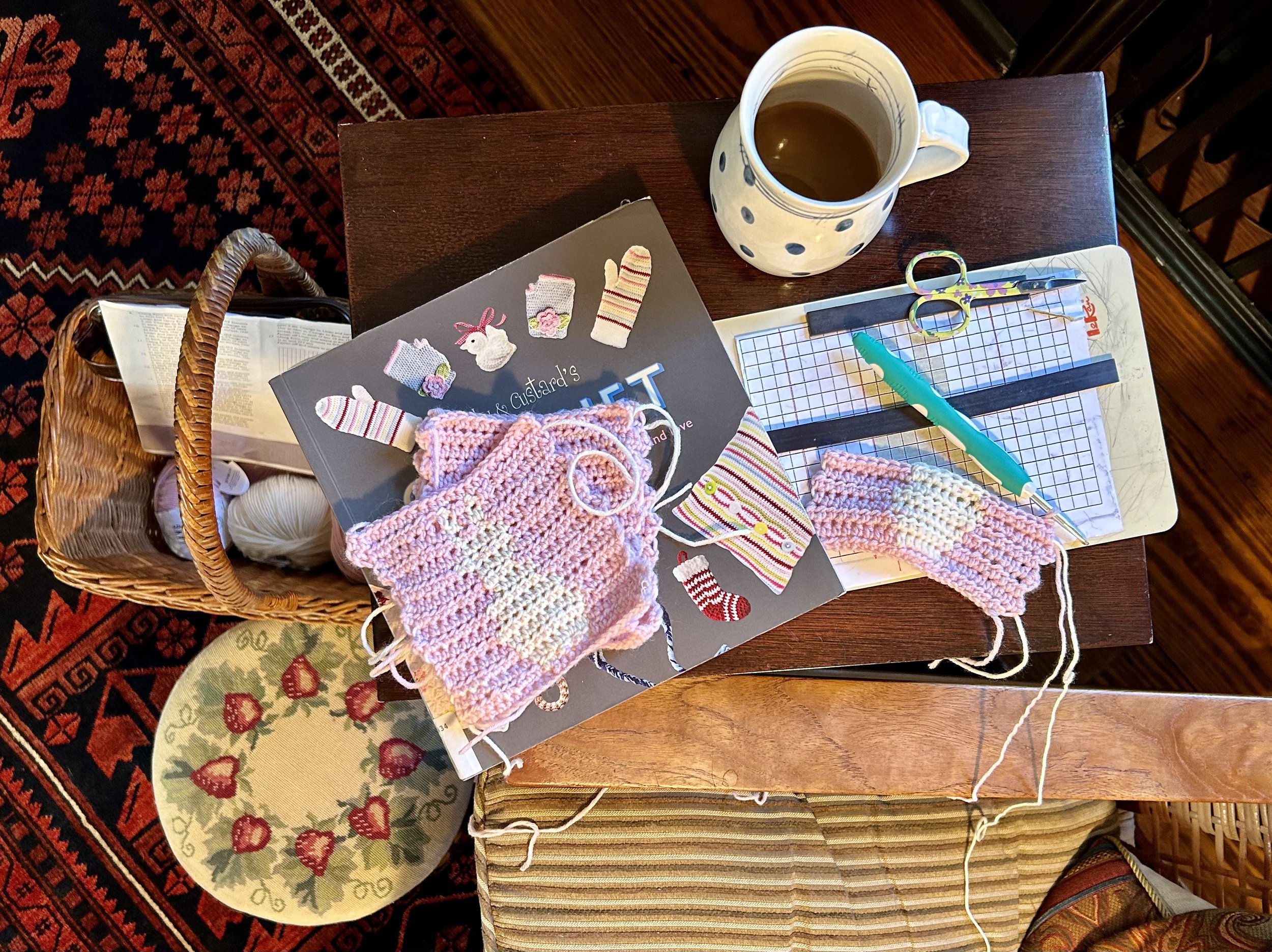
Last night, as I sat mumbling to myself over a crochet project, hubby mentioned I was doing “full on Grandma”. There I was in a rocking chair, reading glasses perched on my nose, bright light shining over my shoulder, my mother’s needlepoint footstool under my feet, and her knitting basket full of yarn. Yup. Full on Granny! The reality is I had made a ridiculous decision and now am suffering the consequences.
I had taught myself to crochet a few years back, and managed to whip up a few fun “amigurumi” gifts for family and friends. Amigurumi is a Japanese term which combines the words for “knitting” and “stuffed doll”, though the projects are not knitted, nor always a doll. The designs are worked in circles, and involve a basic crochet stitch and lots of counting. The projects tend to be small and cute, though the Pokémon characters I made were neither, as well as a tad complicated.

When our second grandchild was expected, hubby and I picked up a charming Steiff toy while in Belgium. At the time we did not know the gender, so went with a lovely brown bunny. Eventually the kids found out a little girl was going to join their family, and I happily found a crochet pattern for a bunny blanket. Of course, that pattern was in very boring cream and tan, so I blithely decided to pick up (expensive) wool yarn in pink and brown, and figured I could crochet the blanket in time for her birth.
Ah, the joys of overestimating your talents. Who the heck knew crocheting a blanket involves a much harder set of techniques than my cute amigurumi Charmander dragon?! Just what the heck is a half treble crochet stitch?! How the hell do you carry two yarns, switching between them as you crochet? And why in God’s name did I keep losing stitches? It soon became clear that dark brown was not going to work for the bunnies – since you carry it throughout the pattern, the darn brown showed between the pink stitches. Back to the yarn shop. $40 later I now have a cream yarn for said bunnies, and am back at the beginning.
Not that I’m under the gun or anything, but lovely granddaughter was born on Wednesday, and I am heading back to spend a week playing with 3-year-old sister and getting as much infant snuggles as possible. With better yarn in hand, I sat in my usual “project” armchair in our bedroom and spent SIX HOURS trying to figure the damn pattern out. Lots of YouTube videos. In the end, I made ONE block (of 16) and managed to pinch a nerve in my leg, rendering my foot completely useless for walking. Good grief.
Yesterday I decided to mimic my mother, who always did her needlework while sitting in a small rocking chair. My entire life Mom used a rocking chair, and while her specific one is gone, I had begun “collecting” rockers during Covid. Odd choice, I admit, but the large loft in our barn was a perfect location for friends to meet “outdoors”, but under a roof, during the lockdown, and the local thrift shop sold rocking chairs for ridiculously cheap prices. Varying girlfriends would pick among the dozen or so chairs, and over the year or so we would meet for coffee and celebrations, rocking away our worries. One chair, a 1960s Danish Modern teak one created by Hans Olsen, cost me $10. It was so comfortable, and actually worth well over $2000, that I put it in our sitting room. After my foot recovered (but is still tender), I decided to set up production in Hans Olsen’s chair, complete with my mother’s very old needlepointed foot stool with the charming strawberries and her antique floor lamp.

I have managed to get my production down to 1.5 hours a block…and now have 4 complete. I am not optimistic that I will crank out 12 more before tomorrow’s trip back to the kids. So Mom’s wicker basket, filled with all the necessary yarns and tools, will come with. Hubby did ask last night why the heck I didn’t just make a quilt? Very good question.

Awaiting A Grandchild

A brief blog post to celebrate a new life. My second granddaughter is expected to arrive today, and I am on my way to meet her. Praying mother and child do well through the delivery, and I know the little one will be welcomed with a great deal of love from her parents and both grandparents.
In case anyone is curious, the artwork is an etching I picked up at an estate sale a few months back. It is titled “Human Touch” and is an “artist proof”. The artist, Walter Moskow (1931-2013) studied at the School of the Art Institute and lived in Illinois.

The Garden That Never Withers

I spotted this etching at an estate sale this past weekend, after I had paid for a collection of treasures. I certainly did not NEED another piece of art, but it spoke to me. The young man reduced the price to $40 – a tad high for my thrift store sensibilities, but I decided to splurge. I am glad I did. As I have been mulling all week what I wanted to post for my 100th blog post, this artwork offered some interesting thoughts.
The artist, Gross Arnold, was born in Romania in 1929, and died in 2015. While studying art, he fled to Hungary in 1947 when Romania was taken over by Communist Russia. He is considered a “graphic artist” and is well known in Hungary for his copper plate etchings. This particular artwork, titled “The Garden That Never Withers”, depicts a sunflower field and is dated 1962. I actually hadn’t noticed the date until I enlarged a section to show the details! It is dated and initialed on a small rock.
The work is remarkably detailed, especially if you realize the artist carved the image into a copper plate, printed it onto paper and then hand colored the image. Each one is unique, and thus there is not the edition numbering often seen on prints (i.e. 179 out of 250 would show as “179/250”). Arnold has depicted the sunflowers as unique faces, and filled the foreground with a large array of fairies, birds, bugs and quirky creatures. The overall vibe is a surreal, fantasy environment, with a child-like sensibility.
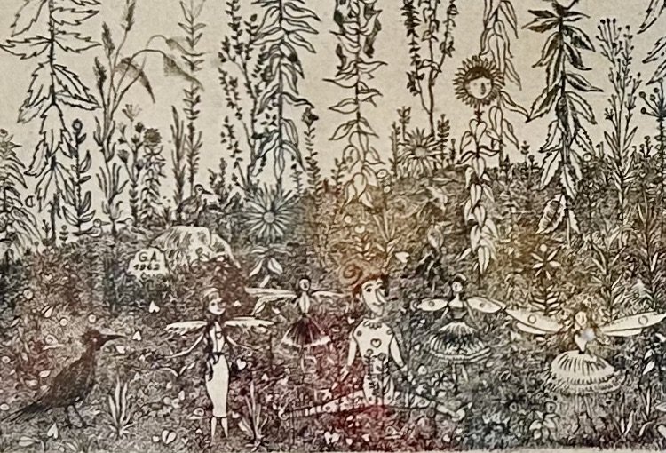
I suspect some viewers will feel the work is ‘creepy’. I think this comes from the minimalist tree and vast, mostly empty sky. These create a striking backdrop to the over-filled sunflower field. The colors are also muted, though that may have more to do with the work being painted over 60 years ago, with the watercolor paint fading with age. The ability to create “atmosphere” with a copper plate etching is limited to lines, so I sense Arnold added the smiling ‘man in the moon’ and a few faint fairies darting about to offset the ominous blank sky. The sky was simply a background for Arnold, as he spent all his energies filling the curved earth with details.
And oh my gosh did he enjoy creating a community of flowers. Each one is unique, with quirky facial expressions, some clearly feminine and others masculine. Some young, some old. The petal ‘hairdo’, the ‘leaf’ outfits, and the flowers tilting this way and that. There are a few female flowers with long flowing hair with ‘ribbons’ of leaves atop their heads. Note the gentleman on the far left with a bowtie! There are numerous fairies scattered about in the field as well a pair of ‘bee’ folk. A dark crow on the far left, as well as numerous ducklings climbing over the rock.
One of the books I loved as a child was the large Grimm’s Fairytale collection my parents had, with its gory stories and illustrations. The history of fairytales is fascinating, as they reflect old folklore, morals and human fears. My parents also had books on mythology, and all those ancient Greek tales fed right into my enjoyment of human foibles translated into stories. Arnold’s garden of delights does not seem to be ‘saying’ anything particularly, but the one young boy sitting at the front of the image seems to be Pinocchio, with his much-desired human heart, but slightly elongated nose.
When I began researching Arnold I came across a number of quotes which summed up my enjoyment of his art. He wrote “we are surrounded in the world with so much trouble and horror, they should not be allowed into the art” (https://www.kollergaleria.hu/kiallitas/arnold_gross). He was often referred to as an “eternal child”, filling his art with childlike wonder and joy. Having lived through WWII as a child, escaping Communist Russia’s invasion as a young man, and settling in a foreign country might make someone bitter and sad. He chose to play with his art instead.
The sunny colors of sunflowers tend to make us all smile, with their bright hues and oversized charm. It is hard to be sad in the face of such charm. Arnold’s artwork reminded me of a daughter-in-law as her favorite flower is the sunflower. As a wedding gift, I created a quilt to reflect the couple’s Colorado home, with a field of unique sunflowers, pieced and appliquéd over the mountains. (For those interested, the sunflowers were created using a technique designed by Robin Ruth for mariner’s compass blocks https://www.robinruthdesign.com/)

While I did not create ‘faces’ on my sunflowers, I did hide a few secret images to reflect me and my love for the couple. Having children, building relationships, creating art and love is truly work. But it is the best of life’s ‘work’, and as I come across vintage artwork, I am always inspired by the artist, and the impact the art has on my emotions. I found an (unattributed) quote about Arnold’s work which sums up its appeal to me: his work is “fed by the joy of play, the enjoyment of nature, the appreciation of loving human relationships and the respect for the values of classic art and literature”. That is really all there is for me - a garden of love that never withers.

Houston, We Have A Problem

To be fair, Jack Swigert actually said “Okay, Houston, we’ve had a problem here” on 4/14/1970 aboard Apollo 13, but who’s worrying about literary misquotes at this point? The basic fact remains that I now have a serious problem. Having ventured to the ridiculous ‘Bins’ thrift store with a friend again, I acquired yet another quilt. I don’t, in fact, collect large quilts (haven’t as yet discussed my doll quilt collection stored under a bed). As I didn’t need another quilt, I was unsure about purchasing it, but my girlfriend insisted I rescue it. Based on weight, it likely cost me $10. It seems I have a fondness for charming, unloved 1970s crazy quilts.

When at the Bins, most folks are in search of specific things (clothes to resell mainly) and old quilts do not hold much appeal. There’s even one “shopper” with an online following who sets up a video space in a corner and “sells” items online before she’s even purchased them! You literally have no idea what you will come across, and while much is a tad yucky, sometimes cool things are uncovered. My friend found a vintage French gold pen (worth over $150!) inside the pocket of a sport coat she was assessing. Bought that coat! There are now a myriad of for-profit “Thrift Stores” open, some in our area, which “stock” their stores with the things culled at Bins. Mind you, not everyone washes the items before reselling so I will leave that idea for you to mull over. YUCK.
My problem is it seems women in southern Wisconsin back in the 1970s were making crazy quilts. Contemporary families, emptying out elder relatives’ homes, do not appreciate the charm of these items and the quilts are donated to thrift stores. It makes me sad that someone’s handiwork is unappreciated, and the fantastic array of vintage fabrics is off-putting to the current “everything is gray” generation. So I am stuck with yet another quilt to restore because I cannot leave these treasures behind.
Thus far my quilt finds have no notation of maker, location or date. I would love to explore who made this piece but alas that is not going to happen. Other than the fabrics dating to the 1960s and early 1970s, and being found in Wisconsin, I have little to go on. Unlike my prior Bins crazy quilt (see blog post: https://www.ericasheirloomquilts.com/ericas-heirloom-treasures/wisconsin-crazy), these fabrics are mostly cottons and a bit more rural “farm” vibe. The quilt has a sweet “make do” vibe, and the overall sense I have is it was made c.1970. Tackling the “cleaning” of the quilt evolved into quite a project.

First up was a bathtub rinse. Yikes, the pea green water had me washing it twice. Then it dried in the sun. The interior of the quilt (what would be known as the batting) was oddly lumpy so I decided to disassemble the piece and clean up the batting. Oh dear - that was a huge mess! Turns out whatever was used (no clue!) by the quilter as “batting” basically crumbled into messy loose lumps and was all over the top and backing. And my sewing room! What a mess. I ended up taking the pieces outside and shaking them to loosen the stuffing. Hubby actually swept the patio as he thought it was some odd plant pollen. Oopps.

At this point I decided the darn thing had to go through a washer and dryer. The backing was so full of this odd stuff it was the only way to get it removed. The top also, though I confess to being a tad nervous about it surviving the machines. It seems the original maker had used “foundation” pieces of old well-worn wool blankets for constructing the blocks, and they held up remarkably well. The odd fluff was removed and the top and back were quite clean. This crazy quilt was reasonably well constructed, and I mended some of the stitching on the blocks. Thankfully not a huge number as sitting down and doing embroidery had not been on my short “to do” list! After completing the repairs, I squared up the original backing and then tacked the quilt down on the floor, laying the backing on top. Pinned in place all the way around, sewn together, flipped right side out and pressed well with an iron. Now I have a fun early 1970s crazy quilt to decide what the heck to do with!
So, Houston, how the heck am I going to manage this new craze?