
Nesting In Springtime
This blog is a peek into the chaos of my brain these days. I have a lot going on, what with now being on the Board of my local quilt guild and our purchase of an out-of-town property near one of my children. To say nothing of my need to sell items I thrift on eBay for income, my desire to create quilts and art, and the importance of taking time for walks, climbing, yoga and friendships. The lists! I am a big maker of lists, complete with pencil and paper, as it helps keep me organized (public service announcement: highly recommend Black Wing graphite pencils https://blackwing). And there is something remarkably fulfilling about crossing off “done” items. Old school, but it just is not the same on a dinky phone. While the paperwork is a bit daunting, my ‘fun’ has been planning the interior design of our condo purchase. I gave myself a $5k budget to find furniture and I have hit $5110, though that includes art and lamps I could not pass up. I decided to go all in on the 1970s vibe, though as is typical of me, I am a bit eclectic in my interpretation. All of the items I have found in the Chicago-land area, and entailed numerous trailer rentals, hiring of young men as muscles, and much grumbling from husband. Almost all have fascinating stories – either about the item itself or about the journey to retrieve said item.
A year ago we purchased a 14 foot camper and I did the same thing – “nesting” I have decided to call it. That space is very small, and I wanted to make it vibrant, fun and relaxing. We love the little thing, though we have not as yet taken major trips as we are waiting for retirement for longer jaunts. Now, however, I am tackling a 1300 sq. ft condo and the scale went up dramatically. There are so many wonderful stories, from meeting fascinating people, rescuing dogs, driving through Wisconsin and Illinois in the Springtime, and sending dear friends after remarkable treasures that I truly don’t know where to start.
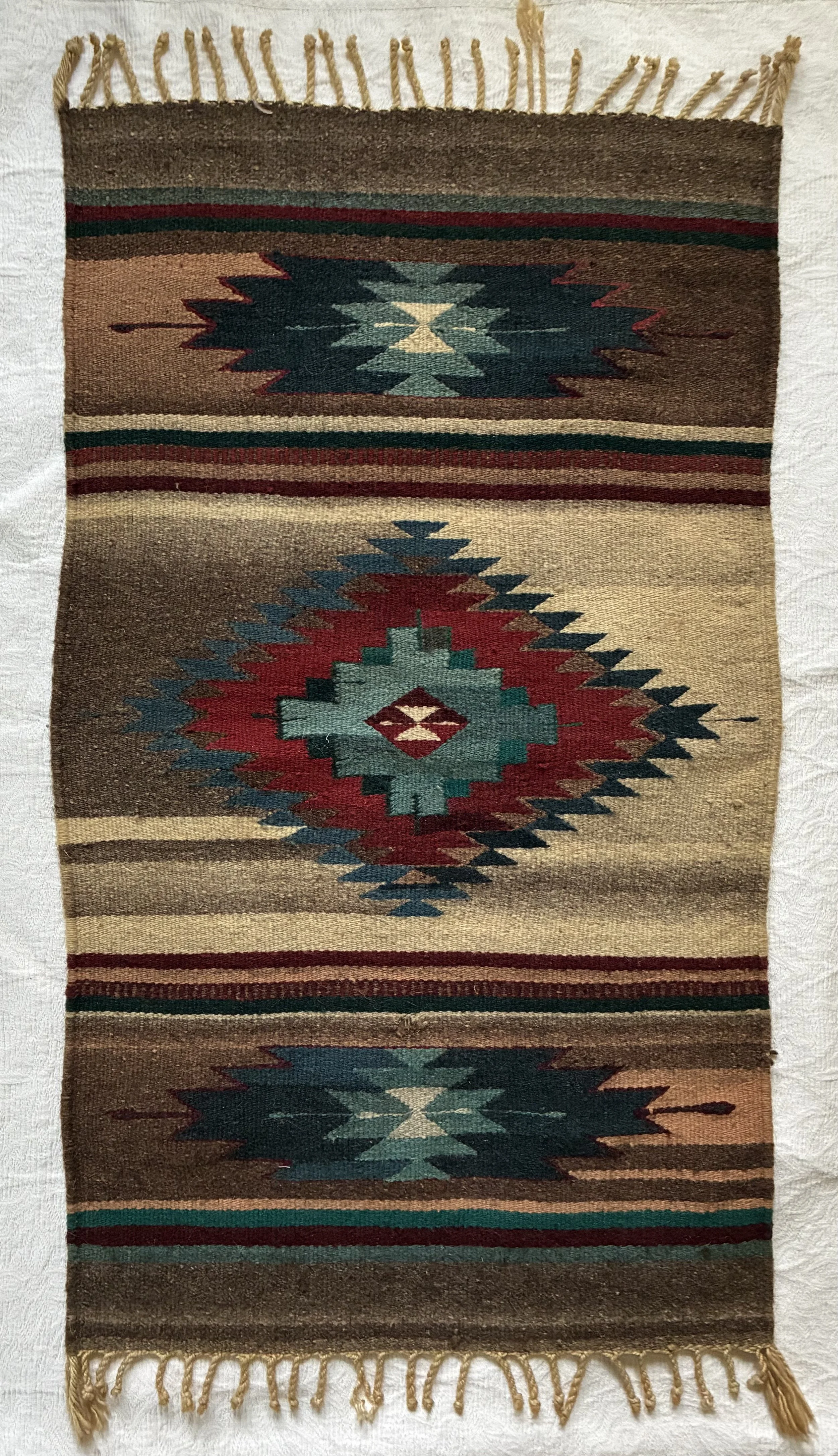
I think the Navajo rug is likely the most important story so I will start there. It encapsulates the joy of this process: remarkable vintage, handmade piece, ridiculous steal, and the beauty of friendships. An estate sale listing the other weekend showed a number of interesting pieces, but I was ground to a full stop by the photos of 3 rugs. Nowhere in the write up did the sale discuss them, and they appeared to me to be Native American, and likely old, maybe 1950s or 1960s. I have virtually no expertise in such things, but my hunch was they were handmade. As I was out of town, I tried to tempt a few friends to head to the sale Friday morning. Being good sports, they did! The one I wanted for display in my condo’s living space cost $22. I wasn’t sure if I was thrilled it was so cheap or incredibly saddened that the beauty of these pieces was so unappreciated. The other two are also astonishing, so much so my charming girlfriend decided to buy those for her children. I was a tad verklempt as they are remarkable, but the fact they will be appreciated and displayed – with a lovely story attached – is more important. She also said if the kids don’t ‘want’ them, she will pass them along to me. Here’s to nesting!

A.I. And The Dreaded Y Seam
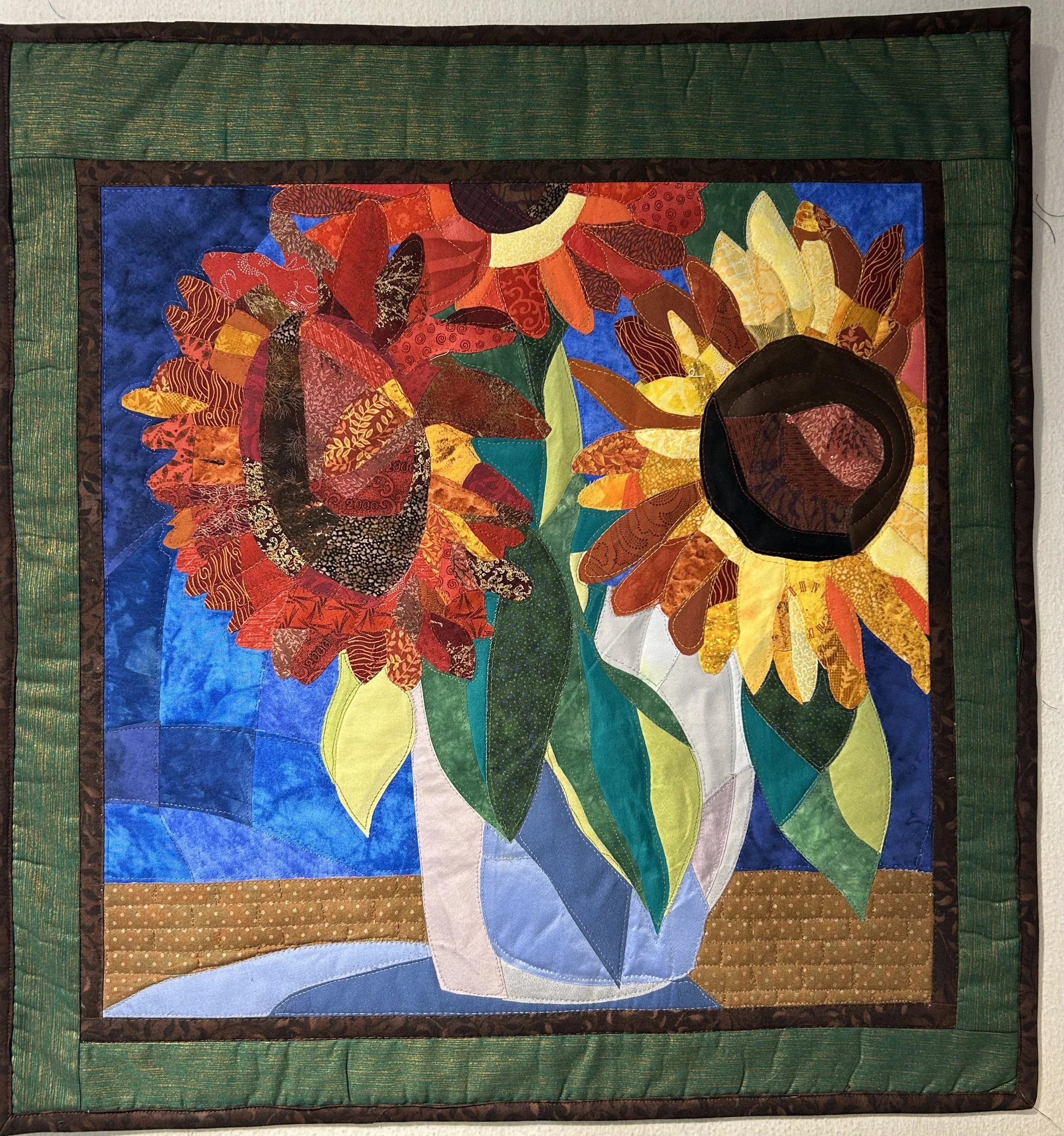
I learned today that A.I. has no clue how to sew; design, yes – sew, nope. I concluded this after visiting with a dear quilting friend. She showed me a project she was completing for her 21 year old granddaughter who had used A.I. to design a tee shirt quilt layout. The graphically appealing pattern was a nightmare to actually sew, rendering my friend irked by all the ‘set-in’ (or “Y”) seams. This sunflower quilt was also designed by AI, though nary a Y-seam to worry about. In fact, any experienced quilter will do her darnedest to avoid those dreaded set-in seams. It seems A.I. hasn’t learned that lesson.
Teresa (aka ‘The A.I. Quilter’ https://theaiquilter.com/ ) spoke at my quilt guild’s last summer, discussing A.I. and its use in quilt making. I signed for her workshop as I was intrigued, and knew virtually nothing about using A.I. The workshop required participants to complete a questionnaire which Teresa then used as a prompt for creating a unique A.I. generated quilt design for each of us. I requested a classic artwork recreated with a modern slant. The A.I. platform interpreted that to mean ‘dancing women’ images; not exactly the ‘classic art’ form I had in mind. Teresa recognized how off-base her A.I. platform went, and sent different ideas after informing A.I. to use artwork instead of dance. The resulting options by Vermeer, Van Gogh and others were more in line with my intention, and we landed on Van Gogh’s sunflowers.
The workshop did not spend a great deal of time on the means to construct the quilt, rather focused on A.I. in general and how to incorporate it as a tool in quilt making. I found this fascinating. Constructing the actual quilt pattern from the class was more a paint-by-number (with fabrics) process than actual sewing. Having used fusible fabrics for many years I forged right ahead, enjoying the relaxing process of playing with color and fabrics to build the flowers. Partway through the project, I realized the abstract flowers were actually in a vase on a table! It was not obvious from the original image, but I liked the idea of anchoring the flowers in a logical space. I finished off the quilted piece like artwork, with a beautiful green silk fabric ‘mat’, offset with a dark brown inner ‘mat’ and binding.
Unfortunately, the A.I. pattern my quilting friend was working on for her granddaughter DID require sewing. And it became very clear Artificial Intelligence does not include seamstresses working in the background. While the design is creative, incorporating all the granddaughter’s tee-shirts, an experienced quilter would look to group the sections to make all the seams straight lines. This pattern has numerous sections where the seams stop and start (look at bottom left corner where the 4x8 piece sits sideways and does not allow for a complete, straight seam in any direction as it is ‘set in’ the middle of numerous blocks.) Construction involves sewing a partial row, leaving it unfinished so the next area can be ‘set in’ next to it – thus the “Y” where you pivot to go in a different direction). Confused? Not to worry, except to say I would highly advise against relying on A.I. to create sewing patterns unless -like my good friend – you are an experienced sewer and know how to navigate the dreaded “Y” seams.

A Polish Lion
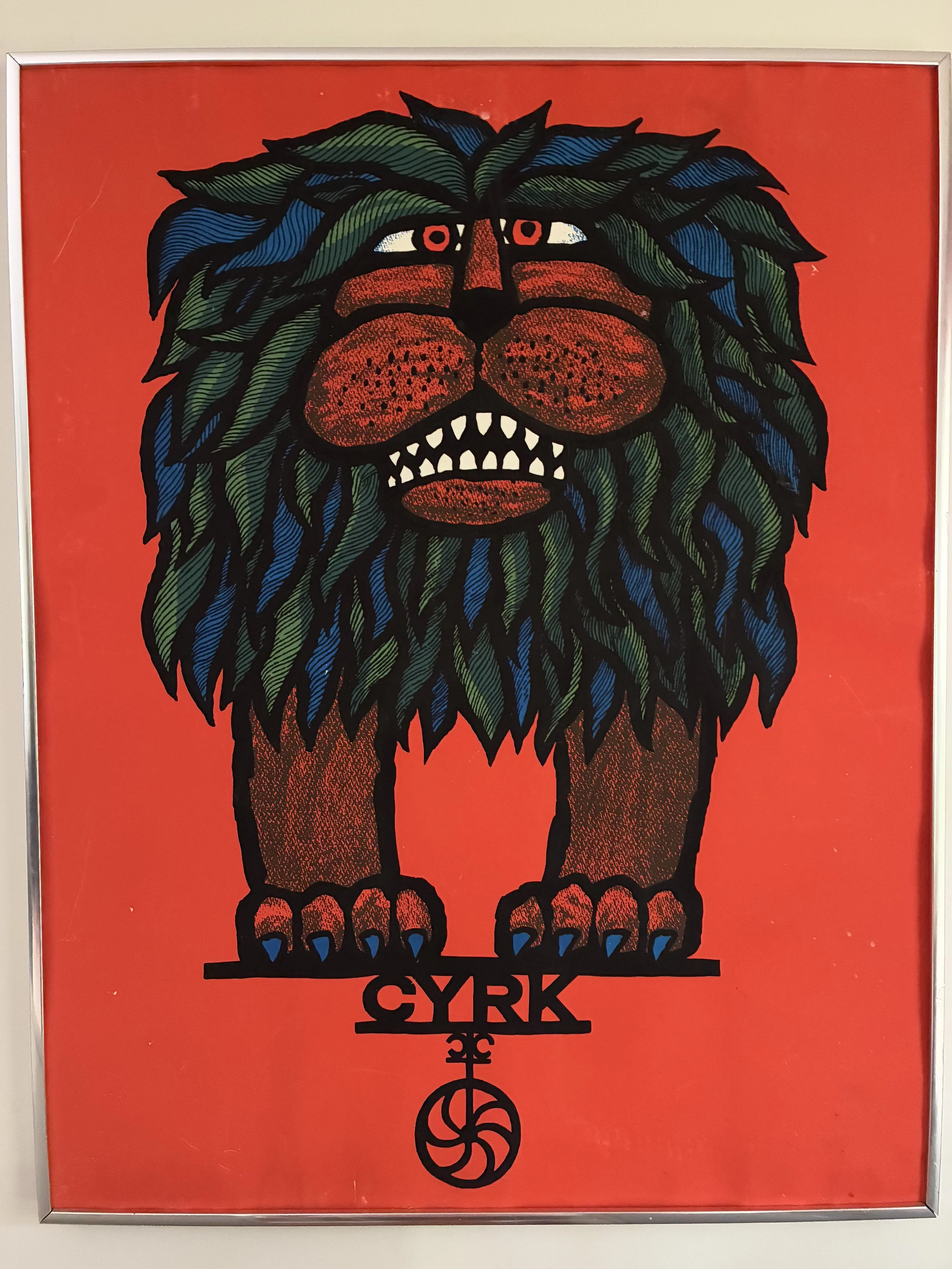
Sometimes a piece of art is really a political statement in disguise. I did not expect this vibrant – and charming – poster of a lion balancing on a small circus ball to be one, however. All I knew was that the colors leapt out at me, the design spoke to my 1970s heart, and the lion was destined to join our circus themed family room.
Last Fall I attended an estate sale at a crowded, tiny house in Barrington. This piece was among the clutter in the ancient, wood garage-cum-shed. The poster was framed but without glass, and practically vibrated across the dim space. I made a beeline to it, snatched it up and carted it inside. Nor did I pause to do any ‘research’ as I basically didn’t care. The poster was not priced so I asked. The response: $7, a rather peculiar number, but I was not arguing. At all. I brought it home, hung it in our circus family room, and was informed by my husband that it was staying right where it was. I guessed ‘cyrk’ meant circus, but I had no idea in what language. Once I began doing research, I realized what a treasure my grinning lion is.
The work is made of three colors: orange, blue and green. Orange and blue are complementary colors (across the color wheel from each other), and much of my family room is decorated with those two colors. Adding green compliments the blue, as they are both cool, calming colors and are ‘analogous’ (next to each other on the color wheel). Not surprisingly, the fireplace in my family room is painted green, and there are many ‘green’ accents in the room as well. The artist effectively created the lion’s textured body by using the background orange and adding black dots. The heavy black outline builds his shape, as well as the charming circus wheel and balance platform.
His whiskers are simply heavier black dots over the orange, but it is the use of white that makes the piece pop. Assuming the original paper was white, the orange ink was laid to create the background, with the areas of teeth and eyes uncolored. The black lines draw in the details, and the animal’s grin is both winsome and childlike. So what is the history behind this remarkable work?
The artist, Hubert Hilscher (1924-1999), was well-known in his day, and was part of the famous “Polish School of Posters”. This art collective began in Poland under communist rule after WWII, and was most famous from 1962 to 1989. The communist government censored art, particularly restricting ‘degenerate’ or ‘western’ art. However, the Polish Ministry of Art & Culture needed posters to advertise their state-run cultural events, including movies, theater, music and circus productions. The Ministry asked the artists at the Warsaw Academy of Fine Arts provide the artwork. The classically trained artists were not enthusiastic, but given the collapse of most commercial business, the artists agreed on the condition they could use their own creative vision. Thus was born the Polish School of Posters (The-Polish-School-of-Posters---A-Remarkable-Period-in-Graphic-Design-History). Hilscher created my grinning lion poster for a circus in 1967.
“Unlike western advertisements, Polish posters were not expected to provide detailed information such as dates, times and locations which were posted elsewhere. The information transmitted was essentially visual” (https://www.kingandmcgaw.com/stories/projekt-26-and-the-polish-school-of-posters). They were easily reproduced on transportable lithographic presses, and plastered all over Polish cities for advertising.
The work was designed to be eye-catching, with hand drawn lettering and unusual design choices, often driven by the lack of commercial marketing (since the communist government was footing the bill). While the artists could not be overtly political, many of the works contained subtle political statements. The use of the lion in my Cyrk poster is a case in point. A lion is often a symbol of strength, pride and defiance, used here as a subtle anti-Soviet nod. Specifically the oversized beast is balanced on a teeny tiny ball – the Soviet state.
The original posters that exist would have been salvaged from the streets, and beginning in 2020, a British commercial printing business, King & McGaw, began reissuing the posters in ’limited runs’. To see some of Hilscher’s works, here’s a link: https://www.projekt26.com/hubert-hilscher). My Cyrk poster was reissued by King & McGaw in 2023, and I have no idea if the poster I own is a true vintage piece or a modern one. Either way, Cyrk will remain watching over my (100% Polish) husband while he sits at his computer in our family room.
The Different Drummer
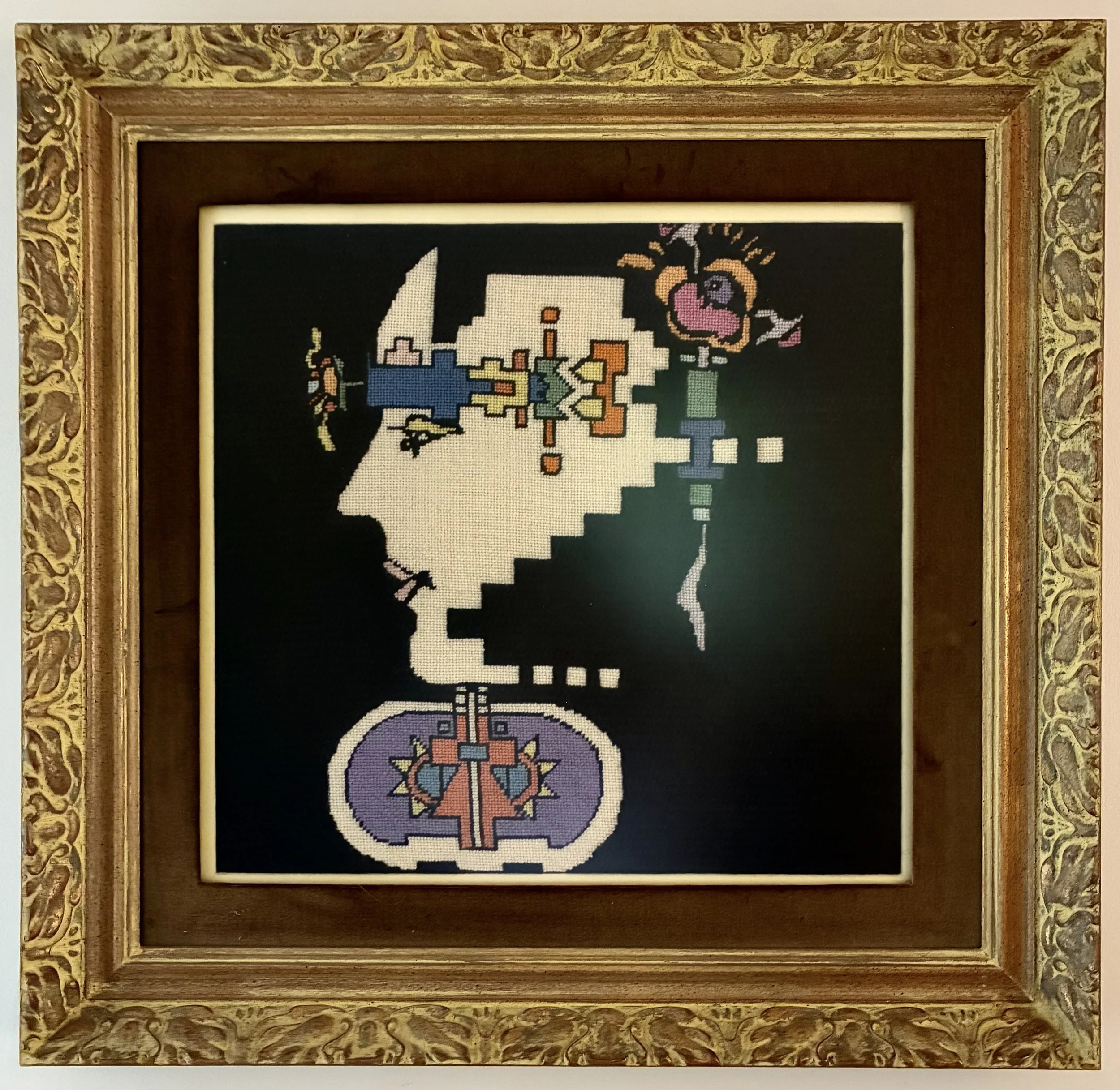
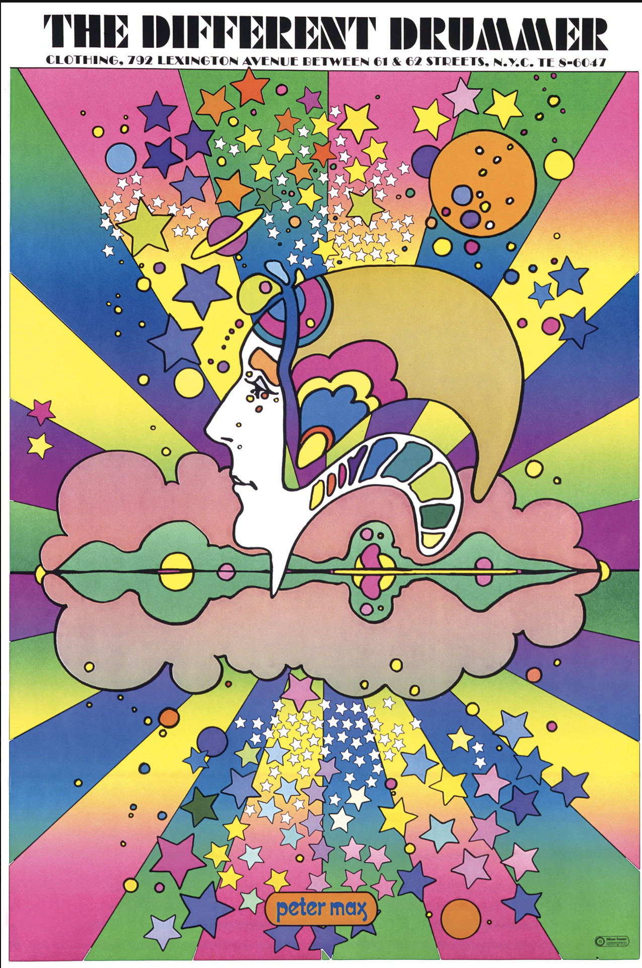
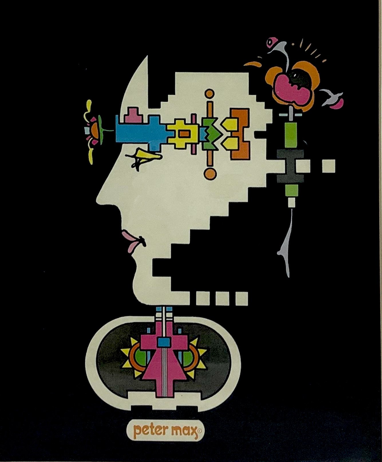
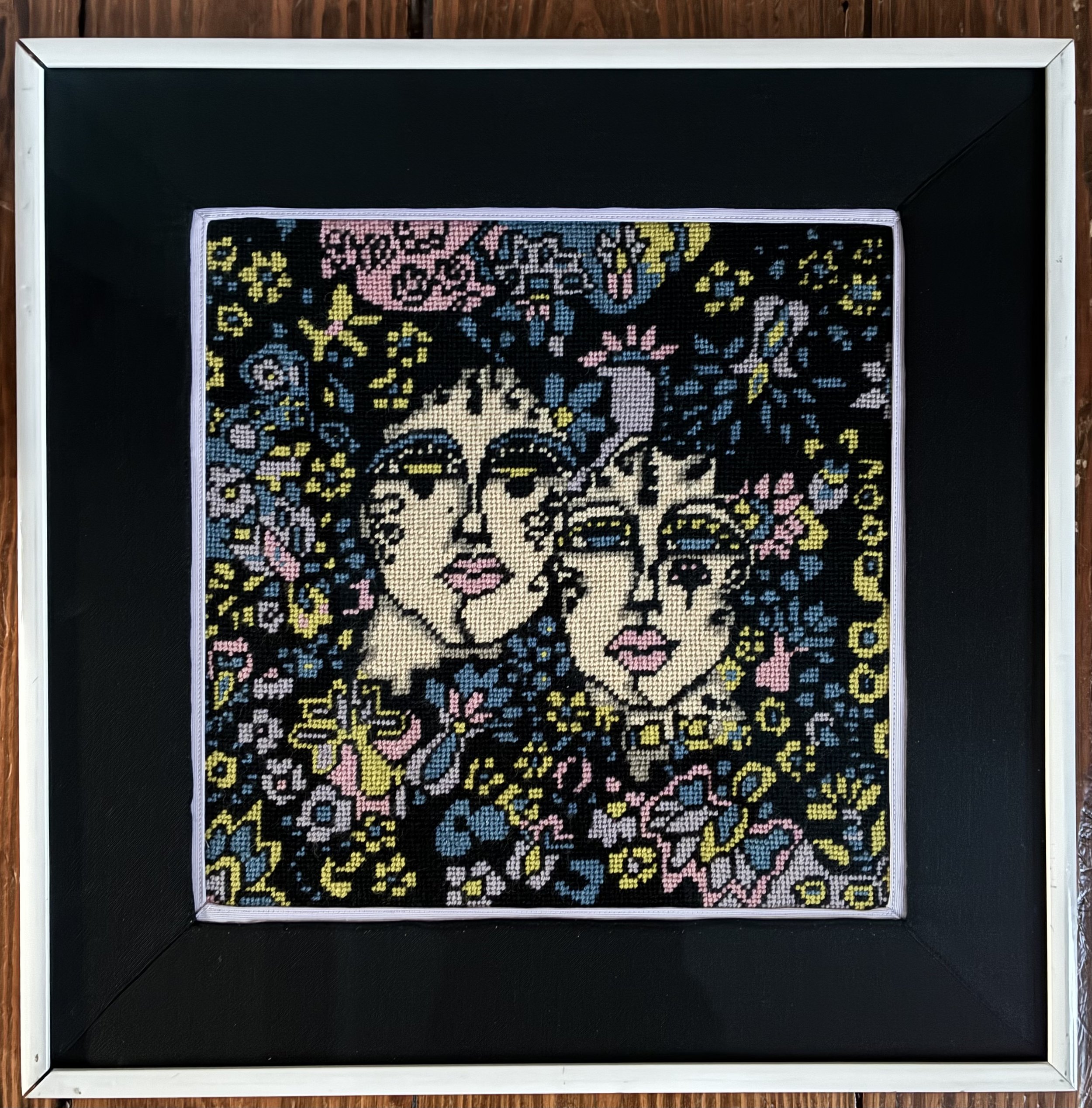
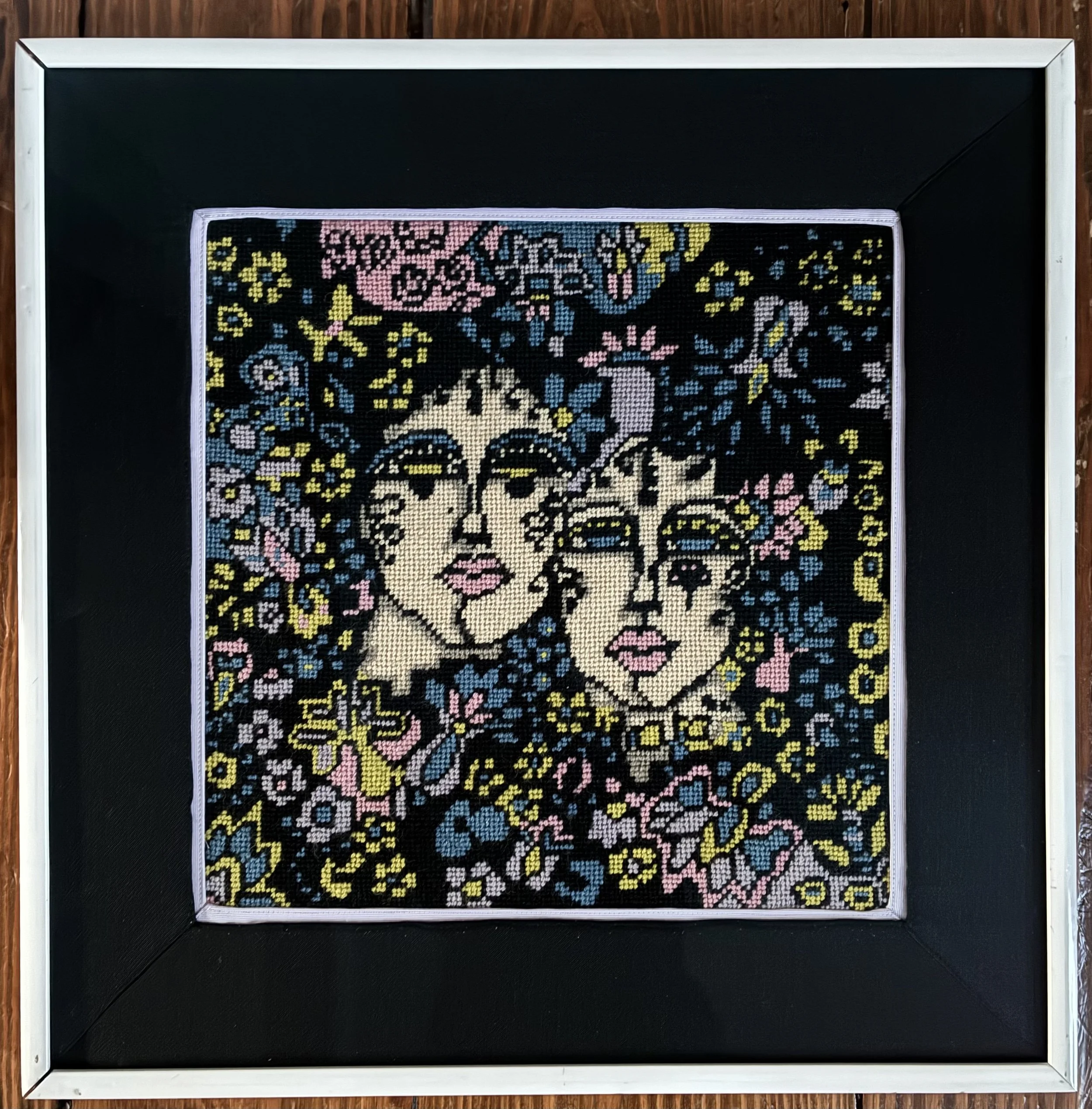
An estate sale listing last fall showed two needlepoint works that I found intriguing, and, while one was unfamiliar to me, I recognized this one as based on the artwork of Peter Max. I dashed to the sale and found them in a basement storage area, framed and remarkably underpriced. The other piece had framing damage (ericas-heirloom-treasures/something-rich-and-strange), but this one was encased in an elaborate gold frame with brown velvet matting. Dear lord – the cost today for such a large frame would be well over $500. I carted them both home, found spots on our walls for them, and began an interesting journey launched with Google’s A.I. Image Search.
Back in September, 2025 my online sleuthing identified this needlepoint as ‘inspired by’ Peter Max’s “The Different Drummer”. Done in 1968, the artwork was an advertisement for a clothing store in New York City by the same name. The Different Drummer, on Lexington Avenue, was frequented by hippies and rock stars, and became a counterculture destination. The store sold posters of the artwork, and many teens had them glowing in black light on their bedroom walls. The poster is a classic example of Max’s “cosmic art”, with its vibrant color palette, space age imagery and groovy, psychedelic (read: drug infused) peace and love vibe.
Which is, of course, a far cry from the origin of the quote “different drummer”. Henry David Thoreau (1817-1862) was an American naturalist, abolitionist and writer, best known for his 1854 memoir Walden, a reflection of living a simple life in the woods in harmony with nature. It is in that work that he writes:
“If a man does not keep pace with his companions, perhaps it is because he hears a different drummer. Let him step to the music which he hears, however measured or far away”.
A counter-culture, high-end clothing store in Manhattan most likely was not what Thoreau had in mind. But his writing introduced the idiom “marching to the beat of a different drummer”, an idea that one should live according to their own principals and not conform to the expectations of society. The wars in Korea and Vietnam, and a distaste for the politics and cultural repressions of the era, spawned a significant youth counter culture, and Max’s vibrant artwork fit the esthetic. I am starting to understand why this artwork appeals to me.
Peter Max Finkelstein was born in Berlin in 1937, and his Jewish family fled to China in 1938, living there for 10 years. The family moved to Israel and Paris before landing in Brooklyn, NY in 1953. Much of Max’s early art was graphic design work (advertising, book covers, album covers, posters) and he became a sensation after creating a poster for the “Be In” hippie gathering in Central Park in 1967. He even appeared on The Tonight Show in 1968, and his Life Magazine cover in 1969 was headed: “Peter Max: Portrait of the artist as a very rich man”.
What fascinates me, however, is that an AI image search today quickly located a different work of art, “Geometric Man,” as the needlepoint’s inspiration. I can hardly blame AI for the miss last Fall as I too had not found “Geometric Man”, but the discovery seems apt. Like many artists, Max often repeated images, and his 1973 “Geometric Man” is a close relative to the man in profile depicted in “Different Drummer”. If one searches for “Geometric Man” without the needlepoint image online, Da Vinci’ Vitruvian Man is what shows up, with nary a reference to Max’s work. Da Vinci posited that mankind, while the center of the universe, is built of geometry. Max’s “Geometric Man” shows a more mechanical aspect of mankind, and the popular television show of the era, Six Million Dollar Man (1973-1978), immediately came to mind. The plot featured a NASA astronaut who is rebuilt by the government with bionics after his spaceship crashed. Max’s Geometric Man runs via gears in lieu of a heart, and his brain is composed of cogs and gear shafts spinning a whirligig sprouting from his forehead. Max does, however, include a budding flower in the man’s brainstem, a positive note we can hope reflects our AI-filled future.
By the 1990s, Peter Max’s commercial wheelings and dealings resulted in financial decline, IRS liens included, and he turned to a partnership with Park West Gallery (still in operation), selling artwork on cruise ship auctions. The business model is a tad shady, but was very lucrative for the gallery and the cruise lines, lawsuits and claims of fraud notwithstanding. There was also significant family dysfunction between Max’s second wife and his two children, with claims of abuse, lawsuits, guardianships and – by some accounts – elder abduction and manipulation. A New York Times article in 2019 tells the sordid tale. Sadly, it is an all too familiar tale of greed, and the turmoil left him widowed when his wife committed suicide. (https://www.nytimes.com/2019/05/28/business/peter-max-dementia-cruise-ship-auctions.html) He remains alive, but the value of his art has been impacted by the mass-produced renditions created during these controversial years.
While I found out a great deal about Peter Max, and his sad story, I remain in the dark about the creator of the needlework canvas, nor why they undertook the huge effort and expense to recreate the work in stitching. Both the works I picked up at that sale were created from visually striking examples of 1970s artwork, one done by an unremembered woman, the other by a man who commercialized his artwork during his lifetime and made -and lost – a significant amount of money. I am left wondering if I like the first AI result sending me to “The Different Drummer” more than I like the “Geometric Man” route. The joy of walking in the woods, of finding -and listening to- your own beat is such a basic human experience. The Geometric Man is much more a harbinger of the computer life we now all live, something 1970s counter culture did not predict. Yet Peter Max, who fled Nazis and found his expression in commercially successful artwork, now lives in isolation from a dreadful disease amid myriad lawsuits between his family members. While AI grinds on in infiltrating our lives, possibly we can cling to the flower in our core, and find our own way through the woods.
Something Rich And Strange
I found this hand-done needlepoint art at an estate sale a few months ago, along with another work, spending $70 for both. The other piece was immediately recognizable as Peter Max’s ‘Geometric Man’ done in needlepoint and set in an elaborate gold frame. This piece was not easily identified, stumping both AI image search and me. I knew it was likely 1970s as well based on the groovy vibe, but I could not find anything remotely similar. The framing was damaged, but it spoke to my 1970s sensibility and I happily carted it home.
Wanting to have it professionally re-framed without spending a fortune, I mulled what to do. The glass was missing and the original matting was water damaged so I needed to disassemble the piece to begin renovations. After prying the piece out of the original white frame, I discovered the (hand painted) canvas was entitled “Mazel Tov” but there was no maker information. ‘Mazel Tov’ is a Yiddish term meaning ‘congratulations’, often used for celebrating happy occasions like births or weddings. Interesting.
Using the damaged matts as templates, I cut new matt forms and then hunted for fabric to use. Eventually I thrifted a pair of wool dress slacks and a purple cotton button-down shirt to utilize. After a bit of trial and error, I cut and ironed pieces to fit, used a spray adhesive to adhere the fabric to the board, and then secured all layers by sewing around them on my sewing machine. Not the easiest project as the darn thing was 21” square and I had to move my sewing table away from the wall to manipulate the boards under the machine. With new matting in hand, I had the work professionally framed, reusing the original 1970s white frame. Plexiglass would cost nearly $160 so I opted for $85 glass instead (I am cheap). It is in my dining room at the moment, the fun colors and charming vibe brightening my mood no matter the stress I am feeling.
While recently visiting a dear friend, I showed her an image of the needlework, and she, being a theater buff, noted it reminded her of the “God Spell” artwork of the 1970s. Using that cue, AI image search immediately landed on a 1970 blacklight poster “Something Rich & Strange” by Patricia Mancuso. Bingo! I could not find a darn thing about the artist Patricia Mancuso, which I do find annoying (Peter Max, mind you, is easily researched). It is odd that even now, having had AI locate the Patricia Mancuso poster, if I search just the needlework it will not find her – indicating yet again that AI might be useful but it is not foolproof.
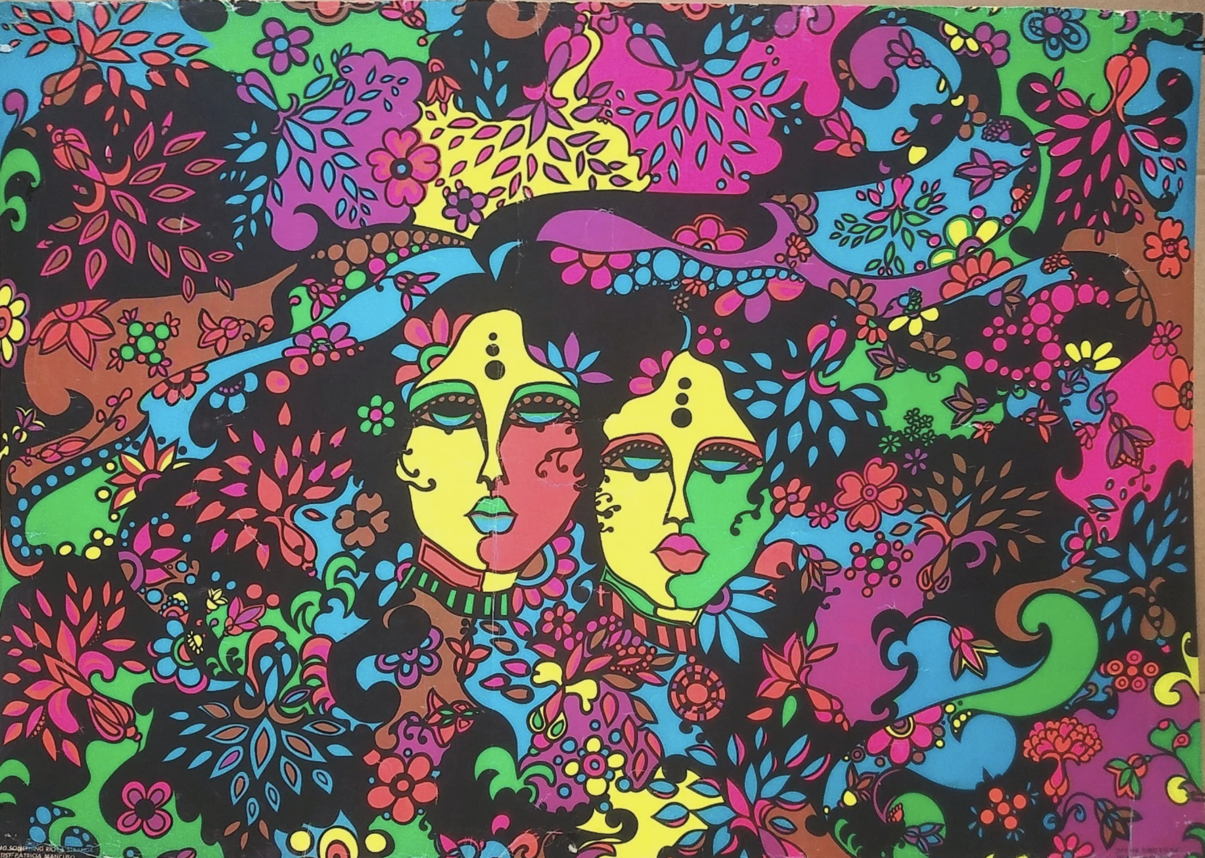
Now, to make things more interesting, the poster’s title references a quote by Shakespeare in The Tempest. It is from Ariel’s “Full Fathom Five” song in Act 1, Scene 2 : "Nothing of him that doth fade / But doth suffer a sea-change / Into something rich and strange.” This speech introduced the term “sea change” in our lexicon, signifying a profound, wonderful transformation. Oddly, the entire premise of Ariel’s speech is to deceive Prince Ferdinand into believing his father has drowned, when, in fact, he is alive. Ariel paints a loving vision of the father transforming into pearls and coral, consoling the deceived Ferdinand who accepts her words as truth hook, line and sinker.
Having been married over 35 years, I recognize that communication truly has the biggest impact on relationships. Being open minded to find out the truth, not just to react emotionally and focus on your own beliefs, lies at the heart of transforming a marriage into a partnership. Moving from vengeance and anger, to attempting to understand and offer reconciliation and forgiveness will make that marriage a transformative partnership. I am left with the distinct feeling that my needlework canvas was a work of art made for a newlywed couple, embarking on their personal journey in marriage. Tempest indeed!

Sweet Serendipity
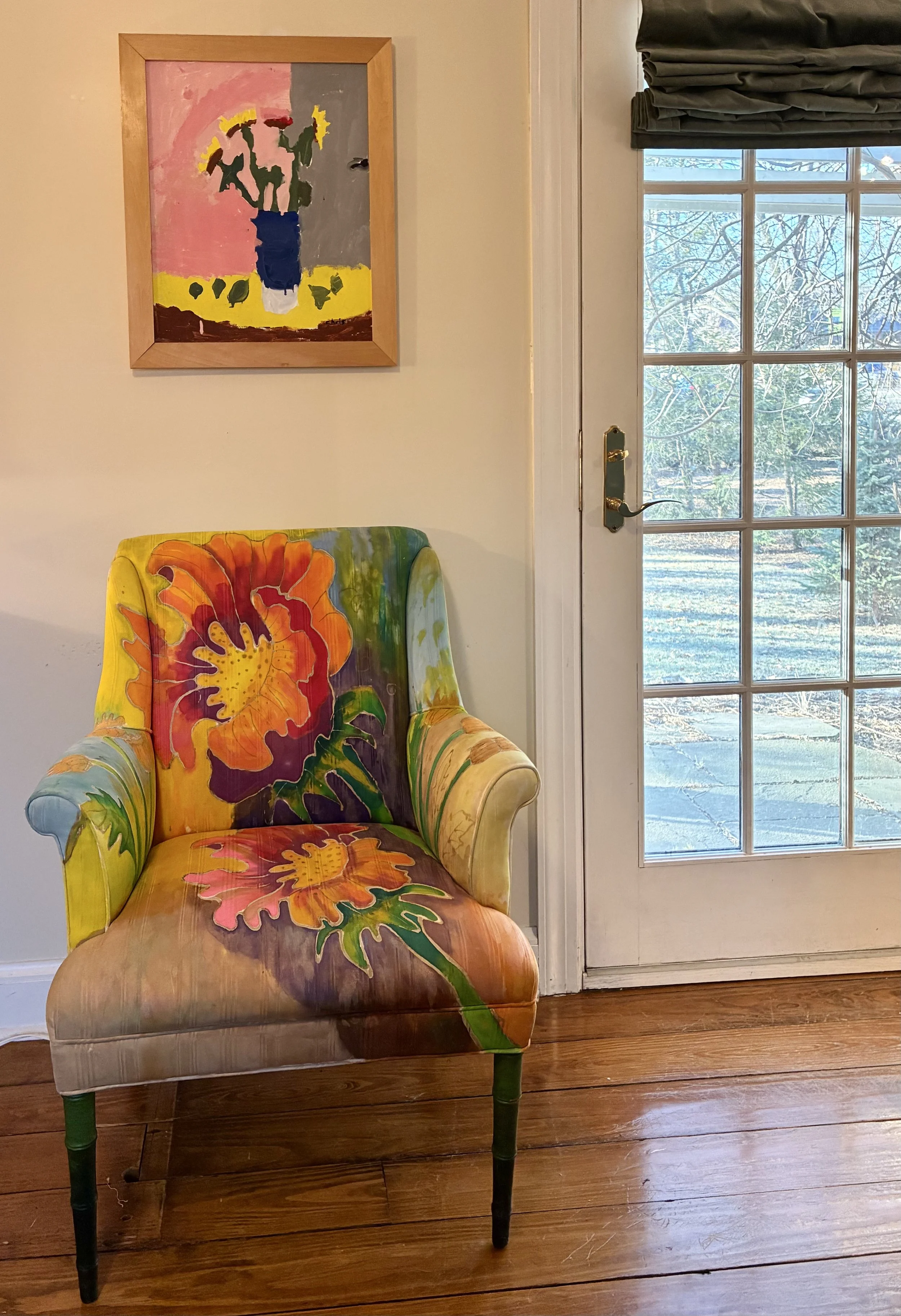
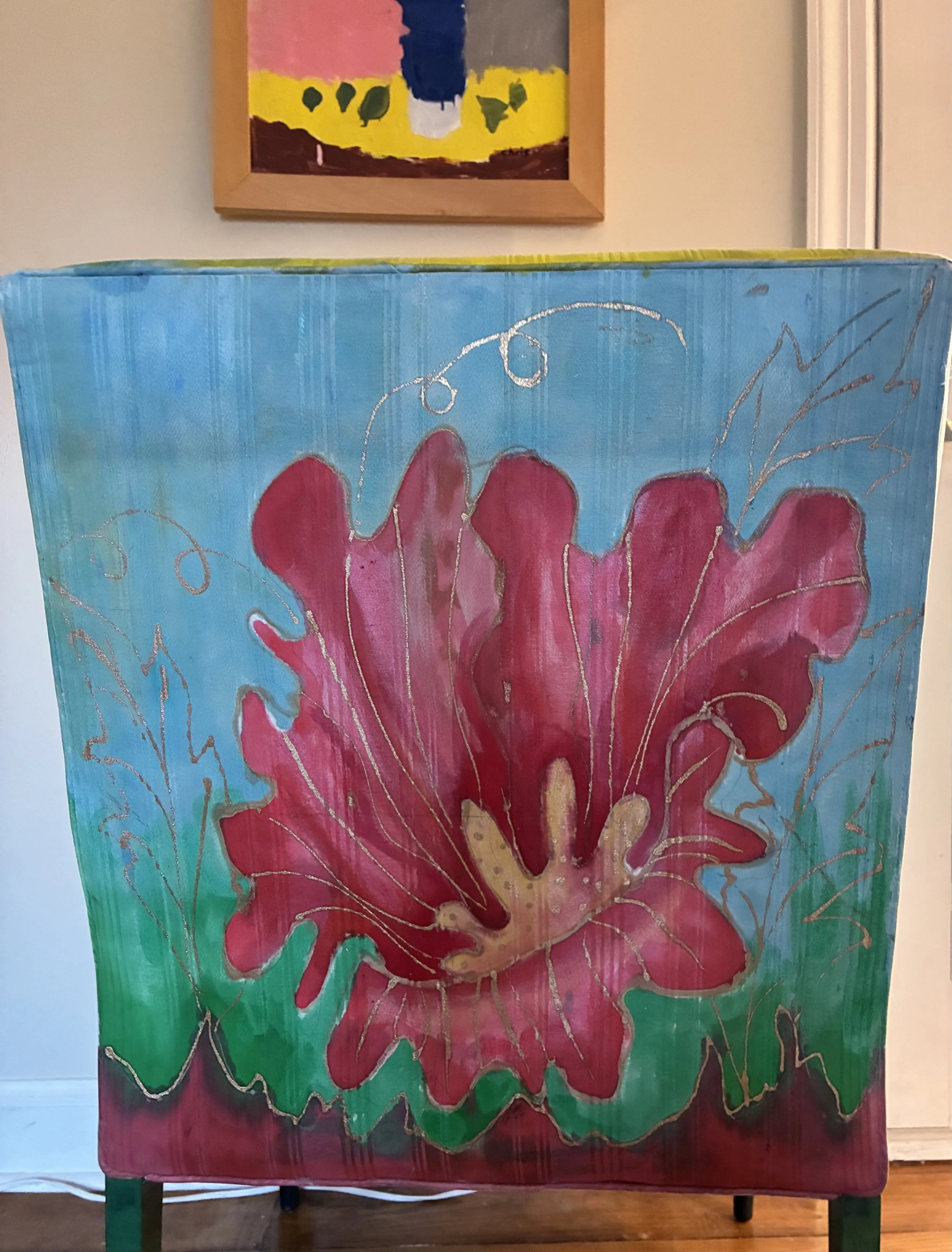
There are times when a piece at an estate sale seems to speak to me. This chair is a case in point. The sale was a distance away in Wisconsin, but the house had a stunning quilt studio and a great deal of art so I had to go. Kay Sorenson, the owner, had been an early pioneer in quilting back in the 1980s, and amusingly, she seemed to never throw anything away. Wandering through the small, crammed house was a bit like walking through a quilter’s time capsule. 1980s quilted clothing? Check. Amish style quilts? Check. Modern art quilts? Check. Fabulous vaulted sewing studio chock full of supplies, yarn, old quilts and treasures? Check.
This chair was sitting forlornly in a family room space, and the price tag was a tad steep for me at $150. The chair tried desperately to convince me to cart it home, sparkling in the sun and showing off its stunning hand painting. I refrained, both due to price and the ever present question of just what the heck I would do with it. I got home, still pining for the piece. Sigh. A dear friend told me she was stopping by the sale on the last day so I asked her to look for it. The sales people said someone was buying it. However, that sale fell through and my friend was told it was now available. She called to ask what I thought, and I told her to give them a lowball offer…which they accepted! She kindly delivered it to me and I brought it inside with no clue where to put it.
The piece is remarkable. The armchair is likely vintage 1940s, well-constructed and covered in a striped silk fabric. Then Kay Sorenson painted the ENTIRE thing – legs a variety of shades of green, and the silk fabric with wonderful sprays of huge flowers, front and back. I am not sure what type of fabric paint she used, but it is soft and very permanent and the chair promptly landed in my bookcase hall, where it has been endlessly admired by my art appreciating friends.
Recently I finished a major ‘overhaul’ of what had been a guest room space connected to my sewing area. When I mentioned I was thinking to remove the large bed, my husband joked I was simply looking for more room for my sewing stuff. Duh. The bed, frame and all, was donated to a women’s shelter, and I began moving things around to open up my small and cramped sewing nook. Years ago I had a small armchair in the space, which got removed when I added a trunk I refinished ( ericas-heirloom-treasures/a-place-for-everything-in-1947). My husband often sat in that chair when visiting with me while I worked in my sewing room and I was inspired to move Kay’s painted chair to the spot where it fit nicely. However, the artwork I had on the wall clashed rather badly with Kay’s painted chair, so I began moving art around. This is not an uncommon occurrence mind you. For those of you familiar with children’s books, it’s a bit of ‘when you give a mouse a cookie” situation.
Tucked in the back of my sewing nook is a painting I have had hanging for many years, a charming still life of a vase of flowers done by my son. When that son was born 33 years ago, he spent a month in ICU due to a severe crisis at birth. Thankfully he survived unscathed, though for 4 or 5 years after, the doctors tracked his development. At one point he underwent multi-day testing at Northwestern University for his school-readiness, determining he was ‘dyslexic’ though that word was out of favor. As both my father and I had struggled with dyslexia (Dad’s was diagnosed, mine was not) it was not clear this was caused by his early birth crisis. However, I will forever be grateful to a doctor who suggested finding him some other art form to help him express himself as words would not be his strength. I enrolled him in guitar lessons until he ended up getting electrocuted (long story but again he managed to survive unscathed). And, at one point during his elementary years, I had him take an art camp at a local art center. Art, and later photography, became a passion for him, and I framed and saved many of his works.
This little painting, done at that art camp, I have treasured. It reminds me that even through difficulties flowers will bloom, and life will work out, which it has for him. When the lovely painted chair moved to my sewing space, I relocated the flower painting and was astonished by how complimentary the two pieces are. The serendipity of the two works meeting makes me smile every time I enter my (new) open sewing space.
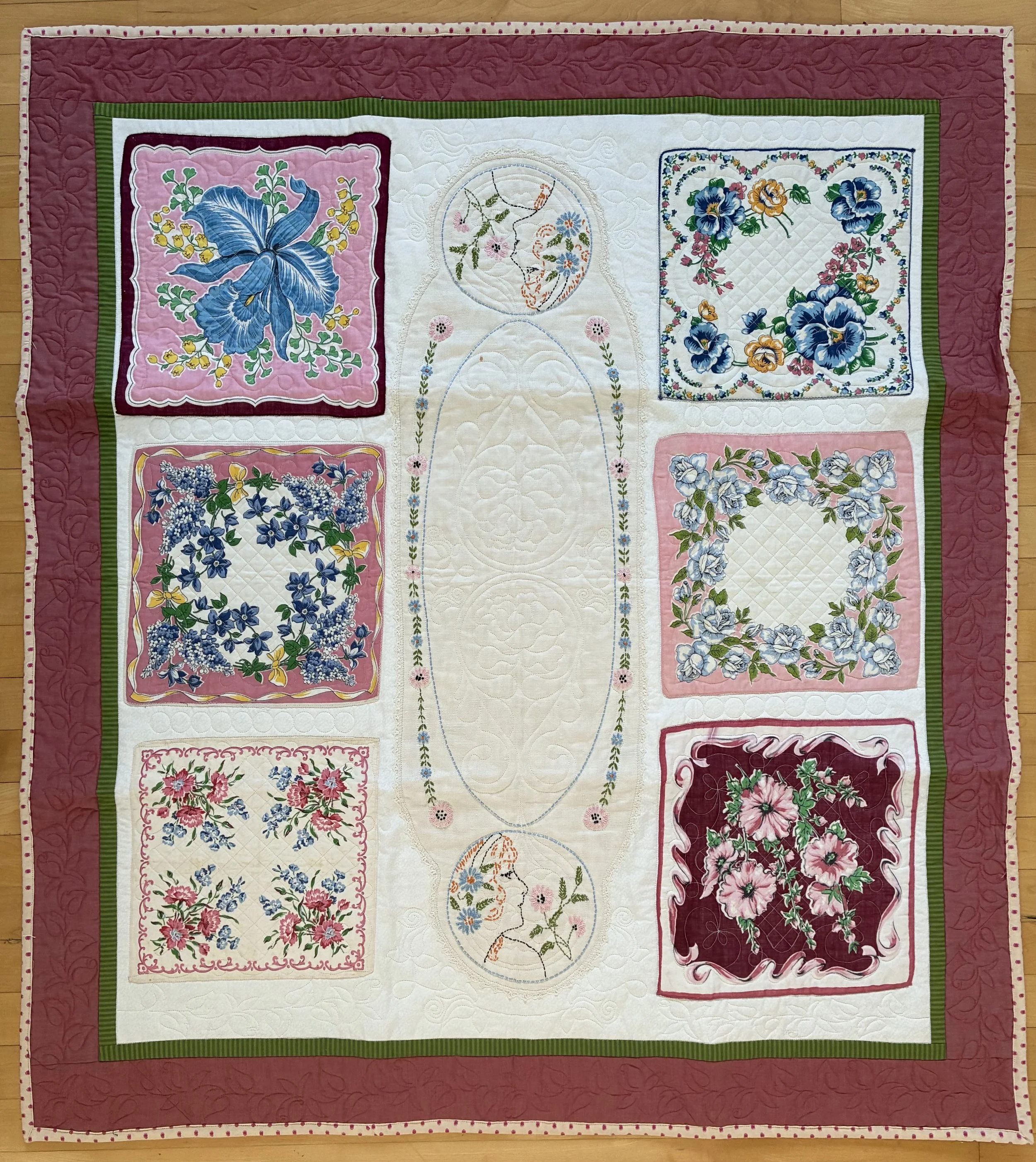
Hankie-Panky

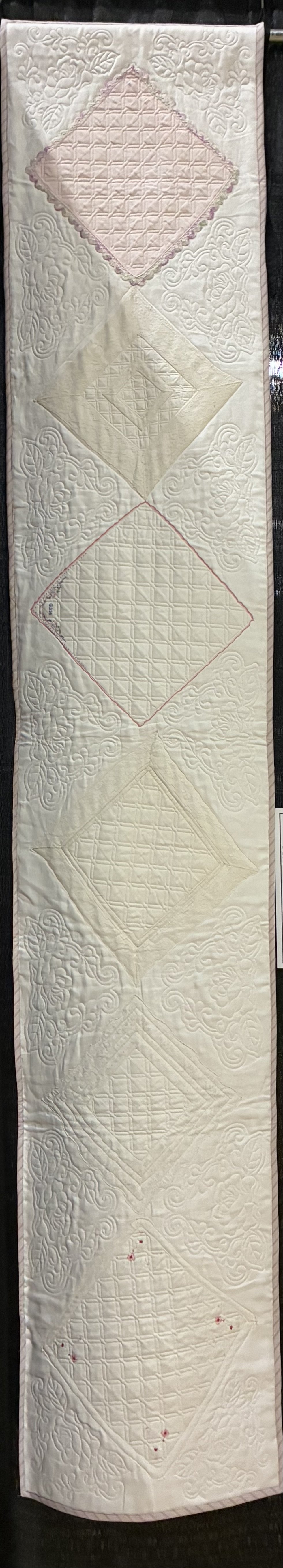
Awhile back I was asked to give a talk about my vintage finds and quilting projects. It morphed into a show and tell of the wonderful treasures I have found thrifting, and how I use them in quilt and sewing projects. I have a quilted table runner made from family heirloom antique hankies but it wasn’t available for my talk. As I wanted to discuss what you can do with all those vintage family treasures you have ferreted away in drawers, I needed an example to share. This quilt was my solution. I dug through the piles of vintage linens and hankies I have collected, thrifted a man’s dress shirt for the rose border fabric, and had a professional quilter finish it for me.
Handkerchiefs were a ubiquitous item used by people of all walks of life for centuries, but it was Marie Antoinette that prompted the modern square shape we all recognize. Archeologists have discovered the use of cloth hankies as early as 1000 BC, and by ancient Roman their use was common, both for personal hygiene as well as for signals in public games. During the Middle Ages, knights would vie for a lady’s handkerchief to tie to their armor. But leave it to Marie Antoinette to complain to her husband, King Louis XVI of France that the ridiculous sizes and shapes of the courtiers handkerchiefs were distracting and unseemly, creating a visual she found annoying. Thus King Louis issued a law in June, 1785 that no handkerchief could be larger than his, and that the length must equal the width (i.e. be a square). The term itself, for those etymological fans out there, is actually French, deriving from ‘couvrir’ (to cover) and ‘chef’ (head) as the cloth was used for wiping the face or nose. Added to the English word “hand” and there you have it.
Back in December of 2023, my first official quilt ‘client’ was a local woman who had a collection of her grandmother’s hankies. She wanted a long table runner made with them as a Christmas gift for her parents. I liked the idea so much I used heirloom handkerchiefs passed down from my father’s relatives and made a similar table runner. I used a vintage linen tablecloth as the background, and a dear friend offered to quilt it. She did a lovely job, highlighting each hankie with detailed quilting in white thread so all you see are the lovely designs amid the heirloom hankies. My table runner is long and narrow to suit a farm table in our dining room, but honestly given it is a white linen I have been hesitant to use it. Guests may have to sign a blood oath they won’t spill on it: no hankie-panky around my treasure please.
client’s hankie table runner

Girl Math
A recent estate sale listing included two pieces of art by my favorite Chicago artist, Marcella Lewin (1918-2004). I wrote about two pieces of hers I thrifted a few years ago, which cost me cumulative $45 dollars (https://www.ericasheirloomquilts.com/ericas-heirloom-treasures/treasures-by-marcella). I made a mad dash to the sale, and, sadly, the works were not as cheap. But “girl math”!
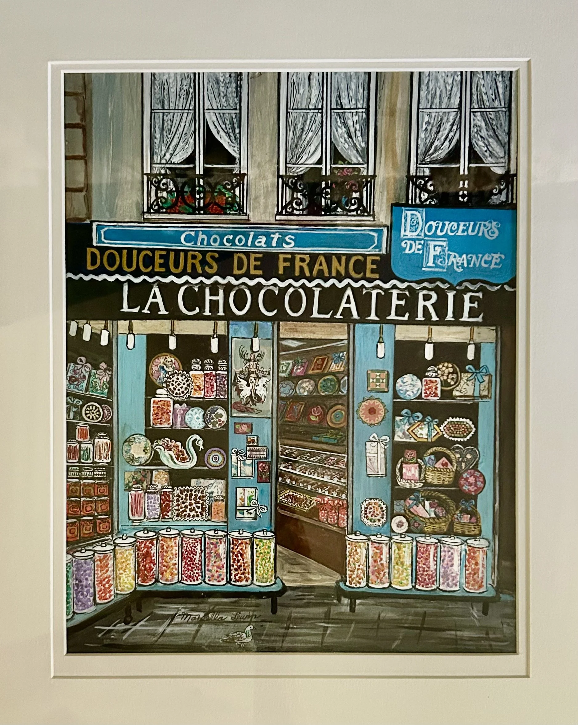
This piece was one I could not pass up. It is a hand drawn image, beautifully framed, done in lovely shades of blue and brown, a spot-on compliment for my blue and brown kitchen. AND it is about chocolate. AND Paris. The details of all the candy jars is incredible, and I simply held my breath as I turned over the tag, knowing full well I would have spent a fairly significant sum for the piece. Phew – it was only $125 and I snatched it off the wall faster than I could blink.
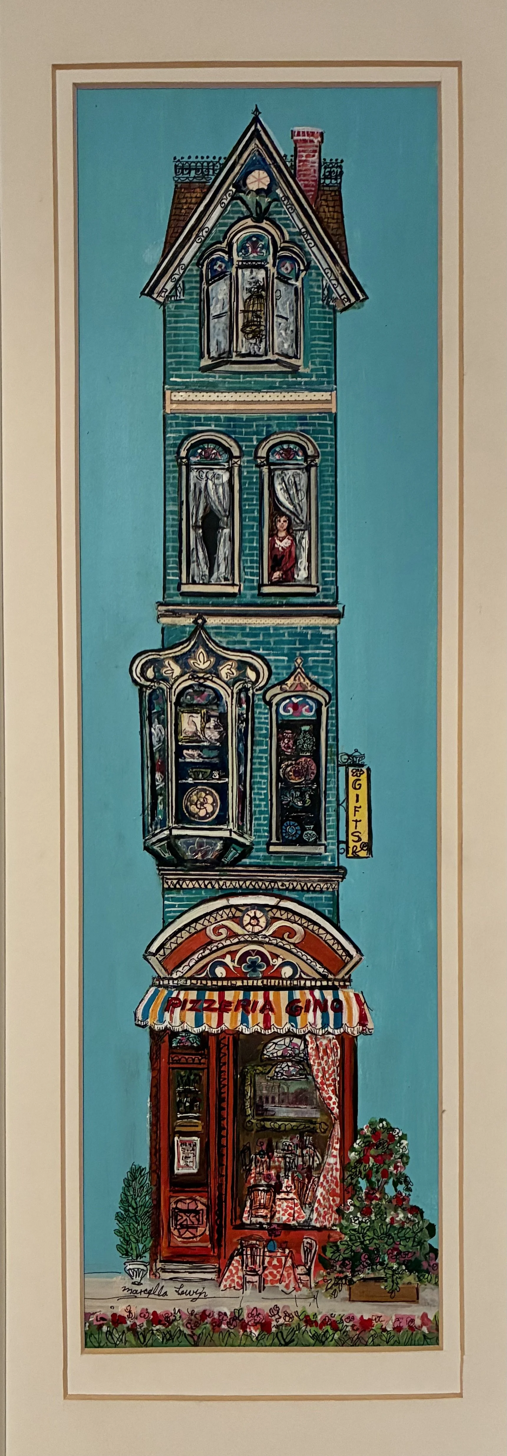
The second work by Marcella Lewin was done in a tall, skinny format, portraying an aqua blue Victorian house with a red ‘Pizzeria Gino’ on the ground floor. Also hand drawn and painted, and beautifully framed. The details are charming, with a bed of pink flowers, a bird cage and a woman in upstairs windows, and elaborate architecture details gussying up the building. While I thought it charming, I couldn’t justify the $100 price tag. I pined for it, didn’t actually need it, and decided buying the French Chocolate shop for $125 was enough for one day.
Needless to say, at the end of the weekend, I went back to the sale. The piece was still there, now half price, and I happily carted it home for $50. Having spent $175 on two pieces I most certainly didn’t ‘need’, I felt impelled to justify the expense to myself. I now own 4 works by Marcella Lewin, the two thrifted ones and the two more pricey (by my standards) estate sale finds. However, when averaged out they are $55 apiece. I don’t know about you, but having art professionally matted and framed is remarkably expensive these days – I recently paid $85 to have an already matted and framed vintage work finished with a piece of glass. Having any of the Lewin pieces reframed would likely set me back over $200 apiece.
It seems my concept of justification is a viral trend these days called ‘girl math’. The modern spin started on Tik Tok a few years back, and women add posts about using flawed logic to justify or rationalize the cost of purchases to feel better about their spending. One example is to divide an item’s cost by usage frequency, though in my case it is more a law of averages skewed slightly. From Wikipedia: cost-per-use “evaluates high upfront costs by dividing the price by the expected number of times it will be used, emphasizing an item's long-term value. For example, if a sweater costs $100, a consumer may view the purchase as reasonable by considering how often they expect to wear it, effectively lowering the assessed cost-per-use. This approach relies on the ‘framing effect’, enabling individuals to justify big-ticket or luxury items by altering their perception of the purchase.” (https://en.wikipedia.org/wiki/Girl_math)
And of course the modern internet promptly coughs up all the doomsday and stereotype critiques as well. It seems financial experts are very worried about consumers justifying irresponsible spending, worrying about long-term saving plans, and the potential result in psychological distress as a result of financial uncertainty. I for one feel my psychological distress would have been worse for missing one of these treasures, now all hung on walls in my kitchen. Take that framing effect!
The Year of The Horse
When I learned this is the year of the horse in the Chinese zodiac, I laughed. As far as I’m concerned, with a daughter who has loved horses since she was 5, every year is a year of a horse. I am not one to ‘follow’ the zodiac, but I do enjoy the ‘not actually serious, but often spot on’ nature of the varying zodiac calendars. Being an Aries, I seem to be: courageous, confident, determined, enthusiastic, honest, passionate, creative. But also: impatient, moody, short-tempered, impulsive. Yup. So what does the Chinese year of the ‘fire horse’ mean?
Each Chinese Zodiac year has a corresponding element (wood, fire, earth, metal, water) within the 12 year cycle. The five elements are set in a specific order, as one creates or controls the next. For example; wood makes fire burn, fire creates earth, earth bears metal, metal runs water and water makes wood grow. To learn more about your specific birth year, here is a great website: https://www.bendigojosshouse.com/zodiac-calendar/. It seems I am a Water Rabbit: Trustworthy, empathic, modest, diplomatic, sincere, sociable, caretaker, sensitive. The ‘water’ adds: Sympathetic, perfectionist, coordinator. I am unclear as yet whether I like being a ram or a rabbit, and if someone had asked, I don’t think I would have picked ‘water’ out of a lineup of possible elements for me. And I suspect there are those of you who might debate that ‘diplomatic’ moniker. But anyway, back to horses…
February 17, 2026 begins the Year of the Fire Horse —‘fire’ being the element, and ‘horse’ the Zodiac sign. The last fire horse year was 60 years ago. Per the sign, this year we will experience rapid change, fresh opportunities, personal growth, and a faster pace of life. I for one could do without the faster pace of life, but personal growth is always a good idea. The wood snake year (ending 2/16/2026) provided a time of reflection, shedding old stories and habits and honoring your intelligence. Now, with the Fire Horse, that clarity needs decisive action. “Horse energy promotes movement, circulation, motivation and mental clarity, all of which benefit overall health…That said, this constant movement is about consistency—not flat-out speed that then requires long periods of recovery. A Horse year is not about running the fastest but running the longest. The Horse is not afraid of slowness, it’s afraid of stillness” (https://www.vogue.com/article/year-of-the-fire-horse-2026). I cannot help but think of my daughter, and her competitive years riding horses.
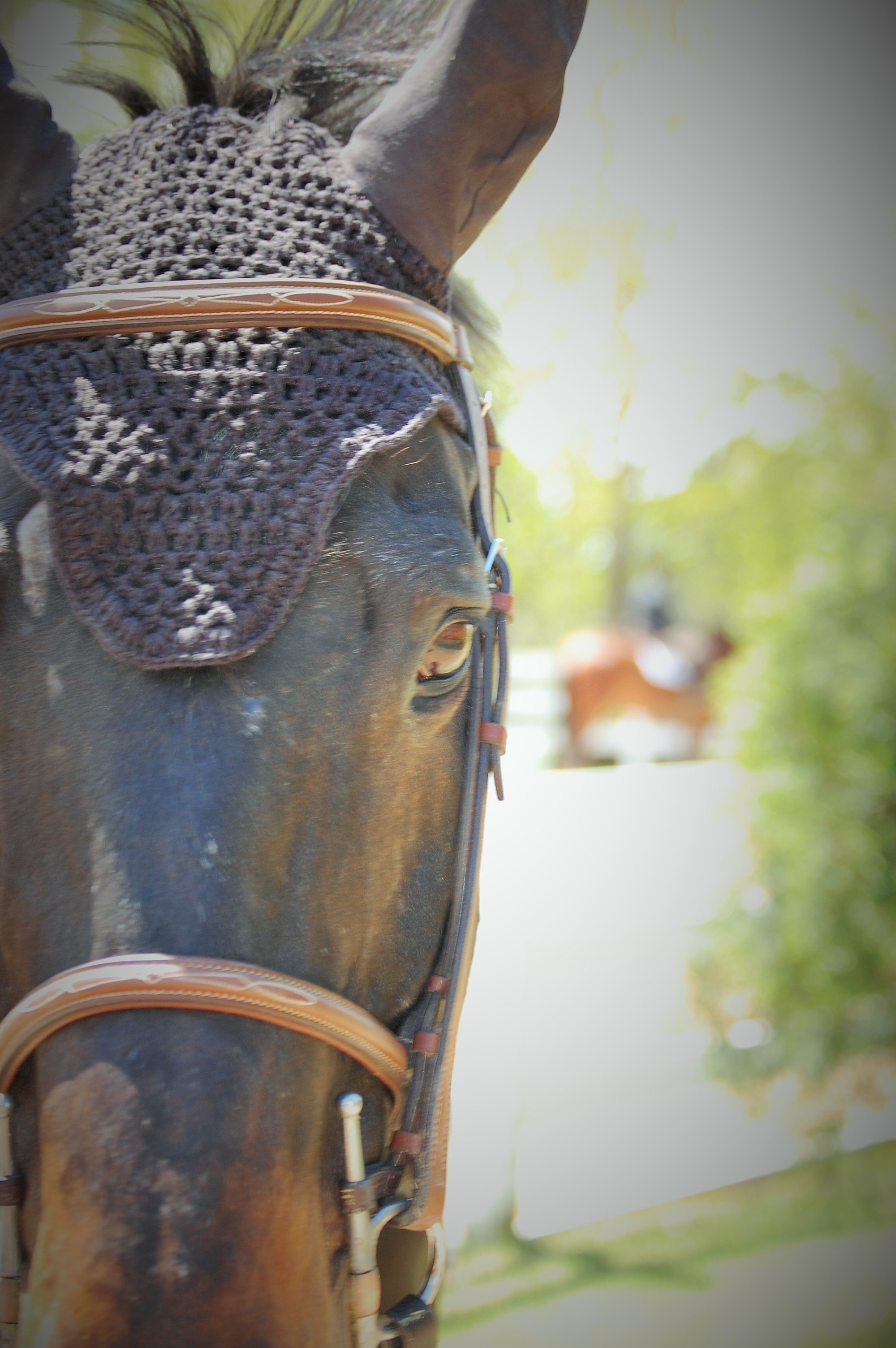
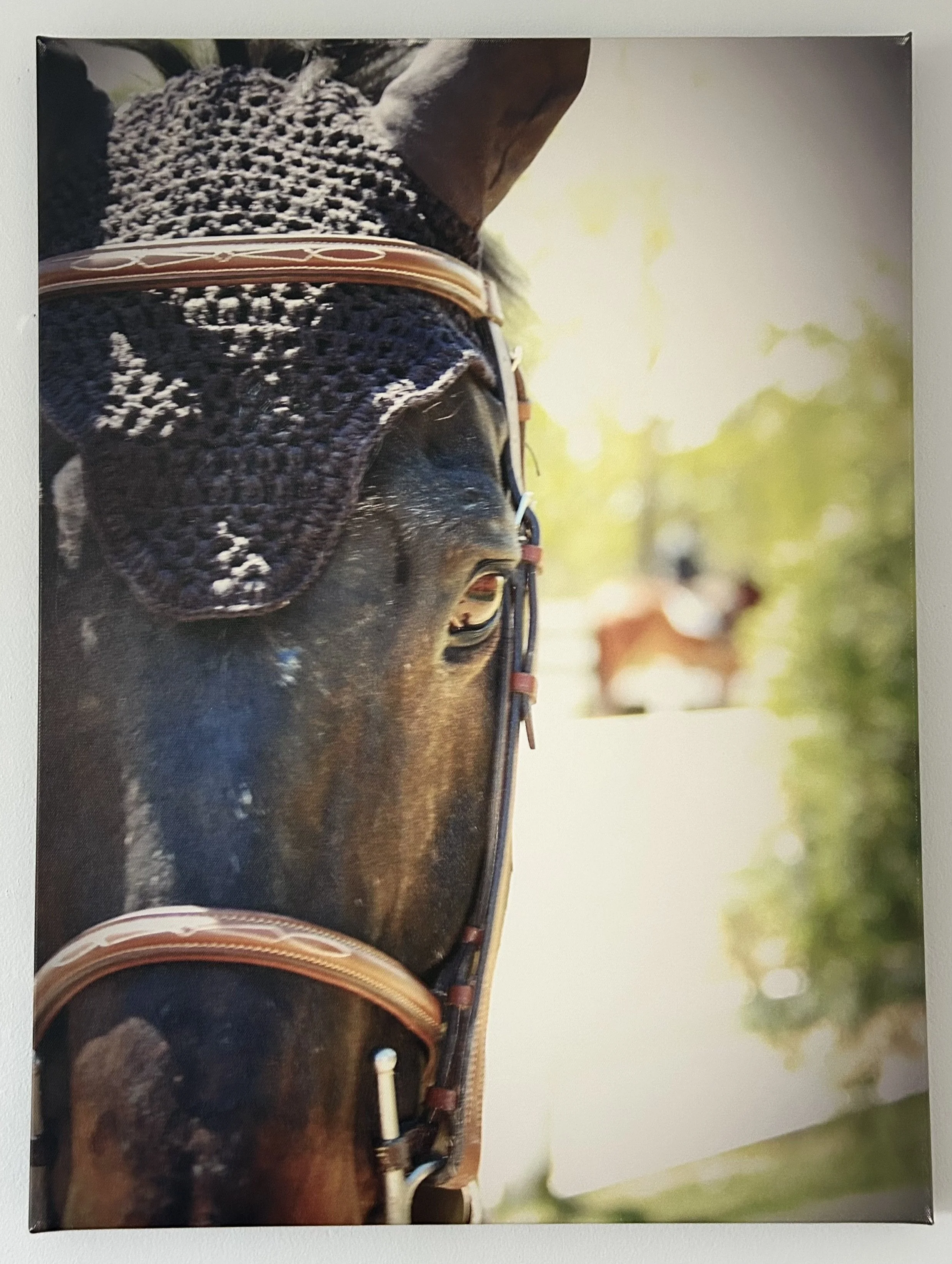
I took this photograph of a horse named Cezar with a traditional 35mm camera, back in 2017. My daughter leased Cezar for a year of riding competitions (translation: her parents paid for the leasing, boarding, training, show fees, and travel). Cezar was a retired race horse, retrained for show jumping competitions. He was in his late teens when my daughter leased him, and had numerous issues, including a lack of teeth and bad knees. But he was a goofy animal with a big heart and my daughter loved him. While the process was not inexpensive, the joy this animal brought her made it worthwhile. And who cannot love a horse who’s favorite snack is Fruit Loops cereal? This photo was taken while she was competing at a Hunter/Jumper show at Ledges in Roscoe, Illinois. While I attended most of her competitions, I confess I did so with significant anxiety each time she entered the ring.
Her love of speed, daring competitive nature, and joy of the horse meant I often had to close my eyes as she zipped around a ring. Half the time I was amazed she kept track of the route to race through – pivoting this way and that, jumping certain “standards” in specific orders and doing so going as fast as possible on an animal weighing roughly 1200 pounds. And, after winning overall for her class that year in Illinois, she started at college and Cezar returned to his owner. But her love of horses has remained steadfast, finding barns to do casual riding, befriending wonderful young women with similar caring natures, and trying to help horses needing rescuing. It is a challenging industry, often filled with folks trying to use the horses they own to make a living, instead of caring for the horses they way those animals may need. But I suspect every year will be a year of a horse for her, and thus for me.

Sprucing Up
My husband says I have no shame as I surreptitiously snip buttons off clothing while thrifting at the ‘Bins’. I even have a tiny pair of (pink) scissors in my bag for such behavior. The truth is much of the clothing at the Bins is damaged, often already missing a button, stained, or torn. But if I am to be perfectly honest, not always. A friend also finds buttons for me and recently found an astonishing set of 1980s pewter penguin buttons. I wish she’d taken a photo of the top that wore those! Some fellow thrifters have commented that knowing how to sew, I can pick up cool items with torn seams, frayed hems or buttons missing, knowing I can mend them for resale. I marvel at how few people can sew on a button or darn a hole. That said, I confess that this old granny did learn a new trick recently.
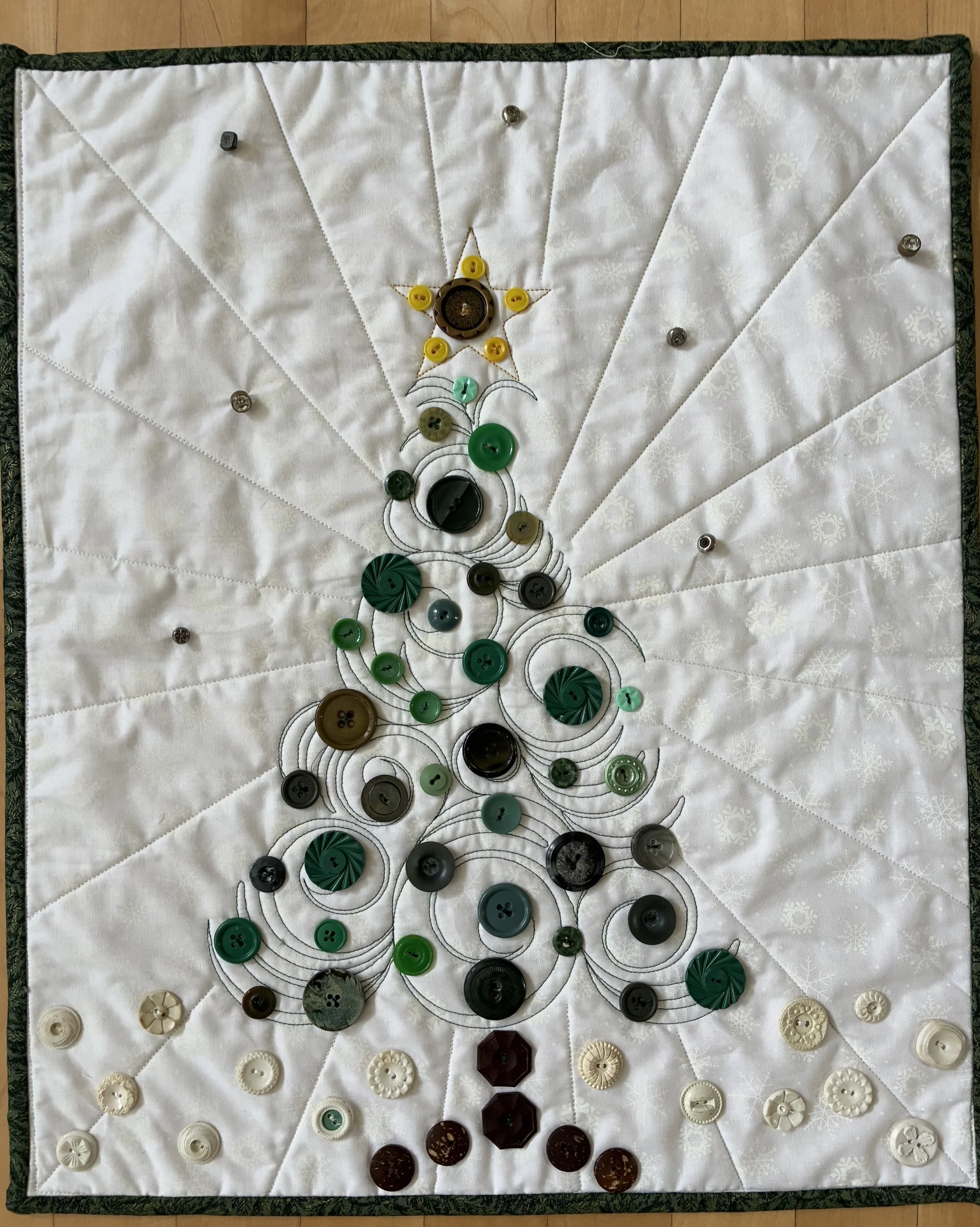
Last year my local quilt guild held a quilt show, and I was helping with the ‘Silent Auction’ fundraiser. Guild members make small quilted items for show attendees to bid on, and the auction is a great money maker. One member donated a few ‘sample quilting’ projects, and this small holiday tree was one. However, the piece needed a bit of sprucing up as it was only the quilted image on the white background. I decided to add buttons to the tree.
I have a large collection of buttons, sorted by color. I pulled out the green/blue bin and ferreted through them. Oddly, green buttons are one of the harder colors to find, and while I always keep an eye out for green clothing with buttons, my green collection is paltry. I managed a decent layout, stopped for the evening and turned out the lights. A bit later, I wandered into my sewing room to put something away, and, with no immediate lights on, glanced at the ‘buttoned’ tree. It is a very different design experience to look at things as shapes not color, and I rearranged all the buttons to ‘feel’ a bit more balanced without the lights on.
I shared a photo of the ‘work in process’ with my fellow quilter, moaning about all the buttons I had to sew on, by hand. She replied that I could sew the buttons on by machine. Say what?! I called her immediately. Hot damn was that a revelation! I have hand-sewn buttons, taught my children, and their scout troops, the same. Needle, thread, thimble, in and out, wrapping stitches, knotting underneath. It amused me to realize that, duh, machine manufactured clothing most certainly had machine sewn buttons, and I was a tad late to the game.
But now I had free reign to bling the heck out of the tree! Sewing buttons on by machine is a highly addictive process. I dug through my yellow buttons to build the star, the white to create snow and the brown bin to grow a tree trunk. The final touch was to add twinkly stars and so I pulled out my ‘metal buttons’ bin. There are some amazing ones, including my fabulous pewter penguins, but metal buttons tend to be ‘shank’ style. For the button-uneducated, there are 4 types of buttons: flat hole (think button down shirt), stud or riveted (think jeans), toggles (think pea coat ala Paddington Bear) and shank buttons. Sewing buttons on by sewing machine is easiest with a ‘flat’ style so the needle can go in and out the varying holes. Shanks come in myriad designs, but all have a finished face surface and a ‘shank’ loop on the back side for sewing. While these can be sewn by machine, it is finicky and I have not as yet mastered that skill.
While my passion is quilting, belonging to a like-minded group is a wonderful way to grow in whatever creative endeavor you enjoy. Village Quilters, a guild I have belonged to since 1992, offers me fellowship, friendship, and inspiration. My friend’s donated quilt became a fun project for me, our guild raised funds from its sale, and I learned a new trick. Who says you can’t teach an old dog new tricks? At least this dog is happily sewing buttons on thrifted treasures by machine!
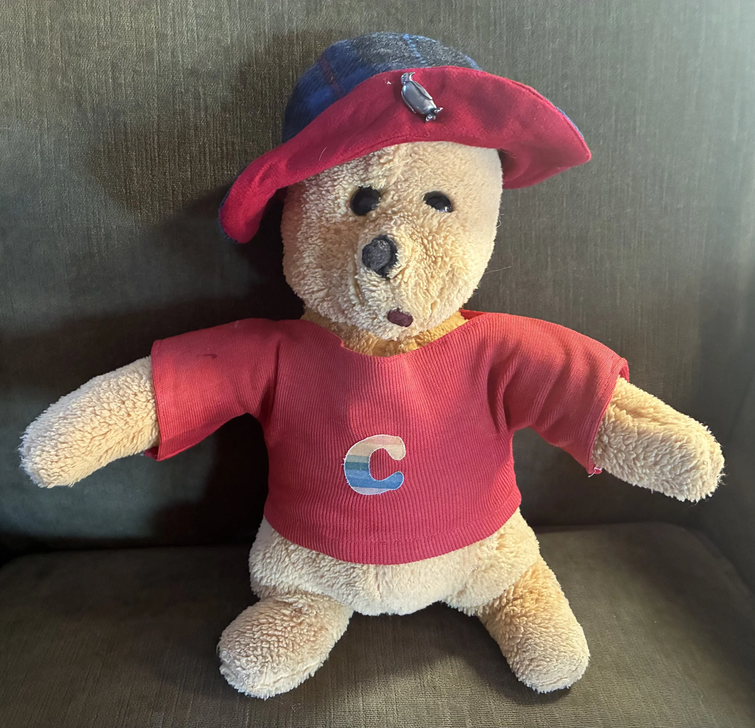
Winnie Goes To College

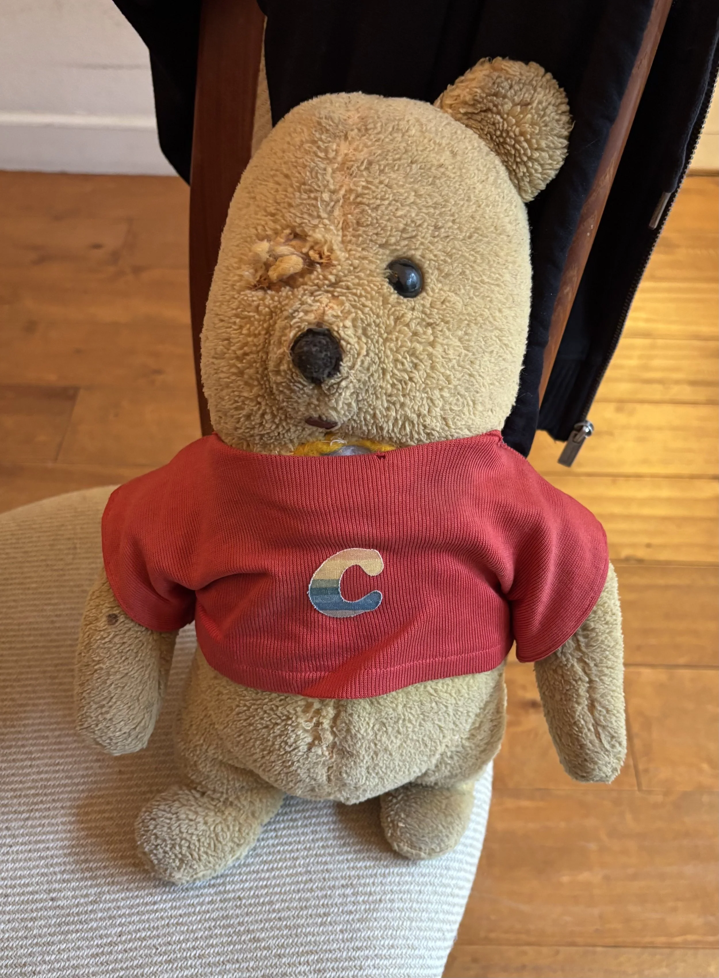
A dear friend recently asked if she could send me her childhood lovie for repair. I remembered the bear, a 1960s Winnie the Pooh, because my friend had it with her at college. Of course I said I would fix it up, but when Winnie arrived, I was rather horrified. Winnie had not aged quite as well as we had in the ensuing years, having lost an eye and an ear, suffered some gaping holes and acquired a great deal of filth. To say nothing of the peculiar crunchy nature of the bear’s stuffing which was truly disturbing.
I met my friend back in 1982, when we both started at Vassar College, living in the same ancient dorm building. My friend had a single while I had a roommate, so we often ended up in her dorm room. Winnie was ensconced on her bed, and spent many nights being loved and tormented by our college friends. One friend took great glee in throwing Winnie high in the air – not a clue why, but I do recall repairing that friend’s Snoopy lovie, which had sprouted a hole in his neck. His air-tossing days were well behind him, so possibly Winnie became a substitute for her fun.
Winnie retired to California in my friend’s parents’ home many years ago. When the bear was discovered recently, packed away in a long forgotten box, my dear friend needed the comfort only Winnie could offer. Her parents are blessed with 3 daughters who tirelessly care for them in their home with additional hired care givers. But, as all of us will, my friend’s aging parents are struggling through the distressing process of dying. Some days are filled with smiles and others with tears. Given the shape Winnie was in, a sane person might simply have pitched the darn bear. But my friend turned to me for help.
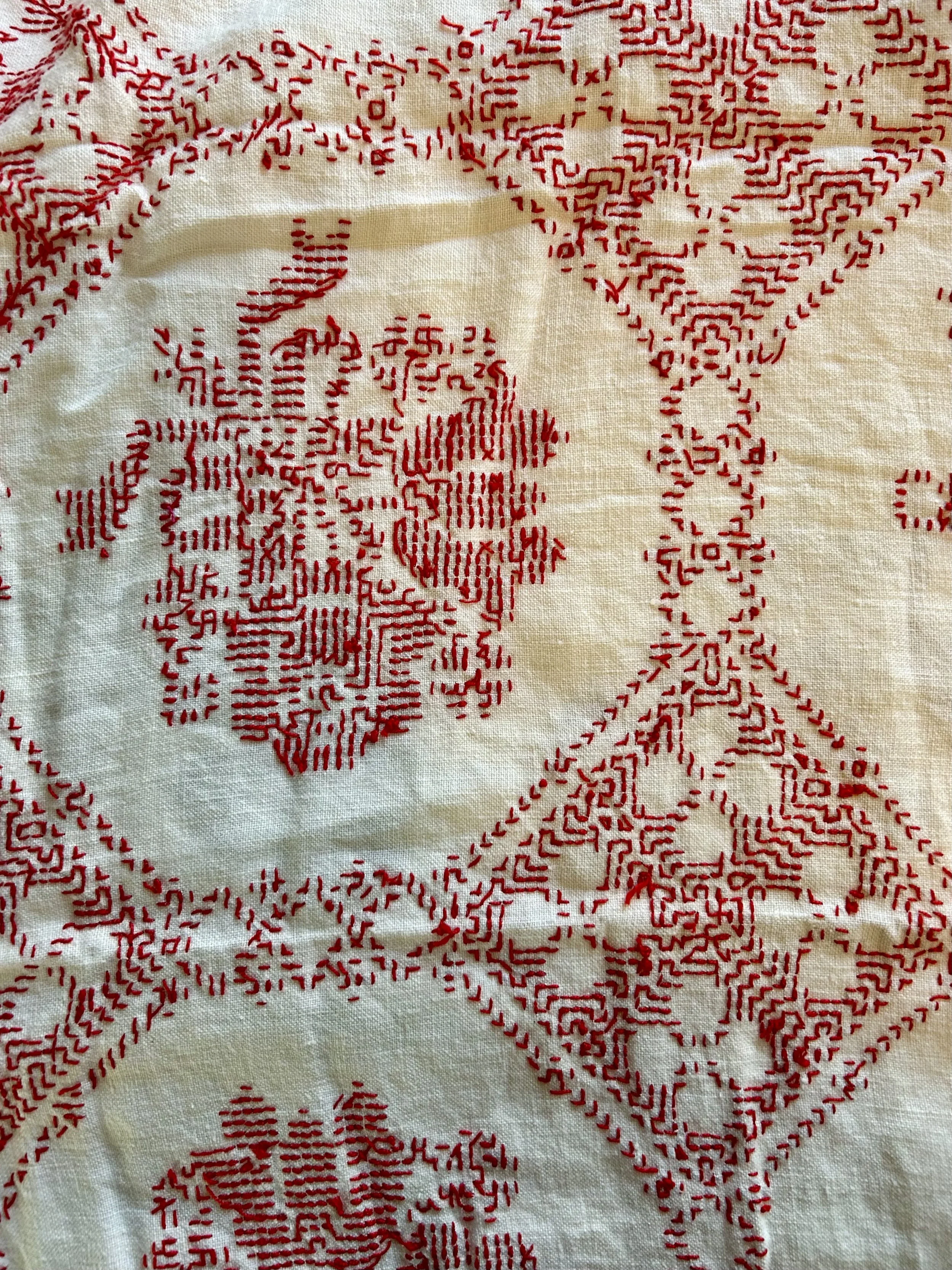
For reasons I cannot fathom, the original stuffing for the bear had turned into a crunchy mess. I will share a photo as the stuff was disgusting. My husband questioned if it might be toxic, and I blithely dismissed the idea. Ooops. According to an AI reply to the question, it turns out: “many bears from the 1960s and 1970s were stuffed with polyurethane foam or chopped rubber sponges. As this material ages, it can degrade into a fine, sand-like dust that may contain carcinogenic substances and is an irritant to the respiratory system if inhaled. In a fire, this material is highly toxic and can give off lethal fumes.” Well, that ship has sailed so I will let my friend know she’s on the hook if my medical bills mount! I did promptly get out the vacuum and wipe my sewing tables down with a damp cloth.
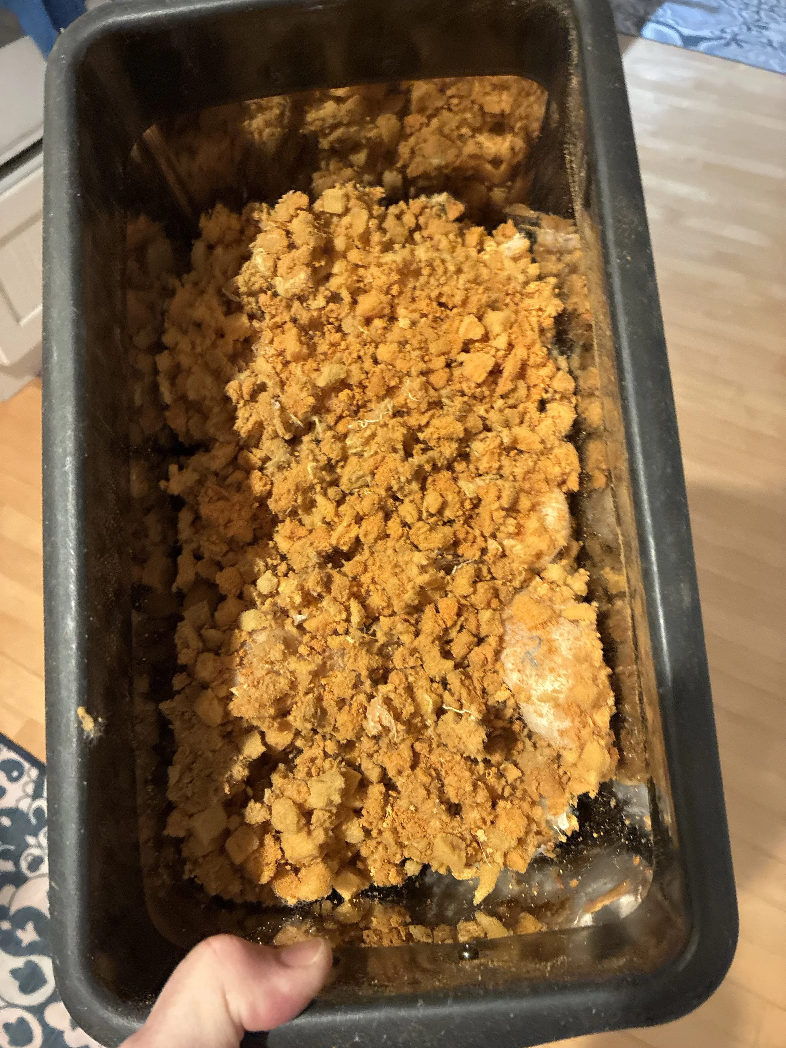
Winnie then went for a deep spa treatment. In the kitchen sink with dish soap. The bear was so filthy, my husband was startled the next day -he thought it was a brown bear not an orange one. With the stuffing all gone and the bear open, I removed a prior patch on the neck and chest area, opened up the back seam, and began sewing the varying holes and damaged areas via the sewing machine (nose, face, arms, tummy). I sewed around the eye hole by hand, pulling the thread tight to snug-up the gaping hole.
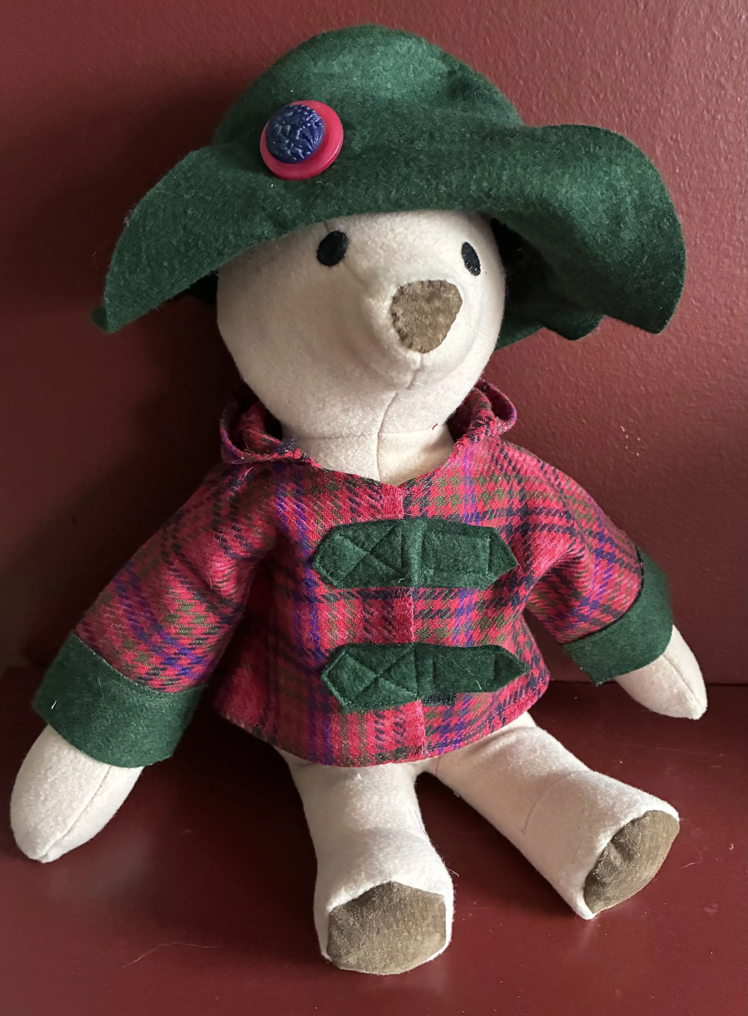
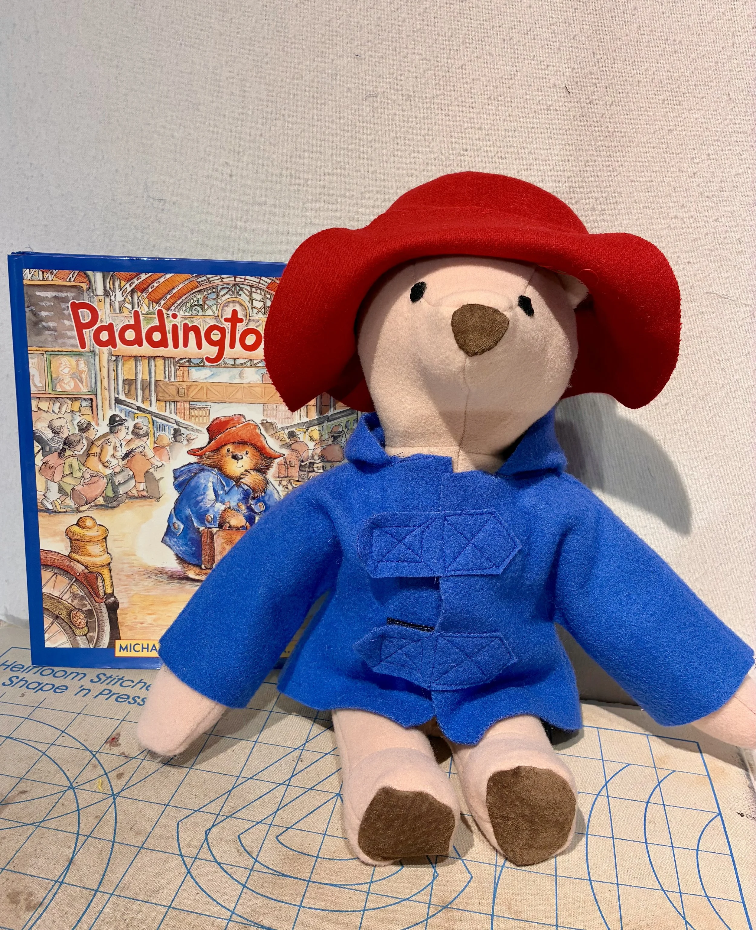
Needing stuffing for his transformation, I went to the local thrift shop – no Joann’s Fabric Store sadly, and I am on strike from ordering off Amazon. After squeezing a variety of pillows, I bought one I liked, brought it home, opened it up and re-stuffed Winnie. I sealed the bear up and hunted for a black button to resemble the original eye, which is a rivet not a button. I wasn’t thrilled with the results – the bear looked like it was on Ozempic, and the eye protruded too much. I opened the bear back up, pulled out a long doll sewing needle, and yanked the button-eye deeper into the stuffing. Then I added significantly more stuffing to fill the bear out a tad better. When I shared the results with my friend, she joked that Winnie needed an ear transplant. I would not likely be able to match the fabric used for the original bear, but inspiration struck when I realized I could create a hat using my Paddington Bear pattern!
I borrowed Miss E. Paddington’s hat and tried it on Winnie. Sadly it was too small. I then dug out the pattern pieces for the larger size Paddington (18” versus the 13” one I had made) and realized that hat would be too large. Now we’re in Goldilocks territory, needing one in between to be just right. Using the two patterns, laying a piece of tracing paper over and hand drafting a pattern created the size I needed. I chose a (thrifted) blue wool, cut and sewed the hat, plopped it on Winnie and realized it was too floppy. Cut out another in a contrasting red wool (also thrifted – you get the idea), sewed them together and decided the hat needed a bit of bling. Penguin button to the rescue!
Now, there are many of you out there who probably have no idea why my dear college friend and I have always toasted to penguins. I will set the scene. A gaggle of us college girls sit in our sweats in a dorm room, a 1900s building with wood floors, radiators and old pine furniture. In all likelihood we are eating popcorn. Our 1982 music (Thriller) is blaring while we play Trivial Pursuit. Yes, this was our version of exciting weekend plans, but Vassar was not known as a party school, nor much of a coed one at the time. The Trivial Pursuit question was posed:
How many times a year do penguins have sex?
Answer: once.
Well dang if they didn’t have us beat! Winnie sat nearby, watching us with amusement.
Miss E. Paddington

Paddington Bear’s birthday is October 13,1958. He was created by the British author Michael Bond (1926-2017) in a child’s book A Bear Called Paddington. The story of Paddington is a well-loved one, though the back story may not be as well known. Miss E. is a tribute to that story, and a gift made for a granddaughter’s first birthday.
Michael Bond grew up in Reading, a western suburb of London. When he was 12, the Kindertransport humanitarian effort began, run by British volunteers from 1938 to 1940. Parents in Nazi controlled Germany, Poland and Czechoslovakia shipped their children to London, alone. The British government waived visa requirements for these unaccompanied minors, and allowed strangers to sponsor them. The little ones traveled by trains and ferry, wearing labels and clutching small suitcases as they arrived. The program saved over 1,000 children, many of them becoming orphans due to the Nazi pogroms in Europe. The Bonds opened their home in Reading to these refugees, and Michael Bond would have lived with these grief stricken children as he became a teen.
When he was 31, Bond picked up a stuffed bear toy in a gift store for Christmas for his wife, and almost immediately began writing his famous story. He wrote it in 10 days, and struggled a bit with Paddington’s home. Bond’s original choice was an African nation, but interestingly there are no bears native to the continent of Africa. Bond chose Peru because his Christmas gift bear resembled the Andean bear – a spectacled bear native to South America. Paddington is much beloved in England, his story having been adapted for television, films, the stage and endless toys and items.
I too loved Paddington when I was young. I had a British nanny as a very young child, and her parents would send our family gifts for Christmas over the years, mostly candy (smarties and flake bars!) and books. I inhaled Enid Blyton’s books, plowed through The Secret Garden, Narnia and The Little Princess. And, as a child who loved to sew, I purchased a sewing pattern to make a Paddington bear doll in 1977. And yes, I still have that pattern! I have no recollection how many I made, but I do recall shrinking the pattern (by hand as home copiers didn’t exist) and making a number of ‘mini’ bears as gifts for friends.
While mulling ideas for my granddaughter’s first birthday gift, I thrifted a hardback Paddington Bear book, a 1998 edition in celebration of Paddington’s 40th birthday. Inspiration struck! I dug out my pattern, and started plotting my creation.
As any number of my sewing friends can attest, the closing of Joann Fabric stores in 2024 created a significant hurdle for sourcing needed fabrics and notions. Joann’s went bankrupt because in 2010 a private equity firm, Leonard Green & Partners, took it over using a $1.6 billion dollar leverage buyout. This process netted the partners a huge amount of money, but left Joann’s with over one billion dollars of debt. The same partnership took over another beloved store for sewing diehards, The Container Store, running the same deal, and putting that business into bankruptcy as well. I digress but these deals make me angry, and have left me high and dry when I need supplies.
Left with no local store to hunt for ‘bear’ fabric, I went thrifting. My husband wondered why I couldn’t simply order online, but the need to feel fabrics is important, especially when making something for a baby. I snagged a long coat in a felted brown wool fabric, and without looking at it too closely, threw it in the laundry. Pulling it out of the wash, intending to throw it in the dryer, I looked more closely. There was no way I could chop up the coat – it is a fantastic Australian made felted wool trench piped in leather with leather facing on the collar and pockets. And the darn thing had the audacity to fit me. So now I have a fantastic Fall coat, but not a fabric for my Paddington.
Off to a local thrift store where I found a 1990s pink cashmere and wool size 14 blazer. No reason Paddington couldn’t be pink! I washed it a few times, both to soften it as well as to felt the wool. I decided the nose and paws should be leather not felt, and so cut up thrifted leather clothing. I embroidered they eyes (no buttons for a one year old), as well as a heart and initials. As I made the coat and jacket, I also changed a few things to make the gift baby-safe. I made everything in the ‘classic’ colors, sat Paddington down and took a photo. But I wasn’t inspired.
I decided Paddington needed a little sister, Miss E. Paddington, and pulled out more wool (thrifted) to create a youthful and more feminine outfit for my Paddington. The one you see is a second one made after gifting the baby her toy, similarly attired but no buttons on the hat. Unclear if little one enjoys her Paddington, but my Miss E. Paddington sits in my sewing room, reminding me of my beloved grandchildren, and that the world is full of wonderful, creative people who offer us all kindness when we most need it.

A Rose By Any Other Name
It’s been a heck of a rocky road these past six months and my blogs have been few and far between. It started with a ridiculously expensive and lengthy crisis with our water service. While husband had shoulder surgery, with the correspondingly painful, difficult and lengthy recovery. Add a few personally upsetting issues, with corresponding sadnesses. Two emergency “help take care of the grandchildren for 4 days” outings. With lots of drives to Indy. And now a broken rib. So I am now exhausted. I am taking a few deep breaths, and trying to slow down and heal. Taking time to be creative in my sewing room, enjoying transforming found treasures (silk flower quilt and hand stitched wool needlepoint),and trying new ideas inspired by thrifted finds. But boy have I found some amazing artwork and I’m itching to get back to writing. Where does all the time go?! I’ll be back soon.

Humphrey All
Sometimes when we reflect on childhood memories, the feeling is one of a dream sequence. It becomes hard to separate what actually happened – and when – with how our mind strings those early memories together. This remarkable little painting by Polly Nicholl prompted me to think about some very early memories, and the summertime games my older siblings would play while I was “in bed” in the early 1960s.
The truth is, I was not “in bed” – I have distinct memories of climbing out of my crib to go stand by the window and watch my 5 siblings run around the yard in the summer dusk. I suspect I was around 2, living in the house my parents built on Barren Circle in Chappaqua, NY. My brothers and sisters would have been 10, 9, 7, 5 and four, and they played a game we called “Humphrey All”. The actual game is “Home Free All” – a version of tag where anyone who is “caught” can be freed by a player reaching the home base and yelling “home free all”. In my family’s case, we yelled “Humphrey All”. For obvious reasons but to be clear, my family name was Humphrey.
Our home was on a dead end circle, and there were only a few houses built at the time. Our house backed up to a very large “rock”, making no backyard but plenty of side yard and lots of front yard including the empty paved circle. On the other side of that “rock” was a marshy area with a small lake, though not accessible to our home, nor was I actually aware of it at the time. What I do recall are large turtles in the yard, merged into the evening games in my memory. I have no idea if this actually happened, but in all likelihood the turtles were being disturbed from their habitat as houses were being built, and they began to wander. These were not “pick up and look at” turtles – more “small boulder” sized. Why I recall them is unclear, but my memory has connected them to the evening games I watched from my bedroom window.
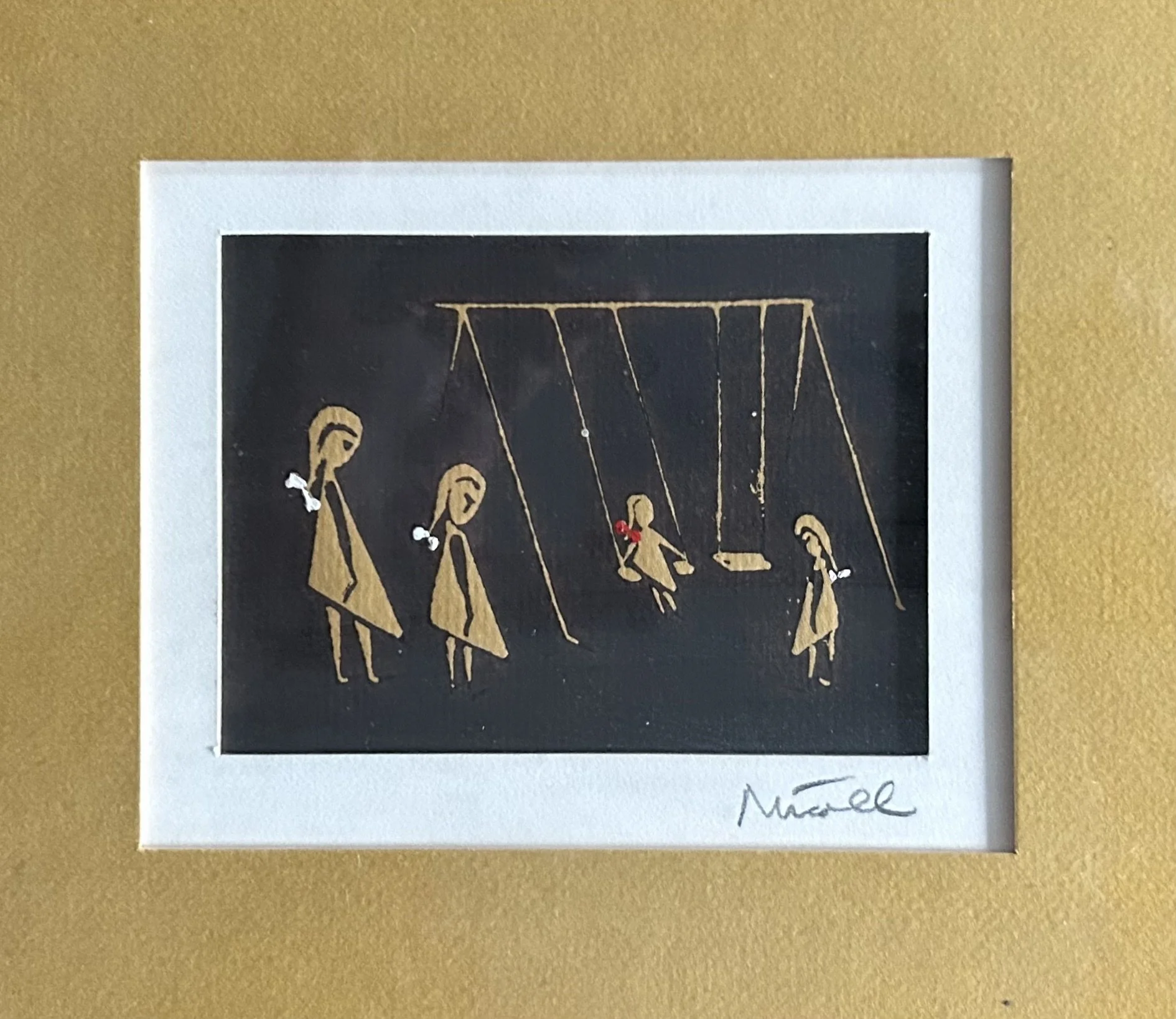
This image prompted these memories as we also had an old fashioned slide and metal swing set in our yard, and many an afternoon was spent playing on them. As the youngest of 4 girls, I was often watched over by my older sisters, and this image made me think of the 4 of us. Highly unlikely I was wearing a dress – or a red ribbon in my hair – but the ages of the girls is so much like the 4 of us that it seemed it depicted us.
The work was done in 1971, or at least framed in California at that time. Polly Nicoll was German, moving to this country “prior to WWII” the note on the back says. I was not able to find anything online about her, and am grateful for the note as it tells me she attended USC, studied writing, and then turned to art. Her note continues:
“Her main interest is the figure, though she finds some aspects of nature equally expressive in terms of form and space. She tends to search for the permanent rather than the transient and paints in a variety of styles because she feels ‘Monday’s works is not Friday’s, yet both are valid.’”
The work is a painting, and is very clever. Nicoll used the golden matt, also used in the framing, and inked over it to sketch out the image. The bows in the girls’ hair are added with dots of paint. Her style is very midcentury modern, and is remarkably expressive for such minimal use of paint. Somehow, with only a few lines, we can sense the swings moving, the girls eyeing their little sister, and the young red bowed girl sitting smugly on her swing. Today is Monday, I am rather busy these days doing all sorts of things, but come Friday, I am sure I will again turn to introspective moments as I enjoy lovely vintage artwork.
School Colors

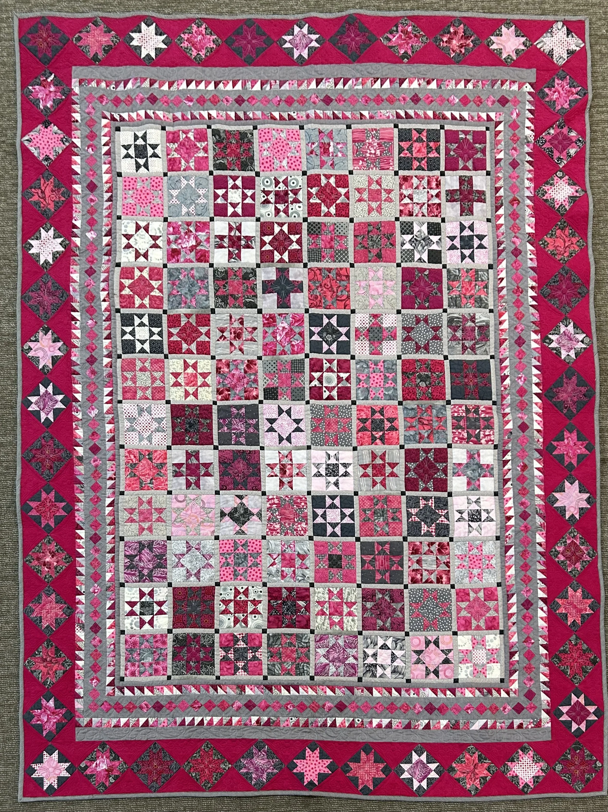
I finished this quilt last week, after working on it for at least ten years, but likely longer. I first saw quilts done in the pattern at a quilt show in the early 2000s. A group of women had each made a quilt using Civil War reproduction fabrics in browns and pinks as specified by the pattern designer (“Ancient Stars” by Susan Garman, 2001). The displayed quilts were stunning, and I was drawn to the pattern. I have an affinity for antique quilts and entertained the idea of making one. The thought was not one I pursued, until years later the quilt pattern was donated to our guild garage sale, and I managed to snag it. Thus began a very long journey, complete with missteps, frustrations, and quandaries.
The first choice to make was the color pallet. I honestly don’t know why I chose modern pinks, nor why I picked gray instead of brown. As this was well over 10 years ago, it was not because gray was the current “in” color in decorating. In all likelihood I happened to have some pieces that complimented pink fabrics I had on hand, and thus I started the years-long journey with pink and gray, picking up more fabrics as needed. There were years the project was put away and left to gather dust. And I recall one phase where I thought about starting over as I really love pink and brown and what the heck was I thinking??
Back in the 1980s when “color theory” was the rage, my mother and I had our “colors done”. She was a Winter and I was a Fall. For a number of years she made me beige clothing as it was “my” color. Dear lord do I look half dead in beige. It may be my color but it doesn’t do a thing for me - I blend away into nothing. Even my husband banned me from the color, and my friends have long known to steer me away from beige clothing when we’re out shopping. Brown, however, looks great with my coloring. And since black is remarkably unflattering to me (being a “Fall”), brown has always been my go-to neutral. I honestly do not own a piece of black clothing, while my mother, with her Winter coloring, lived in black and jewel tones.
Brown is considered a “warm” color, and falls on the color wheel as a very dark version of orange. It is the earliest known color used by humans to create art, using variations of earth pigments to draw on caves. The word “brown” shows up in English language as early as the year 1000. Brown, like most colors, has both positive and negative associations. While the negative have to do with poverty, the positives are “a sense of strength and reliability, as well as feelings of warmth, comfort and security.” (https://www.dunnedwards.com/pros/blog/the-color-brown).
Pink has its own associations, almost all to do with romance, feminine attributes and kindness. Amusingly, when my daughter was young, her older brothers would announce “We’re in the pink zone” whenever we were shopping for girl clothing or toys! Pink lands in the red section of the color wheel, and thus pink and brown are neighbors – being offspring of Red and Orange. This is known as “analogous” colors, and is considered a calming or harmonious color combination. Interestingly, when you add white to blue or green, you refer to the color as “light blue” or “light green”. When you add white to red, you call it “pink”, a term that cropped up in usage back in 17th century Renaissance Italy. Many folks know I love the color pink, and I often wear pink and brown. And have a brown car (though sadly without a pink interior). So here I am, a pink and brown girl, grumbling about my pink and gray quilt, and considering bagging the whole darn thing after having made a significant number of pieces.
Then the Covid lockdown hit, and boy was I happy to have a huge project to tackle. I began cranking through the center blocks, and making the one inch “½ square triangles” of the inner borders. For those of you not quilt oriented, the 96 center blocks are an ‘Ohio star’ pattern. It is composed of a 9 patch, meaning blocks in a 3 x 3 square. To create the star shape some of the blocks are divided into a “ ½ square triangle”. This involves diagonals and fractions (yuck, who likes fractions?!) so the easiest option is to make oversized blocks and trim down to the correct size. No fractions! But tedious. Same with all those one inch “½ square triangle” blocks running around borders, all 452 of them.
As is the case with many quilt blocks, the parts of an Ohio Star can be put together in various ways by spinning those triangles. Some variations result in an “Ohio Star” pattern, and others are completely different. When I finished the 96 blocks and began putting them up on my design wall, I realized a number needed to be redone. I cannot recall how many, but enough to cause swearing and grumbling. Clearly I went a little wild during Covid lockdown. Or at least as wild as a quilter can go. Sigh. Which is all well and good and rather creative, but made for a substantial amount of nausea when the blocks started going together. I have no issue with nausea if that is the artist’s intention, but in this case there was too much going on to add wonky blocks that didn’t “look” like Ohio Stars.
Redoing the blocks did not mean simply reusing the parts already made. Some had to be redone entirely which made me rather grumpy. On top of already being grumpy that I was not making the damn thing in pink and brown. Which would look lovely in our bedroom with our antique brass bed and butternut furniture, Mom’s pink Turkish rug, and our chocolate brown dressing room. But no, I was making a pink and gray quilt. So it got put away. Again.
At some point, having an ‘unfinished project’ gets on my nerves, and I make a “do or die” decision. If I love the piece, I have to finish it. Otherwise I pass it on in some way. So about 2 years ago I decided I needed to finish the damn thing. (While I do swear a lot in general, this quilt really rose my swearing language to a new level.) In an effort to embrace the gray, I began to think about the colors and where they surfaced in my memory. My alma mater, Vassar College, has a stunning stain glass window in the 1905 library. It is known as the Cornaro Window and depicts Elena Lucrezia Cornaro Piscopia (1646-84), the first woman in history to receive a doctorate, defending her thesis in Padua in 1678. She is wearing pink robes thank you very much. The original school colors, pink and gray, were chosen in 1867, representing the rose of sunrise breaking through the gray of women’s previous intellectual life. Elena with her pink robes stands as a stunning symbol of women’s right to learning. https://vassarcampushistory.vassarspaces.net/architecture/the-cornaro-window/.
While the colors were changed at some point to be maroon and white, those of us old enough still think of Vassar as pink and gray, with its remarkable focus on educating women. While my quilt may be done – in pink and gray – I wonder how history will look back on women, and their education, during this journey we are all currently on. Time will tell, as it often does. Elena – my granddaughter’s name!- will stand proud in her pink robes as we close in on 400 years of our journey, complete with missteps, frustrations, and quandaries.

The Passage of Time
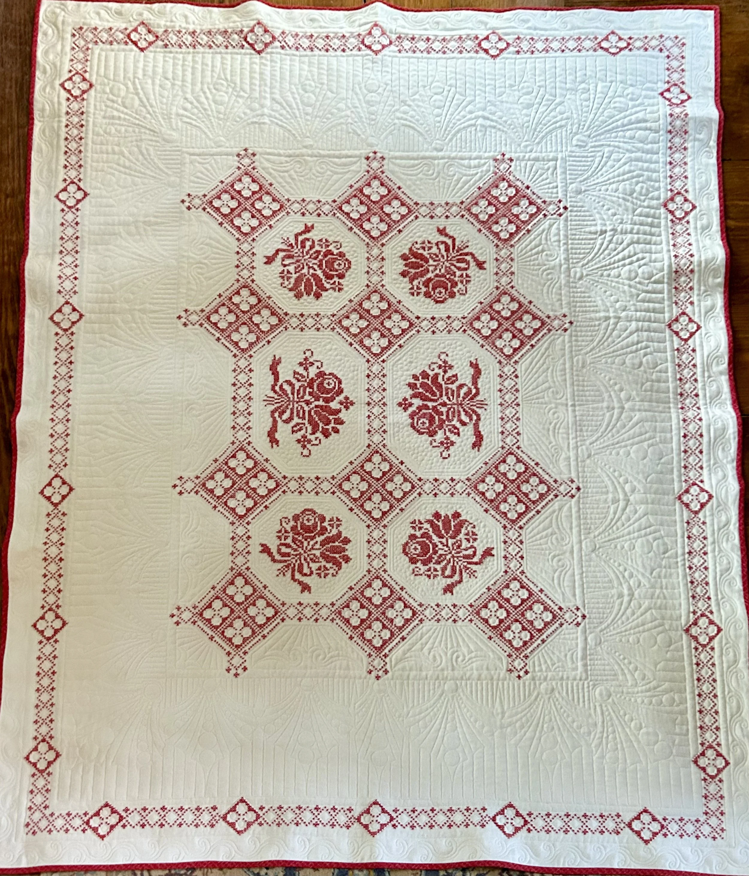
It sometimes amazes me how quickly life can pass us by. When children are little, parents feel like the days are endlessly long, especially when things are stressful and chaotic, with hardly enough time to sleep. But, soon enough, children are grown, parents are empty nesters, and the days seem to fly by. How the heck do I, a woman who basically doesn’t have a full time job, seem to have days filled with so much I never have time to accomplish all I want to do?! Those books piling up that I absolutely want to read? Dusty. The house projects I want to get done? Awaiting hubby’s involvement…which means very low on the ‘to do’ list. The quilt projects in my mind, and sometimes actually in bins in my sewing room? Great ideas, excited to get to them, but when the heck will that happen between the projects I need to do, the gifts I need to make, the found treasures needing repair or finishing?! I say all this as I look at this remarkable quilt, realizing it is a perfect example of time passing.
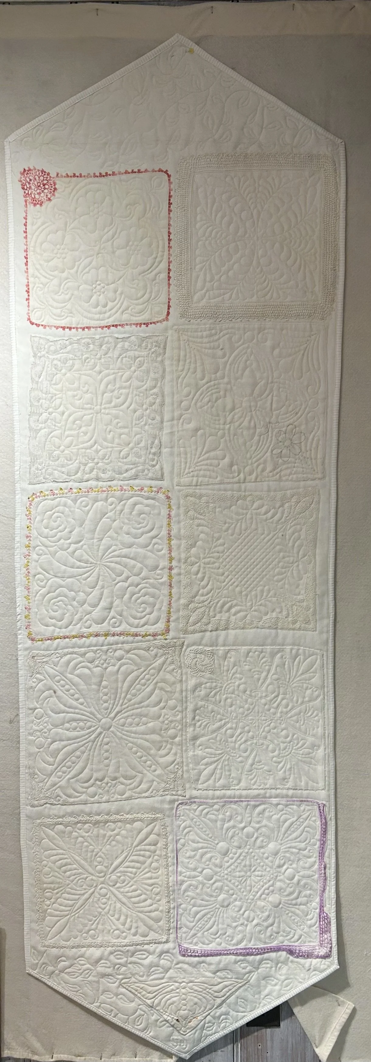
I found it during a Bins thrifting outing a few weeks back. The work was originally done as a table cloth, beautifully cross stitched in red on a heavy linen ground. The women was a talented needlewoman as the back is nearly as lovely as the front. I would guess it was done in the 1950s, a time when sitting by a television in the evening or listening to radio broadcasts was the family entertainment. I am unclear if it was a “stamped” pattern or if the woman designed it herself. Given the era, I suspect it was a printed pattern, but either way the time needed to complete the piece was significant. A family held onto it, likely unused as it was always considered a “special” piece. We hold onto those “special” items, handmade by someone we love, as we don’t want to damage them. But what is their value if no one remembers using them? I always insist to new parents that my gifted quilts should be used, thrown on the floor, dragged around in a stroller, snuggled under while reading a book. Otherwise, it languishes as a “pretty” thing no one has a relationship to. Children grow up, parents downsize, and suddenly that “special” quilt -or table cloth – is sent off to a thrift store as no one really cares about it.
When I found this remarkable red work tablecloth, unused and then discarded, I thought it would make a lovely quilt. That said, there was not a chance in hell I would have time to hand quilt the piece – a process that is charming but so darn time consuming almost no quilter I know does so anymore. I could quilt it on my domestic sewing machine, but my skill doing so is rudimentary, and would not do the piece any justice. A dear friend who is a remarkably talented quilter offered to do the work for me on her long arm quilting machine. She did NOT have to ask me twice! How the heck she came up with the beautiful design and executed it so stunningly is beyond me. So now I feel rather guilty.
Not only did she finish the piece a few weeks ago – and I have not as yet had time to write about it – I am not sure how to repay her generosity. She requested I take her and a granddaughter to a Bins outing which hardly seems like work to me! But being a tour guide to the Bins is an amusing process as it is truly a unique world, filled with characters and rules and all sorts of divergent dynamics: people shopping for specific items, selling “found’ treasures to peers, discussing resale values and experiences, dealing with children and teens, watching “on- line sales” events live in the store. And finding treasures.
I also feel guilty submitting the quilt in my local quilt guild’s upcoming October show. The irony is that I basically invested no time into the piece, even though I am submitting it as “my” quilt! The unknown woman who did the red cross stitch work? The lovely friend who designed and quilted the work to bring it to life? Or me, who basically put on the binding? Yup, I win!
The Sun and The Moon
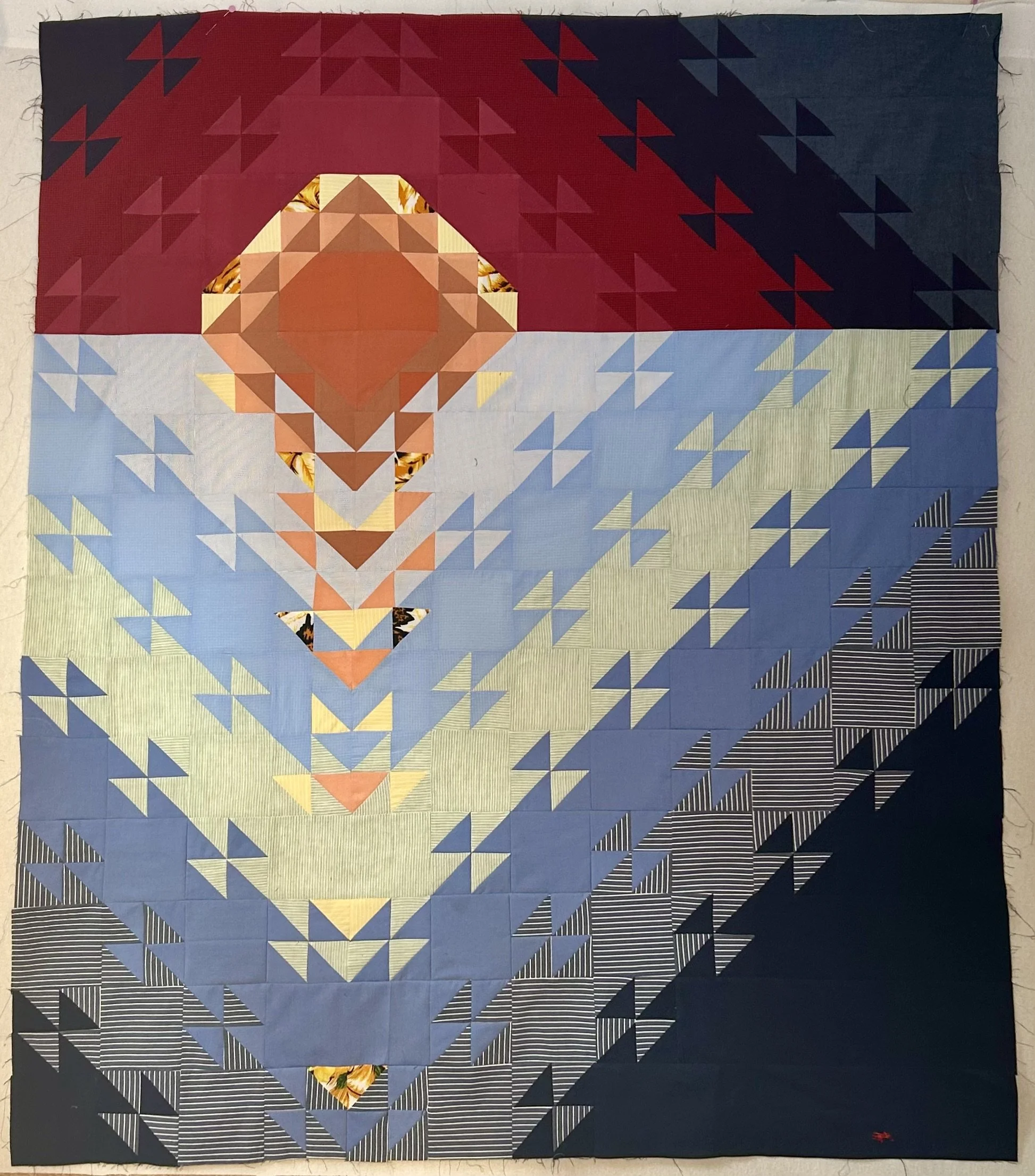
These two quilt tops are projects I have been creating for a client. She had lost her husband a few years ago and struggled to part with his clothing in her grief.


These two quilt tops are projects I have been creating for a client. She had lost her husband a few years ago and struggled to part with his clothing in her grief. Eventually she contacted me and requested I make some quilts using his shirts. The first set, made a year or so ago, was designed for a daughter’s young twins, and had a dot theme. She then requested a pair of quilts for another daughter. As any parent knows, you can’t gift one child something special without considering the other sibling! The idea was to have an image of a beach sunset due to the family’s love of Key West.
Figuring out a way to utilize only men’s shirts into a beach sunset image was a bit of a challenge. Eventually I found a pattern designed by Karen S. Biglik of Fabric Addict called “Sunset at Sea” (https://www.fabricaddict.net/). The pattern uses 16 different fabrics and is rather complex, not from the sewing perspective but due to the design requirements. The construction requires each fabric to be used in specific places, thus creating the visual of the sun’s reflection in the water. To accomplish this with the shirts, I had to adjust the pattern’s key to reflect my fabric choices. And then the anxiety set in.
The quilt directions specified how much of each fabric was needed IN YARDAGE…and I had shirts. I was leery of not having enough fabric since I was using the husband’s shirts and clearly couldn’t dash to a store to get more. What to do if I ran out? How to figure out if I would have enough? I purchased a shirt from a thrift shop and chopped it up to see how much I could expect to get. Turns out, you can actually cut a lot of useful pieces from a shirt. However, the pattern direction specified cutting yardage into strips and sub cutting those to get the pieces needed. I didn’t have that luxury so I had to calculate each fabric’s specific size pieces and cut individually. Sigh.
Construction involved a great deal of zip lock baggies with labels, piles of units and a lot of swearing. Once done with the Sunset top, I discovered an error – I was rather surprised there was only one! The photo above still has the error in it though I have fixed it in the meantime. The client loved the work and I was left mulling what to do about a second quilt. Some of the shirts would not produce enough fabric to create the same top again, and, to be honest, I really didn’t want to make two nearly identical quilts. Boring. After a bit of thought, I asked her if she might like the second quilt to be a moon rise. She loved the idea. Having already worked through the challenges, the moon was a tad easier except for the coloring.
My color palette for the moon was cool colors – blues, grays and whites of which there were oodles of shirts. I wanted the sky to seem like a gray evening but when I began creating the image, it was rather dull. I pieced the ocean sections together but left the sky in strips on my design wall to assess. The most obvious solution was to create “stars” in the night sky. To do so I had to disassemble some blocks, make tiny half square triangles of the corresponding background color with yellow, and then piece them back together. Another sigh.
I think the resulting quilts work well and, once quilted, the client is excited to share them with her daughter. While they could be considered a “baby quilt” in size, I think of them more as wall art, proclaiming to a beloved that “you are my sunshine” and “I love you to the moon and back”.

Worth More Than Money
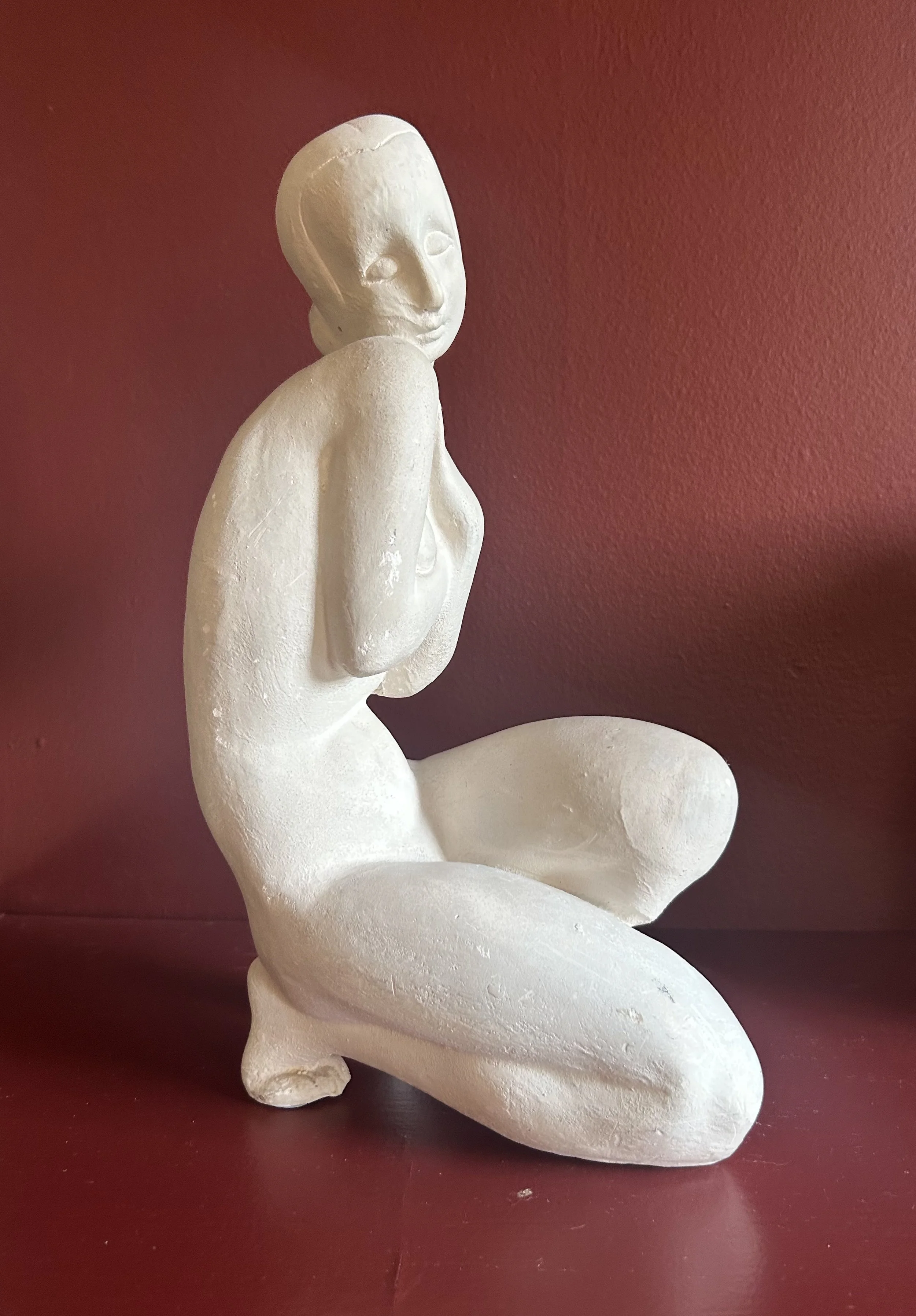
A local designer has hosted estate sales over the last year or so, and I twitch with anticipation when one is coming up. At the recent one, Hubby and I had fun gawking at vintage art, furniture and treasures, admiring many cool items. Most were way beyond our budget, so while I covet fabulous pieces, I have to contend myself with not so expensive treasures. When we first arrived at the sale, I saw this small statute and immediately picked her up. Not cheap by thrift store standards, but no matter: she was coming home with us.
She is not marked in any fashion, and the seller told me she was Deco and made of plaster. I guessed the era but was not familiar with plaster as a sculpture medium. Off to the internet. Turns out, Plaster of Paris has been used by artists for thousands of years. It is much like modeling clay, so the resulting piece is either directly molded by the artist’s hands or casted from a mold of an original design. It was used to build the pyramids of Egypt as well as Pompeii’s walls. For centuries, an area near Paris contained the needed gypsum to create the clay. In 1254 King Henry III visited Paris, was so impressed with the French’s fine white (plaster) walls, that he introduced the stuff to England where it became known as “Plaster of Paris”. Its use for actual artwork started in 16th century Italy.
During the estate sale, as my arms got full of finds, the staff carted the pieces to a table near the checkout area, one of many piles for fellow shoppers hunting for treasures. At one point hubby had a few things to add, and he carried his finds to the pile table. When he returned, I wondered if he found my pile, mentioning mine included a white female sculpture. Yeah, he says, I figured that was your pile. Made me laugh.
Clearly hubby recognizes I tend to pick up artwork with a female focus. When I brought my Deco girl home, I wandered around the house counting the female sculpture works scattered about: twenty three at the moment. I have written about many of them (15 plus a few more I have sold), and this doesn’t include paintings with feminine figures. For amusement sake, I then counted the male statuary – that didn’t take long! There are 5, three of which I have written about. One belonged to my mother-in-law, Lottie Jarrett (1926 - 1988).
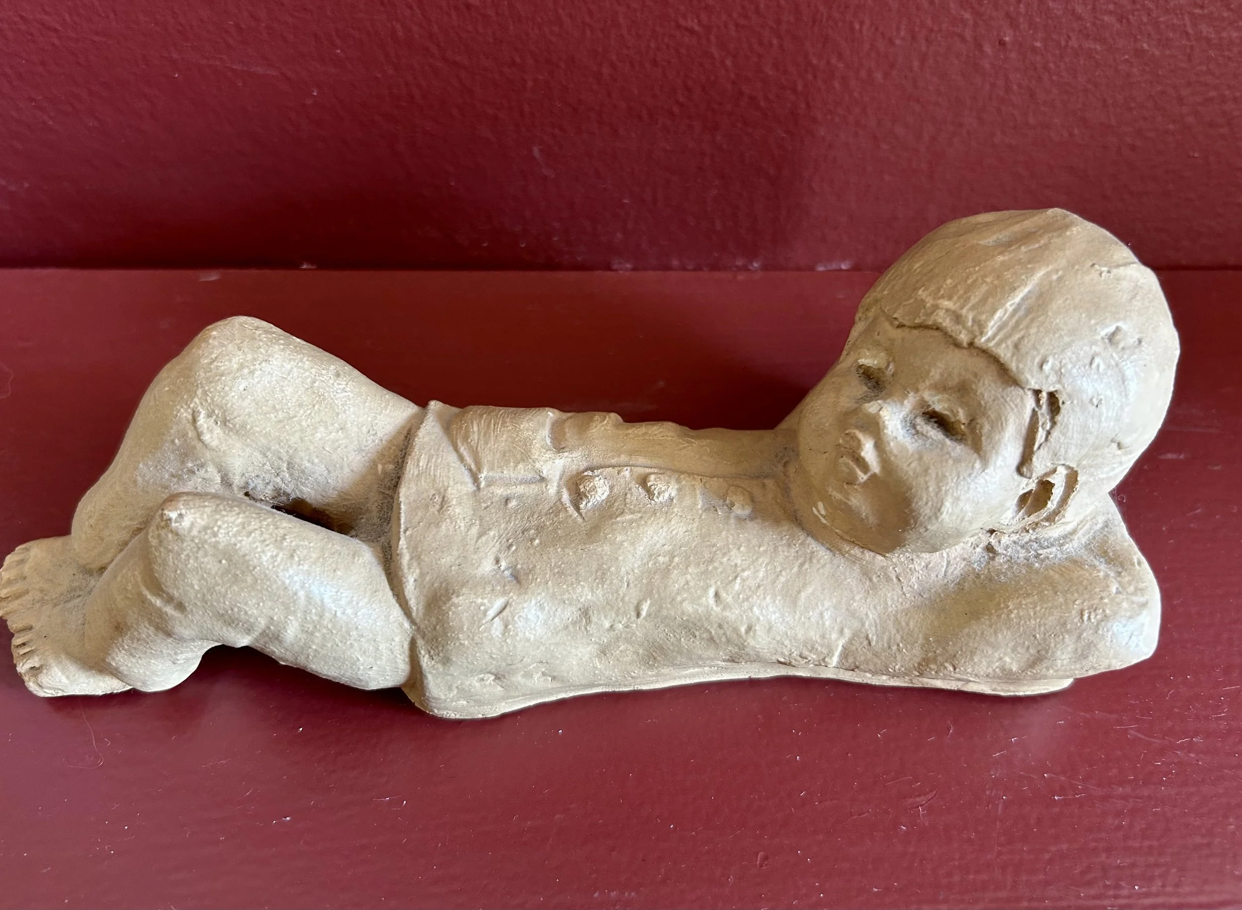
This figure of a boy was one of three similar works Lottie owned. My husband’s father requested my two sisters-in-law and I each select a statues after Lottie had died. I don’t recall what the other 2 looked like, but in 1988 everyone said this statue represented my dreamer husband. As a newlywed, I found it a sweet thought, though the work isn’t something I would like normally (too “precious moments” for my taste). I am not clear if hubby is sentimental about it, but I have so few items from Lottie, that I have kept him. My counting exercise made me curious about the piece, and started research.
The artist, Ann Entis, worked at Dave Grossman Designs Inc of St. Louis in the late 1960s and 1970s. Her works are all similar child-like statues done in a tan clay. There are many of them lurking about in thrift stores as they were cast from molds and produced in volume. In my research I came across a fascinating law suit filed by Mr. Grossman in 1972 against an Illinois manufacturer for copying the works designed by Ms. Entis. The entire case notes are available on line, and it seems the case was decided in Grossman’s favor (https://law.justia.com/cases). Apparently the court agreed Ann Entis’ sculpted child faces and styling were copyright protected.
If you image search the Ann Entis figurine, thousands of images pop up, including many similar ones by a woman named Lee Bortin of Chicago. Turns out, she was the defendant who lost in the 1972 court case to Dave Grossman Designs! That said, neither Bortin’s figures nor Entis’ are particularly valuable, well under $20 these days. The Entis figurines were sold locally in St. Louis by Grossman Inc, which operated from the 1960s until 1981. As my in-laws lived in St. Louis from 1979 to 1982, I suspect Lottie picked up the 3 figurines at that time, choosing three boys to represent her three sons. She died 6 years later.
If you do an image search of my Deco female, not a single image shows up that looks even vaguely similar. I suspect she is a one of a kind piece, hand sculpted by someone in the 1920s, though her value is unclear. Unsigned and with no distinctive details, she is only as valuable as my enjoyment of her. My mother-in-law’s inexpensive, mass produced dreaming boy realistically has even less financial value. The female figurines gracing our home I find lovely but I am eh regarding the little boy. Maybe because it is male, but likely more to do with the mass production aspect. But the little boy has personal history and a connection to my husband’s parents – something that is worth more than money.
Off With Her Head

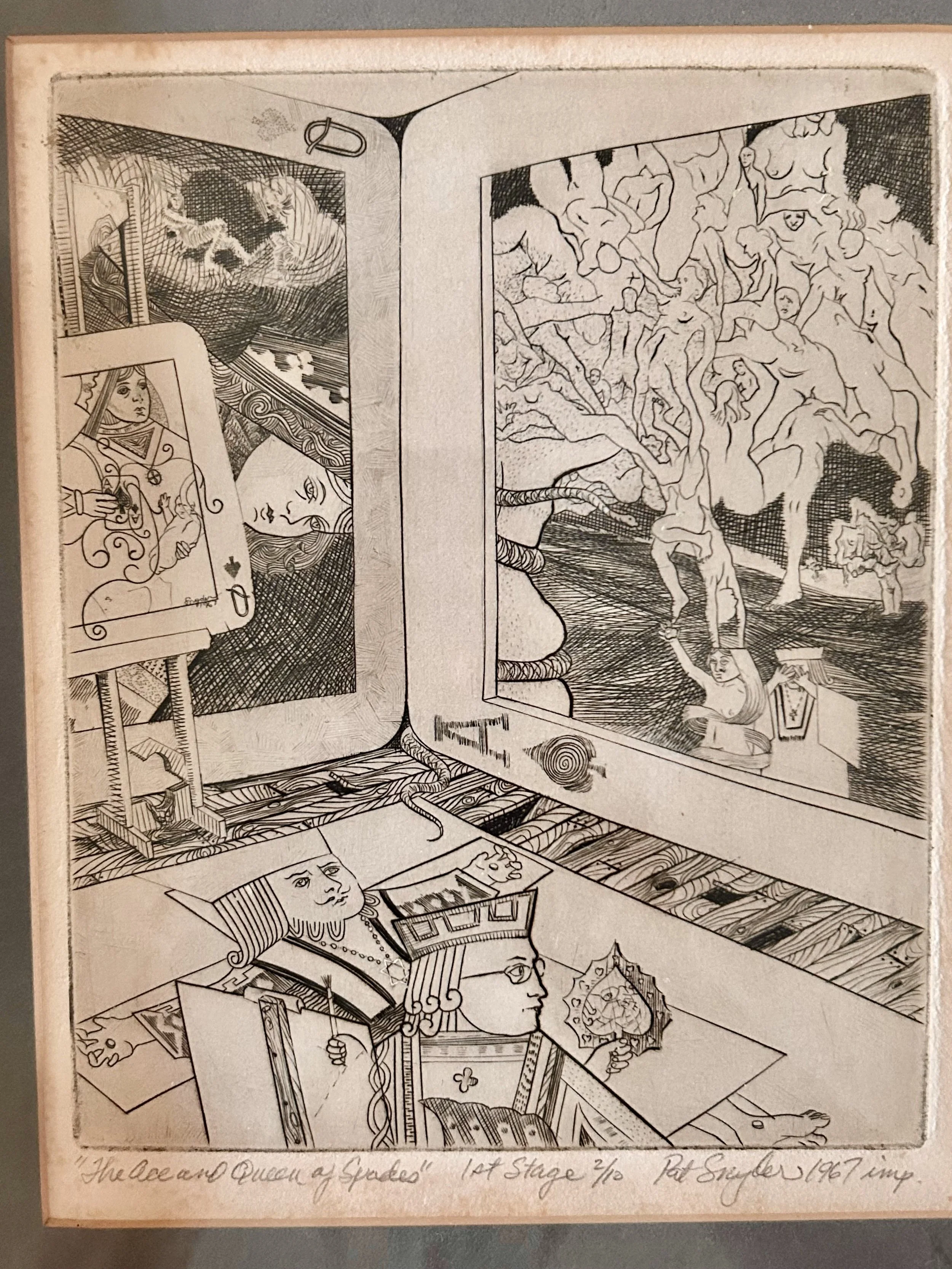
This work, titled “The Ace and Queen of Spades 1st Stage”, is a lithograph by Pat Snyder, dated 1967. When I came across it at a church rummage sale, I thought it was related to Alice in Wonderland, and purchased it without much thought, tucking it away in my art closet. The work is masterfully done, but there is a slightly disturbing vibe to the piece, and I chalked that up to the Queen of Hearts from Alice In Wonderland. As I had not done any significant viewing of the piece, I pulled it out the other day to study it more closely. Definitely not Alice, though the small guillotine in the image screams “off with her head”.
The work draws your eye – literally – to the central junction of the cards. Hidden there, amid the wood grain of the floor boards, is a slithering tail of a snake, peeking out between the cards. Notice the “central” point is actually off center to the left– a masterful stroke by the artist to make us nervous. The term being “off center” describe feelings of instability, or a sense of nervousness of things being “off”. To make sure we don’t miss the point, the snake then reemerges inside the frame of the Ace of Spades card – winding its way up a tree, head pointing us in the right direction. This, too, is a quirk of human nature: we tend to go right when faced with choices. We enter a shop and turn to the right. We (mostly) read to the right. We scan newspapers to the right (okay, sure, I’m dating myself). But the reality remains that we tend to head right – though maybe not in moral issues. And, in case anyone wonders, the Ace of Spades is the highest card in a deck and is known for its association with power, authority and dominance.
As we look over the Ace of Spades, drawn in by our friendly serpent, the storm clouds overhead swirl with a Dante Infero-esque cloud of bodies. A sense of souls piling up in hell. Not to belabor the point, but those are all women, and they sprout from the head of the small, naked – female – figure fleeing in the foreground. And yet our buddy Adam is fully clothed and not easily identifiable other than guilt by association. Mr. Snyder then whacks us over the head with Adam covering his eyes and wearing a religious symbol. Well then. Things are getting curiouser and curiouser.
Mr. Snyder actually created a self-portrait in the work, which is how I determining Pat is male. I would have guessed the artist was a woman due to the era – late 1960s with all its women’s rights demands – and the emerging theme. However, the artist stands in the foreground, depicting history from his perspective as he looks over his left shoulder (not right!) at his subject. He wears glasses, and holds a pallet in the shape of a spade. Traditionally, the Jack of Spades was considered a messenger, a person in a capacity of trust. Sometimes “this card is used to designate a critic, or a critical position; a moment of impending danger.” (https://cardarium.com/jack-of-spades). The “reverse” of the card – meaning the upside down side – signifies scrutiny or inquirer.
I bring this up because the undercurrents of the work begin to congeal around issues of women and the degree to which they are blamed and judged. We have already introduced Eve, and there are 2 queen of spade cards. One holds up the left side of the house of cards. The other smaller one is situated on an easel. The queen in the smaller card holds a playing card and a baby, and the easel upon which she rests is actually a guillotine. The baby is very faint, still seeming to be in-utero, and the playing card is the Ace of Spades, signed by the artist. I get the sense Mr. Snyder is sympathetic to the plight of women, with them carrying all the blame and damage, specifically around the issue of abortion, while the man literally runs away with his eyes covered. Though that may simply be my feeling reading into the work.
And then we have our king. The floor “king” has no “house” though he wears a Star of David, has stigmata in his hands and feet, and appears to act as the “rug” in our house of cards, upon which we all tread. Mr. Snyder is not subtle, I give him that.

Tin Can Art
When I was in elementary school in Darien Connecticut, my favorite classes were Gym and Art. I was an extreme tomboy with such short hair, I was often called a little boy. Many times when “sides” were chosen – yup, gym teacher would assign two captains to pick students for teams – I would be one of the first picked. I was scrappy, tough and very fast. How times have changed! Not scrappy. Not very fast, and definitely not short hair. What hasn’t changed is my love of art.
The art teacher was a funky young woman who created all sorts of fun projects. As this was 1976, one group project was sewing red, white and blue quilt squares into a large quilt for a fundraiser for the school. I managed to sew my block right onto my pants, so my first foray into quilting certainly was not highly successful. Another project was using myriad supplies, scraps and junk the teacher collected, to build a sculpture. I built an Eskimo, using a large coffee can and fur fabric scraps. The art teacher liked it so much, she used it on the cover of a “catalogue” she created for the school-wide art show that Spring. I still regret it was long since thrown away –one of those things I wish I had kept as it was a charming “child” art project. I have kept many of my children’s projects, and some day they may appreciate having them. Or not – but at least they can decide.
When I saw this little guy at the thrift shop I had to bring him home. He reminded me of my missing Eskimo, and he is so clearly a child’s art project he makes me smile. Complete with the tin can body! Instead of using fabric for clothing, the child used papier-mâché, building up his body and hat in one go, and plunking a nose on his face. The swinging arms were added using a nail covered over with a button. The artist then painted the sailor, including his white scarf and pink cheeks. My favorite is the pins used for his eyes and mouth, and the snazzy blue ribbon hat brim. He has some sadnesses, including a crack down his front, but he fits right in my son’s childhood sailing theme bedroom, now a guest room.
Don’t give me a theme as my OCD nature means I hold onto them for ages, in this case over 25 years. While my son has moved to his own home, taking many of his childhood room’s items, I still find sailing themed treasures to add to the room. Thankfully he and his wife have created a sea theme bathroom with a kraken shower curtain, so some of my finds end up sailing to Colorado. My children are stuck with my memories of their childhood loves, and it is hard not to continue to give them packages full of treasures. As they are grown and married, I have to show some refrain, though any treasure that doesn’t speak to them is allowed to move on in the world. But, mind you, refrain is a comparative term. And my favorite adage? One man’s trash is another’s treasure. Thrift shops are amazing depositories that reflect this – and some of the items I come across, both art and quilts, astonish me. I understand holding onto all those family mementos isn’t always possible, but such a little guy as this? How could a mother part with him?!