

The Warmth of Clay

This little girl came home with me the other day from the thrift store. As she was priced $2.00 I did not “look her up” on Google Image Search as I didn’t care. She was charming, I could tell she was vintage, and knew she would fit right in on my bedroom fireplace mantel. Once I got her home, I noticed the bottom was signed “Johan Krukmakaren”.
Unfortunately, as a “signature” this is fairly worthless. “Johan” is John in Swedish. And Krukmakaren simply means “potter”. John Potter is not much to go on. Might as well be “Mary Painter” for all the good it will do. While there are a myriad of similar pieces for sale all over the internet, they’re all claimed to be made by “Johan Krukmakaren” as though that was his name, and with no detailed information about our potter Johan. After a great deal of searching, I learned quite a bit about Swedish potters in the 1960s and 1970s, a boom time for art pottery in Sweden (see prior blog: https://www.ericasheirloomquilts.com/ericas-heirloom-treasures/letting-go). Unfortunately, I was unable to locate a Johan whose work resembled this little girl. She is made of dark brown clay, fired at a high temperature, making her a “stoneware” piece. The artist then added color glazing for the child’s blond hair and orange teddy bear. She has scuffed knees, but being a little girl who quite often had cuts on her knees, I could relate. She has a charming button nose, slight indents for eyes and adorable naked bottom.
That evening I put ointment on my sore hands (climbing) and picked her up to show her off to hubby. As I did, I began rubbing her, and discovered the joy of holding an item made of unglazed clay. It is warm! And the process of “oiling” her with my hands covered in cream seemed to bring her to life. She had been charming, but when warm and imbued with oil from my hands, she fairly glowed. To be honest, it was also remarkably soothing to rub the charming sculpture in my hands. Holding a small curved clay figure that fits nicely in your hand is a novel sensation. Much art we don’t “touch” as we worry about fragility and damage etc. But I suspect she was meant to be enjoyed through touch.
As there are a number of other old sculptures on my mantel, I decided to “oil” them as a comparative exercise. The young girl and goose statue (see blog post: ericas-heirloom-treasures/composing-in-triangles) was carved of wood circa 1930, and while rather dusty, it did perk up quite a bit when I added some “oil” to it. Honestly it did not “feel” quite as soft and comforting as my clay girl, but the wood looked much better after its spa treatment. Nearby is the cast metal sculpture of a woman by Paul Herzel, and I confess it was most jarring. While the statue seemed happier to have a bit of oil shine it up, it most certainly was not sensual – more anti-sensual if there is such a thing. Harsh, cold, and very unforgiving. In this case, the tactile sensation of holding a warm and rounded item made me recognize that potters must enjoy the warmth of clay as they create. I heard the local community college offers pottery classes – might be in my future!

Glass From The Past
I have become weirdly attracted to vintage art glass of late. I say “weirdly” because if someone had told me 20 years ago I would find the art form of glass intriguing, I would have thought them nuts. To me, glass was a “functional” thing – windows, vases, jars; practical and necessary items in our everyday lives. But, much like quilts, just because something is used for practical purposes, does not mean it cannot also be a form of art. And this is an artform of which I have virtually no knowledge.
As I often do when curious, I turn to The Oracle and hunt for information. There is naturally formed glass, and these have names depending on their creation. Volcanic molten rock turned into glass is called “obsidian” (or “volcanic glass”). Meteoritic impacts on the earth millions of years ago created “tektites” (also called Libyan Desert Glass – I’m guessing that’s where they first were found). When lightning strikes sand, “fulgurites” are created – brittle tubes of melted sand. Oddly, some marine creatures have silica skeletons which are also a form of natural glass. (https://whatson.cmog.org/exhibitions-galleries/glass-nature).
Humans began making glass objects around 4000 years ago, and there is debate as to whether that began in ancient Egypt or Near East (near modern Iraq). This may be due to the dry conditions in Egypt, near perfect for preservation, which allowed ancient glass items to survive. The prone to flooding regions of Near East degraded ancient glass, leaving a flaky powder which was often overlooked by early archeologic explorers. I will allow you to research to your heart’s content, as it is fascinating but not pertinent to my thoughts this morning (https://www.smithsonianmag.com/science-nature/a-brief-scientific-history-of-glass).
I think my favorite line in the research was learning what exactly glass is. Crystalline quartz, which seems similar to glass in many ways, is composed of silica atoms that are regularly spaced in a repeating pattern. Glass, however, uses the same material, but the atoms “are arranged topsy-turvy” (see prior Smithsonian article). Topsy-turvy! What artist cannot be attracted to topsy-turvy?! The idea of using a basic item, atoms of silica, and stirring it all up to create something wonderful and new lays at the heart of creative expression. Glass making adds the rather dangerous element of fire, making my frequently nicked fingers from rotary cutters used for quilting seem rather childish.
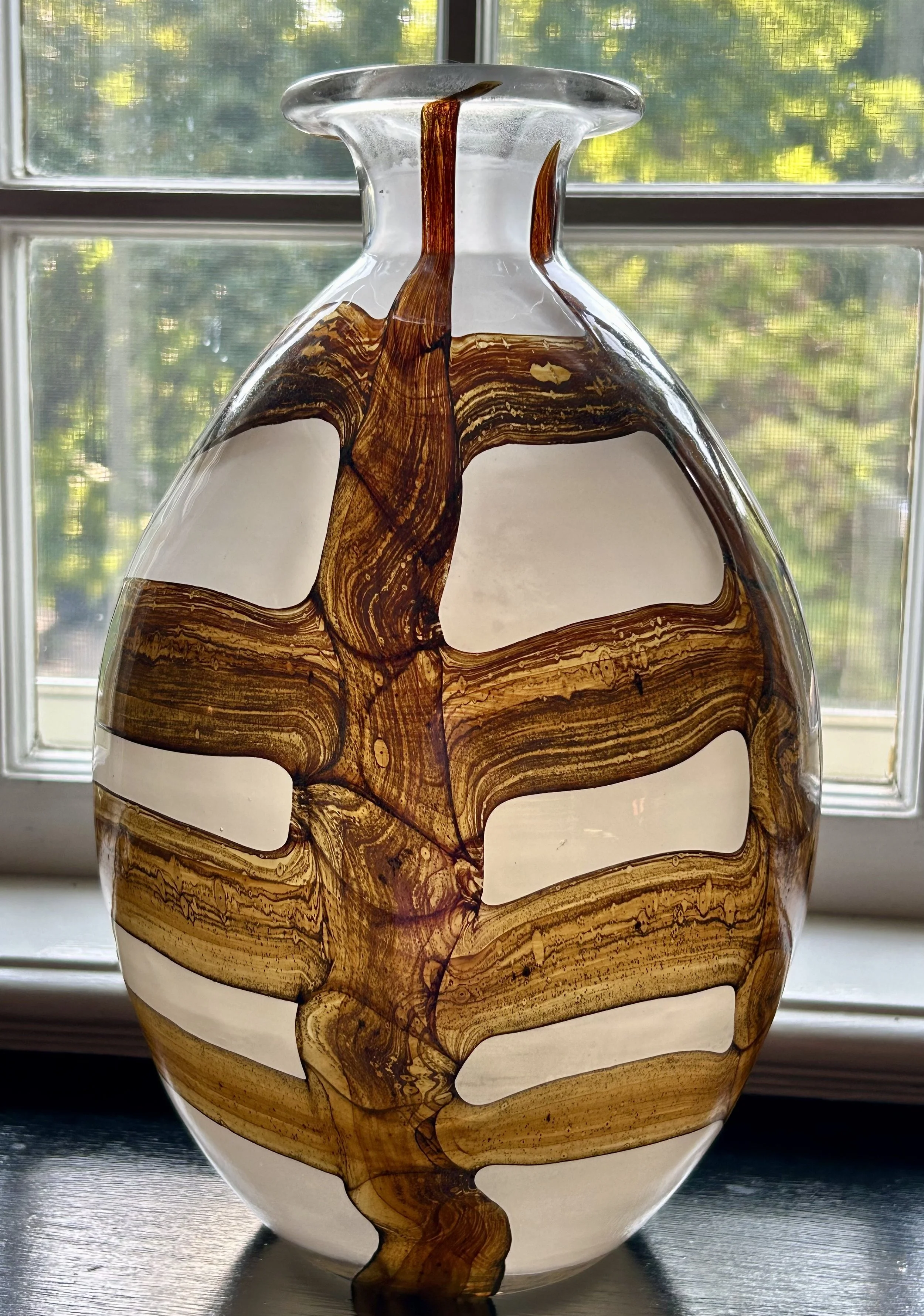
This vase, a recent thrift store find costing a few dollars, spoke to me immediately. The thing is 12” tall and weighs nearly 6 pounds. It is not signed, but has a pontil mark on the bottom (see prior blog for explanation: https://www.ericasheirloomquilts.com/ericas-heirloom-treasures/primary-colors ). It has a wonderful 1970s vibe, and the dark brown swirls set against an opaque white base appealed to me. I originally place it in a corner cabinet in our family room, but the piece fades to boring when set in a dark corner. I carried it around the house a few days back, and when I set it on this window sill, it lit up. So there it stayed. Even hubby noted how cool it looks with the sunlight behind it, and hubby noting anything “new” is noteworthy (I frequently say to him “if it ain’t naked, you don’t notice…”)
While my piece is unsigned, it looks strikingly like the work done at Mdina Glass, a company started in 1968 on the island of Malta by two British artists. It is still in operation (https://www.mdinaglass.com.mt/en/home.htm). An early pattern produced in the mid 1970s was “Earthtones”, later called “Earth”, and is made of a brown and sandy opaque Maltese glass. While the coloring is identical, none of the pieces I could find showed a spine design similar to mine. I have contacted the company to see if I can get a definitive yes or no, but I actually do not care all that much.
The piece is fun, offering a variety of interpretations due to its patterning. Its warm colors offer a feeling of grounding, as “Earth” might. And, given that it is a simple vase by design, I have come to realize that the human spirit likes to create beauty even for the most simple items in our lives. Much like a quilt, the utility of the object is only enhanced by the desire of the creator to offer a sparkle of design. I confess I am now rather attracted to the handmade glass items of yesterday. Likely more to follow.

Full Circle

This is a story about a personal heirloom - a Tiffany’s & Co Elsa Peretti 18k snake ring with a diamond tail. The ring was a gift from my husband, though honestly, neither of us can remember when exactly he gifted it to me. I think it was “early children”, in our first home in Libertyville. Hubby thinks it was earlier, in the apartment we rented for 2 years in Evanston. We had moved there from Cleveland right after our wedding. After selling the first house we owned for less than 6 months, we schlepped all our stuff and a 6-month-old golden puppy to a second-floor apartment while both unemployed. This was roughly 35 years ago, making the ring an early 1990s design.
I grew up with the understanding that gifts from Tiffany’s were “The” gift to receive. My father would gift my mother Tiffany jewelry, so that little blue box elicited a great deal of excitement. More importantly, my mother wore an antique Tiffany & Co. diamond engagement ring that was a family heirloom. The ring belonged to my grandmother’s mother, Margaret LeBoutillier (1874-1905) – her engagement diamond from my great grandfather Benjamin Strong (1872-1928) purchased in New York in the late 1890s. There is even a portrait of her wearing the ring – which is slightly odd, come to think of it, as she is surrounded by her parents and brothers but not her fiancé. Since she died while suffering postpartum depression, the ring was saved and my grandmother, Katharine Strong Humphrey (1904-1987) gave it to my father for his fiancé, Barbara Fallon, in 1954. Mom wore that ring until the 1980s, when she passed it on to my brother. At that point mom found two antique wedding bands – one ruby and one diamond – she wore until the day she died.
Here’s the tragedy, and I confess this one still makes me so dang verklempt. My mother gave the ring to my brother for his (first) fiancé, back in 1986 or so. That marriage went sideways fairly quickly, and I believe they divorced in 1991. After the young woman gave my brother back the Strong engagement ring, HE SOLD IT. Ok, I have vented. I simply cannot believe that ring left the family. Realistically it could be said to harbor negative karma – the first bride that wore it died tragically. The second bride – my mother – wore it and prospered for near 30+ years. However, bride #3 did not have a happy ending. I will get over it but not likely any time soon.
All of which circles me back to my Tiffany gift from hubby. I have loved the symbolism of snakes since college. I took classes on women’s history and the symbolism of mythology. The pre-Greco cultures thriving in early Europe. And the symbol that shows up most often in those studies was a snake. Modern culture immediately sees a snake as bad. The serpent in the garden of Eden is deeply embedded in many of our beliefs. And yet, originally, a snake was a symbol of rebirth, of the imagery of life continuing in a circle. It was a powerful metaphor for the female of the species. It is interesting that early Christian theology turned that symbol into a significant evil. And do not get me started on the early Christian attacks against female healers. In any case, I love the symbol of the snake but that is not to say I actually like living snakes.
For many years I wore my hubby’s beautiful gift on my right hand, as I had a very traditional “Tiffany setting” diamond engagement ring and simple gold band on my left ring finger (seriously traditional for someone so free thinking but this was 1986 so cut me some slack). Eventually I ended up with other wonderful rings, (see blog posts gums-gift-from-gumps and all-you-need-is-love), and the snake went into the jewelry box as I stopped wearing it.
The problem with being a rock climber, especially a middle-aged rock climber, is it takes a toll on your hands. While I can give killer back massages and open most any stuck container, I can hardly get my rings on and off. I have had rings enlarged numerous times over the years, and recently gave up on wearing my wedding rings. Just a week or so ago I realized the snake ring is a perfect solution! As it is “open” it actually has some give to it. And I can get it on over my sadly large knuckles. I now wear it as my wedding band on my left hand. Seeing it reminds me of history, both cultural and personal. I suspect you will not be surprised to learn I studied a variety of topics in college: English Literature, Political Science, Mythology, Astronomy, Art History, European History and Women’s Studies. I wrote a thesis about the butterfly representing the psyche in both the poetry of Spenser’s Fairy Queen (which I studied in the original Old English while at Kings College London) and John Keats (Ode to Psyche). Odd choice, and nearly didn’t pull it off, but I loved the dive into those worlds. Now I get to wear a snake ring – fat knuckles, extra wrinkles, and larger worries be damned – that brings my life full circle.

On A Beach in Libertyville


One of the more difficult aspect of sharing my treasures is getting a picture – with an iPhone – to look halfway decent. These paintings, hung in a corner of a basement room, were a challenge. It is hard to grasp exactly how large they are as these images of them do not show the scale. I found them on Market Place in 2020 while I was trying to create a serene space to practice yoga at home during the Covid crisis. While they seemed a perfect solution for me, I really had not considered just how large they are. The canvases are 5 feet tall, with the larger one being 6 feet across. After driving to the woman’s home and realizing there was not a chance in hell they were going in a car, I was able to borrow a friend’s pick-up truck to schlep them home. Installing them in our not fancy cellar was another project, and they are certainly not moving any time soon.
Living in a house built in 1930 in Illinois does not include fancy high-ceiling entertainment areas in the basement. Truth is, we are lucky if it is dry, because the state of the art “sump pump” system available when the house was built was a trough around the perimeter. Inside. With a few drain openings here and there. More “there” than “here” – meaning where the water ends up is not always anywhere near one of the damn holes. On top of that, the floor is a fairly thin coat of concrete over a much older sandy floor. This is noticeable where the ancient furnace was removed which was done when we first bought the property.
We knew the furnace was ghastly and would need to be replaced, but moving in May meant it wasn’t on our to do list immediately (and it was a heck of a long “to-do” list. And we had a baby and two young boys). Until it roared to life early one morning in September and scared the heck out of us. The whole house shook. It seemed there was no “off” switch. Removing that monstrosity took 5 men a full week. It was originally an oil burning beast and had been converted to gas at some point. Since it was red, I called it Marianne (children’s’ story…). The workmen said thing was older than the house, and the verdict was the house was built around it. Quaker Oats had torn down a house on the site in 1930 to build our current home, so likely Marianne was a remnant of that building.
Quaker Oats hired a scientist named Dr. Kent to conduct the research for the chicken feed farm. He relocated his wife and young son, Junior, to Illinois in 1922 from Cornell in NY. For two years they lived in Lake Bluff, until QA purchased a property that would work for the new research facility: a 65-acre property in Libertyville, a mile from the train, with a huge barn and two houses. I suspect the two houses were key, as the farm foreman lived in the cottage, while the Browns were in the main house. How it transpired that Mrs. Kent pitched such a fit that QA agreed to remove a large farm house and replace it with a Colonial Revival per her demands I will never know.
Very early on in our ownership of the property I had tracked down Junior. I only spoke with him once by phone. He answered a number of questions I had, and kept insisting he should dig through all the family papers in his basement. As I was exceedingly anxious to know what was in those papers, I tried to reach him again when I had not heard back. His phone was disconnected and I even went so far as to call the local police station. I don’t remember all the details, but the conclusion was Junior was likely demented and had either passed away, or had been placed in a care facility. I determined he was born in 1920 so he was in his 80s when I spoke with him. He is the one that told me about his mother, and her insistence the home be a New England Salt Box. I also learned she hailed from Michigan, his parents were first cousins, and for some odd reason sent Junior to Switzerland for boarding school. This was corroborated by a local newspaper (library microfiche!) article from some time in the 1940s about him coming home prior to the start of WWII.
So back to my cellar. I have painted the walls and floors, trying to brighten the area and banish the myriad of creepy crawlers (my children have acquired a very specific dislike of massive centipedes. Interestingly they are actually a predator of spiders which is another bane of my house’s existence.). I hired a painter many years ago to spray paint the “ceiling” – all the floor joists and pipes and wires – a dark blue. He did – and when he came upstairs and took off his glasses I laughed hysterically. He literally was blue from hair to shoes with only the area of his glasses showing his skin. Needless-to-say I have never tried to “touch up” the ceiling paint.
And while I have had numerous decorations and large chalk boards on the walls for the kids when the space was a massive rec room, almost all those have moved on in the world. When Covid happened, hubby and I began to spend more time in the cellar, mainly for exercise options. Our children’s teen tv area became the streaming area for “in house” Covid exercise classes. But the space was depressing and dingy. A mirror helped, but I wanted a large piece of art to bright the area. Searching on Marketplace, I came across a woman selling these two canvases of a beach scene. I figured they were vinyl or cloth, but for a super cheap price, I didn’t care.
I was a bit gob smacked that they were actual paintings, done by her uncle (no idea name or date). I recall someone in her family commissioned him to make them for an office room, and she ended up with them. As she didn’t want them, she sold them to me for $40. Both. Once I got them home, the realization that I couldn’t just tack a nail in the wall to hang them up became obvious. First, the walls are concrete. And the canvases are huge. Hubby and I ended up using chain and hooks and hanging them from the ceiling. They are lovely and peaceful and do an amazing job brightening a cellar. So, apologies for the terrible photograph, but as I sat doing some shoulder exercises tonight I couldn’t help but think how being by the ocean has resonated in my life.
As a child, my family lived in a town on Long Island Sound, and we spent days at the beach. As a teen, the beach was a hangout area much like malls were in my children’s teens. My parents retired to a beach town in Florida, living in a community with a private beach a short walk away. My children grew up vacationing there, running after gulls, watching dolphin, collecting shells, and playing in the waves. I am most certainly not a “sit on the beach” type but I made an effort to enjoy the beauty, find peace in the sound of the waves. None of us enjoyed 2020, and the impact of Covid. But having these painting brightening my online yoga classes most certainly helped. As being by an ocean -whether real or painted – does help calm the soul.


Grandmother’s Moniker
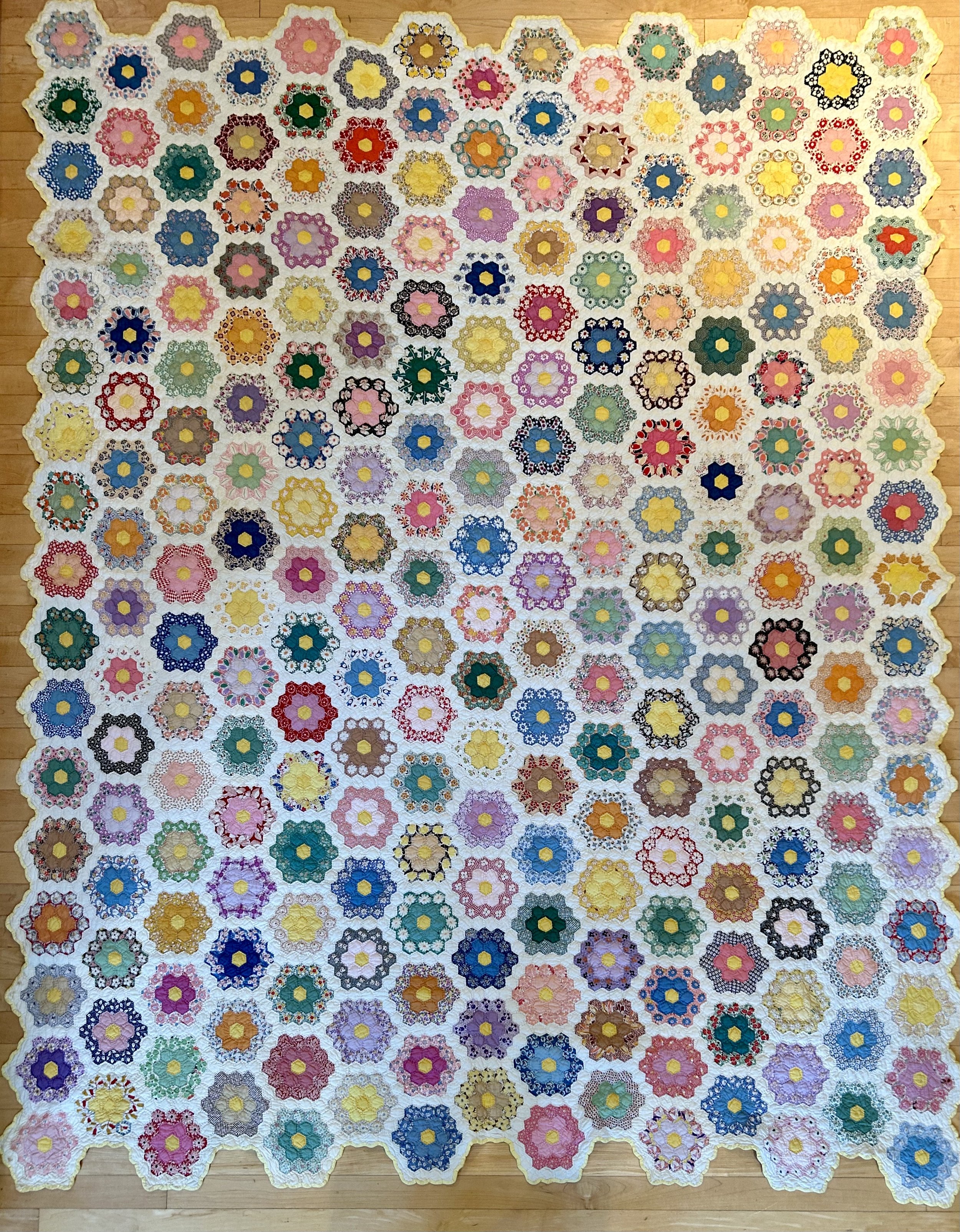
I have not decided if the IRS needs to know I received this quilt as “payment”. A thrifting girlfriend asked me recently if I could clean an old quilt she had found. Certainly, though I was a tad worried what a thrifted quilt purchased by the pound was going to look like. Honestly my heart stuttered a tad when I pulled this out of her bag. The quilt is pristine. Colors are bright. Binding was unfrayed. And while it needed to be washed to remove dust and brighten the yellowed tone of age, it was hardly used.
And no wonder. It is remarkable. The pattern is called Grandmother’s Flower Garden and is composed of hexagons. The pattern originated in England in the 1700s and was called “honeycomb” due to the design’s similarity to actual honeycomb. The yellow centers are a traditional choice, referring back to this origin. The pattern became popular in the United States in the 1930s during the Great Depression. As the pieces are quite small, this pattern helped utilize scraps of fabrics from clothing making. The entire quilt is hand done. Take a moment to look at the flowers. The artist used the traditional yellow piece in the center of every flower. The second “round” on each is done in a solid color fabric. And then she “fussy cut” fabrics to highlight an image and repeated that design around each flower’s third ring. It is hard to explain so here is a close up of two:

I have made virtually every type of quilt imaginable over the 35 years I have enjoyed quilting. But I have never tackled a crazy quilt (though now have 2 wonderful ones -see prior blog posts: https://www.ericasheirloomquilts.com/ericas-heirloom-treasures/wisconsin-crazy and https://www.ericasheirloomquilts.com/ericas-heirloom-treasures/jeannies-crazy-quilt). Nor have I tried to make a Grandmother’s Flower Garden. I am a grandmother now, but confess the idea of gardening is remarkably low on my to do list. Thus, my garden is not something to have as a moniker. Much more likely I would be “Grandmother’s Baking Treats”. Or “Grandmother’s Snuggly Quilts”. To say nothing of the daunting task of hand piecing a flower garden quilt. Each flower is composed of 19 pieces. On this quilt there are 248 blocks, meaning you need to cut and hand sew 4712 pieces to simply make the flowers. (Hubby wondered how I got that figure: math, dear lol). To say nothing of all the white “setting” blocks. I admire the perseverance. And in this case I also admire the workmanship.
As I lusted after the quilt, my girlfriend asked if I could repair another item she had that needed a hole darned. I joked that I could repair a pile of clothing (for her to resell) in exchange for the quilt. She thought that a fabulous idea!! So now I have a 1930s stunning Grandmother’s Flower Garden to admire while I nibble on chocolate chip cookies with my granddaughter.

Wisconsin Crazy

This quilt came home with me last week from a crazy thrift store outing in Wisconsin. A girlfriend invited me to go the “The Bins”, an “outlet” thrift store in a Wisconsin town north of us. It is a vast warehouse where everything is sold by the pound. The cross section of people there is astonishing: women with young children; young men of every color trying to score vintage concert tee shirts; teen girls in packs looking for fun outfits; middle aged folks of all walks of life hunting for items to resell for profit. I can’t say I enjoyed the “thrifting” aspect as it was exhausting (and dirty!) digging through mounds of everything imaginable. After three hours of hoisting mounds of clothing my rotator cuff had enough and is still annoyed with me. My favorite part, though, was people watching with scoring a treasure a close second.
This quilt was in my friend’s cart and I was seriously covetous. When she sorted through all her “finds”, she decided the quilt had a hole, and handed it to me. The hole she noted was something I could easily repair, so I happily brought it home. Based on weight it probably cost $6.50. The process I then submitted the darn thing to made me think of the museum exhibits I attended years ago to see the Gees Bend quilts (https://www.arts.gov/stories/blog/2015/quilts-gees-bend-slideshow).
Those quilts, made by poor black women in rural (and isolated) Gees Bend, Alabama were showcased at national art museums in 2002, garnering the women and their community fame and opportunities. As artwork, I appreciated the talent of the women to create warm bedcoverings while also making art with what they had. As a quilter, the quilts were hard for me to appreciate as my very OCD brain just wanted to wash them, square them up, re bind them and generally change them entirely. Well, my recent quilt find wasn’t going in any museum so I was free to do as I desired!
The quilt I picked up is a crazy quilt, and boy was it dirty. I would guess it hadn’t been washed since it was made in the early 1970s. While the top was sturdy, with nice embroidery done on the patches, the finishing left a lot to be desired. The backing fabric was pulled to the front and tacked down, making the edges bunchy as well as wonky. After disassembling, I threw the backing fabric into the wash, washing it multiple times to stop the fabric from bleeding color. The front, being more fragile, went into the bathtub. I used shampoo to wash it a few times. One purple velvet fabric continually bled, so I eventually stopped when all I saw was red dye and not filth in the wash water. Drying the thing was an exercise – towels, sheets in the sun, drying rack, ironing.
Then began a complicated process of squaring up both the backing and the top. As the top did not have a square edge to be found, I used my kitchen floor boards as a level guide. After lots of crawling around on the ground, cutting and sewing -voila!- I reassembled the piece. In fact, it is slightly larger now as the originally sewer had turned under about 4” on all sides of the top when finishing it. The last step was mending the few fabrics that had some damage. A red synthetic I was able to patch using cut off pieces of the same fabric. The green wool I backed in felt and darned in place. The out-of-place cotton calico I simply zig zagged frayed edges and left it alone. Now I have the quilt on the guest bed in my sewing room, and I find myself fondling it with a smile every time I walk past.
Hubby is also a fan, and neither of us can understand why our daughter doesn’t want to hang it on her vaulted walls! Sadly, I think this is a case of “parents being so weird”, but honestly this quilt is such a testament to the colors of our childhoods. It also speaks to the hard work of some woman to make a bright bedcover for a loved one during a very chaotic period – Vietnam, social unrest, huge economic changes. I do not know anything about the maker – what color, religion or social slant. I do know, however, that this was a Wisconsin woman who saved, made do, and tried to brighten up her home.
Believe it or not, the majority of these fabrics were from 1960s and early 1970s clothing. Hubby and I have joked that the quilt would survive a nuclear explosion as there is almost nothing natural on its surface. These fabrics were absolutely cutting edge: synthetics, rayon, nylons, and probably a few I can’t even identify. I absolutely can see bell bottom pants. Crop tops. Velvet blazers. Funky mini dresses. This was the vibe of society in the late 1960s, and this quilter has compiled a testament to that generation as told through her family’s clothing.
As a child, my mother often made items of clothing as gifts for us for birthdays and Christmas. Knit sweaters, dresses, jackets and skirts. These were not my favorite gifts to receive when I was little, and my family took up my comment “oh it’s a clo” as an amusing refrain. As an adult Mom would make whatever I requested: wedding dress, maternity business clothing, adorable baby outfits, stunning sweaters. I miss her and would give anything to have a quilt like this one composed of all the fabrics she used over the years to make wonderful clothing. But Mom was not a saver, and all those scraps and outfits are gone, other than a few memorialized in family photos (or saved in my closet). The Wisconsin woman who created this crazy quilt was someone who, like Mom, loved working with fabrics. And making treasures for her family. Sadly, the generation that came later either didn’t appreciate the quilt, or the story of its fabrics and family tale was lost. I for one appreciate it, loving the reminder of the 1970s’ crazy styles, and hope it doesn’t get thrown away again. Because, honestly, what’s not to love about it?!

Letting Go

Sometimes a treasure comes home with me and I struggle to let it go. The idea is I should resell things – for a profit – as it is silly to hold onto every single adorable item I pick up. Otherwise, my children would be stuck dealing with way too much stuff when I am no longer around . Hopefully my blogs will help them recognize the importance of some things, and the emotional connection of others. These ramblings are in a sense my attempt to capture those connections.
I helped my mother through the painful process of slowly discarding her life’s collection of “stuff” after my father died in 2010. She moved into a community where she would stay for 11 years, with each subsequent move into a smaller space as her care needs increased. And each time I was the child who did all the work to move her, assessing what to keep and what to surround her with as she declined towards her death in 2021. It is a difficult process to let go for some people. My mom not so much – she did not place much sentiment in things. I, however, seem much more inclined to like Stuff. This statue is a case in point.
I picked her up at an estate sale recently, which of course indicates some other family was starting that process. Realistically I should not refer to it as “her” as it is actually a couple, but the busty woman most definitely spoke to me. I love her strong woman vibe, hoisting that prim and proper guy over her head. The top hat man spoke to my circus themed room, which has a few “ringmaster” men on display. There is something about the piece that makes me smile, and of course makes me think of relationships in general. I had no idea “what” it was, did not ‘google image search it”, nor did I actually care and happily paid $16 for the piece. Turns out, she is valuable.
The piece is called “Public Debate” and was made by Lisa Larson in 1968. Larson (1931- 2024) was a Swedish ceramist and is much beloved in her native country. (Read a lovely blog post about her here: https://fishinkblog.com/2024/03/12/lisa-larson-world-exclusive-interview-for-fishinkblog-3/). While teaching ceramic at the College of Crafts and Design in Gothenburg, she was invited to work for a year at the Gustavsberg porcelain factory in 1954. She stayed until 1980 when she began working freelance, eventually founding her own studio in 1992. Her pieces are highly collectible, and too numerous to count. This one seemed to be worth a good deal more than $16. The debate in our house was the need to sell her.
I didn’t want to, obviously, but as I don’t actually “work”, bringing in money to offset my thrifting addiction is a wise idea. And the fact that items I find do not have an emotional connection in my life – other than the appreciation of the work done by an artist, the enjoyment of their beauty and humor, and the curating of our home with treasures. My children will not be pleased if every single item I love ends up stacked deep in our barn. Sadly, I sold her – mind you at a great profit, but still it was a sad day when I shipped her off.
Sometimes you must though. Life has a way of throwing things at you, and sometimes the best thing to do is spend time with those you love, not cling to found treasures. I am sad at the moment, which is never a good place to start writing, but the reality is life is transient. We hold onto the people we love, the treasures we collect, the spaces we reside. But sometimes you have to let go. It is good training to let go of stuff, as letting go of loved ones is a much more difficult process. Watching my mother go through her final years was a painful reminder that relationships are truly the most important thing to cultivate in your life. Holding Mom’s hand in her final hours -during the depth of the Covid crisis – was profound, and difficult. Her life had dwindled to a single room, isolated due to the Covid restrictions, as well as her struggle with dementia. As I looked around her room I realized how few things remained of the life Mom lived. A few important pieces of art. Family photos. A few collected treasures and mementos. I am sorry to be so maudlin, but I am struggling with letting go – both figuratively and literally – and I realize that the important thing is to love.

Channeling Frida
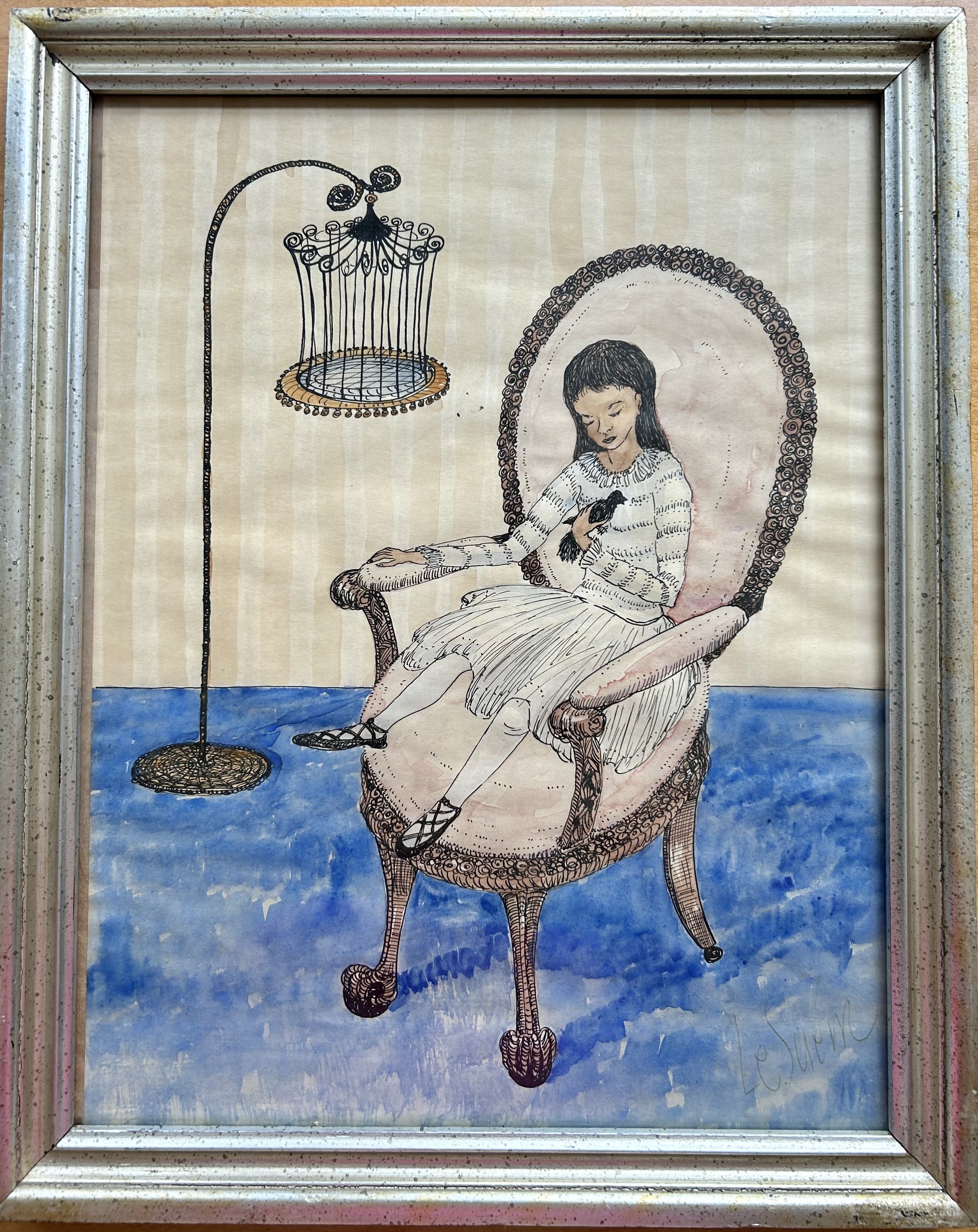
I picked this artwork up at an estate sale recently, and it made me think about the purpose of art. The piece is likely a pen and ink with a bit of watercolor, though I am not 100% sure. It is not a print of any type (no Benday dots) and is on a piece of paper with a watermark saying “Hamilton Ledger”. Undated and unsigned, but titled “Le Suen” (translates as “Sound Familiar”). The back of the old frame has a note saying “Borda Gardens, Cuermuaca, Mexico”.
Borda Gardens was once part of a remarkable property created in the 1780s, with a garden design by Alexandre-Gustave Eiffel (of Eiffel tower fame). The estate is now a public park and museum, with cultural events hosted in the park. My guess is the artwork was created by a local Mexican artist who exhibited at a show in the Gardens, with my piece being purchased by visiting Americans. I would say 1950s due to style of paper.
I suspect any number of people would not find it attractive. Nor want it on their wall. The vibe is a bit “creepy” and the black bird doesn’t help the situation much. But the purpose of “art” is not always “decoration” – sometimes it is about noticing your response. This work creates a bit of unease, and made me think of the famous Mexican artist Frida Kahlo (1907-1954).
First let’s figure out what is making us uneasy. The perspective of the piece is a bit challenged, though possibly on purpose. The angle of the chair is distorted, and while the detailing is impressive, the artist pitched the chair in such a way that the piece doesn’t seem quite “right”. Also note the chair’s Victorian style clawed feet which adds to the ominous avian vibe. The scale of the girl to the chair is also off, as is the perspective of her sitting in the chair. She seems to be a young teen aged girl, but if so, the chair is huge as it dwarfs her. The dark hair, while likely culturally appropriate for someone of Mexican heritage, seems a bit sinister splashed against the pink chair. Then we add a black bird, freed from its charmingly detailed black cage, and calmly resting on the girl’s chest. Black birds are often a bad omen in popular lore. Like many things, however, there are other interpretations and black birds can also symbolize a new phase in one’s life. The title of the piece “Sound Familiar” certainly makes this a mystery.
I sense the work is inspired by Frida Kahlo (https://www.fridakahlo.org/frida-kahlo-paintings.jsp). Kahlo grew up and lived in Mexico City. Much of her work is autobiographical, and tends to be portraiture. She had polio as a young child and suffered a horrifying accident at age 18, derailing her medical training, and turned her to artwork. It also left her virtually crippled and in pain the remainder of her life. Her artwork reflects this, and much of it is disturbing (to me anyway). The small piece I purchased made me think about this because it made me question the “purpose” of art. Often times we use art as “decoration”, trying to complement our home with something pretty. While we seem to be ok reading books or watching movies full of disturbing issues, we shy away from hanging “creepy” things on our walls. I do wonder what the artist of “Sound Familiar” was trying to say, and I will continue to reflect on the power of art to cause us discomfort. Sometimes that’s not a bad thing.

Jeannie’s Crazy Quilt

This week has been an astonishing whirlwind of quilts. I am a bit giddy, actually, and have 3 stories based on three different fabulous quilts buzzing in my brain. I do feel, however, that Great Aunt Jane is going to the front of the line. You know how I feel about history, especially when it involves heirlooms and ancestors. Jane Strong (1866-1955) was my father’s “great aunt”, and her quilt landed on my doorstep this week.
While I have made many types of quilts in my life, I have never attempted a “crazy quilt”. I have collected wonderful silk fabrics and antique lace for years with a notion of creating one as I love the look of them, but thus far have not begun. The typical process is to start with a base square of fabric – muslin most often – and jigsaw puzzle fabric pieces together to fill the block. In antique crazy quilts, the fabrics were often from worn clothing, and often included dress-making silks. These fabrics are prone to deteriorating over the years. Silk is inherently fragile, but it did not help that during the late 19th century, silk fabrics were “weighted” with lead to make the fabric stiffer and more costly. After the individual blocks are patched together, the quilter begins to “embellish” them with embroidery stitching and fancy images. Then the blocks are sewn together, backed with fabric and left unquilted. While the construction is simple, I am daunted by the steep learning curve all that embroidery would require. Now, fortunately, I don’t have to make one as I have Great Aunt Jane’s to show off!
Jane was the second of five children of Adeline Schenck (1844-1933) and Benjamin Strong (1834 –1915). Interestingly, my family has always referred to her as “Jane” but the family archives indicate she was “Jeannie Schenck Strong” when born in Redbank, NJ. Unclear when she became “Jane” in family lore. She was the only daughter, and her brother, Ben Jr. (1872-1928), was my father’s grandfather. Jane did not marry (nor did two of her brothers). Her nephew, Ben Strong III (my grandmother’s eldest brother) wrote a family memoir and says Jeannie “devoted herself to looking after her mother and father in their later years. In addition, she had great artistic talents, doing beautiful painting. She was for years a member of the “Shut In Society” and carried on an active correspondence with shut-ins all over the world”.
My Uncle B in New Zealand remembers his Aunt Jane well, as she was very close to his mother, my grandmother Katharine Strong Humphrey Osborne (1904-1987). Aunt Jane came to help her neice when the family lived in Litchfield, Connecticut. Katharine was struggling to raise 3 boys while her husband, Watts Humphrey, commuted into NYC for work. Now, there’s an interesting aside – Watts would fly a biplane off a lake near their home, landing on the East River to get to Wall Street. For reasons unknown to me, he would spend the week in New York, returning to CT for the weekends. Thus, my grandmother was left alone to raise 3 elementary-aged boys, and her Aunt Jane came to stay for a number of years.
My Uncle mentions Jane was a unique woman, walking around the house reading a bible in Italian out loud. No clue why, but it made an impression on him. He stayed in touch with her throughout her life. When she died in 1955, he received a number of her things, including a wood trunk with the quilt top stored inside. Jane’s companion said Jane had started the quilt around 1910. My Uncle and Aunt moved to New Zealand (her native home) back in the 1970s, carefully storing the quilt in Jane’s wood trunk. My Aunt’s New Zealand relative “finished” the crazy quilt top, thus helping to preserve it. This involved adding the black (cotton) border and burgundy backing and binding. The piece was then “tied”, using an embroidery thread to tack the top to the back. Fortunately, she did a lovely job, and the crazy quilt can safely be handled.
Back in October, one of my New Zealand cousins began reading my blog and we started a correspondence. He shared with me a catalogue of family heirlooms the NZ Humphreys have been treasuring. Among the pages was a picture of Jane’s quilt. I wrote a blog about my coveting the piece, and my charming relatives decided it needed to fly across the world to live with me! (https://www.ericasheirloomquilts.com/ericas-heirloom-treasures/forget-the-silver-i-covet-the-quilt)
When my doorbell rang on Friday, I was working on a different quilt and almost missed the bell. The postal worker had a thin package for me that needed my signature. It was from New Zealand. Great Aunt Jane’s crazy quilt arrived and I held my breath opening the package. The work is lovely, the fabrics are stunning and in remarkably good condition, and I was speechless when I laid it out on a bed. I can hardly believe a woman born in 1866, as the Civil War just ended, the sister of my great grandfather, made this work using fabrics culled from the family’s clothing. Honestly, while I cannot point to any in particular, I suspect some of Benjamin Strong’s clothing is entwined in the blocks. It is a treasure of beauty, and the joy of writing about my family and recording these small miracles of history remembered brings me such pleasure.
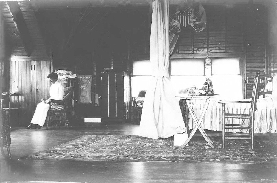
Jane Strong in the family’s summer home on Woods Hole, MA (notice the sewing machine!)

My Grandmother Kat


When I was born only one of my grandparents was living, my father’s mother. Katharine Strong (1905-1986) – called Kat by her family – was my “Gum”. Realistically, I hardly knew the woman, and now, as a grandmother myself, I wish I could ask her about her life. While my family would visit with her, it was not frequent and, being near the youngest of a large gaggle of children, I did not engage with her much.
My parents would take all 7 of us kids to Florida every other year. There are videos of us, all dressed up in our fancy clothes, being escorted to the airplane by my grandparents (we considered her 3rd husband our grandfather). Dresses, hats and the whole shebang. In addition, they would visit our home once a year or so. I do remember the childhood Easter Egg hunts in her yard on the inland waterway on Siesta Key. Her husband, my “Pop-pop”, would hand out prizes for all the egg hunters, and his charming “categories” became a tradition I carried on with my children. When we visited Florida, we stayed in a rented beach home or motel, though I believe my older sisters would stay with Gum or with an aunt nearby.
Being the 6th of 7 children made me a bit of extraneous energy, and I recall my father would propose “the quiet game” whenever family visited. The idea being the younger kids – me included – would lie quietly on the floor. Whoever lasted the longest would win a quarter. I think it likely I never won, but can’t swear by it. In any case, my interactions with Gum were not particularly memorable, and I have no close anecdotes to share.
Looking back, I would say I did not get the warm and fuzzy vibe from Gum, partly due, I suspect, to my being a rambunctious child, with many siblings vying for her attention. And, realistically, she was more the stoic, New England, Presbyterian type – raised in a very high socio-economic class in the New York City area. While her life was one of upper class, her tragic childhood likely had a significant impact on her.
Her mother suffered postpartum depression, and stayed at Glen Hall Hotel and Sanatorium while Kat was an infant. Upon returning to the family, she used her husband’s revolver (for his work with J.P. Morgan ferrying money on the streets of New York City) to commit suicide. Tragically Kat and her siblings were at home at the time. Soon after this her older brother came down with whooping cough, infecting a little sister Peggy. Kat was sent to a hospital (though possibly more like a sanatorium than what we think of as a medical hospital) to avoid infection. She was away for an entire year, and Peggy died during that time. Eventually Kat returned to her home with her father and two brothers.
Kat’s father remarried when Kat was 4. Two girls were born to the couple, but the stepmother (Katharine Converse) did not remain, leaving Ben Strong for California with her two daughters in tow when Kat was 12. In addition, there is a family story that Kat’s nanny got pregnant (though I do not know if this was before, during or after her stepmother was around) by the butler (of course). The nanny was fired, but not the butler. Kat told the story to my Mom, who in turn told me, making sure I understood how bitter Kat (or Gum as I called her) felt about the loss of the woman who cared for her.
What does this have to do with the charming carved clay sculpture I found at a thrift shop for $1.99? This little lady made me think of grandmothers, both my own and my being one. Really, it made me sad to realize I didn’t know my grandmother, nor recall her with the kind of charm this little lady possesses. The figurine has an apron embellished with a “K” so I named her Kat.
Kat – the clay one – was made by “VH” on 4-18-1972, according to the back. It is possible she was a school art project, but I cannot help but think VH made it as a gift for grandmother “K”, depicting an actual woman. She has very specific details. Her tight curly hair. Her wire-rimmed reading glasses. Her trimmed out apron, over a collared dress, with the back showing the apron ribbon tied into a bow. And her mixing bowl – she was a baker!

Being a baker as well, I have included my granddaughter in various baking projects. Wearing my apron and reading glasses of course! I want to build a connection with my little one so as she grows, she knows her “Nana” loves her. I am sure my Gum also loved me, but she was a complicated woman from an era that was more reserved. She grew up with horse drawn carriages, household staff, and owned a car in 1918 (I have a photo of it!). She attended Smith College, and traveled internationally (by boat) with her father, Ben Strong (1872-1928) for his work with the Federal Reserve. She received the right to vote just as she became an adult. She married at 20 and promptly had 3 sons a year apart. She lived through 2 world wars, with her brothers and her first husband entering both conflicts. She was divorced at a time when that was not the done thing, having to travel to Nevada in the 1940s to accomplish it. She raised three teen boys alone, without financial assistance from an ex-husband, with no work experience to speak of. While I want my grandchildren to know me as a loving Nana, I do not want Kat’s life story to fade away either. Complicated women seem to run in my family.


American Dream

Sometimes when I research a found treasure, I learn interesting tidbits about the artist as well as the art. Sometimes I find absolutely nothing. And others? I find a person with a lovely voice and learn a great deal about many things. This charming artwork by Tom Marrazzo dated 2/16/1936 falls into the last category.
I picked up the piece at a local thrift store for $2.99. The artwork puzzled me as it does not appear to be a print, more a pen and ink work (no Benday dots). But it also feels much like an old etching, in the style of Rembrandt, with the busy town scene of a butcher working in the open air, while the charming local folks, chickens and dogs mill about. I put it up on my display shelf in our dining room and left it to be admired.
Recently I decided to research the piece. Google Image Search was useless, and a name search revealed almost nothing, other than learning “Marrazzo” is a family name from Naples, Italy. I did, however, find a contemporary artist with a gallery called “Marrazzo Art”, run by Cindy Marrazzo in Tennessee (https://marrazzoart.com/). As the name is slightly unusual, not a “Smith” anyway, I figured no harm done in reaching out to her to see if she had any familiarity with a Tom Marrazzo. And boy did I discover a wonderful story!
Tom Marrazzo was her father, born 1919 and died 1988. Her note to me is a lovely tribute to him, a man who lived a very American tale of immigrants, family love and creativity.
July 17 CM to EHJ:
“Dad was the first son born here in 1909 in Long Island, NY. His 5 older brothers and sisters were all born in Naples, Italy. Two more brothers were born after him here in the states. I believe that piece was inspired from trips they made back to Naples, Italy. He was a very talented artist and could also sing and dance. Wow could he sing! I still miss him, 35 years later.
However, as you probably know, making a living as an artist in the 1920s and 1930s, wasn't very profitable…Dad got his degree in architecture to work for his dad…who owned a construction company in Long Island, NY. Architecture was his way of being practical. However, he wouldn't marry the cousin brought over for him to marry from Naples, Italy, chose to marry another and was disowned. The family was very Italian in traditions.
Dad's first marriage didn't work out, but it did bring him to Chicagoland. He eventually married my mom, and I was born when he was 47 years old. Dad was a Korean War Veteran - Army and Air Force…He was also a great bowler with a 190 average, a professional baseball player and Mom and Dad would jitter bug up until a week before he left this earth. I should also mention, when 3 art teachers came to the house to beg my parents to let me go to the Art Institute on a full scholarship, my dad was adamant that it wasn't practical. Denied my dream at 16, I went into the service at 17 and then engineering school. 15 years ago (36 years later), I started painting again, and I understand why he did what he did for me. Although I sell almost everything I've ever painted, it is very hard to make a living as an artist.
Whether you write about him or not, thank you for the memories and letting me talk about him. I miss him to this day and still ask him for help in my art. Sometimes I feel I get answers from him. For example, I was about to quit painting for multiple reasons. I looked up to where I'd consider heaven and begged for his help in finding some direction. The next morning, I received a letter from AAPL that they were featuring me in September's Landscape issue in American Art Collectors magazine. In the following weeks I was accepted into Artsclamation art show in Knoxville, TN - where I had in the previous year been wait listed. Sometimes I hear his critique while I'm painting. I just wish he could have physically been here to see what I have accomplished with my art and living both our dream.”
I love the journey that created this artwork. A family with 5 children leaving Italy on a boat in the early part of the 1900s. Setting down roots in Long Island, but traveling - with 8 children - to see the family “back home” in Italy. A young man, capturing the scenes of that life, so foreign to his experience in the United States. And his choices regarding careers, marriage, and creativity. The majority of us are the descendants of a story like this: my father’s Pilgrim and Dutch ancestors in the 1630s; my mother’s German ancestors in the 1890s; my husband’s Polish ancestors in the 1910s. While the details may vary, we are all lucky the American Dream allowed them to thrive. As Cindy Marrazzo will be in the Chicago area in the fall for an art show, I will give her the piece I found as it really should find itself back home with her and her family.

The Path Ahead

This artwork reminds me of my college’s original 1867 colors: pink and gray. The students selected the colors to stand for “the rose of sunrise dawning over the gray of women’s previous intellectual life”. While the artwork actually has a brown cast to the dark colors, it spoke to me today in a way it hadn’t before, mirroring my feelings. I purchased it a number of years ago from a local thrift shop, framed as it is in its 1970s gold frame and brown matting. It is number 180 of 275, is undated, and is signed by Diane Vidito. The work is a lithograph and is entitled “The Fenway”
A fenway is a path through a marshy area. The word is old English, and originates from the idea that a murky, difficult area in the landscape is called a “fen”. In ancient England, filled as it was with bogs and marshes, arriving at the entry to a frightening landscape meant finding the way through was critical. Thus, the search for a fenway. Amusingly Microsoft doesn’t like the word “fenway”, thus my writing is currently covered in red squiggles of editorial warning. All of which really does feel apropos for the sense of doom and despair I have been wallowing in of late. I needed a way through a bad case of anxiety.
This work offers a glimpse of peace on the horizon. The dark tree in the middle plane, and its corresponding inky shadow most definitely put you on edge. Especially as the shadowed ground is so undefined - oily with a sense of menace. And damn it girl, you have to schlep through it. However, the rose of sunrise dawning in the sky offers a glimmer of safety. The water is clear. And the distant shore is pink! Comforting, and tinged with the color of life. Up in the far-left distance is a building. Unclear what the white mausoleum structure is meant to be – it hardly looks like a house, with its formal white pillars. But it too is bathed in a pink glow, though it is somewhat hidden behind a growth of trees. It takes more than a cursory glance to notice it.
So much of our lives are spent with cursory glances. But spending time with a piece of art, like with this painting, you can reflect parallels to your life. While the life that is burbling around you can feel overwhelming, appreciating something of beauty can offer a path through the muck. It does not need to be “official” art, or even art per se, but when you begin to build an awareness of why a piece affects you, the story you discover can be a surprise.
It was only as I was enlarging this work on my computer that I began to notice things missed over the years I’ve owned it. I got so entangled in the big scary tree, noxious oozing slime, and unattainable distant safety, I missed something critical. Take a moment and go back and look. I’ll wait.
Tucked behind the behemoth, grabby, decrepit tree is a small tree. And it is pink. There may just be a fenway ahead, to that great white house in the distance.

Lily of the Valley

This Lily of The Valley art made me think of my mother, Barbara F. Humphrey (1928-2021). It is actually a large pin, mounted on green velvet, inside a well-made box with a glass lid that slides out. I found it at an elderly woman’s garage sale this past weekend. She wanted $8 for it, and told me it was from “the last century”. Turns out it was made in New York City in the early 1990s. The artist Michael Michaud is still active (https://www.michael-michaud-us.com/). The piece is hand cast bronze, painted in green vermeil, with fresh water pearls that dangle down off each tip. It notes on the back that is it number 393 out of a run of 750.
The pin itself is actually close to life-sized, which I should know as our front yard has a large area thick with Lily of the Valley. When the flowers bloom in May, the smell is astonishing, and the little white bells create a dainty carpet across the whole area. Over the years I would pick a huge bouquet and overnight ship them to my mother, as they were her favorite flower. She carried them on her wedding day on May 22, 1954. Now whenever I see something with a Lily of the Valley image, I think of her and the woman she was.
Mom was a complicated lady, raised by a first-generation German woman, Frieda Hermes Fallon (1898-1961). Her father, Martin Fallon (1893-?) was born in Ireland and raised in Boston. He inconveniently had a prior marriage and 3 children he neglected to mention to his new Catholic bride. When this came to light, Mom was around 8 and her sister Lois two years younger. Martin left Frieda and the girls, and moved away from Chicago. My grandmother moved in with her eldest sister Frances’ family, with Mom and Lois in tow. There was very little money as this was during the depths of the depression in the 1930s, and Mom had to take care of her sister and attend school. She became a “parentified child”, and simply got things done. She earned a scholarship to Mundelein College in Chicago, and won awards for her debate performance, particularly being part of the first women’s debate team to go up against West Point. (My children all just went “ah-ha! Yes, that must be where my genetic tendency to debate things came from.)
Mom had a strong belief in helping women, likely formed by her close attachment to her Aunt Frances who offered support during a difficult time in her childhood. Mom told me many stores about Aunt Frances, who seemed a remarkable character. As an adult, Mom volunteered at numerous organizations, including League of Women’s Voters, Planned Parenthood, and reading literacy groups, teaching adults how to read. She also would help women she knew who were in a bad situation, including daughters, daughters-in-law, nieces (and nephews), her sister, our old nanny, and numerous international women trying to immigrate. Most of this was financial and given as a gift.
Lily of the Valley is often considered an invasive weed as it is not native to our country. The plant can spread quickly, choking out weeds, like Creeping Charlie and Garlic Mustard. In my mind managing to smoother nasties is a fabulous side-effect of allowing Lily of the Valley to flourish. And, besides, none of us are native either, and growing roots in this country is what our ancestors have all done.
Whenever I see Lily of the Valley it brings a joy tinged with sadness. Sadness from losing Mom due to dementia during the horrid Covid-19 epidemic and missing her wisdom. Joy in the memories of Mom, the beauty she was, and her strong sense of supporting women. We need more women like Mom


Primary Colors

In a prior blog post I noted my attraction to triangles, and the degree to which they impact our appreciation of art (ericas-heirloom-treasures/composing-in-triangles). All well and good, but people don’t tend to shop by “shape” – more likely you head to the store looking for that perfect pink dress. Or red. Or black. Or whatever color floats your particular boat. Colors are trendy, and believe it or not, there is actually an institute that predicts color trends: Pantone Color Institute (https://www.pantone.com/about-pantone). This is a for-profit consulting company that started in the 1950s standardizing colors for the printing world. It has a huge impact on designers as well as clothing, housewares, and decorating trends. Not surprising “Ultimate Gray Pantone 17-5104” was the “2021 color of the year”, and gray is everywhere these days. But the basics of all color we see are primary colors: Red, Blue and Yellow.
This gathering of glass vessels has been in flux on the mantle in our Calder family room for a number of years (see ericas-heirloom-treasures/calders-rewarding-circus). I did not have a “vision” of any type, simply would pick up interesting hand-made glass when I came across them at estate sales or thrift stores. I only just realized I had collected primary colors! With a lot of circles thrown in, all of which directly reflect the Calder work.
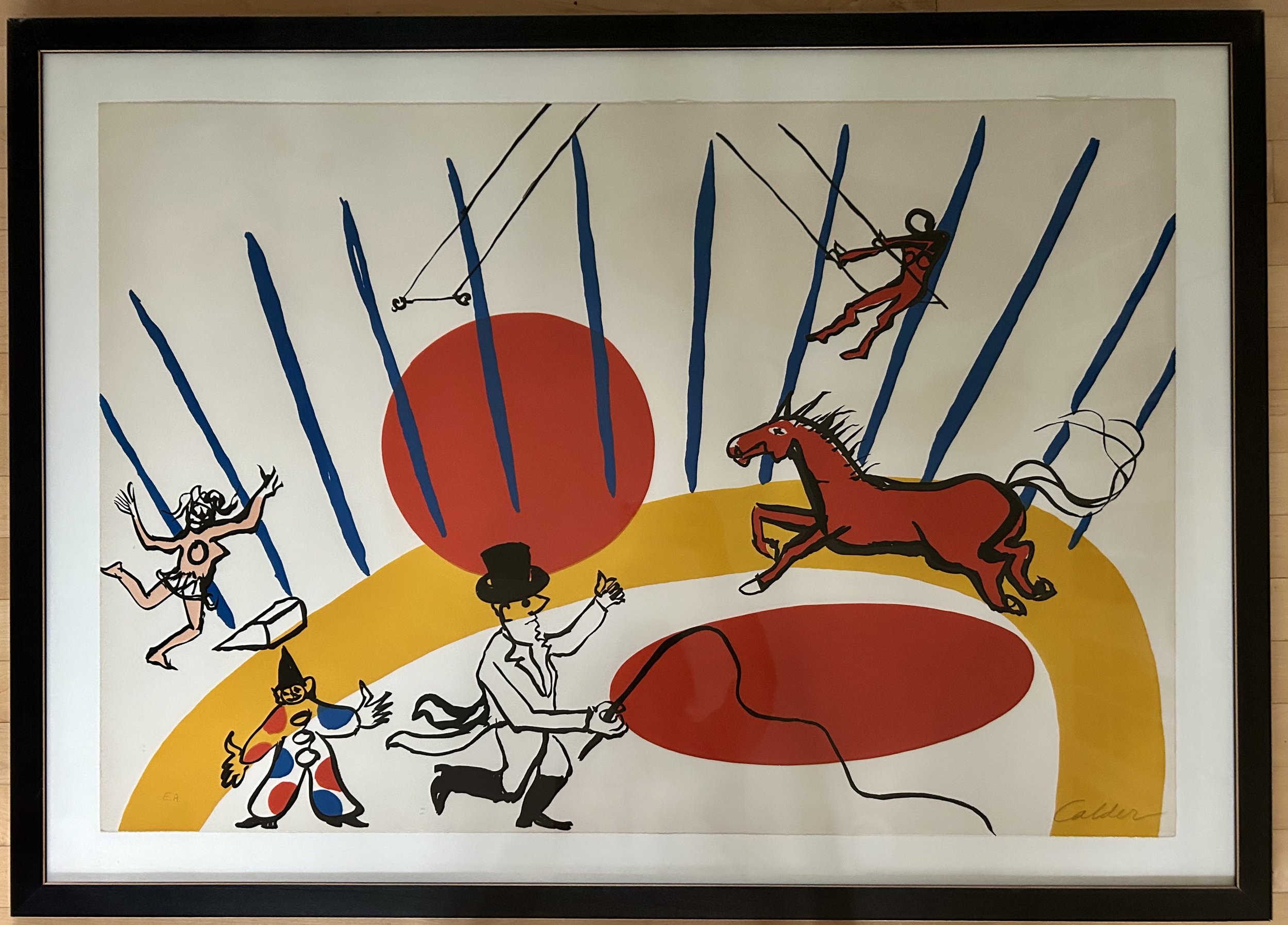
The wonderful red-orange jar was found at an estate sale years ago. Its color and shape are a great compliment to the orange-red circles in the Calder lithograph. The piece is a three-sided vessel, with a distinct circle indent on each face, a helpful means to hold the piece when pouring. I hadn’t researched the work as I didn’t think I could discover much about a vintage glass vessel. How Google Image Search has changed that!
The piece is a Blenko art glass decanter from the 1950s. Blenko Glass is an American art glass company started in 1893 in West Virginia, and is still in existence (1). This piece was designed by their first “resident designer”, Winslow Anderson (1917-2007). He began a residency at Blenko right out of college in 1946, though it is unclear when this piece was designed. It is described as having a “trefoil top” and both the jar and the glass stopper are hand-blown.
How to tell if a glass piece is “hand blown”? The most obvious is to feel for a “pontil” mark on the bottom of the work. This is a small ring-shaped divot in the middle of the base, which can be felt by running a finger across it. This comes about due to the artist using a long metal pipe, with a thin layer of glass on the end, to handle the hot glass during the shaping process. “This handle will often leave on a small amount of glass when separated from the hand-blown glass. The pontil mark confirms that the glass is blown by hand. However, this mark can be polished away to hide the irregularity” (2). A pontil is a term from Italian pontello or ‘small point’, a diminutive of the word punto – point or spot.
The term “trefoil” is also a Latin-derived term, relating to Christian symbolism. It is a “pattern of three interlocking circles that was used as symbol in church architecture…A trefoil is meant to represent the Holy Trinity” (3). (As a complete aside, I find it cosmically ironic that the trefoil symbol “evolved into the radioactive symbol and biohazard symbol…that represent hazardous material” (3))
The other two vessels are more recent thrift store finds. Both have pontil marks and were hand-blown, but very little other information was forthcoming. The blue is a cobalt blue satin glass, made circa 1940. The piece has a charming ruffled top, sweet dimpled curves and adorable blown-glass ball stopper. I feel like I’m describing a grandchild, but Google described it as a “cruet”. My curiosity got the better of me, and off I went to research (etymology, for anyone wondering, is the study of the origin of words and the way in which their meaning has changed through history). “Cruet” is also a religious word, deriving from German “kruche” or pitcher, and originally referred to the vessel used to hold wine during a Catholic service. Now we understand it to be a bottle, with a stopper, for serving liquid condiment during meals. This particular cruet is simply on display, no salad dressing in sight. And the rich blue is an exact match to the blue “tent” lines on the Calder.
The gold decanter (missing its stopper) is a very 1960s design, and makes me think of a childhood television series “I Dream of Jeannie”. In retrospect, that show is a bit disturbing, but as a 1960s child, it seemed magical. The “I Dream of Jeannie” bottle, however, was a 1964 Jim Beam “Christmas special” bottle filled with bourbon, and used as Jeannie’s home on the show. My gold decanter doesn’t look much like it, but its coloring, brass handle and wicker wrapped neck certainly feel very 1960s, and it creates yet more circles. These compliment the Calder’s large arching swath of yellow, which defines the circus ring.
I have a strong urge to move the 3 bottles around so that the red is on the left, with the yellow in the middle and blue on the right. This reflects my ocd focus on “roygbiv”, or the order of the colors of the rainbow (red, orange, yellow, green, blue, indigo, violet). But these particular glass vessels are rather stubborn, and make it quite clear they look better aligned by shape. The weight of the largest, red, vessel on the outside anchors them, with a triangular slant downward toward the lighter, yellow glass. The yellow compliments the antique frame of the large oil painting is rests against, and all those circles create a pleasing softness, offering a bit of a reprieve for your eye, even as you continue to argue they’re in the wrong order.
(1) https://blenko.com/pages/blenko-history
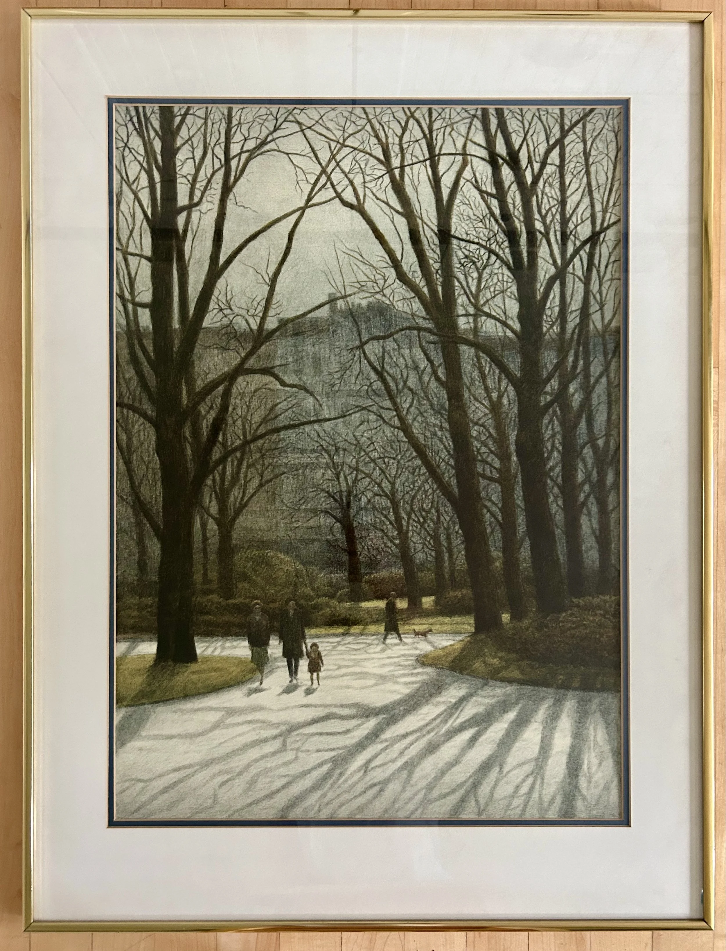
Sargent In The Park

This artwork was at my local thrift shop for $35. It is large – measuring 24” x 32”, and nicely framed. I really had no idea where I would hang it, but it spoke to me of the New York City of my childhood. It ended up in our basement stairwell, which actually makes more sense than you might think. The tan walls, black stairs and tunnel-like space suited the artwork, causing a moment’s pause as I head down to the basement.
So, what about this piece made me pause? Really, the picture itself somehow makes you pause. It drags you back into a past world, creating an atmosphere of somber majesty, with an undertone of nervousness. The soaring trees, overwhelming the walkers? The imposing, but obscure, building looming in the background? The gray tones? Or the trees, casting reflections on sidewalks that somehow feel a tad sinister – like skeletal hands stretching across the plane of the artwork? All that, but also no phones in hands, no strollers, or electric scooters or roller blades. There is only feet, and hands and a sense of ages gone by.
A photographer friend suggested that laying a glass framed artwork on the ground and shooting a picture of it from above was a way to avoid the glares and reflections the glass can create. Having done this (success!), I was not optimistic about learning anything, as the artwork has no visible signature or date. But Google Image search had no trouble! The work is a lithograph, dated 1980 by Harold Altman (1923-2003).
While I had no discernible way of knowing, my instincts said the work was of Central Park in New York City, likely in the 1980s. Turns out I was completely correct! Altman was a well-known NYC artist, with many pieces owned by The Whitney, Museum of Modern Art and Brooklyn Museum among others. He is famous for his 1980s lithographs of Central Park, though later he did work in Paris parks as well. While he was a prolific artist, he spent a great deal of time working in lithography. There is a website dedicated to his work and it describes his lithographic process:
“Lithography is a method of printmaking based on the opposition of oil and water. In lithography, a design is drawn with a greasy crayon on a thick slab of polished limestone... It is then fixed — or prevented from spreading — by applying a chemical mixture of gum and nitric acid. The surface of the stone is then thoroughly dampened, since the key principle behind a lithograph is the natural antipathy of grease and water. When ink is rolled over the dampened stone, it attaches itself only to the greasy areas of the design. When a piece of paper is pressed against the stone, the ink on the greasy parts is transferred to it. To create a color lithograph, a separate stone is used for each color and must be printed separately.” (https://www.haroldaltman.com/) I find such trivia fascinating.
While I visited NYC quite a lot in high school and college, with different sisters in very different times in my life, I also spent time there as a young girl. Mom would put me on a train alone – mind you I might have been 10 – to head into Grand Central Station in Manhattan to meet my mother’s college friend HJS. HJS had been widowed after only 8 years of marriage, and lived on the upper west side in a large, stately apartment overlooking Central Park. She would bring her daughter “L” and me to incredible NYC experiences in the 1970s. I recall Hello Dolly with Carol Channing. Art exhibits, including Calder. Dinner at unusual restaurants or friend’s homes. The family had a boxer name Sargent, and the idea of having such a dog in an elevatored building in the heart of the City seemed odd to a suburban girl with a big yard. The dog, however, was lovely, and in fact had been awarded an honor from the City because it defended L from a wild dog attack in Central Park.
The part of this meandering that springs from the artwork is the association of these visits with Central Park. The apartment looked over the park, and L and I would often go out to play nearby, dog in tow. We would scamper around the park’s paved paths, and play in an old metal playground situated beneath the apartment’s window. While the park may have been perfectly safe, I suspect, in mid to late 1970s this might not have been the case. There was a sense of danger, so while the area was lovely, I was always slightly on guard. Knowing their dog had to save the daughter from a crazed dog didn’t help my comfort level. But the lithograph speaks to that childhood sense of awe and majesty, with a serious case of danger lurking like a gray mist.

Turtles In Heaven

This little turtle was a child’s art project, made in 2nd grade by “C”. Problem is two of my children have names starting with “C” so it is a tad unclear which one was the artist (no date). I suspect the two “C’s” will have to clarify, but in the meantime, turtle resides peacefully in our bedroom. It is precious, obviously, because my child made it as a treasured gift (sure, sure, I get the irony that I don’t know which child). It sits on our bedroom mantel, with its grass green color and charm reflecting the lovely French lithograph of 3 children gardening (https://www.ericasheirloomquilts.com/ericas-heirloom-treasures/gardening-in-history). The turtle also invites a bit of whimsy - there is something inside it which rattles when shaken – not sure what, but the sound is a sweet noise, and each time I pick it up I can’t help but rattle it. And Turtles always make me think of my mother, Barbara F. Humphrey (1928-2021).
There’s something about Turtles – a candy – that I simply cannot refuse. My mother, who hardly weighed more than 100 pounds most of her life, loved these candies. Of course, being my mother, she would buy one of the packets at the grocery store – you got three in the sleeve. She would give one to me, eat one, and then SAVE ONE in her purse. Ludicrous! Who doesn’t just snarf the package in one go?! Explains why I’ve not been near 100 pounds the majority of my life. I think the candy meets all my sweet tooth cravings: gooey caramel, crunchy nuts, and dark chocolate. Sprinkle a little sea salt on top and you would have nirvana as far as I’m concerned. I don’t know if tastes are hereditary, but I certainly learned of these treats from my mother.
Interestingly, the “Turtle” candy has been around a very long time. They were first created in 1918 by Johnson’s Candy Company, soon to become DeMet’s Candy Co. The company started from a candy and soda fountain shop in Chicago, owned by George DeMet. Mom, being born and raised in Chicago, clearly was familiar with the local candy, though I don’t know if she ever went to the actual DeMets Soda Fountain, located at 177 N. Franklin in the Loop in Chicago.
When my mother succumbed to a dreadful death from dementia, my close friends wanted to gift me something with a purpose. They selected a donation to the local forest preserve for a turtle restoration project. They had no idea of my mother’s love of Turtles, passed on to my sweet tooth as well. While the Forest Preserve dropped the ball on its “meet your turtle” process, I really didn’t mind. It was the sweet thought, which connected me in a very emotional way to my mother, that was important. In addition, one friend, a talented card-crafter, made a lovely remembrance card for me with the gift and I have saved it, hanging it on a bulletin board I see each day.
The photo my friend used for the card was from my visit to celebrate Mom’s 90th birthday. The staff loved the cupcakes, and the residents were a tad overwhelmed by the large bottles of wine (I escaped without getting in trouble so we’ll leave it at that). Sadly, Mom said to me that day would be her “last birthday”. She wanted outta here, poor woman, but painfully lingered on yet another 3 years, managing to land in Medical Care right as Covid-19 slammed into us all. Ok, I cannot continue in this vein as I will become weepy. The donation, gifted to the Lake County Forest Preserve, created more turtles for the woods we enjoy, and I will be grateful for the gift, the child-made craft, and the love and inspiration of a complex woman. And boy do I hope there are Turtles for Mom in heaven.

Feedsack Friendships

This quilt is a vintage one, picked up by my daughter’s friend at a local estate sale. Given she is newly graduated from college, I would guess she did not pay much. The quilt is from the 1940s, done in block format with two applique patterns – a flower and a butterfly - put on a 10” diamond. Interestingly, the shapes are not actually appliqued in place – instead, they were laid down, and, using a thick black thread, were machine stitched onto the background. Then the details – the body shape, wing outline and antennae were painted on with black ink!
My daughter asked if I could clean the quilt for her friend. The thing was so yellowed, I had to soak it overnight in the tub. The product I use is “Retro Clean” and it is a great way to clean vintage linens. Not all, mind you, as I have had things bleed as well as bleach out. But it was clear this quilt had been well loved and washed numerous times, so I was not too concerned with bleeding colors. Also, the quilt did not have any holes or damage, making it a sturdy choice for washing.
After the quilt enjoyed its over-night spa treatment, the water in the tub was literally pee-colored, and it needed a good rinse. I squeezed and twisted the quilt, then hoisted the soddened lump onto towels. At which point I rolled it up, burrito style. More squeezing, twisting and even standing on the towel burrito. Then off to the grass for a suntan, with a large clean sheet underneath. Within a few hours the quilt was only slightly damp. At which point I draped it over some lawn chairs for its final airing.
Now I was a bit verklempt regarding the binding. The original binding – the green fabric that goes all around the quilt’s edges – was completely shredded away along the top edge and parts of the sides. This make sense for a well-loved quilt. When a quilt is on a bed, the edge at the top is the one that gets handled - pulled on, bunched up, grabbed at. A “directional” quilt like this – where the images go only in one direction, makes it difficult to use the quilt on a bed in any other direction. Thus, one edge always gets the wear. Fresh binding will give the quilt a new lease on life. The trick was the fabric color.
For those of you unaware, colors are trendy. Different tones, styles and hues become popular, not only in the decorating and clothing industries, but also the fabric world. The greens you buy today are very different than those around even 10 years ago. In this case, the original green was a light mint green – think mint chocolate chip ice cream. Interestingly, the binding green was not used anywhere in the actual quilt top – one would think the “leaf” green of the flowers would have worked well. But most likely, this quilt was a bit of a “make due” work, and the fabric the quilter had the most of was the mint chocolate chip. Thankfully a nearby quilt shop – Sew N Save in Racine WI - had some options, and I landed on one, not mint green, but a nice shade that looked very 1940s.
I originally thought the quilt might have been a “friendship” quilt. In a friendship quilt, a group of women each make a block in the requested style. When the blocks were completed, the woman collected them, and began the process of creating the quilt. Mind you, this could take a year. It could even take 10 years. And, to be honest, I know quilters that have friendship blocks still in piles in their sewing rooms! Here, though, I suspect the pieces were all made by one woman, as a few of the fabrics are repeated, and the leaf green is always the same. More likely, friends donated scraps of bright fabrics to the woman, so she would have a nice variety for her butterflies and flowers. These fabrics are “feed sack” pieces from the 1940s.
A bit of history: starting in the 1840s, textile bags were used to sell food staples, such as bulk flour, sugar and animal feed. The original bags were course materials, and were reused as rags and towels. In 1910 better-quality fabric bags were introduced, and over time these bags became a source of fabric for clothing and quilts. The bag manufacturers soon realized women would request husbands “shop” for certain feeds based on the fabric they needed! There are numerous stories of feed stores having to move large piles of bagged staples so a certain fabric could be found. During the 1940s feed sack fabric became critical for many families due to the 1943 government restriction that ALL cotton fabric was for military use exclusively. With the exception that “commodity bags” were allowed. A feed sack basically was a 1 ½ yard piece of useable fabric, and women began to share and swap these fabrics. (1)
These butterflies and flowers are a testament to the ingenuity of women to create something lovely during a time of depravation. The bright, cherry colors offset the dark days of the Great Depression of the 1930s and the rationing years of the 1940s. The idea of a “quilting bee”, while viewed as a tad “old fashioned” and nostalgic by our modern era, was really one of support. The women helped each other, sharing patterns, fabrics, stories and often much needed friendship. The quilt my daughter’s friend found is a treasure of untold stories, friendships and the joy of adding sunshine to brighten a gloomy day.
(1) https://pieceworkmagazine.com/make-do-feed-sack-fashion-in-the-first-half-of-the-twentieth-century/


Puzzling Poultry Painting

I picked up this small oil at a church rummage sale because, of course. Chickens and all that. Paid $20. For those of you unaware, hubby and I own a property that once was a chicken research facility owned by Quaker Oats. Chickens have a way of migrating into my life. Of course, chickens don’t actually migrate, or fly for that matter, mainly due to the breeding for meat, making them aerodynamically land-based. But the painting was a bit of a puzzle none the less.
Research on the internet did not turn up much. There is little information about the artist, other than multiple paintings of chickens, all signed, as this one is, “Borofsky”. One eBay listing says “Borofsky specializes in barnyard scenes”. Well yes, but why exactly? Or when? No first name or dates to help identify location, era or history.
These particular chickens have me puzzled. The artist has a very “old masters” style, particularly with regard to the background scenery which is done in high detail. The sheaves of wheat tied up and leaning against the barn. The chickens, rendered such that they seem to be actual birds being depicted, not stylized images. The lovely muted color pallet. The frame, too, appears rather old – wood, likely walnut, with deep grains and a rich “old masters” color. But how old is the darn thing? And where, exactly, are we?
As I purchased the work in Winnetka, IL, it is possible it could be from Europe, and could be old. Winnetka is a wealthy Chicago suburb, with estates dating back to the 1850s. With a median income over $250k, the town is the second wealthiest in Illinois, losing out to its neighbor Kenilworth for first place. Thus, treasures found at this annual church sale tend to be remarkable. I scored an incredible, very large hand-woven Turkish rug at one of these sales for $75. Unfortunately, that treasure reeked of cat urine, and needed to be professionally cleaned as I was unable to make a dent on the stains (or smell). The large Arabic man that came to pick it up was wowed by the numerous hand-woven carpets in our home. I had two remarkable – though damaged – small prayer rugs that he was also agog over. Since he had a crew to repair those pieces, we swapped his work on the Turkish rug for the two child-sized prayer rugs. While I suspect he made out quite well, I was glad the rugs I had stored for 20 years unused would be repaired and likely admired. And I got a fabulous Turkish rug cleaned and repaired for free!
Back to my mystery rummage sale chickens. Since hubby jokes that I have a bit of a “triangle” fetish, I have to point out the triangles at work in the piece. The sheaves of wheat, leading down to the crown of the rooster and on to his tail builds one side of a triangle. The placid hen, pecking on the ground, mimics the angle of the sheaves, and creates the second side. The little chicks, aligned with the sheaves’ angle as well as the rooster’s feet anchor the bottom of the triangle. The landscape also offers triangles – the trees, the greenery and the clouds all have triangular forms scattered about, mimicking the chicken triangle that is front and center. A well-executed painting with classic structures incorporated into its design.
Now that you are sick of my fascination with triangles, I confess I think the piece is American. As well as likely turn of the 19th century. Why? The landscape feels more American than European, with the endless open land and uncultivated fields. European spaces are much more dense, having been cultivated for much longer, and they tend to be very proud of their architecture, while this piece hardly gives the building a second glance. Additionally, “Borofsky” is a name that screams “immigrant” to me. Research says the name is Jewish, denoting someone from Polish areas with a “bor” or pine forest.
Over 2.2 million people of Polish heritage immigrated to the United States between 1870 and 1914, due to famine and socio-political issues in Europe. This included my husband’s family, Jaworskis and Matlokowskis, who immigrated through Ellis Island sometime around the early 1900s. His parents were born in the U.S., as first generation Americans, in the early 1920s. Most Polish immigrants were Catholic, as were my hubby’s relatives. Only about 5% of those immigrants were Jewish, including our artist friend Borofsky. I am completely spinning a tale here, but I suspect Mr. Borowsky (and I do think it was a Mr. not a Miss) trained as an artist in Europe. Immigrated to the United States at the turn of the 19th century, and landed in New York or New Jersey as many did, including hubby’s family. Hubby’s family all worked as uneducated dock workers on the water in Long Island, suffering a great deal of discrimination. Mr. Borowsky, I suspect, took up his paint brush and created images of farm life in the country he adopted. I hope for his sake his religion and his skill offered him comfort and a living. And, with a bit of creative license, I will say my puzzling poultry was painted by a polish immigrant, pursuing a better life in our country. Happy 4th all, please recognize we’re all in this together.

A Quilt Of Love
This quilt was a commissioned project for a client as a gift for his mother. It took nearly 4 months to complete. Thankfully, I was able to hand it over in time for the celebration he envisioned for his mother’s 80th birthday party. But it was a tad hard to finish it, not because of all the technically difficult steps, but because I was sorry for the process to be over. It was such a creative, collaborative and rewarding project.
Jim’s mother is a quilter, and he wanted to create a special quilt to gift to her for her 80th birthday, to say thank you for all the love and quilts she had provided them over the years. As a quilter, I appreciate how lovely a sentiment this is. He searched via Etsy, local quilt shops, and even area quilt guilds to find someone who could help create the quilt he envisioned. Nothing online inspired him, and eventually he was referred to me via a local moms’ Facebook group, and we began corresponding in February.
He explained he had asked 17 family members to provide cotton fabric, and he wanted these incorporated into the quilt. The fabrics were chosen to convey each person’s relationship with wife/mom/grandmother/great-grandmother. The idea was for the quilt to be “revealed” during the party, with all covered up, and each person discussing their fabric and its meaning one at a time . After some back and forth, it was clear he was attracted to designs “on point” – a setting were the blocks are arranged in diagonal rows, with the blocks forming diamond shapes (instead of the typical “square” set). While this can be a visual interesting design, it does create a bit more challenge from the math perspective - and geometry lessons were a LONG time ago! I searched online and found an image of a quilt pattern I thought would work well. Unfortunately, it was not an available pattern for sale, as it is used by an Etsy quilter for her business. (https://www.etsy.com/listing/622169623/necktie-custom-memorial-quilt.)
Jim had explained to me that his father’s fabric was “roses”. Since the couple went on a first date on the 11th, and later were engaged on the 11th, Dad has always gifted her 11 roses instead of the dozen often available. The joke being he was “too cheap” to pay for 12! I felt very strongly we needed to highlight the roses, and decided to strong arm Jim into agreeing to the idea of a vase of 11 roses in the center of the quilt. Thankfully, he didn’t need too much convincing, and quickly warmed to the idea.
The layout proved to be a headache – would have been ridiculously easy if it was a square set, not the diagonal one. If I was adept at the quilt design program “Electric Quilt” this may have been less torture, but I’ve not tackled learning that program as yet. I admire those that can and am certainly envious – especially when I’m taping grid paper and drafting with pencil and rulers!
When we eventually met, he provided me with 17 yards of fabric! One yard of 17 very – and I stress “very” - different fabrics. I referred to the collection as “Nausea”, mainly because as a whole the patterns did not blend well together. The challenge would be to create a unified quilt with the disjointed, but important, fabrics. He had intended to pre-wash the fabrics, and I suggested no. Not that they shouldn’t be washed – but that I was rather concerned all the different colors would bleed. If that is done in a random washing, loose color can migrate onto other fabrics in the same load, staining them. And then you have a mess. Using a product called a “color catcher” solves this problem – it is a super slick sheet, much like a dryer sheet, that will actually collect any loose pigment in the wash. In some cases, you need to run the fabric through a few washes with color catchers. I washed these fabrics twice, as the first round showed quite a bit of pigment “caught” by the catcher.
I fussy cut the fabrics to make sure they were also on point, so the various designs would read correctly when set in the diamond (otherwise lettering etc would end up sideways). Next issue to tackle was the background fabric choices. I requested Jim find out if his mother had a favorite color. I knew I wanted a cream overall to help calm all the busy fabrics, but the edge triangles and 4-patch diamond blocks needed a strong color to handle all the myriad fabrics. The joke was that Jim said: “Hilarious - to the extent she has one, my Dad says it’s red(dish)… :) Yeah. A red background on red roses? Not so good - even for an ignorant non-quilting boy…..”
Whelp, yes that would be a bit challenging. I voted for blue. I texted him: “So the problem is that red is not a particularly good blending color. Your eyes are used to seeing greens and blues behind things. So, my preference would be to use a nice dark blue as the accent color. And maybe do the center block in a pale blue background. That seem OK?? Can certainly add some more red to the border if we want to bring in red but we don’t want it to get to be a red, white and blue looking thing.” Jim agreed with my suggestions, and I was on to the “vase of 11 roses”.
He wondered if we could use a silver fabric to compliment the blue, but noted his mother tends toward gold. I dissuaded from silver as it would need to be dark to show against the light blue, and sourcing a dark silver silk fabric would be a challenge. I found a yellow linen napkin in my bin of vintage fabrics. Laying it out in such a way that the embroidered hem acted as the top of the vase, and fussy cutting the bottom to highlight the embroidery. After a bit of google searching, I found a pleasing shape, printed and enlarged it. The roses were fussy cut from Dad’s fabric, the leaves cut from a green print I had, and the stems made from silk ribbon. Edges were turned under, glued in place with water soluble glue, and machine appliquéd. I definitely wanted there to be a leaf floating to the ground, as I explained I felt the leaf helped “anchor” the vase on the table. After a bit of concern, Jim agreed, though he asked if I could embroider a date on the leaf. Great idea! He mulled date options with his father, with a bit of stress about which date to use, and the chosen one was hand embroidered in a stem stitch. Hand embroidery was never my strong suit so the lettering needed a bit of tweaking to look as desired.
On to tackling the sourcing of the other fabrics needed. I knew I wanted Cherrywood, a lovely rich hand dyed fabric, in a very dark blue for the accent color. Their website refers to one color as “Nightshade” and I blithely ordered the yardage I anticipated needing. The color arrived and looked like faded blue jeans. Definitely not what I wanted. The company was lovely, and offered to swap the yardage for “Cobalt” which is their darkest blue. Not logical in my opinion! Thank goodness as that was a tad bit of money – Cherrywood is $24/yard! The delay in timing for all the shipping back and forth was a bit of anxiety but I used the down time to work on finding the cream color fabric.
Being a bit of a vintage junkie, I began to search for antique linen I could use. I liked the idea of a rich, heavy fabric and vintage table cloths can be wonderful for their designs and weight. I came across a few with roses woven into the linen, and realized that would be ideal. There were a few on eBay, but nothing with acceptable yardage and cleanliness. Then I found a listing on Marketplace and was so excited I arranged to get it even before Jim had given me the go ahead!

I seriously could not believe it! The woman told me it had belonged to her great aunt, and had never been used. What an amazing piece of beautiful handmade linen, probably from 1920s. Don’t faint, but I put it through the wash. And dryer. If it was to be used in a quilt, it needed to hold up to such, and better to do it to check if it survives, than to find out later when the quilt was made. It was a dream – softened up, didn’t shrink and held up just fine. I did use starch to keep the fabric from twisting as it was a hand loomed linen, but all in all it was a beautiful fabric to sew with. I confess I nearly cried when I had to start cutting.
I was anxious to be sure I had enough of the linen for the quilt, and nearly wore out my calculator measuring way more than twice! More like measure four times, cut once! While there was yardage, the lovely damask rose pattern on the table cloth would not yield enough for all the white blocks on the quilt. I fussy cut all those I could, and used non-rose designs for the partial blocks. Once I had the correct dark blue (which I had to wash FOUR times with color catchers!) I got the blocks made and began the layout.

Upon seeing the first mock up, Jim requested the vase be set off from the theme fabrics with white squares and the blue and white 4-patch blocks. Which required a whole lot more math. As I texted him: “ Dear god it was nutty (the whole sideways thing does a number on my math!)”. His reply: “Loooooove it. MATH!!!” At some point, I simply gave up with the calculator, and began to sew. I felt the light blue block needed a bit more oomph to set it off the white, and came up with the following solution.

I tend to move darker fabrics to the outside when working on a quilt as it helps with the visual weight of a layout – if too much “dark” is near the middle, the quilt can seem heavy – and not pleasing from a design perspective. Jim noted the dark theme fabrics set against the dark blue tended to make them disappear. Amazing! He was correct, and I appreciated his visual awareness. In this case the dark blue acts as the outer anchor, and the theme fabrics needed to be scattered to balance that heavy border.
We settled on the layout, after a bit of moving things around, and then added a “Chinese coins” border of all the theme fabrics along the two sides. The decision to not add the border to the top and bottom was due to the measurements of the quilt – it was longer than it was wide, and to add more to the length would make it a rather long and skinny quilt. On to the quilter!
Designing the quilting on a quilt top in our modern age involves computer assisted design (CAD) on elaborate “long arm” machines, which is an art all its own. My dear friend Nancy is a wiz at the process, and, being an accountant by training, loves for things to be very exact. She and I hunted through her database of quilt patterns, and I shared options with Jim. The ones he liked were those we thought the best choices as well! While Nancy began to laborious process of quilting the top, I struggled with learning to use an embroidery machine.
This started because Nancy had an older machine from a quilting guild friend who had moved a number of years ago into an assisted living arrangement. The machine, a Bernina, was a nice version about 15 years ago! The snafu was that I had to have a special “PED” machine to burn info off the internet to load into the machine. To do that, I had to have a pc computer (I’m an Apple girl). A friend cleaned an old pc he had, I ordered a “PED” machine, and I struggled to get the gadgets to communicate with each other. Unsuccessfully I will add. After hours of frustration. I recall being in tears at some point. And finally giving up, and ordering a second-hand embroidery machine off eBay. Which I then needed to learn how to use! Which is also an art – some quilters use embroidery designs as the quilt top work, but my goal was simply to figure out how to create nice looking labels, as my handwriting is less than fabulous.
I had suggested to Jim that the idea of a “key” for the fabrics would be a good thing to create. I had done this for another client – and it was by far their favorite part of the quilts they gifted their grandchildren, allowing them to identify all the family members on their family tree by the fabrics. In that case, my inspiration was great but I didn’t vet the info, and I learned a valuable lesson! Having to redo that key three times…aarrgg. Jim’s version did not include family names, connections and dates thankfully! I struggled through my steep embroidery machine learning curve. There was much back and forth regarding font style, layout options, and even thread color! The dedication label was a special family expression of love for their wife/mother/grandmother on her 80th birthday, not the right place for my name, and so I put mine and Nancy’s info on the “key” label.
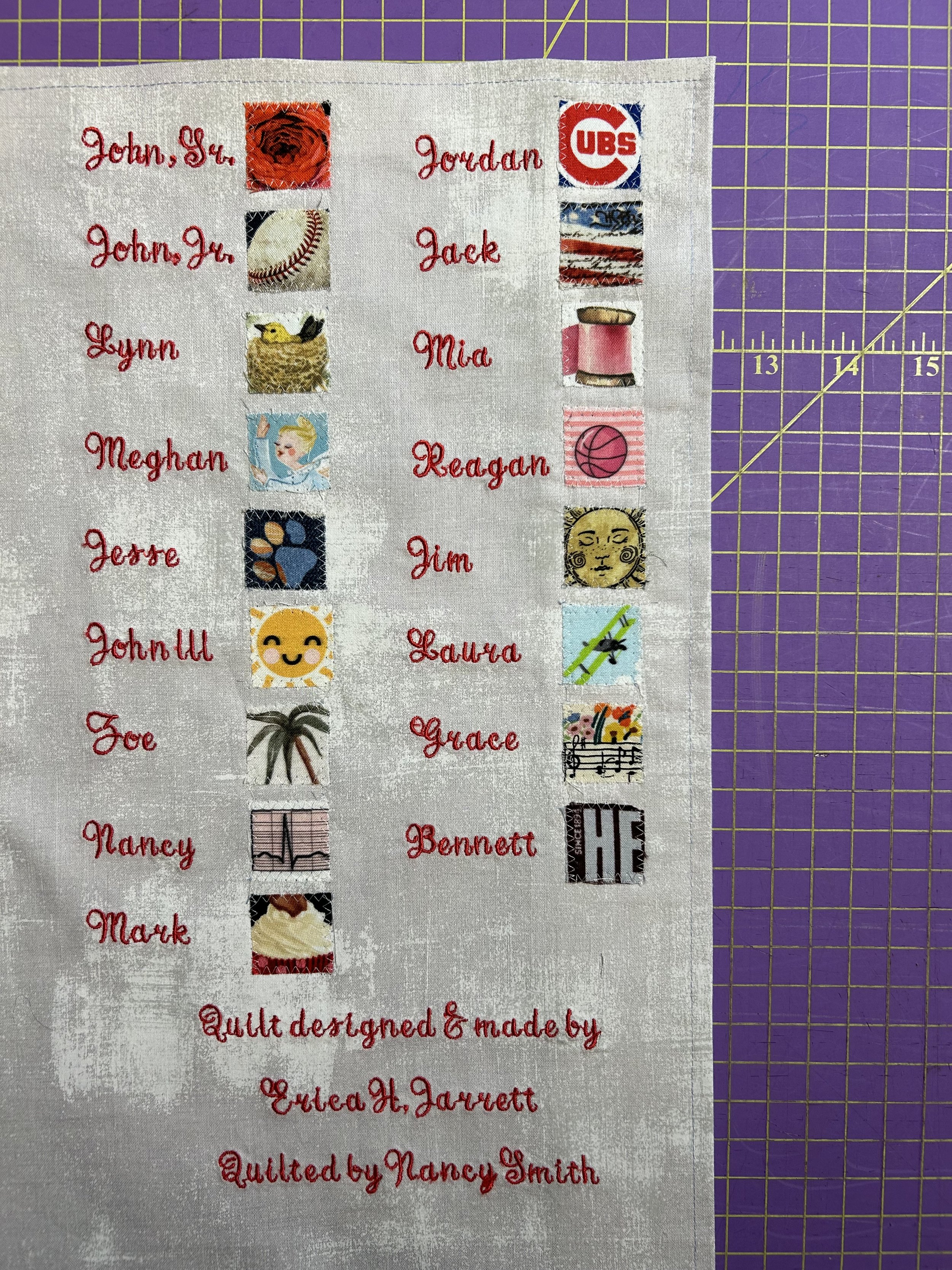
The quilt was a tremendous success – for the family and for the woman who’s love of quilting inspired such a touching gift. I was touched by Jim’s comments after the event:
Yes, it was truly "our own" quilt and you made that happen effortlessly with me. My mom was very impressed with the quality and couldn't believe it. I really love the patterns we chose. The "key" on the back was an awesome separate reveal as well. You really helped my vision see reality. It was not just a precious quilt to gift, but it was the mechanism to create and deliver a precious moment. The moment was incredible and has exponentially increased the value and import of the quilt itself. Seriously, every time she looks at the quilt, she will be touched by the memory of the presentation. It really all came together perfectly - literally and figuratively.Thank you again for making that happen.”
What a special process to be able to take part in!
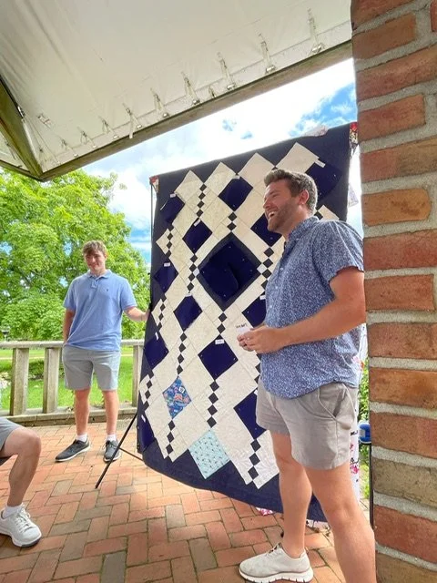


Composing in Triangles

I have realized of late that I treat our home as an art project: the different rooms and various spots around the house become a canvas. I experiment with combinations of artworks, shapes, color or theme until I land on a pleasing design. This collection, on the fireplace mantel in our bedroom, was built around shape.
Composition “usually refers to the arrangement of elements within a work of art. An artist arranges the different elements of an artwork so as to bring them into a relationship satisfactory to them and, it is hoped, the viewer.” (1) In classic art, triangular forms represent a pleasing shape. The triangle base grounds our eyes to the bottom of the piece, and the sides draw our eyes upward, much like in perspective (see prior blog post: https://www.ericasheirloomquilts.com/ericas-heirloom-treasures/wonky-perspective). “In the classical tradition, triangular…compositions were used because they created a sense of balance and harmony by arranging the figures into a stable overall geometric structure.” (1) It is ridiculous how often I move things, even just slightly, to get the composition to please my eye. And Hubby loves to tease me, slightly shifting something just to point out my ridiculousness.
This collection of items has been unchanged for a while now (as compared to the other side of the mantle where I keep swapping things). The pottery was a 2nd grade art class project my daughter made. I suspect her brothers made a similar project, but theirs didn’t seem to survive. The piece is a charming pile of squares made into a vase, emblazoned with my initial and glazed a sweet aqua green. It has become a depository for a found feathers and sticks. And one pink butterfly. The butterfly’s wing creates the perfect triangular line from the top feather down.
The small bronze-looking statue of a female holding a basket is a bit of an odd one. I picked her up from a friend’s estate sale, and loved her curves, regardless of her broken (and patched) ankles. The artist, Paul Herzel (1876-1956) was German born and lived in New York. I was unable to find any other work of his depicting a naked female. He seemed to focus much more on pirates and western American Indians and animals, so it’s unclear why he made this not-typical work. She is likely from mid-1920s, and was cast by the Pompeian Bronze Clad Mfg. Co. Turns out, it is not an actual bronze at all – it is zinc metal with a copper coating (or cladding as per the foundry’s name). It is not likely worth much – especially broken – but I cherish her and find her triangular symmetry pleasing. Her left arm, holding a basket against her hip practically shouts “step right up, ladies and gentlemen, triangles all around”. In addition, the tilt of her head mimics the angle of the butterfly behind her, using her nose to direct our eyes down, to swoop across her body and land on the little girl.
The sweet girl is a hand carved and painted statue, made in Germany’s Black Forest. I found her at my local thrift shop for a few dollars. Someone wrote on the bottom “Switzerland 1951”. Similar pieces on the internet are dated to the 1920s, so I suspect she was picked up as a vacation souvenir at that later date. Many of the internet versions refer to her as “Goose Girl”. The reference is to the Brothers Grimm Fairy Tale “Goose Girl”, though the girl and the goose in this charming piece seem sweet, while the fairy tale is rather gory. Which is saying something as Grimms’ tales are all rather awful, full of nasty characters our modern sensibilities wouldn’t dream of reading young children. It also seems unlikely the child is depicting the Goose Girl as the young woman in the fairy tale is heading off to be married and this little one seems a far cry from that age.
The entire carving is a triangle shape, from the girl’s head to the goose’s rump. As well as her hat, which draws you in from the Herzel statue. Her skirt also flairs into a triangle, creating her triangular torso. And the wonderful white goose, leaning in a triangular tilt against her, creates yet another triangle in the space between them. The overall triangle shape is a perfect childhood mimic of the Herzel statue’s arm and basket that gazes down on her.
If you step back and look at the three items in total, you recognize that all together, they also create a triangle, starting at the peak of the feather, and ending in the goose’s feathery rump. From a composition perspective, there is also the pleasing symmetry of the vertical lines. The tall spines of the feathers, as well as the wood stick. The tall dark shape of the Herzel woman, stepping a bit down in size. And the little girl, ending the vertical lines with a bit of sweet baby pudge. Shapes inform our eye of a path to look at things, and the more a composition offers contrasts, symmetry, and geometry, the more pleased we are. Or, at least I am, until Hubby moves them around to torment me.