

Turtles In Heaven

This little turtle was a child’s art project, made in 2nd grade by “C”. Problem is two of my children have names starting with “C” so it is a tad unclear which one was the artist (no date). I suspect the two “C’s” will have to clarify, but in the meantime, turtle resides peacefully in our bedroom. It is precious, obviously, because my child made it as a treasured gift (sure, sure, I get the irony that I don’t know which child). It sits on our bedroom mantel, with its grass green color and charm reflecting the lovely French lithograph of 3 children gardening (https://www.ericasheirloomquilts.com/ericas-heirloom-treasures/gardening-in-history). The turtle also invites a bit of whimsy - there is something inside it which rattles when shaken – not sure what, but the sound is a sweet noise, and each time I pick it up I can’t help but rattle it. And Turtles always make me think of my mother, Barbara F. Humphrey (1928-2021).
There’s something about Turtles – a candy – that I simply cannot refuse. My mother, who hardly weighed more than 100 pounds most of her life, loved these candies. Of course, being my mother, she would buy one of the packets at the grocery store – you got three in the sleeve. She would give one to me, eat one, and then SAVE ONE in her purse. Ludicrous! Who doesn’t just snarf the package in one go?! Explains why I’ve not been near 100 pounds the majority of my life. I think the candy meets all my sweet tooth cravings: gooey caramel, crunchy nuts, and dark chocolate. Sprinkle a little sea salt on top and you would have nirvana as far as I’m concerned. I don’t know if tastes are hereditary, but I certainly learned of these treats from my mother.
Interestingly, the “Turtle” candy has been around a very long time. They were first created in 1918 by Johnson’s Candy Company, soon to become DeMet’s Candy Co. The company started from a candy and soda fountain shop in Chicago, owned by George DeMet. Mom, being born and raised in Chicago, clearly was familiar with the local candy, though I don’t know if she ever went to the actual DeMets Soda Fountain, located at 177 N. Franklin in the Loop in Chicago.
When my mother succumbed to a dreadful death from dementia, my close friends wanted to gift me something with a purpose. They selected a donation to the local forest preserve for a turtle restoration project. They had no idea of my mother’s love of Turtles, passed on to my sweet tooth as well. While the Forest Preserve dropped the ball on its “meet your turtle” process, I really didn’t mind. It was the sweet thought, which connected me in a very emotional way to my mother, that was important. In addition, one friend, a talented card-crafter, made a lovely remembrance card for me with the gift and I have saved it, hanging it on a bulletin board I see each day.
The photo my friend used for the card was from my visit to celebrate Mom’s 90th birthday. The staff loved the cupcakes, and the residents were a tad overwhelmed by the large bottles of wine (I escaped without getting in trouble so we’ll leave it at that). Sadly, Mom said to me that day would be her “last birthday”. She wanted outta here, poor woman, but painfully lingered on yet another 3 years, managing to land in Medical Care right as Covid-19 slammed into us all. Ok, I cannot continue in this vein as I will become weepy. The donation, gifted to the Lake County Forest Preserve, created more turtles for the woods we enjoy, and I will be grateful for the gift, the child-made craft, and the love and inspiration of a complex woman. And boy do I hope there are Turtles for Mom in heaven.

Feedsack Friendships

This quilt is a vintage one, picked up by my daughter’s friend at a local estate sale. Given she is newly graduated from college, I would guess she did not pay much. The quilt is from the 1940s, done in block format with two applique patterns – a flower and a butterfly - put on a 10” diamond. Interestingly, the shapes are not actually appliqued in place – instead, they were laid down, and, using a thick black thread, were machine stitched onto the background. Then the details – the body shape, wing outline and antennae were painted on with black ink!
My daughter asked if I could clean the quilt for her friend. The thing was so yellowed, I had to soak it overnight in the tub. The product I use is “Retro Clean” and it is a great way to clean vintage linens. Not all, mind you, as I have had things bleed as well as bleach out. But it was clear this quilt had been well loved and washed numerous times, so I was not too concerned with bleeding colors. Also, the quilt did not have any holes or damage, making it a sturdy choice for washing.
After the quilt enjoyed its over-night spa treatment, the water in the tub was literally pee-colored, and it needed a good rinse. I squeezed and twisted the quilt, then hoisted the soddened lump onto towels. At which point I rolled it up, burrito style. More squeezing, twisting and even standing on the towel burrito. Then off to the grass for a suntan, with a large clean sheet underneath. Within a few hours the quilt was only slightly damp. At which point I draped it over some lawn chairs for its final airing.
Now I was a bit verklempt regarding the binding. The original binding – the green fabric that goes all around the quilt’s edges – was completely shredded away along the top edge and parts of the sides. This make sense for a well-loved quilt. When a quilt is on a bed, the edge at the top is the one that gets handled - pulled on, bunched up, grabbed at. A “directional” quilt like this – where the images go only in one direction, makes it difficult to use the quilt on a bed in any other direction. Thus, one edge always gets the wear. Fresh binding will give the quilt a new lease on life. The trick was the fabric color.
For those of you unaware, colors are trendy. Different tones, styles and hues become popular, not only in the decorating and clothing industries, but also the fabric world. The greens you buy today are very different than those around even 10 years ago. In this case, the original green was a light mint green – think mint chocolate chip ice cream. Interestingly, the binding green was not used anywhere in the actual quilt top – one would think the “leaf” green of the flowers would have worked well. But most likely, this quilt was a bit of a “make due” work, and the fabric the quilter had the most of was the mint chocolate chip. Thankfully a nearby quilt shop – Sew N Save in Racine WI - had some options, and I landed on one, not mint green, but a nice shade that looked very 1940s.
I originally thought the quilt might have been a “friendship” quilt. In a friendship quilt, a group of women each make a block in the requested style. When the blocks were completed, the woman collected them, and began the process of creating the quilt. Mind you, this could take a year. It could even take 10 years. And, to be honest, I know quilters that have friendship blocks still in piles in their sewing rooms! Here, though, I suspect the pieces were all made by one woman, as a few of the fabrics are repeated, and the leaf green is always the same. More likely, friends donated scraps of bright fabrics to the woman, so she would have a nice variety for her butterflies and flowers. These fabrics are “feed sack” pieces from the 1940s.
A bit of history: starting in the 1840s, textile bags were used to sell food staples, such as bulk flour, sugar and animal feed. The original bags were course materials, and were reused as rags and towels. In 1910 better-quality fabric bags were introduced, and over time these bags became a source of fabric for clothing and quilts. The bag manufacturers soon realized women would request husbands “shop” for certain feeds based on the fabric they needed! There are numerous stories of feed stores having to move large piles of bagged staples so a certain fabric could be found. During the 1940s feed sack fabric became critical for many families due to the 1943 government restriction that ALL cotton fabric was for military use exclusively. With the exception that “commodity bags” were allowed. A feed sack basically was a 1 ½ yard piece of useable fabric, and women began to share and swap these fabrics. (1)
These butterflies and flowers are a testament to the ingenuity of women to create something lovely during a time of depravation. The bright, cherry colors offset the dark days of the Great Depression of the 1930s and the rationing years of the 1940s. The idea of a “quilting bee”, while viewed as a tad “old fashioned” and nostalgic by our modern era, was really one of support. The women helped each other, sharing patterns, fabrics, stories and often much needed friendship. The quilt my daughter’s friend found is a treasure of untold stories, friendships and the joy of adding sunshine to brighten a gloomy day.
(1) https://pieceworkmagazine.com/make-do-feed-sack-fashion-in-the-first-half-of-the-twentieth-century/


Puzzling Poultry Painting

I picked up this small oil at a church rummage sale because, of course. Chickens and all that. Paid $20. For those of you unaware, hubby and I own a property that once was a chicken research facility owned by Quaker Oats. Chickens have a way of migrating into my life. Of course, chickens don’t actually migrate, or fly for that matter, mainly due to the breeding for meat, making them aerodynamically land-based. But the painting was a bit of a puzzle none the less.
Research on the internet did not turn up much. There is little information about the artist, other than multiple paintings of chickens, all signed, as this one is, “Borofsky”. One eBay listing says “Borofsky specializes in barnyard scenes”. Well yes, but why exactly? Or when? No first name or dates to help identify location, era or history.
These particular chickens have me puzzled. The artist has a very “old masters” style, particularly with regard to the background scenery which is done in high detail. The sheaves of wheat tied up and leaning against the barn. The chickens, rendered such that they seem to be actual birds being depicted, not stylized images. The lovely muted color pallet. The frame, too, appears rather old – wood, likely walnut, with deep grains and a rich “old masters” color. But how old is the darn thing? And where, exactly, are we?
As I purchased the work in Winnetka, IL, it is possible it could be from Europe, and could be old. Winnetka is a wealthy Chicago suburb, with estates dating back to the 1850s. With a median income over $250k, the town is the second wealthiest in Illinois, losing out to its neighbor Kenilworth for first place. Thus, treasures found at this annual church sale tend to be remarkable. I scored an incredible, very large hand-woven Turkish rug at one of these sales for $75. Unfortunately, that treasure reeked of cat urine, and needed to be professionally cleaned as I was unable to make a dent on the stains (or smell). The large Arabic man that came to pick it up was wowed by the numerous hand-woven carpets in our home. I had two remarkable – though damaged – small prayer rugs that he was also agog over. Since he had a crew to repair those pieces, we swapped his work on the Turkish rug for the two child-sized prayer rugs. While I suspect he made out quite well, I was glad the rugs I had stored for 20 years unused would be repaired and likely admired. And I got a fabulous Turkish rug cleaned and repaired for free!
Back to my mystery rummage sale chickens. Since hubby jokes that I have a bit of a “triangle” fetish, I have to point out the triangles at work in the piece. The sheaves of wheat, leading down to the crown of the rooster and on to his tail builds one side of a triangle. The placid hen, pecking on the ground, mimics the angle of the sheaves, and creates the second side. The little chicks, aligned with the sheaves’ angle as well as the rooster’s feet anchor the bottom of the triangle. The landscape also offers triangles – the trees, the greenery and the clouds all have triangular forms scattered about, mimicking the chicken triangle that is front and center. A well-executed painting with classic structures incorporated into its design.
Now that you are sick of my fascination with triangles, I confess I think the piece is American. As well as likely turn of the 19th century. Why? The landscape feels more American than European, with the endless open land and uncultivated fields. European spaces are much more dense, having been cultivated for much longer, and they tend to be very proud of their architecture, while this piece hardly gives the building a second glance. Additionally, “Borofsky” is a name that screams “immigrant” to me. Research says the name is Jewish, denoting someone from Polish areas with a “bor” or pine forest.
Over 2.2 million people of Polish heritage immigrated to the United States between 1870 and 1914, due to famine and socio-political issues in Europe. This included my husband’s family, Jaworskis and Matlokowskis, who immigrated through Ellis Island sometime around the early 1900s. His parents were born in the U.S., as first generation Americans, in the early 1920s. Most Polish immigrants were Catholic, as were my hubby’s relatives. Only about 5% of those immigrants were Jewish, including our artist friend Borofsky. I am completely spinning a tale here, but I suspect Mr. Borowsky (and I do think it was a Mr. not a Miss) trained as an artist in Europe. Immigrated to the United States at the turn of the 19th century, and landed in New York or New Jersey as many did, including hubby’s family. Hubby’s family all worked as uneducated dock workers on the water in Long Island, suffering a great deal of discrimination. Mr. Borowsky, I suspect, took up his paint brush and created images of farm life in the country he adopted. I hope for his sake his religion and his skill offered him comfort and a living. And, with a bit of creative license, I will say my puzzling poultry was painted by a polish immigrant, pursuing a better life in our country. Happy 4th all, please recognize we’re all in this together.

A Quilt Of Love
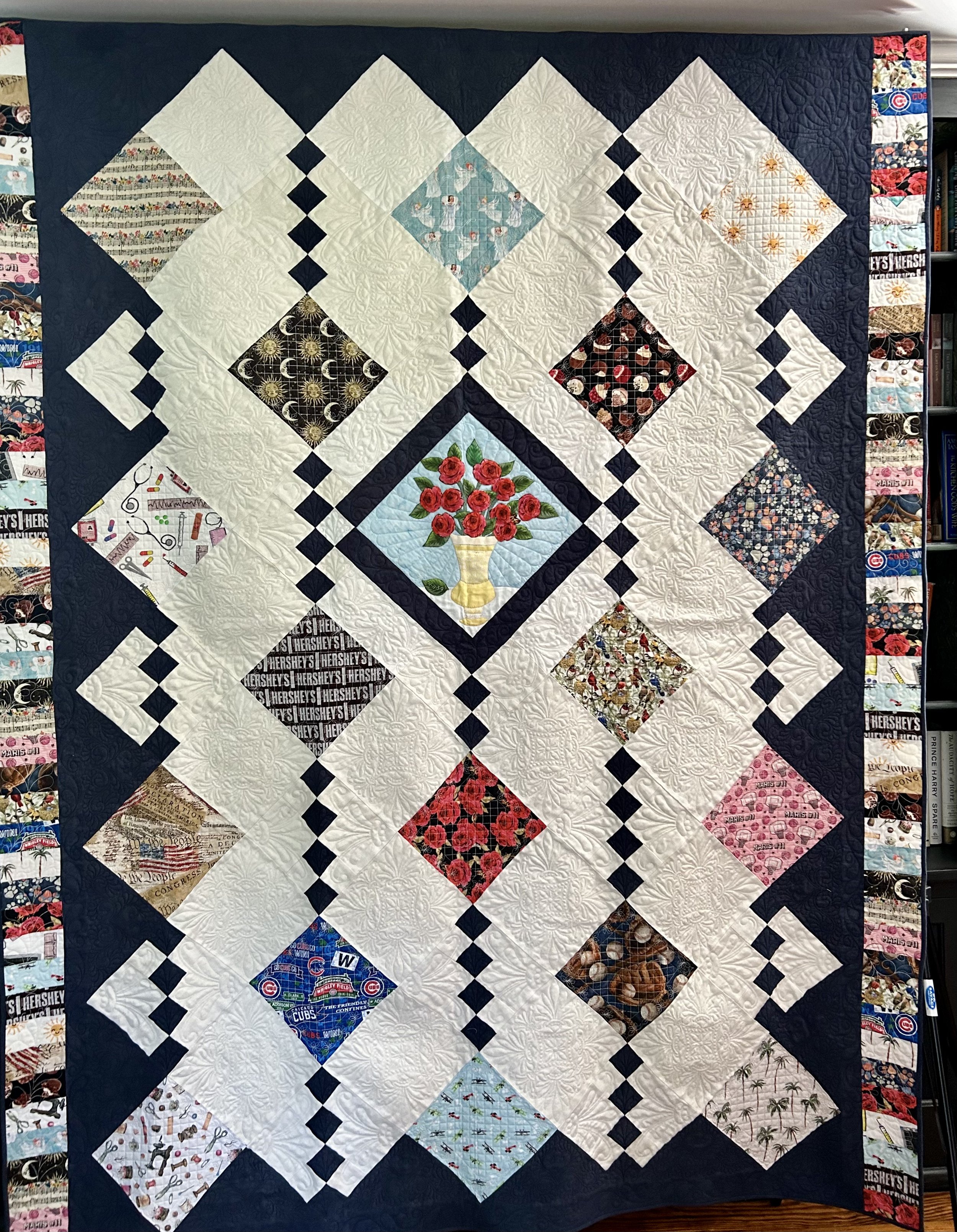
This quilt was a commissioned project for a client as a gift for his mother. It took nearly 4 months to complete. Thankfully, I was able to hand it over in time for the celebration he envisioned for his mother’s 80th birthday party. But it was a tad hard to finish it, not because of all the technically difficult steps, but because I was sorry for the process to be over. It was such a creative, collaborative and rewarding project.
Jim’s mother is a quilter, and he wanted to create a special quilt to gift to her for her 80th birthday, to say thank you for all the love and quilts she had provided them over the years. As a quilter, I appreciate how lovely a sentiment this is. He searched via Etsy, local quilt shops, and even area quilt guilds to find someone who could help create the quilt he envisioned. Nothing online inspired him, and eventually he was referred to me via a local moms’ Facebook group, and we began corresponding in February.
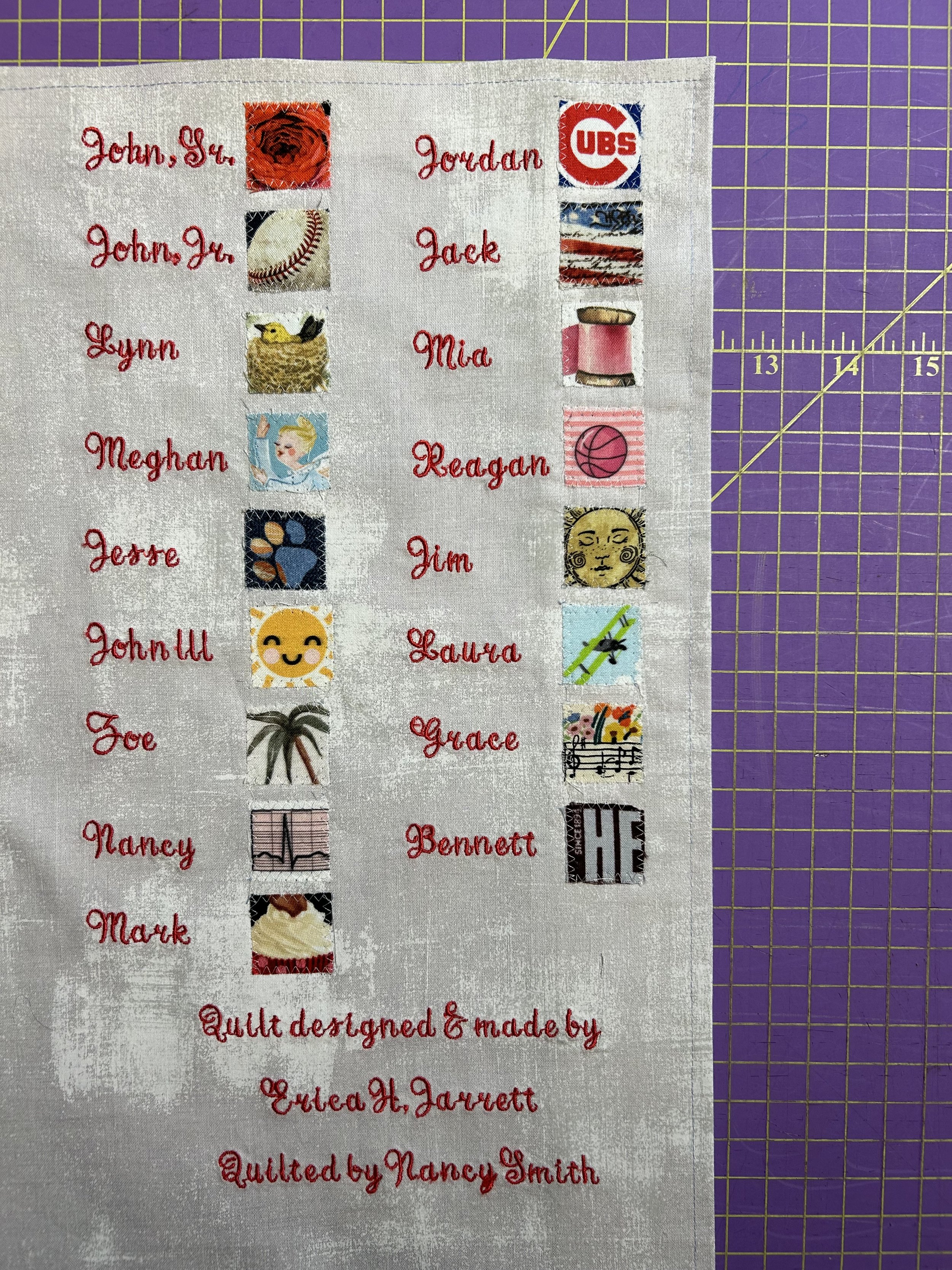
He explained he had asked 17 family members to provide cotton fabric, and he wanted these incorporated into the quilt. The fabrics were chosen to convey each person’s relationship with wife/mom/grandmother/great-grandmother. The idea was for the quilt to be “revealed” during the party, with all covered up, and each person discussing their fabric and its meaning one at a time . After some back and forth, it was clear he was attracted to designs “on point” – a setting were the blocks are arranged in diagonal rows, with the blocks forming diamond shapes (instead of the typical “square” set). While this can be a visual interesting design, it does create a bit more challenge from the math perspective - and geometry lessons were a LONG time ago! I searched online and found an image of a quilt pattern I thought would work well. Unfortunately, it was not an available pattern for sale, as it is used by an Etsy quilter for her business. (https://www.etsy.com/listing/622169623/necktie-custom-memorial-quilt.)
Jim had explained to me that his father’s fabric was “roses”. Since the couple went on a first date on the 11th, and later were engaged on the 11th, Dad has always gifted her 11 roses instead of the dozen often available. The joke being he was “too cheap” to pay for 12! I felt very strongly we needed to highlight the roses, and decided to strong arm Jim into agreeing to the idea of a vase of 11 roses in the center of the quilt. Thankfully, he didn’t need too much convincing, and quickly warmed to the idea.
The layout proved to be a headache – would have been ridiculously easy if it was a square set, not the diagonal one. If I was adept at the quilt design program “Electric Quilt” this may have been less torture, but I’ve not tackled learning that program as yet. I admire those that can and am certainly envious – especially when I’m taping grid paper and drafting with pencil and rulers!
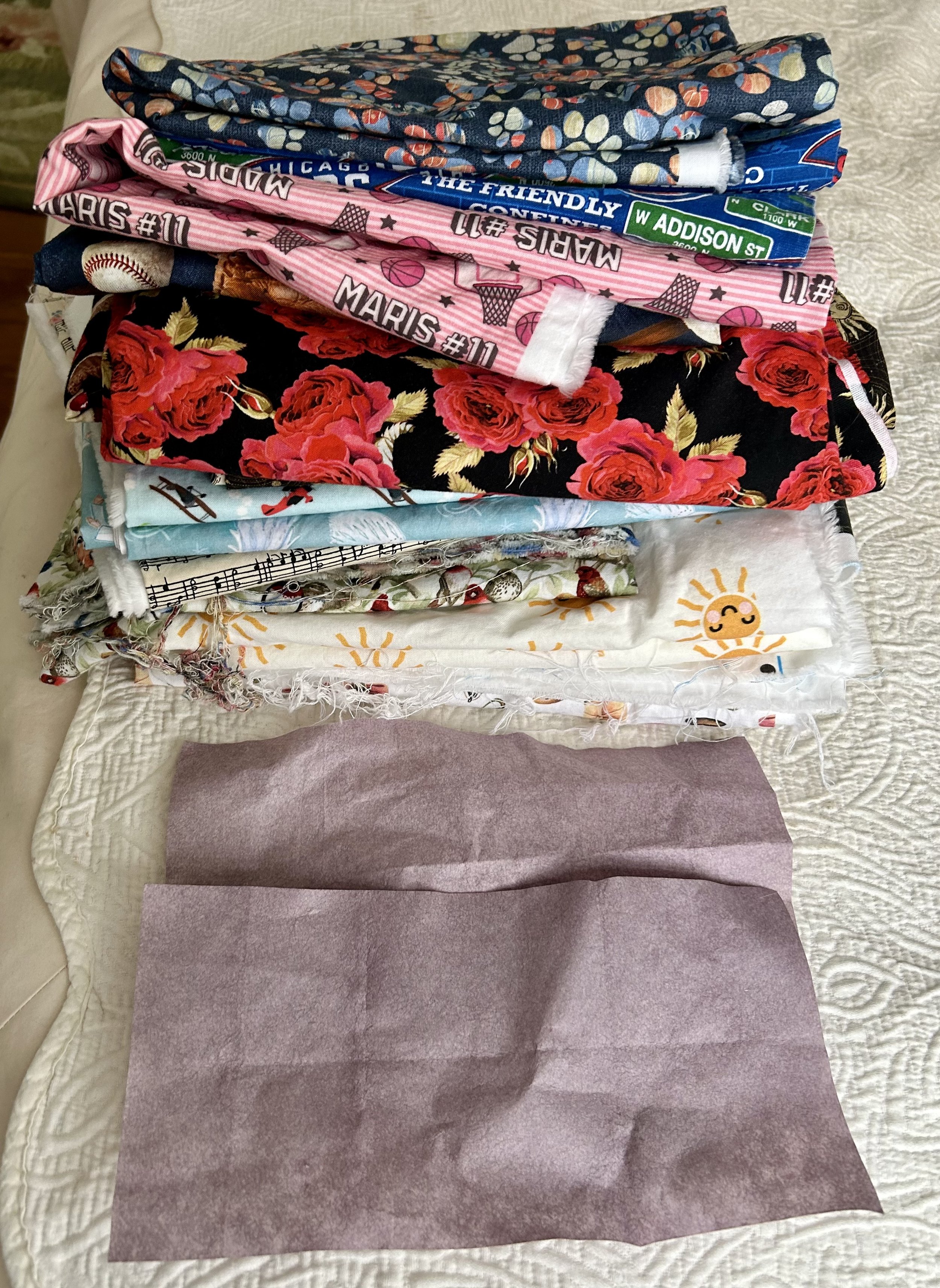
When we eventually met, he provided me with 17 yards of fabric! One yard of 17 very – and I stress “very” - different fabrics. I referred to the collection as “Nausea”, mainly because as a whole the patterns did not blend well together. The challenge would be to create a unified quilt with the disjointed, but important, fabrics. He had intended to pre-wash the fabrics, and I suggested no. Not that they shouldn’t be washed – but that I was rather concerned all the different colors would bleed. If that is done in a random washing, loose color can migrate onto other fabrics in the same load, staining them. And then you have a mess. Using a product called a “color catcher” solves this problem – it is a super slick sheet, much like a dryer sheet, that will actually collect any loose pigment in the wash. In some cases, you need to run the fabric through a few washes with color catchers. I washed these fabrics twice, as the first round showed quite a bit of pigment “caught” by the catcher.
I fussy cut the fabrics to make sure they were also on point, so the various designs would read correctly when set in the diamond (otherwise lettering etc would end up sideways). Next issue to tackle was the background fabric choices. I requested Jim find out if his mother had a favorite color. I knew I wanted a cream overall to help calm all the busy fabrics, but the edge triangles and 4-patch diamond blocks needed a strong color to handle all the myriad fabrics. The joke was that Jim said: “Hilarious - to the extent she has one, my Dad says it’s red(dish)… :) Yeah. A red background on red roses? Not so good - even for an ignorant non-quilting boy…..”
Whelp, yes that would be a bit challenging. I voted for blue. I texted him: “So the problem is that red is not a particularly good blending color. Your eyes are used to seeing greens and blues behind things. So, my preference would be to use a nice dark blue as the accent color. And maybe do the center block in a pale blue background. That seem OK?? Can certainly add some more red to the border if we want to bring in red but we don’t want it to get to be a red, white and blue looking thing.” Jim agreed with my suggestions, and I was on to the “vase of 11 roses”.
He wondered if we could use a silver fabric to compliment the blue, but noted his mother tends toward gold. I dissuaded from silver as it would need to be dark to show against the light blue, and sourcing a dark silver silk fabric would be a challenge. I found a yellow linen napkin in my bin of vintage fabrics. Laying it out in such a way that the embroidered hem acted as the top of the vase, and fussy cutting the bottom to highlight the embroidery. After a bit of google searching, I found a pleasing shape, printed and enlarged it. The roses were fussy cut from Dad’s fabric, the leaves cut from a green print I had, and the stems made from silk ribbon. Edges were turned under, glued in place with water soluble glue, and machine appliquéd. I definitely wanted there to be a leaf floating to the ground, as I explained I felt the leaf helped “anchor” the vase on the table. After a bit of concern, Jim agreed, though he asked if I could embroider a date on the leaf. Great idea! He mulled date options with his father, with a bit of stress about which date to use, and the chosen one was hand embroidered in a stem stitch. Hand embroidery was never my strong suit so the lettering needed a bit of tweaking to look as desired.
On to tackling the sourcing of the other fabrics needed. I knew I wanted Cherrywood, a lovely rich hand dyed fabric, in a very dark blue for the accent color. Their website refers to one color as “Nightshade” and I blithely ordered the yardage I anticipated needing. The color arrived and looked like faded blue jeans. Definitely not what I wanted. The company was lovely, and offered to swap the yardage for “Cobalt” which is their darkest blue. Not logical in my opinion! Thank goodness as that was a tad bit of money – Cherrywood is $24/yard! The delay in timing for all the shipping back and forth was a bit of anxiety but I used the down time to work on finding the cream color fabric.
Being a bit of a vintage junkie, I began to search for antique linen I could use. I liked the idea of a rich, heavy fabric and vintage table cloths can be wonderful for their designs and weight. I came across a few with roses woven into the linen, and realized that would be ideal. There were a few on eBay, but nothing with acceptable yardage and cleanliness. Then I found a listing on Marketplace and was so excited I arranged to get it even before Jim had given me the go ahead!

I seriously could not believe it! The woman told me it had belonged to her great aunt, and had never been used. What an amazing piece of beautiful handmade linen, probably from 1920s. Don’t faint, but I put it through the wash. And dryer. If it was to be used in a quilt, it needed to hold up to such, and better to do it to check if it survives, than to find out later when the quilt was made. It was a dream – softened up, didn’t shrink and held up just fine. I did use starch to keep the fabric from twisting as it was a hand loomed linen, but all in all it was a beautiful fabric to sew with. I confess I nearly cried when I had to start cutting.
I was anxious to be sure I had enough of the linen for the quilt, and nearly wore out my calculator measuring way more than twice! More like measure four times, cut once! While there was yardage, the lovely damask rose pattern on the table cloth would not yield enough for all the white blocks on the quilt. I fussy cut all those I could, and used non-rose designs for the partial blocks. Once I had the correct dark blue (which I had to wash FOUR times with color catchers!) I got the blocks made and began the layout.

Upon seeing the first mock up, Jim requested the vase be set off from the theme fabrics with white squares and the blue and white 4-patch blocks. Which required a whole lot more math. As I texted him: “ Dear god it was nutty (the whole sideways thing does a number on my math!)”. His reply: “Loooooove it. MATH!!!” At some point, I simply gave up with the calculator, and began to sew. I felt the light blue block needed a bit more oomph to set it off the white, and came up with the following solution.

I tend to move darker fabrics to the outside when working on a quilt as it helps with the visual weight of a layout – if too much “dark” is near the middle, the quilt can seem heavy – and not pleasing from a design perspective. Jim noted the dark theme fabrics set against the dark blue tended to make them disappear. Amazing! He was correct, and I appreciated his visual awareness. In this case the dark blue acts as the outer anchor, and the theme fabrics needed to be scattered to balance that heavy border.
We settled on the layout, after a bit of moving things around, and then added a “Chinese coins” border of all the theme fabrics along the two sides. The decision to not add the border to the top and bottom was due to the measurements of the quilt – it was longer than it was wide, and to add more to the length would make it a rather long and skinny quilt. On to the quilter!
Designing the quilting on a quilt top in our modern age involves computer assisted design (CAD) on elaborate “long arm” machines, which is an art all its own. My dear friend Nancy is a wiz at the process, and, being an accountant by training, loves for things to be very exact. She and I hunted through her database of quilt patterns, and I shared options with Jim. The ones he liked were those we thought the best choices as well! While Nancy began to laborious process of quilting the top, I struggled with learning to use an embroidery machine.
This started because Nancy had an older machine from a quilting guild friend who had moved a number of years ago into an assisted living arrangement. The machine, a Bernina, was a nice version about 15 years ago! The snafu was that I had to have a special “PED” machine to burn info off the internet to load into the machine. To do that, I had to have a pc computer (I’m an Apple girl). A friend cleaned an old pc he had, I ordered a “PED” machine, and I struggled to get the gadgets to communicate with each other. Unsuccessfully I will add. After hours of frustration. I recall being in tears at some point. And finally giving up, and ordering a second-hand embroidery machine off eBay. Which I then needed to learn how to use! Which is also an art – some quilters use embroidery designs as the quilt top work, but my goal was simply to figure out how to create nice looking labels, as my handwriting is less than fabulous.
I had suggested to Jim that the idea of a “key” for the fabrics would be a good thing to create. I had done this for another client – and it was by far their favorite part of the quilts they gifted their grandchildren, allowing them to identify all the family members on their family tree by the fabrics. In that case, my inspiration was great but I didn’t vet the info, and I learned a valuable lesson! Having to redo that key three times…aarrgg. Jim’s version did not include family names, connections and dates thankfully! I struggled through my steep embroidery machine learning curve. There was much back and forth regarding font style, layout options, and even thread color! The dedication label was a special family expression of love for their wife/mother/grandmother on her 80th birthday, not the right place for my name, and so I put mine and Nancy’s info on the “key” label.
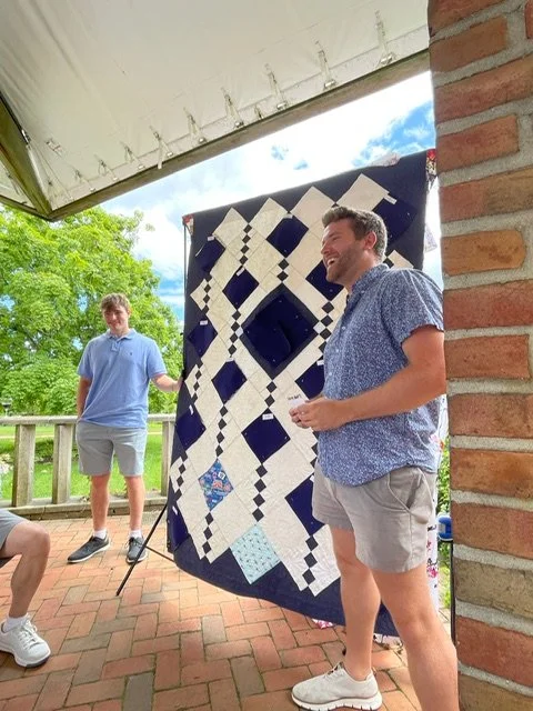
The quilt was a tremendous success – for the family and for the woman who’s love of quilting inspired such a touching gift. I was touched by Jim’s comments after the event:
Yes, it was truly "our own" quilt and you made that happen effortlessly with me. My mom was very impressed with the quality and couldn't believe it. I really love the patterns we chose. The "key" on the back was an awesome separate reveal as well. You really helped my vision see reality. It was not just a precious quilt to gift, but it was the mechanism to create and deliver a precious moment. The moment was incredible and has exponentially increased the value and import of the quilt itself. Seriously, every time she looks at the quilt, she will be touched by the memory of the presentation. It really all came together perfectly - literally and figuratively.Thank you again for making that happen.”
What a special process to be able to take part in!


Composing in Triangles

I have realized of late that I treat our home as an art project: the different rooms and various spots around the house become a canvas. I experiment with combinations of artworks, shapes, color or theme until I land on a pleasing design. This collection, on the fireplace mantel in our bedroom, was built around shape.
Composition “usually refers to the arrangement of elements within a work of art. An artist arranges the different elements of an artwork so as to bring them into a relationship satisfactory to them and, it is hoped, the viewer.” (1) In classic art, triangular forms represent a pleasing shape. The triangle base grounds our eyes to the bottom of the piece, and the sides draw our eyes upward, much like in perspective (see prior blog post: https://www.ericasheirloomquilts.com/ericas-heirloom-treasures/wonky-perspective). “In the classical tradition, triangular…compositions were used because they created a sense of balance and harmony by arranging the figures into a stable overall geometric structure.” (1) It is ridiculous how often I move things, even just slightly, to get the composition to please my eye. And Hubby loves to tease me, slightly shifting something just to point out my ridiculousness.
This collection of items has been unchanged for a while now (as compared to the other side of the mantle where I keep swapping things). The pottery was a 2nd grade art class project my daughter made. I suspect her brothers made a similar project, but theirs didn’t seem to survive. The piece is a charming pile of squares made into a vase, emblazoned with my initial and glazed a sweet aqua green. It has become a depository for a found feathers and sticks. And one pink butterfly. The butterfly’s wing creates the perfect triangular line from the top feather down.
The small bronze-looking statue of a female holding a basket is a bit of an odd one. I picked her up from a friend’s estate sale, and loved her curves, regardless of her broken (and patched) ankles. The artist, Paul Herzel (1876-1956) was German born and lived in New York. I was unable to find any other work of his depicting a naked female. He seemed to focus much more on pirates and western American Indians and animals, so it’s unclear why he made this not-typical work. She is likely from mid-1920s, and was cast by the Pompeian Bronze Clad Mfg. Co. Turns out, it is not an actual bronze at all – it is zinc metal with a copper coating (or cladding as per the foundry’s name). It is not likely worth much – especially broken – but I cherish her and find her triangular symmetry pleasing. Her left arm, holding a basket against her hip practically shouts “step right up, ladies and gentlemen, triangles all around”. In addition, the tilt of her head mimics the angle of the butterfly behind her, using her nose to direct our eyes down, to swoop across her body and land on the little girl.
The sweet girl is a hand carved and painted statue, made in Germany’s Black Forest. I found her at my local thrift shop for a few dollars. Someone wrote on the bottom “Switzerland 1951”. Similar pieces on the internet are dated to the 1920s, so I suspect she was picked up as a vacation souvenir at that later date. Many of the internet versions refer to her as “Goose Girl”. The reference is to the Brothers Grimm Fairy Tale “Goose Girl”, though the girl and the goose in this charming piece seem sweet, while the fairy tale is rather gory. Which is saying something as Grimms’ tales are all rather awful, full of nasty characters our modern sensibilities wouldn’t dream of reading young children. It also seems unlikely the child is depicting the Goose Girl as the young woman in the fairy tale is heading off to be married and this little one seems a far cry from that age.
The entire carving is a triangle shape, from the girl’s head to the goose’s rump. As well as her hat, which draws you in from the Herzel statue. Her skirt also flairs into a triangle, creating her triangular torso. And the wonderful white goose, leaning in a triangular tilt against her, creates yet another triangle in the space between them. The overall triangle shape is a perfect childhood mimic of the Herzel statue’s arm and basket that gazes down on her.
If you step back and look at the three items in total, you recognize that all together, they also create a triangle, starting at the peak of the feather, and ending in the goose’s feathery rump. From a composition perspective, there is also the pleasing symmetry of the vertical lines. The tall spines of the feathers, as well as the wood stick. The tall dark shape of the Herzel woman, stepping a bit down in size. And the little girl, ending the vertical lines with a bit of sweet baby pudge. Shapes inform our eye of a path to look at things, and the more a composition offers contrasts, symmetry, and geometry, the more pleased we are. Or, at least I am, until Hubby moves them around to torment me.

Smooth Sailing

I was gifted this sailboat quilt from a group of women I knew when my middle son was born, and it is a treasured memento of a very challenging time. These women were part of a quilting bee I had joined in 1992. They were encouraging and “taught me the ropes” of quilting (1). Now that I look back, I appreciate the insights and wisdom they offered, both with quilting and with life. I suspect the focus on boats and nautical imagery when decorating that son’s childhood bedroom was inspired by this quilt.
My middle son was born at 35 weeks, critically sick. He spent a month in the ICU, and I (also critically sick) dealt with daily trips to a hospital an hour away, the care of a two-year-old, and the stress of the unknowns of his illness. His health was “touch and go” (1), but thankfully, he recovered, due to the recent introduction of a lifesaving drug, the amazing care he received and his own strength. The impact those weeks had on me, my husband, and our approach to life was significant.
I became a stay-at-home mother, a process that was both incredibly rewarding, and extremely challenging. As a single income family, I followed in my mother’s footsteps, doing all the designing, painting, wallpapering, and sewing for our home. And, like my mom, I hunted for vintage furniture to renovate, scouring antique stores, flea markets and “rummage sales” (1). Mainly because we couldn’t afford the cost of new, but also because I had absorbed my mother’s taste that “old” things were so much better made.
Once we began to renovate our current home – and boy did it need renovations! – I picked a nautical theme for my son’s bedroom, and off I went with the theme. Some of the wonderful finds have moved on to his adult home, though the watercolors have stayed behind on the walls. (I wrote a prior blog about some of these treasures: https://www.ericasheirloomquilts.com/ericas-heirloom-treasures/a-smack-of-jellyfish)

This large watercolor was the first I picked up at a flea market. Unsigned, undated, and professionally framed in Racine, WI. The back has a sticker saying “Shirley Psiones”, though I suspect she was the owner paying to having it framed. Mainly because nothing on the web indicates Shirley Psiones (1925-1995) from Racine was an artist. The imagery reminds me of fishing vessels in Canada or Maine. Though the sandy beach the boats are resting on does not track with those locations so it remains a mystery, but a lovely one.
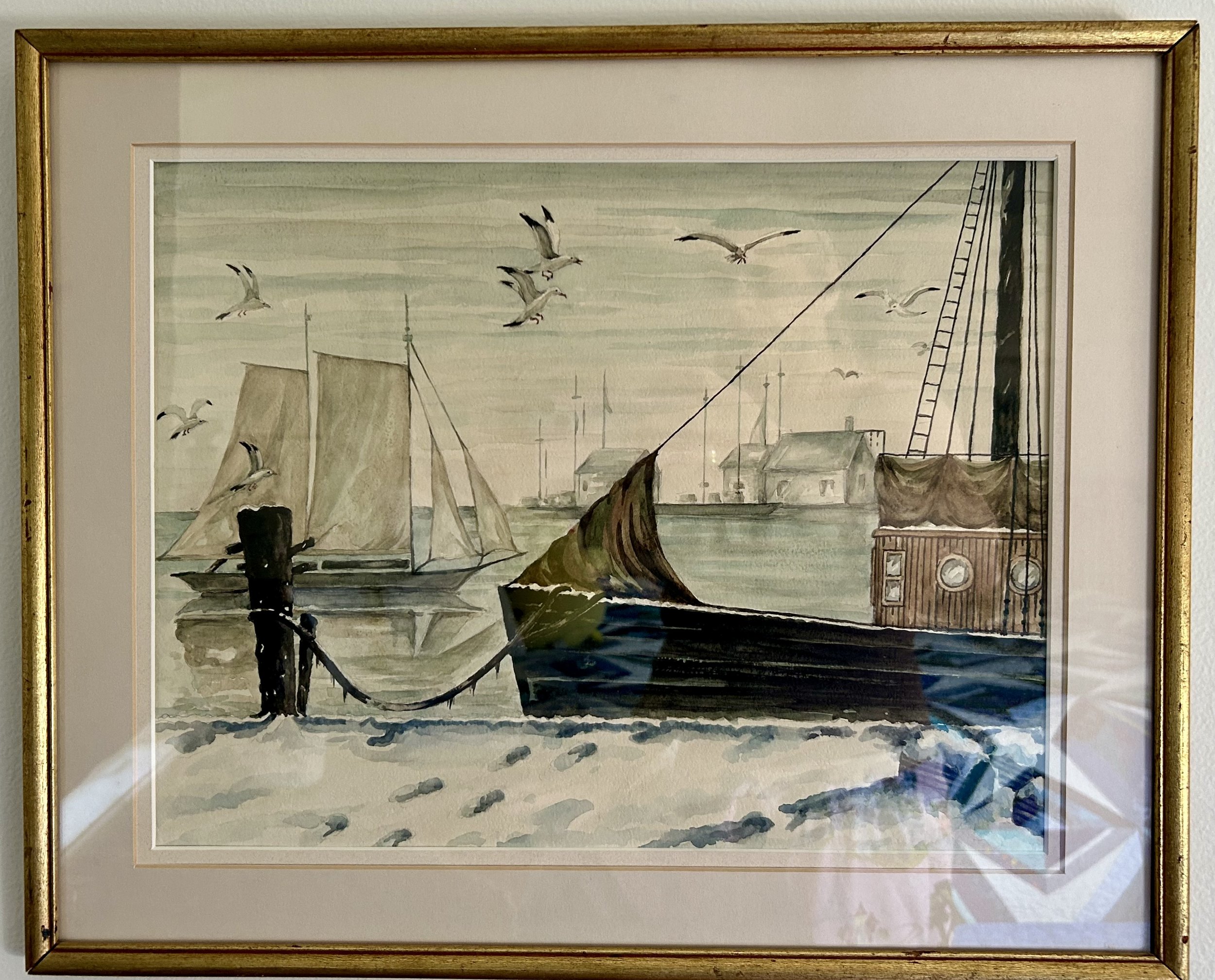
This watercolor also makes me think of Maine or Canada, though it has no obvious identifying feature. It also lacks a signature or date. I love the way the artist makes it clear it is winter, with the gray cold water and grayed buildings in the background. The snow is piled up in the foreground, and even along the edge of the boat. The detail of the icy drips along the mooring rope adds to the chilly atmosphere, as does the reflection of the sailing boat in the cold water. We know it is chilly, the water is calm, and the boats are hunkered down for the winter. Except for whoever thought it a good idea to go for a sail in winter. I have never attempted to paint in watercolors (or in much else for that matter) but I understand it is difficult, requiring speed and a delicate touch. This artist was a master.

This unsigned, undated watercolor was also a flea market find. But it is safe to say we are no longer in North America. I sense we’ve moved to the Mediterranean Sea, likely Greece. Note the ancient ruin up on the hill in the distance. And the colors of the water! This is not the Atlantic Ocean of the other works. Greens, rich blues in wonderful rippling waves. The colorful boats are reflected in the water, adding a sense of movement from the boats rocking on their mooring lines. Offsetting all that color is the background hill – done in grays, with a soft pink sunrise tinting the sky. The bamboo frame is great – likely dating the work to the 1940s. Oddly, Google Image found a near identical painting, down to the shape of the hill with the ruin on top (https://www.ebay.co.uk/). The piece is for sale via eBay in England, and identifies it as a “Greek school” work. Mine is a much better version, but I am curious how these works came to exist.
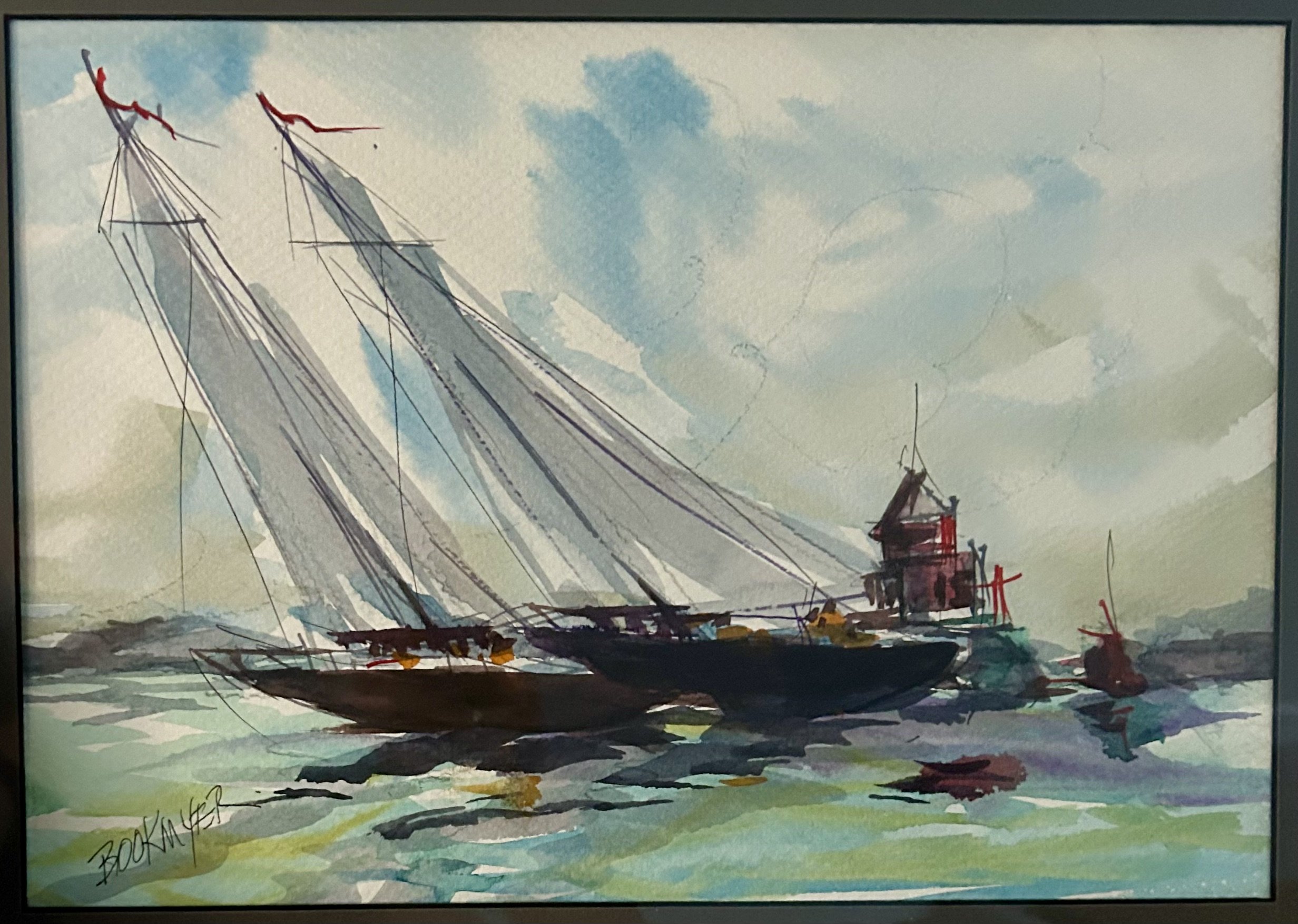
My final boating watercolor is a more recent purchase from the thrift store. Signed “Bookmyer” but undated. No obvious identification via Google search for the artist, nor any clue about the location. Other than to say it is a well-done piece with two sailboats racing in a stiff wind around a wonderful large red buoy. While I love the depiction, I confess I was not one for sailing as a child.
Each summer my father would charter a large sailboat and take some of my siblings off on a week’s sail along the east coast. I did not participate in these as motion sickness and sailboats are not a good combination. However one year, when I was college aged, I did join the crew. That particular sail included a sister and all 3 brothers, and we battled through a hurricane. “By and large” I was useless - I had to stay “above board” otherwise I was significantly “under the weather”, and not able to keep down a “square meal” (1). Definitely not something I would care to repeat. Like ever. Choppy water, small boats and hurricanes are a bad combination for those struggling with motion sickness.
I do love the majesty of large boats, and will always recall the astonishing parade of “Tall Ships” during the bicentennial celebration in 1976. This was actually known as “Operation Sail” which is a non-profit still in existence (https://opsail.org/). There were 16 multi-mast sailing boats in service to various countries, all fully rigged and under sail. Interestingly, in 1986 I was working at a bank in Manhattan, when another sail boat honor parade was arranged. This one was for the Statue of Liberty, celebrating her 100th year, and saw 24 large vessels sail into the NY harbor. It was remarkably hard to concentrate on our training program when the view of the East River out the window was competing for our attention. According to a NYT article it was the largest procession in memory of these majestic boats. Howard Slotnich, the director of Operation Sail which organized the event, said ''We're giving a party, and we've asked the nations of the world to come to the party… In 1976, we asked them to come and celebrate our birthday. This year we are asking them here to thank them for what they have done for our nation.'' (2)
Our country was founded by immigrants, from many places around the globe, the majority of whom arrived here by boat. The Statue of Liberty represented a beacon of hope to many of them during a literal rough passage. Their reasons for arriving varied: political, religious, economic. I can’t say all our ancestors all arrived with hope as many, those enslaved particularly, had a much different journey.
My ancestors, however, did arrive by boats, between the 1600s and the 1880s. Their goal was to start over with “a clean slate” - a nautical term we all use without realizing its origin: “ A slate tablet was kept near the helm [of the boat] on which the watch keeper would record the speeds, distances, headings and tacks during the watch. If there were no problems…, the slate would be wiped clean so that the new watch could start over with a clean slate.” (1) Those people who ventured across oceans to build a new life all did so with the goal of creating a better life for their progeny.
And as I connected with older women through a quilting bee, and was supported through the rough seas of a critically ill newborn , I’ve realized how our lives are impacted by people sharing our journey. Those friendships may have dissipated over the years – the women retired, moved away, passed away. But their kindness and advice buoyed me up (1) during a significant crisis. Thankfully my son weathered that storm successfully. Life is not always smooth sailing, but filling our lives with supporting friendships, art and love offers a wonderful way to sail through life .
(2) https://www.nytimes.com/1986/04/08
(1) https://spiritofbuffalo.com/nautical-resources/nautical-phrases-and-terms/
Summer Memories

Nope, I do not have a memory of wandering through a field of daisies in summertime, with a brother and sister in hand. However, as we all suffer through a scorching heat wave, this artwork speaks to me of childhood summer memories. My childhood was in the 1960s, a time of great extremes, though not of the global warming type. As a child I was unaware of much of the political storms in our society, but I did manage to stir up quite a bit all on my own.
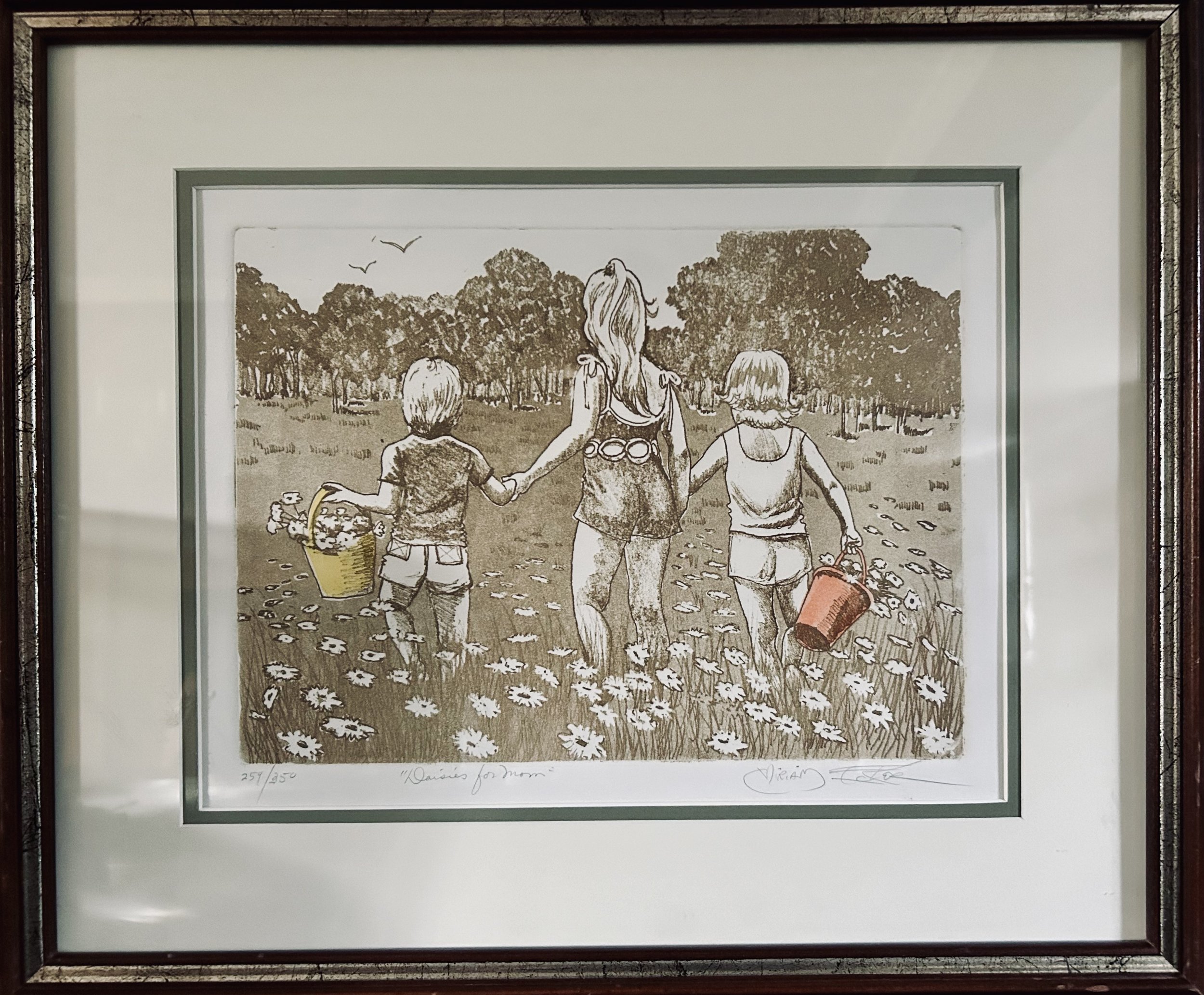
The artwork, picked up at my favorite thrift store, set me back $6.00. It is titled “Daisies for Mom” and is signed Miriam Ecker. It is a numbered etching, and is charmingly done in sepia color with two fabulous accent colors . Miriam Ecker (1926-2005) was a New York City artist, and achieved some success for her work, having one piece juried into a Museum of Modern Art Contemporary Artists show in 1966.
If you look closely at the artwork, you can see the tell-tale signs that it is a hand pulled, hand water colored etching. Just passed the brown edge, there is a deep groove, a result of the heavy press literally pressing the paper as it is pulled through the printing press. In addition, looking at the piece with magnification, you can see the ink dots are not uniform as they would be with a mechanically printed lithograph (Benday dots, see prior blog post for explanation: https://www.ericasheirloomquilts.com/ericas-heirloom-treasures/stop-the-press-its-a-print). And Ecker decided, when the piece was created, that the children’s two buckets should be enhanced – using watercolor she painted them yellow and orange. I have found a few more examples of this work online, and those do not have the added color. In my mind, the two splashes of color are the best part of this piece, drawing your eye to the children, and the flowers splashing from their charming buckets.
For those of you paying attention to perspective now (https://www.ericasheirloomquilts.com/ericas-heirloom-treasures/wonky-perspective), notice how successfully Ecker created the depth of the field. The daisies in the foreground are the largest, blending into simple smudges of shape the further back they go. The trees at the horizon are proportionally correct in relation to the size of the children, and the two birds anchor the idea of the trees being “in the distance”. And then there is the classic triangle shape – in this case the oldest child in the middle, linking arms with the two younger ones, creating a triangle front and center. This is mimicked by the shape of the trees in the distance, giving your eye a pleasing way to wander around the work.
The color choice, of sepia ink, is an interesting one, and I learned a bit about this color in my meandering on the internet. It seems sepia ink has been used for artwork all the way back to the ancient Greeks. It was originally derived from the ink sac of the common cuttlefish, called a ‘sepia’ in Greek. With the advent of photography, the color “sepia” became synonymous with old-time photographs, and we all have filters on our phones that allow any photograph to be changed to “sepia”. What I had not known was that into the 1940s, African American music was referred to as “sepia music” (or even worse, “race music”), until the expression “R&B” replaced it.
Why, I hear a few of you grumbling, does this artwork bring back childhood memories? There is a photograph of me as a young girl that I immediately thought of when seeing this piece. There are three of us, my next oldest sister, 5 years older than me, and my closest in age brother, 18 months older. We stand in a triangular shape, and I’m likely a around 18 months old. I am wearing a bathing suit near identical to the one in “Daisies for Mom”, and I am up to no good as usual…


Ful-O-Pep Roosters
Sometimes historic artifacts are hard to reconcile with our modern sensibilities. Recognizing the misguided ideas of earlier generations can help us accept artifacts we might flinch at otherwise. This trophy of two cocks fighting, from our property’s history, is one such item. Quaker Oats began a chicken feed business in the early 1920s, and, with the attitudes of that era, felt this was an appropriate logo for their new “Ful-O-Pep” business. The assumption being the roosters were feisty and thus full of pep? It is definitely not a fabulous logo from our modern perspective, but, unfortunately for us, it is pretty much on all the artifacts related to our historic home.
A quick history: in the 1920s Quaker Oats wanted to find a way to market the byproducts created in the manufacturing of oatmeal, instead of throwing it in waterways. While I applaud the desire to keep junk out of the water, I suspect the idea was driven more by profits than ecology. The company hired Onley Brown Kent, the first veterinarian with a degree in “chicken husbandry” from Cornell University (I kid you not). Quaker Oats then purchased a farm with 65 acres, a huge wood barn and two houses in 1922 in rural Libertyville. The farm ran for 43 years as a research facility, testing the fortified oat poultry feed and housing over 2,000 chickens. The success of the feed was based on the production of egg laying, and was marketed to mom and pop farmers with backyard chicken coops. The big barn was the warehouse, and the company shipped feed bags of product across the country to feed stores, all with a version of the Ful-O-Pep rooster logo emblazed on them. I have a number of these feed sacks, and even found one inside the wall of the kitchen when we renovated it years back.
I was surprised to learn that as recently as 2007 cock fighting was still legal in parts of the United States. Louisiana was the last state to finally ban it that year, and by 2018 the federal government banned all animal fighting – including cockfights – in all states and territories, as well as making it a crime to “knowingly sell, buy, possess, train, transport, deliver or receive any chicken across state lines for fighting purposes.” (1) Apparently, the “blood sport” remains popular – and financially lucrative – in many countries, and Puerto Rico petitioned all the way to the U.S. Supreme Court in 2022 to allow cockfights in the territory. The case was dismissed, and our federal ban remains. I also had no idea that “George Washington and Thomas Jefferson were devoted rooster fighters. Union and Confederate soldiers put aside their differences on Sundays during the Civil War to pit their chickens against one another. Abraham Lincoln was given the nickname Honest Abe after he displayed impartiality as a cockfighting judge.” (1) I am thankful that the idea of fighting roosters is no longer acceptable, for the roosters’ sake. And I try to enjoy the history of our property regardless of the dreadful logo.
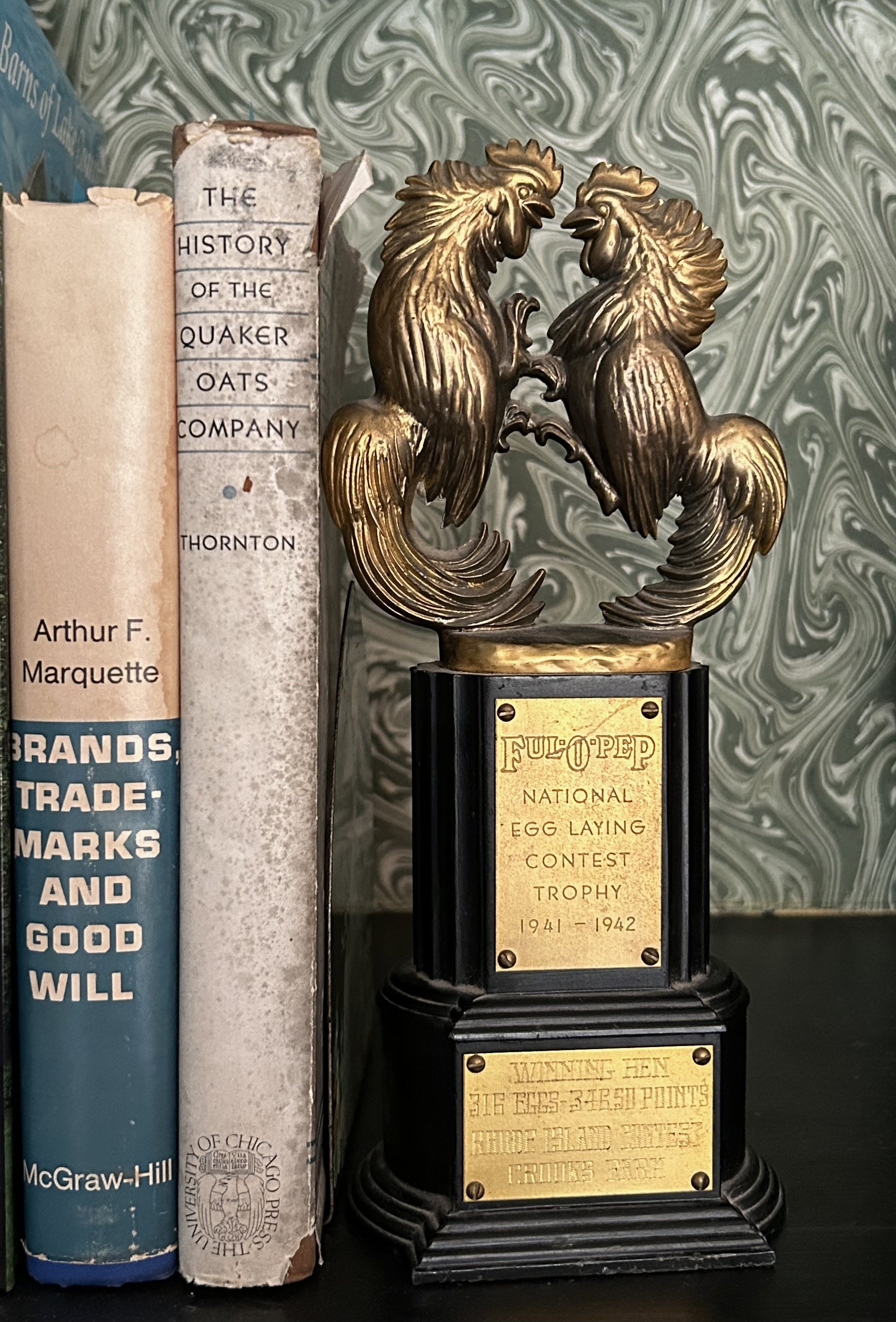
When we first purchased what is left of the farm (after it was subdivided in the 1980s), eBay was a great source for finding vintage Ful-o-Pep items, including the books in the photograph. One eBay dealer back in 2001 sold me a very large metal “Ful-O-Pep Feed” advertising sign we wanted to mount on a barn. The woman, from Kentucky, commented that she thought the sign would be great for someone running cock fights, and wondered if I did. Dear lord. Amusingly, soon after I hung the sign, a rather dilapidated minivan pulled into our long driveway. Two older women got out and asked me where “the feed store” was – they saw the sign and thought they could pick up their animal feed here in town! Many of the items I acquired are displayed on the property, and the feed bags, with their fighting roosters logo, have been incorporated into quilts.
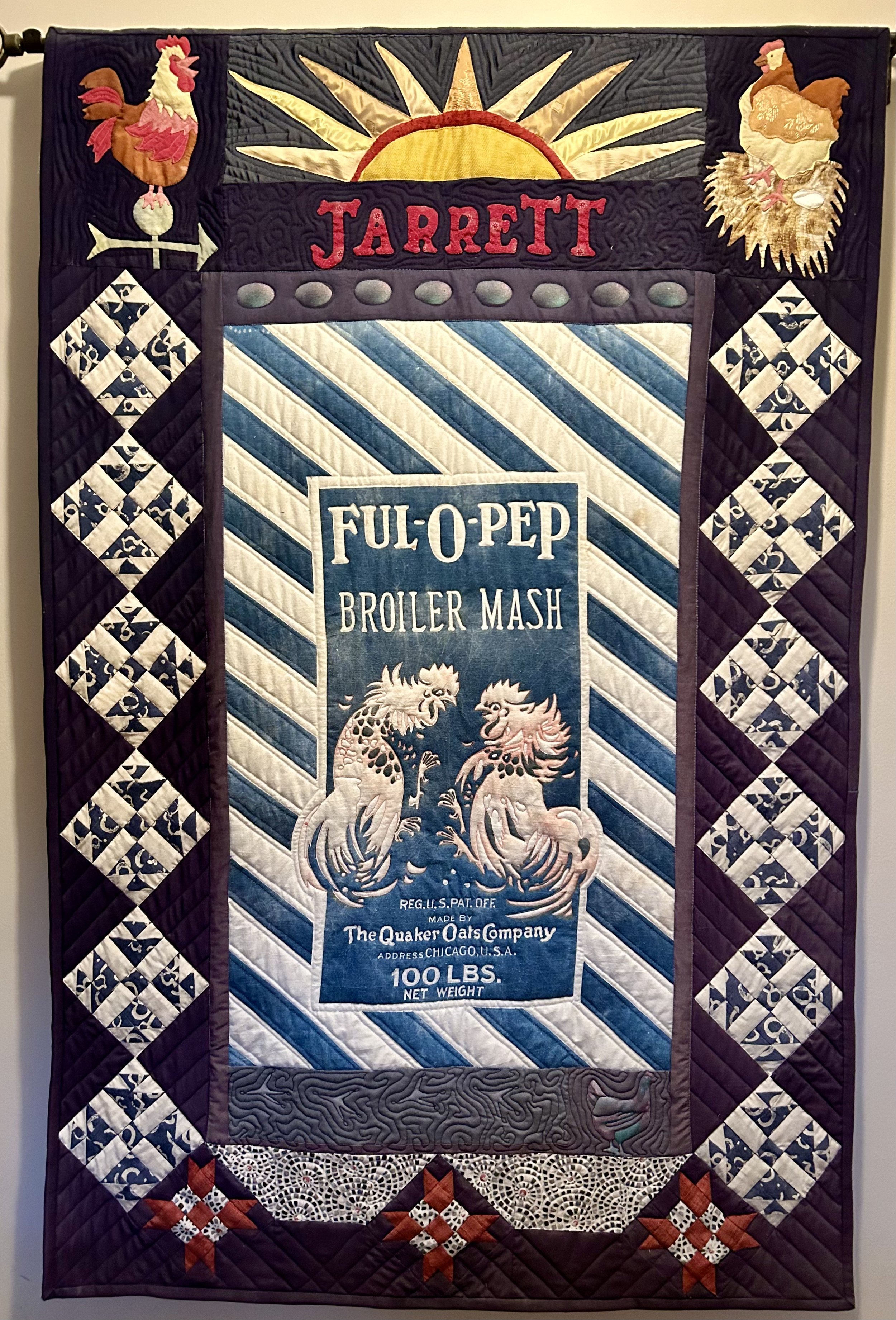
The trophy was acquired from eBay, and sits on our bookshelves. It is an award from 1942 for the “National Egg Laying Contest”, and was given to the best laying hen (316 eggs) from Rhode Island. I am assuming that the hen was raised on Ful-O-Pep feed, though the poor girl was not identified. Crooks Farm took home the trophy, however it seems “Rhode Island Red” chickens are famous for being “good layers”, laying upwards of 300 eggs a year, as compared to the more typical 250. Am I the only one that thinks the logo of fighting roosters an odd choice for a company focused on the egg laying success of their chicken feed? Last I checked, the girls do all the work…
(1) https://www.nytimes.com/2023/01/18/magazine/cockfighting-rooster-breeding.html

California Job Case

This art piece reminds me of the “printers drawer” I had as a child in the early 1970s. The piece is not actually a printer’s drawer, and I suspect it was a high school art project (“here’s a pile of old things – see what you can make”). The work is titled “4 Dandelions & Letters” and is dated “MMXI”. The signature is not clear unfortunately. The back is plywood and the edges and interior framing are all old wooden yard sticks. The dandelions are wallpaper, in different colors and gilding. Hard to tell, but the bottom papers seem to be old computer data cards, with vinyl letters and numbers adhered over them. It was “sealed” in some type of varnish (Elmer’s Glue?!) that most definitely did not hold up well – though to be fair, I have it displayed in our barn loft room, which means it weathered -17* winter and 100* summer temperatures. (see odd white flaking in the photo).

I loved to collect the small china figurines of animals made by Hagen Renaker when I was young (1). Back in the 1970s these figurines cost between 49 cents and a few dollars at our local Five & Dime called Stolers (terrible name for a store). A perfect price point for kids spending their allowance each week. I don’t recall how many I ended up with, but it was well over 100, and I loved playing with them.
Given the large quantity, Mom decided something needed to be done. At one of our flea market outings she picked up a large wooden drawer she called a “printer’s drawer”, and I hung the drawer on the wall, filling its varying cubbies with my collection. These drawers are wonderful for displaying collections of things, and many examples can be found on Etsy. In the printing trade, these are actually called a “job case”, and their history goes back as far as the history of the printing press.
“Back in the old days…newspapers were printed by taking small blocks of metal, each of which had a letter embossed in the bottom, and laying these blocks side by side in a tray to form words and sentences. The blocks were wedged together, inked, and the paper quite literally “stamped.
As you can imagine, setting type must have been a time-consuming business. So to speed things up it was essential that these little metal blocks were organized…They were kept in specially made drawers – trays – which themselves were divided into sections”. (2)
It turns out a California company (name unknown) revolutionized the way the trays were organized. Prior to this, the letters of a font type would be organized with “upper case” letters in the top drawer (literally the upper drawer of the large storage case), and the lower ones in the drawer below (lower case). While this made some sense, it was time consuming for typesetters (there’s a long-gone career) to find each letter needed for composing the printed item (book, flyer, newspaper, etc). The “California job case” rearranged the letters, similar to a typewriter, where common letters are clustered closest to the typesetter, and had bigger cubbies.

Interestingly, a childhood playmate’s mother also used the drawers, but she treated them like an artist’s canvas, and painted them entirely. She used the individual boxes as color blocks, much like a Piet Mondrian painting. I was intrigued by this, and can still see the artwork she made in my mind’s eye. For reasons I never questioned, she was always going up and down the attic stairs outside my friend’s bedroom, paintbrush in hand. As an adult, I realize she must have had a studio in the attic of their 1700s Colonial Saltbox in Darien, CT.
I would bet it faced north – as artists always prefer to be up high, with lots of shadow free light, which comes from the north. It was likely a bit of an ad hoc space, as this was mid 1970s, and the young couple was raising 2 little girls in this remarkable historic property. And I got to play in it, having sleepovers in the living room, meandering through the ancient rooms, and playing in the huge old barn. When hubby and I were looking to purchase our current home 25 years ago, I was reminded almost viscerally of this childhood playmate’s ancient saltbox. And I have never forgotten the mother’s artistry on those California Job Cases.
(1) http://www.hrgallery.mysite.com/minis.html
(2) https://peterjonesselfhelpbooks.wordpress.com/2012/07/13/the-printers-tray/

All You Need Is Love

Dang do I love this ring! I saw it at a fancy estate sale recently. No markings but I immediately recognized it, and asked the woman how much it was. She said $5, and, though the darn thing didn’t fit (20+ years of rock climbing does a number on your finger joints), I snagged it. The image in question, for those of you unclear, is an art piece by Robert Indiana, and I have a special love for this work.
I was familiar with Robert Indiana’s over-sized LOVE sculpture though I knew little about his work. I had not seen the sculpture, however, until my son married an Indiana girl and settled in the state. The one and only LOVE I have seen is at the wonderful Indianapolis art museum, Newfields (https://discovernewfields.org/). Interested in the artist’s history, I turned to The Oracle. (https://www.ericasheirloomquilts.com/ericas-heirloom-treasures/the-oracle-not-at-delphi)
Yes, Robert Indiana (1928- 2018) was from Indiana, adopted by the Clark family at birth. He studied art from a young age in Indianapolis, and moved to a warehouse in lower Manhattan in the 1950s. “Indiana…scavenged the area’s abandoned warehouses for materials, creating sculptural assemblages from old wooden beams, rusted metal wheels, and other remnants of the shipping trade that had thrived” in the warehouse area where he resided. (1). He took “Indiana” as his last name at this point, and LOVE changed his life.
The work began as a sketch on a series of poems and small notes exchanged between Indiana and Ellsworth Kelly (1923-2015), becoming a series of paintings and eventually an oversized sculpture. While Indiana no longer practiced religion, he insisted that “the message of LOVE be taken as a spiritual one” (3). “This simplicity of its message, paired with its simple composition, combine to create an icon of sculpture and graphic design….Indiana captured the spirit of the 1960s in a word. When John Lennon, viewing an exhibition from this series, commented that “all you need is love”, he amplified Indiana’s statement, transforming it into a hit Beatles anthem and oft-repeated refrain.” (2)
LOVE was used by the Museum of Modern Art in 1965 for its annual Christmas card, as well as a US postage stamp in 1973. It has also been “reproduced on countless unauthorized products, [and this] proliferation of the image, led…to negative criticism and incorrect assumptions of the artist as a sell-out” (1). It turns out, Indiana attempted to secure a copyright on the image, but was rejected on the grounds that a single word could not be copywritten. Thus “the image has been marketed commercially on items such as clothing, mugs, and bags over which the artist has no control” (2). And rings apparently.

The ring I purchased was made by Charles Revson (of the Revlon Company) in 1970, and I was unable to discover whether Robert Indiana was in any way consulted or financially rewarded by this depiction. Highly unlikely, as Indiana left New York for Maine in 1970 due to the ensuing chaos inspired by LOVE – over which he had no control.
The sculpture owned by the Newfield’s was Robert Indiana’s first LOVE sculpture. It was built of COR-TEN steel, measuring 144” tall and 144” wide and weighing 9200 pounds. The sculpture was on display for the opening ceremony of the Newfield’s campus in 1970, then traveled a bit, landing back at the Eli Lilly’s corporate headquarters in Indianapolis. The company used “the sculpture as a backdrop for a TV commercial promoting the Lilly company; the ad intended to draw an analogy between the creativity of art and the creativity involved in research” (3) In 1975, the museum purchased the piece and it was displayed outdoors for years, being moved indoors after a restoration project in 2017. There are over 50 versions of the work worldwide created by Indiana (4).

Visiting the Newfield while in Indiana has become a cherished outing with granddaughter in tow. One memorable visit included airplane rides on the escalator, Steinway piano playing (she was remarkably dainty about it – plunking notes one at a time), and seeing the massive LOVE artwork. We were both in heaven. Art is completely about exposure, awareness and personal preference. You can’t know your preferences unless you see options – the “kiss/frog” dynamic. And the awareness of iconic images, which show up in myriad ways in popular culture, helps you recognize the references. Sharing my knowledge and love of art with granddaughter is a special type of love. It is important, however, to always let the little ones have a sense of self agency – if they don’t want to see/do something, it is important to honor that, regardless of your preferences. Love of Art should never be forced, simply offered.
Robert Indiana has a spot in Art History as the creator of the Pop Art generation’s icon: LOVE. And yet it seems wrong that he was unable to benefit financially from that creation. Yes, it is simply a word, but his design is certainly recognizable. While fame and financial success are important, is it true that all you need is love? The jury is still out on that one, though I will find a special home for my LOVE.
(1) https://www.robertindiana.com/artist
(2) https://www.theartstory.org/artist/indiana-robert/
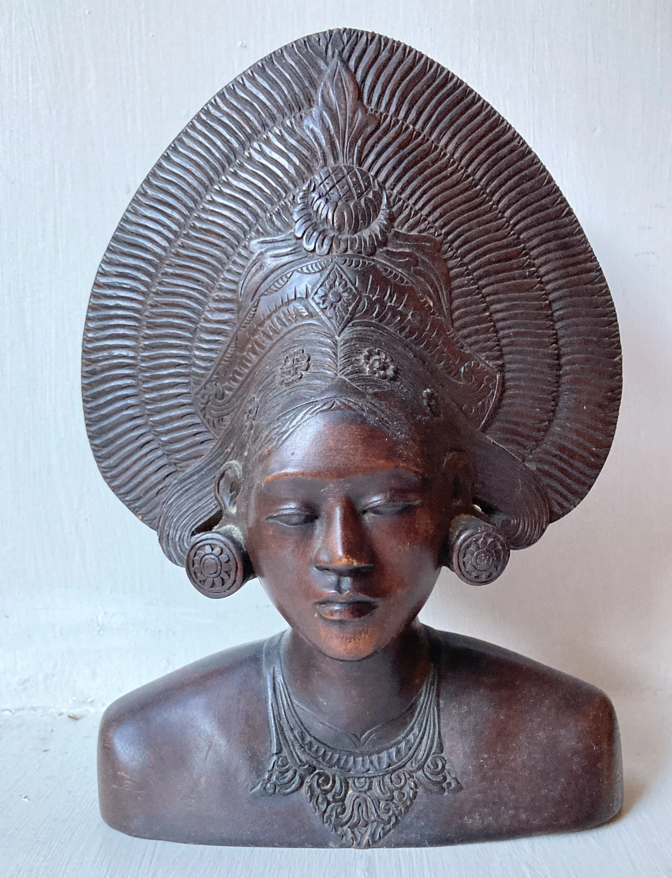
Dance of Love

I had researched this family heirloom a few months back, with a Google image search telling me she was an “African wood female bust made for Western export” circa 1900. I blithely wrote up a story about her, crediting her to my paternal great grandfather, Watts S. Humphrey (1844-1910,) a man in the style of Teddy Roosevelt. He was a well to do attorney living in Michigan with the means to travel. There are papers and photographs in my family files of him camping, hunting and fishing, both in the western US as well as Canada. I ended my charming write-up with a pithy note about a possible safari in Africa, and put the writing aside.
You know the adage “don’t always believe what you read”? Doubly so for information gleaned off the internet. As Abraham Lincoln said: “the problem with quotes found on the internet is they are often not true”. It goes without saying that image searches are also flawed, and while I use them frequently when looking at art, it takes some detective work to drill down to what is true and what is not. To quote a gentleman in a Quora thread:
“Internet is one of the biggest sources of knowledge and information in human civilization.
There are people who want you to think in a certain way. There are also people who want you to act in a certain way. Some of them are not so nice people.
The only objective of such people is to create fake news and mislead people. Some of these people want you to hate other religion, caste, gender or nation.
At any given point of time, there are millions of active propagandists in the world. And most of them are making a good use of internet…
In short, be aware about the intention and it will help us to spot the fake news or propaganda. Once we spot it, we can make a balanced decision.” (1)
Having opened my “African Wood Female Bust” write-up this morning, I entered the photograph into the Google Image search function again, and it seems in the 6 months since my prior writing, Google’s aptitude for identifying her improved. She is not African but Balinese. So much for my prior story. Drat, back to doing research.
According to my research, she is a bust of a Balinese dancer, made in Java c. 1930, and carved of boxwood. Honestly, there are conflicting ideas as to what style of dance the woman depicts. Bali has a number of traditional dances, with elaborate costumes, but the one most closely resembling the headgear this statue wears is the “Janger” dance, done by 12 young men and 12 young women. The dance originated sometime in the 1920s, and the name is translated as “infatuation” – a highly choreographed dance of young people meeting and falling in love. (2)
As I mulled various options, it was clear to me the statue came from someone in our ancestry who had reason to be in the Pacific sometime after the 1930s

This photo, of my pregnant mother, shows the statue on the shelf behind Mom (Barbara Fallon Humphrey 1928-2021). These shelves, with the pipes and model boat, look familiar, so I suspect this is in Chappaqua, NY where I was born. If so, the pregnancy could be one of my brothers or even me (1959-1966). And yes, my mother was always petite, even after bearing 7 children. The mystery remains as to how the Balinese carving came to be in my father’s possession.
I have ruled out my father’s grandfathers as the origin of the piece. His maternal grandfather, Ben Strong (1872-1926) and paternal grandfather, Watts Humphrey (1844-1918) who I originally credited with the “African bust” were deceased before the piece was made. I did recall a family tale about my father’s mother’s older brother Philip being in the military and thus I hunted him down. According to a New York Time’s obituary, “Uncle Phil” Strong was actually known as Brig. General Philip Strong (1900-1971), a Marine Corp General who specialized in U-2 reconnaissance aircraft. “He was an intelligence specialist for the State Department and the Central Intelligence Agency. For two years during World War II, General Strong was chief intelligence officer for the commander of battleships in the Pacific.” He was in the military from 1926 until his retirement in 1964. (3) Bingo!
I am guessing here, but I suspect “Uncle” Brig. General Philip gifted the statue to my parents, possibly as a wedding gift in 1955. Fitting, I think, for a newly married couple destined to have 7 children, to have a statue honoring a dance of infatuation and love.
(1) Anal Kumar Raj
(2) https://www.discovabali.com/balis-most-popular-traditional-dance/
(3) https://www.nytimes.com/1971/11/25/archives/gen-philip-strong-expert-on-u2-dies.html

Wonky Perspective

I can’t help but love this ridiculous oil painting. It was a recent thrift shop find, setting me back $2.50. It is a small piece, and not framed, though someone strung a hanging wire at its top. While signed, the signature is a mystery. Undated, though the style and colors peg it as 1970s. I picked it up because it made me laugh.
The use of perspective in art has always been a struggle for artists. While the ancient Greeks and Romans understood perspective, the concept was lost for centuries, being “discovered” again in the 15th century. In 1436, Leon Battista Alberti “codified… much of the practical work on [perspective] that had been carried out by earlier artists; he formulated, for example, the idea that “vision makes a triangle” as well as the importance of a vanishing point. (1)
Translating the visual world onto a flat canvas requires an understanding that our eyes perceive items on a flat plane as having different sizes based on their distance from us, with our eyes drawn to a specific location on the canvas. This is known as the “perspective” of the work – where our eyes are drawn to – with an awareness that some things are “in the distance”, and small, while others are nearby, or larger.
Artists have used mechanical aids to help create this perspective, relying on a horizon line and the vanishing point. At some points artists actually drew lines in pencil or chalk directly onto the canvas to help with this, and even poked pins into the artwork to attach strings to a “vanishing point” (Vermeer’s work is famous for having these pinholes). “So as to appear farther from the viewer, objects in the compositions are rendered increasingly smaller as they near the vanishing point.” (2) Think of a road leading off to the horizon –

the visual of the horizon line, the vanishing point of the road as it reaches that horizon, and the triangular shape of the road as it moves into the distance are all clear visuals of these ideas. In this sketch, the poles along the road and the trees along the way all get smaller as they are “further away” from us. (3) Children tend to disregard the use of perspective, and untrained artists -and even some trained ones – can botch the execution of perspective, much like my ridiculous artwork.
This painting is more than slightly wonky – slides into downright hysterical. Where to start?! Clearly the artist intended the horizon to be the actual horizon where water meets sky, painted in a light gray off in the distance to the right. However, instead of allowing that to draw the eye to a vanishing point, the fishing pole is the “vanishing point” – but illogically as the top of the pole appears even with the far distant horizon. Just how big is that fishing pole?! The birds are not helping. The one closest to the bottom of the fishing line is the smallest – as though it is the farthest away, and yet it is next to the fishing line which logic tells our mind is actually nearer to us.
The fishing child’s legs are hysterically out of proportion as well, specifically in relation to the charming wood fence that meanders into the distance – right into his chubby feet. To make matters worse, the little girl sitting behind him is actually significantly bigger than he – which logically makes sense as she is depicted as older, but illogical in the perspective of the piece. As the fence meandered into the distance, the children got LARGER! And somehow their chubby little bums sit charmingly on a slight hill in the foreground, filled with sunny flowers. But the perspective of the children’s rear-ends make it seem they are precariously seated with a pit of flowers directly behind them!
The flowers are also confused – those in the precarious pit and distant field are done in a fairly good rendition of perspective. But note the two little ones to the far right – which should be significantly bigger than those on the hill due to their proximity to the front of the picture plane. But no, they are tiny, so tiny in fact, the boy’s shoes – much farther down the fence – dwarf them!
There are so many different perspectives at work here that the painting does cause a sense of vertigo. Not clear if our mystery 1970s artist was possibly aiming for this effect, or simply completely oblivious to the effect. The two children also remain oblivious to their precarious position, and await the result of the fishing expedition, complete with a wicker basket by the girl’s side. Though, given the confusion of distance, size and proportion, I am slightly worried about the pending size of that fish.

Monitoring The Barn
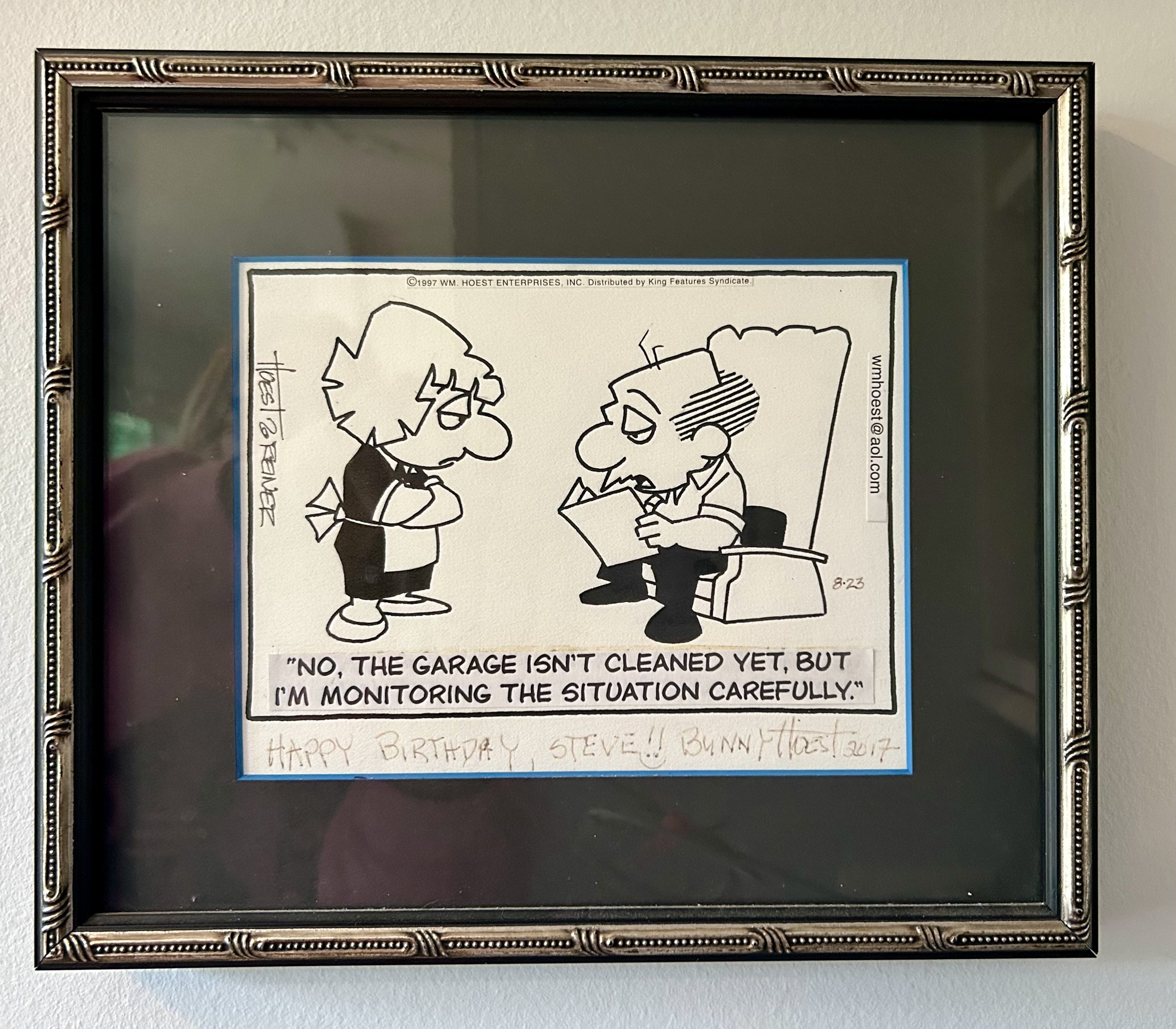
While I have never been a comics reader, early in our marriage, we received The Chicago Tribune newspaper on Sundays as Hubby enjoyed the comics. He often would read some out loud, and Lockhorns was a perennial favorite. This particular comic was run on 8/23/1997, and its humor spoke so clearly to our approach to “projects” around the house. The piece amused me so much, I reached out to the artist to purchase the original panel as a birthday gift for Hubby for 1998.
Those of you paying attention will notice it is signed by Bunny Hoest in 2017. When Bunny Hoest personalized the original strip, she used a non-permanent pen, and a number of years ago I realized her signature and inscription were faded away. I disassembled the framing and mailed the original art back to her to re-sign the piece. It seems with another non-permanent pen as that writing is ALSO beginning to fade. As the woman is now 93, I will leave her be.
The Lockhorns cartoon was started by Bill Hoest (1926-1988) in 1968, before their marriage (her second). It ran in over 500 newspapers, and was syndicated by King Features. The comic is done as a “panel” not a “strip”, with a scene presenting the “the ups and downs of committed relationships through the lens of the married couple Loretta and Leroy Lockhorn. The two exchange witty barbs and sarcastic quips all while demonstrating their deep love and affection for each other. Through thick and thin, couples counseling and Leroy's occasional trips to the bar, Loretta and Leroy exemplify the enduring nature of their relationship” (1).
Upon Bill Hoest’s death in 1988, Bunny took over the cartoon design, working with artist John Reiner, who came to work with the couple while Bill struggled with cancer. After researching, I learned Bunny used “gag writers”, a process the couple started in the 1970s. She says: “ I look at everything that comes in and I literally hand pick the one or two I will use from the ideas people send in. If I use the idea, even if I have to do a lot of editing, we used to say it comes in as gem or a germ. If it’s a germ of an idea it means I can rework it so that it’s perfect for the LOCKHORNS. If it’s a gem of an idea means it comes in perfect and I burst out laughing -this is it. So, we pay 10 dollars for every idea used. It’s not a living, I have 100 gag writers and I use 11 ideas a week, 6 daily and 5 on Sunday. So if a gag writer gets a couple in a month, he makes twenty dollars.” (2)
I also discovered, in this same 2012 interview, why the piece I own has taped lettering attached. The process of creating the comic involves Bunny developing the design, John drawing the artwork, and a typesetter using the “Hoest font”, typing up the needed words and pasting them onto the original piece. This piece would then be mailed in to King Features to complete the color placements, and distribute to the syndicates. In 2017, Bunny donated all the archives of the Lockhorns work (among other cartoon work she created) to Adelphi University. This piece hangs on my kitchen wall instead of residing in the Adelphi archives.
I am a bit of a “let’s tackle something new today…and finish it NOW” type person, while Hubby is sure a bike ride or some other relaxing option is a better choice. 37 years into a marriage, we remain the same. Now, though, it is not a garage he needs to clean, but a huge barn -literally, as our property has a few barns. Still waiting for him to tackle the piles in the area daughter and I aim to hold a “barn sale” in a few weeks. Sigh. To be fair to Hubby, my daughter -in-law refers to me as “Hurricane Erica” so it is possible I am a tad over-busy. It’s safe to say I am monitoring the barn very carefully.
(1) https://en.wikipedia.org/wiki/The_Lockhorns
(2) https://www.raymondpalma.com/bunny-hoest-interview-current-writer-of-the-lockhorns-comic-strip/

A Smack Of Jellyfish
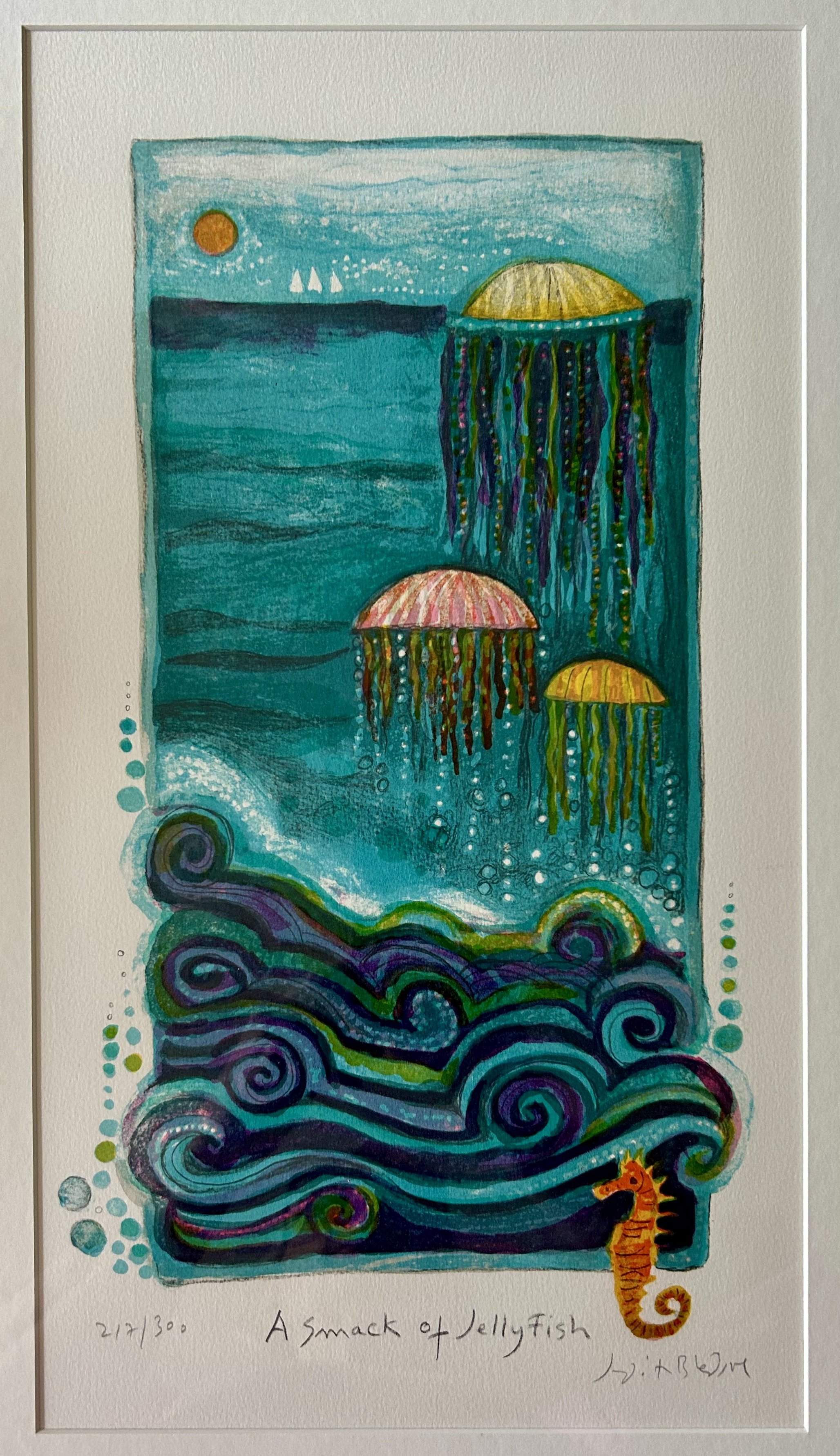
I love everything about this lithograph. First off, who knew a group of jellyfish was called a “smack”?! That sent me right to The Oracle (see prior blog: https://www.ericasheirloomquilts.com/ericas-heirloom-treasures/the-oracle-not-at-delphi). The term is derived from the sharp blow (or smack) you feel when you get caught in a group of jellyfish. I, for one, have never been “caught” in a group of jellyfish – I spent many vacations visiting Siesta Key, FL, both as a child and with my children. Whenever jellyfish were about, we high tailed it out of the water. There are numerous types, some completely harmless, but a number of jellyfish can cause severe pain to humans. Much like mushrooms, they’re not something to mess with, and I suspect the common response among beach visitors is to avoid jellyfish like the plague.
I discovered the fabulous lithograph while volunteering at my favorite thrift shop, framed in a simple, well executed frame. When I am volunteering, I cannot price something I covet, for obvious reasons. After doing some research, I asked the manager for a price and she determined a fair one. Not cheap, but under $50. I happily paid it as I have decorated a son’s childhood bedroom with nautical imagery for many years. Interestingly, I don’t recall my son ever expressing any specific desire for his room to be “nautical” in nature. However, I hung a wallpaper border of nautical flags which set the tone for the room for well over 20 years, and either he humored me or he enjoyed the spoils of my thrifting/flea market hunting.
This piece was destined for that room, and while the other works are all watercolors of boats, this piece fit right in. I will have to write about some of the other pieces as they are impressive watercolors, but the main reason I added this piece was the collection of very large shells I have. My eldest sister acquired these when we would visit our grandparents on Siesta Key. As a child I coveted those large shells, and spent many a morning scouring the beach for large shells washed in overnight. Beach glass, sand dollars, shark teeth, even sea horses were found. But alas no impressively large shells. I suspect these shells may have been purchased as the local gift shops were filled with such finds. Back in the 1960s, the stores were small shacks on the beach, surrounded by towering pines, and the gaggle of us kids would wander through them admiring all the found shells. Those charming beach huts are long gone, replaced with high rise condos. My memories of the rented sea side bungalows and towering pines have remained. As have the shells – though to be honest I’m not clear how I ended up with them. They were displayed in my sisters’ bedroom, and I recall my eldest sister drew the shells in pen and ink while studying fine art in college. Not sure where those drawings ended up, but they hung for many years in my parents’ home.

(the 1970s sea urchin light was a flea market find)
I keep meandering, so back to our lithograph. Smack of Jellyfish was made in 1982 by Judith Bledsoe, and the back has a detailed documentation of the work. What a fabulous thing for us art hunters! Much like vintage quilts, so much art has no information and the work, while signed, remains a mystery. In this case, we are informed the work was derived from an original oil painting done by Bledsoe, and redesigned into a lithography run of 372, of which this is 212 of 300. Thankfully, the back explains why the series is 300, but 372 were produced. 60 were run as “artist proofs”- a process by which the artist develops the artwork, printing samples, so to speak, until she feels the piece is how she wants it. The final 12 were “personalized dedications to collaborators in the handwriting of the artist” – meaning additional printings given to other artists or printers who helped in the creation.
What I especially love about this documentation is that it explains HOW the work was made. “The artist created the image by drawing directly onto ten zinc plates and one plastic sheet.” In addition, the artist “supervised the mixing of colors, pulled several proofs and made corrections. The edition was pulled, one color at a time, at Arts Litho in Paris, France. “ The plates “have been destroyed” thus no additional unauthorized pieces could later be made. The work was published by Circle Fine Art Corporation, and bless them, they note they want “you to be fully informed about the art and how it was created. This Documentation provides you not only with the information required by the various fine art disclosure laws of NY, IL and CA, but also with additional important facts and data”! I was unaware Illinois had such a law. Seems it was enacted in 1972, and there are some very specific guidelines regarding the sale of print work. "Fine print includes, but is not limited to, an engraving, etching, woodcut, lithograph or serigraph”. https://www.ilga.gov/legislation/. It does indicate any framed work under $60 does not need to follow the law. Phew!
Who was Judith Bledsoe? The Oracle says she was an American painter and print maker (1928- 2013) who ran away from home at age 16 and moved to Europe. After living in London, she settled in rural France. (https://judithbledsoe.com/About the Artist.htm) She did work for UNICEF as well as the 1996 Olympics in Atlanta, GA. In her own words: “My involvement in art has come as naturally as breathing – I could not have done anything else. It is all a matter of seduction, as most things in life are. Inspiration grows out of doing the actual work itself, from working steadily and keeping your sensitivity alive to everything…Art for me is magic, although it’s also magic when someone falls in love with a work of art, sees it and has to have it live with them in their home. That’s what art is – a torrid love story. You have to create it with your heart full of flowers.” It’s safe to say Bledsoe got my torrid love affair of art! Now to keep my eye out for art under $60.

Pretty In Pink Hermes

While I certainly covet art, I also covet a few items of clothing: vintage Louis Vuitton purse, Missoni sweaters, and a Hermes silk scarf. Not as if my life style warrants such treasures, but a little luxury never hurt a girl. The likelihood of coming across any of those at a thrift shop I would have said was close to nil. I will have to revise those odds, however as I scored this amazing work a few days back. For $1.00. I kid you not.
I’m realizing I have yet to discuss clothing as art – but i have always felt “clothing” is an artform. The designing of. The fabric and details of. The selecting and wearing of. There is art involved in each step, though our modern “disposable” society often forgets all that when grabbing cheap clothes at a box store. To make an article of top quality, there are designers, dyers, weaver, engravers, printers, sewers. I’m sure there are others, but you get the idea. This particular scarf was designed by a Vladimir Rybaltchenko (1939-2002), and made by Hermes of Paris in 1981.
It is known as the “Ich Dien” scarf, part of a series of The British Heraldry designed by Vladimir Rybaltchenko in 1969 and re-issued as a Limited Edition in 1981. It was in honor of the marriage of the Prince of Wales to Diana Spencer, and bears his coat of arms against the backdrop of Gothic architecture. The scarf depicts the coat of arms of “England (three lions)…of Ireland (a gold harp with silver strings), Scotland’s coat of arms, a lion in the upper right and at the center the Royal Badge of Wales.” The term “Ich Dien” is the motto of the Prince of Wales: I serve. (1)
I can’t bring myself to sell it – a common thing I do with treasures I find. But I have decided I will claim it as art and justify keeping it. (I should note hubby has literally never asked me to sell or get rid of art – sometimes when I replace things he will comment that the piece didn’t really work for him. But when “treasures” come home, he’ll often say “hit the bid”).
How did I come by this remarkable, limited edition, perfectly pink scarf?! I had stopped at my local thrift store and an employee was hanging recently received scarves for sale. We fell to talking as I browsed the scarves. Glancing down at the plastic bin she was pulling the scarfs from, the bright pink, and clearly silk, scarf winked at me. I reached in, pulled the darn thing out, and could hardly believe it was an ACTUAL HERMES SILK SCARF for $3.00 (I ended up paying $1.00 due to discounts). I didn’t look at it very closely, tucked it under my arm, visited with a few other employees, paid for my scarf and a few other little things (children’s book of course) and dashed to the car. I am still amazed.
The details of the piece are stunning. Turning to The Oracle, I learned more about the process. “Hermès relies on a global team of approximately 50 independent, freelance designers…to dream up its prints. Once a design has been chosen…it gets scanned into a computer where an artist outlines the design on a screen”. (2) After colors are chosen, there is a six-month engraving process where “Hermes engravers break the artist’s design down into unique films, one for each color contained within the design. As many as 47 different films may be created for a single scarf design.” (3) While the engravers are at work, “Brazilian silk is transported to France where the raw silk is woven into the silk used for the scarves. This weaving process can take up to three months. Craftsmen then mix pigments together and boil them to create the perfect colors for the design. Once the colors are prepared, the silk is stretched over a printing table and the screens are applied to the silk. One by one, each screen adds new color and pattern to the silk to build the final pattern. The colors are allowed to dry, then they are “fixed” into place with steam.” (3) This entire process, from start to finish, takes almost two years from design to scarf.
I did laugh, though, when researching the scarf, as the site detailing the heraldry had a reader comment from adguru1010: “Clearly the scarf held up better than the marriage!” I will wear the Hermes as I love the color pink, and take joy from the artistry of the work.
(1) (Details of the scarf spelled out here: a-closer-look-at-the-british-heraldry-limited-edition-ich-dien-hermes-scarf/ )
(2) https://www.harpersbazaar.com.sg/fashion/how-the-hermes-silk-scarf-is-made
(3) https://fashion.luxury/style/made-hermes-scarves/

Lion Low

I picked this watercolor up at an estate sale the other day. While the piece has no date, I immediately felt it was from the 1970s, and made me remember Born Free from my childhood. I managed to dash to the sale late in the day, and found the artwork in the garage. Painted by “Mary Lee”, titled “Lions”, and set me back $25. Internet sleuthing is near impossible for a watercolor with no date and “Mary Lee” as the artist. (see note)
The earworm “Born Free” started buzzing in my brain, and so off to the Oracle to see why. Born Free was a memoir published in 1960 by Joy Adamson. A movie followed in 1966. (The movie won two Oscars for the song Born Free which explains my earworm). Given that I was only 3 when the movie came out, I suspect my memories were from the 14-episode television show run in 1974. The story of an “orphaned” lion Elsa, raised and then released into the wild by Joy and George Adamson is more complex than my memory recalled, and while tragic on many levels, it also did a great deal of good for conservation awareness. George killed Elsa’s mother, and then reared the 4 days old cubs he discovered (which is why he believed the lioness was attacking him – she was protecting her cubs). Two cubs were sent off to zoos and Elsa was eventually released into the wild after much retraining. Sadly, she only lived a few more years, dying of a tick-born malaria-type illness. Tragically, Joy Adamson was murdered in 1980 at age 70, and George was murdered by poachers in 1989. The Elsa Conservation Trust they created for the profits from their numerous books and movies has continued to this day, and it donates funds for wildlife education and conservation. https://elsaconservationtrust.org/

Back in 1990, pregnant with our first child, husband and I attended “Art In The Barn” in Barrington, IL. While browsing, we came across “Animal Crackers” by Ann Otis. I loved the colors, and the memories it recalled of eating Animal Crackers as a child while grocery shopping with my mother. I could still happily eat a box, and I purchased them for my children while schlepping them through grocery stores as well. Who didn’t “play” with the animals as you munched them?! If you managed to save a few unbroken ones, you turned the box into a circus toy. Only lasted as long as the crackers, however, which in my case was not terribly long! The charming artwork hung in our nursery for years, and eventually was put away as the kids grew and décor changed.
As an aside, it seems I was smart enough to tuck a business card into the back of the frame when I purchased the piece. Ann Otis was a local artist, who made “etchings and monoprints”, and she charged $75 for the framed piece in 1990. Given her chosen mediums, I suspect the work is an etching, with multiple plates imprinting different color to the work. A complicated process, and criminally underpriced. You can see the etched line work clearly in the standing lion, particularly in his mane and face. (Note to self: always save the paperwork)

Many years later, when I began collecting “circus” artwork, I picked up yet another lion. This from the local flea market. The piece is a woodblock print – the image was created by carving a piece of wood with the lion, and pressing it onto the paper. The added grass and blue sun may have been a second piece of carved wood, inked in different colors and layered over the lion. “Sollid” made 200 of these, likely in the mid 1970s based on the coloring. The dealer, Dale’s Upstairs Gallery in Racine, WI (no website -he’s old school) uses vintage frames he collects to reframe old pieces, and suggested the white washed framing. We settled on the dark blue matting and I love the unusual look!
This woodblock lion hung in our “circus theme” family room near my Calder until another fun estate sale find replaced it (https://www.ericasheirloomquilts.com/ericas-heirloom-treasures/dante-at-the-circus). Now, having two charming “lion” pieces tucked into a closet, I decide two makes a collection, and moved them into an upstairs bathroom. Word of advice, however: don’t give an O.C.D. art obsessed woman a “theme”! Finding “lion” artwork has become a fun hobby.

This piece, a charming acrylic painting, was found at the local thrift shop, destined immediately for the bathroom. It is unsigned and undated, and cost $2.50. It is painted on wood, and the bright colors make me guess it’s c.2000. It is small, but I do enjoy the feeling the artist created, with the fabulous flowers draped through the lion’s mane, and the majestic face, well done in paint.
My last piece (thus far anyway) was purchased off eBay as it was one I could not pass by. An oil painting on canvas, dated April, 1974 and signed by Helen Owen Snodgrass. No information online about artist, but she clearly had a sense of humor. She titled the piece “Lion Low”. The back also states “Mother” gifted it to “Jill” on July 29, 1974. No way of knowing, but I suspect Helene may have been Jill’s mother, gifting her a humorous visual for the 1970s, including the ridiculous headband and hippie hairdo. After the 1966 movie, and 1974 television show, lions became quite popular. Born Free inspired many of the nature shows we all watched on our old television sets – no remotes, no recordings, tied to the actual channel’s schedule. If it was Sunday at 7:00 you sat on the sofa to watch Mutual of Omaha’s Wild Kingdom. There were other animal shows as well, Animal World, Flipper, Mr. Ed – the idea of animals deserving respect and conservation was a new idea, at least one that finally got traction, in the 1960s and 1970s. I’d be lying if I said the damage humans are doing to the animal world – as well as environment in general – does not distress me. But when I am feeling low, I can appreciate the artwork of many people celebrating these majestic animals.
Note: internet sleuths determined the piece was painted by Nan Lee Roberts (1920-2007), an artist of some renown.

Rough Riding
I have had this horse sculpture for many years, and he sits atop a wonderful old desk in our family room. Unfortunately, I know nothing about the horse’s history. My gut says it is very old (around 1850), American made and Midwest in origin. It is composed of layers of wood that were joined in numerous ways, and from that chunk of wood, an artist hand carved the 3-dimensional horse in mid-stride. He is roughly 3 feet in length, and has seen some rough riding over the years.
I have no idea what it was designed to do. It is too small to be a carousel ride. Possibly it was a store display sign, as the wood is well weathered, with only slight remnants of white, red and brown paint. But what was it advertising? What were the deep channels across the back of the horse used for? It also has two metal rods (possibly handmade nails) cut off on its flat bottom. Given the trouble I have had over the years keeping him balanced atop my desk, I suspect he was mounted somehow using those now removed pieces of metal. (If you get the chance, ask my sons about the time they knocked the horse off the desk).
The desk – what a wonderful story that is! Husband and I were newlyweds, and went on an antiquing trip with another couple in 1989. Both couples were looking to furnish recently purchased houses, and I specifically wanted a large old desk. We headed to Indiana from Illinois, with one couple driving a car and the other driving a rented van to fill with our treasures. As this was pre-internet days of antiquing, I had called ahead to a few dealers to find those selling furniture. Our first stop was in a small town in northern Indiana. We were not optimistic about the “shop” as we drove through a 1950s subdivision and pulled up to an unassuming home. However, the old man walked us over to his garage, which turned out to have a large pole barn attached to the back. Literally the first thing we came across was this desk. There was much discussion regarding whether I should buy something immediately, and I recall I was dissuaded from the purchase and we drove off. Within hours I knew that was a mistake, and we backtracked and snagged this wonderful desk.

The piece has two 1893 Arm & Hammer calendars glued to the inside of one door. However, I believe it is much older than that, probably circa 1850s. It is considered a “plantation desk”. That said, I hate the term for the connotations it evokes of our Civil War history. Interestingly, though, the origin of the plantation style desk was not southern, but for rural post office work. Like most of this style, the base of the desk is deep, with a slant to it. These sometimes had a base that lifted, much like the school desks of my childhood, but this one does not. Instead it has a remarkably deep drawer on the right side, and a charming decorative cut out on the left to allow you to sit at it. It is made predominantly of walnut with a few other woods. The legs are hand turned, and there are wonderful cubbies and drawers behind the doors. The nails are handmade, but unfortunately, the keys for the locks are long gone. It would not be considered “fine furniture” but was clearly handmade with a purpose in mind. The fact that walnut is a northern wood, and that I bought the desk in Indiana from an “antiques picker”, I feel fairly sure it came from a rural town in Indiana, Michigan or Illinois. Antique pickers journey around to local auctions and estate sales to stock pile interesting pieces to sell to “big city” dealers…or young couples!
The desk moved with us 25 years ago to our current home on the old Quaker Oats Research Farm property. It feels fitting that the rural desk and well weathered horse reside together in our family room. Our horse-riding daughter could not understand why, as we had a large barn, she could not also have a horse. As our town administration had a conniption fit regarding the rental house on our property, it was highly unlikely we could add a horse to the mix. To say nothing of the cost. She is still grumpy that the large collection of Breyer horses I played with as a child in the 1970s got pitched by my mother. Her room in our home is most definitely decorated with horse art. Now that she owns a home, I keep hoping all those dust collecting tchotchkes will gallop off to her place. Thus far, no dice. I did manage to get her to take the ridiculous pile of horse gear won in show competitions, as well as the large container of “place” ribbons. The large tack truck is still stored in the barn, but I suspect someday this rough riding horse will retire to her place to live out its days in comfort.

I think this answers my question regarding the purpose of said horse! 1875 handcarved wood “glider” rocking horse

A Woman’s Wide Shoulders, Giacometti Style
Wouldn’t it be wonderful if this was a Giacometti sculpture? Highly unlikely as he was Swiss, working in Paris, and I found this sculpture at an estate sale in my Illinois town 30 years ago. The statue was cast in metal, possibly bronze, and secured to chunk of wood. I see a woman, wide shoulders and flared hips, holding a child in her left arm, with the child resting a hand on her head for balance. There are no markings, and no identifying information. The figures are very abstract, but often I am startled when visitors simply cannot see the woman and child.
The work seems similar to sculptures made by Alberto Giacometti (1901-1966). Before WWII Giacometti’s statues were small, some smaller than a few inches! His early work was with the Surrealists in Paris, but they kicked him out as his figures were too “realistic” for them. While he did produce various types of art, he continually returned to the human form. His work, as well as my mystery piece, was created by building a model with clay (or wax), working the piece with fingers, knives or chisels to created desired effects. When satisfied, the piece is cast in plaster to create a mold. Molten bronze is then poured into the mold, which melts the clay (or wax) form and creates the statue. A different technique is to create a re-usable mold from the original clay/wax sculpture, allowing the statue to be cast multiple times. Until the mold is destroyed, the piece can be continually recast, as happened to Edward Degas’ (1834-1917) work after his death. Giacometti actually did produce re-usable molds, though he tended to “rework” each piece.
Interestingly, I had attached a note to the bottom of the piece when I purchased it. I must have asked about its history, and the seller indicated it was picked up by their deceased relative at the estate sale of David Adler. My mystery deepens! David Adler (1882-1949) was a well-known architect in the Chicago area, designing remarkable estates for very wealthy clients (http://architecture-history.org/architects/architects/ADLER/bio.html). He studied in Paris, and traveled through France. He died a widower at age 67 in a home in Libertyville. (That home, The Adler Center, was donated to the town of Libertyville by his heirs and has remained a local art center for our community). The sale my sculpture was originally sold at was for David Adler’s estate (he had no children) in 1950 or so, purchased by a local family, and then sold again to me nearly 30 years ago. Given the wealthy clients Adler worked for it is possible she was a gift to him, or Adler could have purchased her in France and so I’m not betting against the statue being a Giacometti!
Giacometti’s work often featured human figures, and after WWII, he created the elongated single figures he is known for. Giacometti “whittled his subjects down to heavily worked but stick-thin figures…[His] expressive figures became associated with existentialist ideas and a sense of post-war trauma…“Reduced, as they are, to their very core, these figures evoke lone trees in winter that have lost their foliage” (https://www.tate.org.uk giacometti). In addition, he is well known for his work having very small scale heads in proportion to the bodies, much like my statue has.
My “Mother” statue has textural details resembling those of Giacometti’s work, and the elongated female and child, with their off-balance orientation, creates a sense of movement and challenging perspective. The peculiar stick thin arms and legs, and the elongated neck of the woman are not a “portrait” of someone, though Giacometti wrote that he created his art from his viewpoint of a model, with some of the features being distorted due to the perspective he saw. The child, while clearly younger than the female, is also oddly thin and elongated. To hold an older child as such would be rather impossible, but a baby would not be so long limbed. I do sense the idea of bare trees in winter, with the odd stick limbs and sharp angular shoulders.
Those shoulders, to me, are the defining feature, and evoke a difficult time in my life, as a daughter and as a mother. Back in 2010 my father had died, and my mother, Barbara F. Humphrey (1928-2021), facing widowhood and early stages of dementia, was struggling through a painful family rupture. She was scared, felt abused by some of my siblings, and relied on me a great deal. It was a difficult time, one that left many scars on my heart, but I was blessed to have a husband and children who supported my need to often fly to Florida to help Mom. As we were at the end of the process of relocating her – and trying to settle my father’s estate as my mother desired – my mother gifted me a simple diamond necklace. She told me that I had strong shoulders, ones she relied on a great deal, and she was incredibly grateful for all my strength, support and love. I have worn the necklace ever since, and recognize how important it is for women to be strong, to have broad shoulders, as they face the obstacles life throws them. I have been rock climbing for over 20 years, and thus literally have strong shoulders. But Mom was referring to my emotional shoulders – the ability to offer her my strength to help her get through such a fraught time. Rest in peace, Mom, you earned it.

Gardening In History

I purchased this vintage poster on eBay around 2001. It hung in my daughter’s bedroom for years, with the charming, yellow Anna French wallpaper husband and I loved. The wallpaper is long gone, sadly, but the artwork now resides in our bedroom, which I guess is a fair trade. I love its peacefulness, and it brightens our north facing room.
The piece is dated 1931 and says “Concours de’ L’art a l’ecole” (School Art Competition). It is signed G. Rochette below the kneeling girl. The work is Art Deco in style and coloring, and was printed in blocks of colors. To me, it is 3 children in a garden. However, a similar piece online was described as a scene of a teacher (kneeling) with a boy (shoveling) and girl (watering can). Possibly, but I will stick with children as I like that interpretation better. Trying to figure out more about the piece, I began internet sleuthing.
To start with, the piece is referred to as a “stone” lithograph. As that was a new term for me, I did some research. A stone lithograph is made by hand, literally drawing directly onto a stone plate (other mediums are used as well nowadays). The image is secured using chemicals, the stone is inked, and is then pulled through a press. Prints made this way have very random “dots” of ink, visible with magnification, which are distinct from the mechanically reproduced “prints” with uniform dots. This lithograph is large and required a similarly large-sized press to run it through.
Clearly, the work was created in a school of art (“l’art a l’ecole”). THE art school in Paris was the Académie des Beaux-Arts, and in all likelihood this piece was from a student there. The school maintained both an “Academy of Painting and sculpture” as well as “Academy of Architecture”. Students began by studying classic art and architecture, and in advanced grades were required to compete in “cours” (competitions). I suspect this piece was produced for such a competition.
As I was researching the school for this picture, I realized I have a family heirloom hanging on my wall that also is from the Académie des Beaux-Arts. This collaged piece was assembled by my eldest sister back in 1980, around the time my parents were clearing out the box of family heirlooms. I recall there were a few other “postcard” paintings addressed to Ben Strong, but they have been lost over time. These ones, all signed (unclear) and dated around 1917 are of various landscapes with buildings around Paris. As I don’t read French, and Google can’t make heads or tails out of the writing, they remain unidentified, both the artists and the sites.

Many American students attended the school in the early 1900s through scholarships, and it seems my paternal Great Grandfather Benjamin Strong (1872 – 1928) was a sponsor of these students. They, in turn, mailed him these postcard pieces of art during their time of study. Amusingly, they addressed the envelope: Mr. Benjamin Strong Jr., Federal Reserve Bank, New York”. Mailed by boat all the way from France, before World War 1!
It is rewarding to learn the process behind their creation, and to know my Great Grandfather was a patron of the arts as well as known for creating the Federal Reserve banking system in our country. I have had the collaged piece for many years without knowing anything about it. Understanding a bit more now about Ben Strong’s personal struggles makes this piece all the more impactful. His first wife’s suicide, his second wife’s abandonment, the death of a young daughter and the separation from his two youngest daughters all occurred between 1904 and 1916. In addition, he was raising 3 children, battling tuberculous and the corresponding opioid addiction. But he still supported young artists, offering them financial help to study in Paris. I can only hope these little pieces of art brightened his life as only a moment outdoors, in the sun, among the flowers can.

Dutch Treat

Having just returned from a week trip to the Netherlands and Belgium, it seemed an appropriate time to look at this large-scale watercolor I found months ago at my local thrift store. The picture measures 21” by 17” and is nicely framed, though to capture a painting behind glass takes a bit of camera work so the frame is not shown. It caught my eye, likely because I’m a sucker for anything Dutch. For the ridiculously low price of $35 I couldn’t pass the piece up. I hung it on our screen porch as the colors worked beautifully, and I puzzled over the image for quite a while.
Oddly enough, I recognized the signature. Linda Kollacks had been a member of my quilt group years ago, and I admired her amazing applique work. She is also an artist of some renown in our area, and works mostly in oils. In fact, I purchased a small oil from her years ago for my daughter, as it depicts the ponies of Chincoteague, a sweet reminder of a trip daughter and I took to see the famous “swim”.
Clearly this large watercolor is depicting some Dutch scenery, but the musical instrument in the background, and the very obviously dated costumes left me a bit confused. The puzzle was solved – sort of – when a friend posted photos on her Facebook page of her recent trip to Holland, Michigan. It seems the image Linda Kollacks painted was from a Dutch village in Michigan called Nelis Dutch Village. (https://www.dutchvillage.com/) The Village is similar to Colonial Williamsburg, having interactive exhibits and events recreating the culture and heritage of the “real” Holland. The city also hosts a tulip festival each year, a celebration started in 1929. (This year’s event is May 4-12 so maybe plan for next year!) It is at this Village you can find this odd musical machine – known as “De Gouden Engel” (The Golden Angel), a Dutch Street Organ. After consulting The Oracle (ericas-heirloom-treasures/the-oracle-not-at-delphi), I learned quite a bit about these instruments, this one in particular.
The organ is from 1908, and was originally known as “De Tiet”...due to rather voluptuous female caryatids on the front which were removed at some point, well before the organ arrived in Michigan. There is quite a dissertation on the De Tiet (now De Gouden Engel) (https://Carl Frei Dutch rebuild Nellis' Dutch Village Holland MI.pdf) but it seems this particular organ has gone through a number of renovations. It is a thought to be a “genuine Carl Frei organ” built from a Gavioli machine. It was “rebuilt” by numerous organ companies, and spent many years being rented out for events in Holland and Belgium.
Still not clear what a “Dutch Street Organ” actually is, so more consulting with The Oracle. The origin was the simple music box, carried by a strap around the neck, and played by turning a crank. Eventually, these grew into larger, louder machines on wheels. Traveling showmen would rent a Street Organ for their music halls or fairs, and the machines “soon proved to have some nasty disadvantages when they were transported and played on the streets. Filled with reed pipe ranks such as vox humanas, saxophones and clarinets, they went out of tune very easily during their daily voyage over the cobbled streets of Amsterdam and other big cities. Moreover, due to the increasing traffic noise by motorcars, their sound also grew relatively too weak to be overheard properly. As a result, nearly all of these organs were rebuilt in the 1920s and 1930s to match the changing circumstances.” The Organ’s sale to Mr. Nelis in Holland, MI in the 1970s for his amusement park saved its musical details from additional ruin/repair.
The amusement park includes dancers, as depicted in Kollack’s watercolor, with the street organ playing behind them. I have not yet figured out why she painted such a large watercolor of the scene, but I did learn in my research that she and her husband spent over 20 years living in Brussels. Possibly a visit to Holland, MI spoke to her and she captured the scene in watercolor.
My recent visit to Amsterdam and Belgium did not include street organs and dancers. However, Kings Day in Amsterdam certainly created massive crowds dancing to all sorts of modern street music- live music, boom boxes, ruckus singing (and LOTS of drinking…don’t advise getting caught in that chaos!). However, the wonderful city of Bruges, filled with cobbled streets, fascinating history and an ancient clock tower certainly makes you feel you are in living history. The city was not bombed by Hitler as he was keen to get his hands on the only Michelangelo statue outside of Italy – the lovely small-scale Madonna of Bruges, displayed in the Church of Our Lady. While Hitler wrecked destruction on humanity, his avarice for precious art did allow small moments of miracles – including the saving of Bruges. I will not discuss the horrors of his behavior, but will feel thankful for the Madonna of Bruges for her sojourn to the salt mines of Austria, and her return to the beautiful city she rescued.